Lessons
Nature and Landscape Photography- Class Introduction
03:10 2Cameras and Sensors
07:03 3Lenses for Nature and Landscape Photos
09:32 4Tripods and Monopods
24:42 5Exposure and Metering
09:20 6Exposure Modes
14:57 7Focus: Modes, Points and Buttons
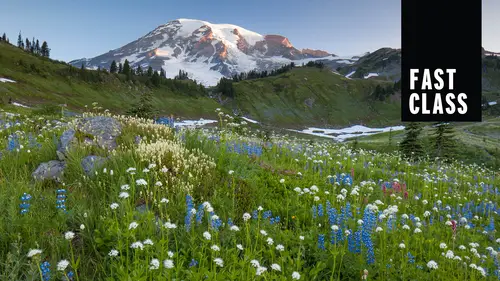
20:15 8Mountains and Forests
17:39Lesson Info
Elements of Design
Well, so far we've been talking about subjects different mountains, lakes, everything else that you can photograph. And so I'm gonna jump into kind of a different way of approaching some of the same things. And that is through the elements of design. And these are just good graphical things that work in photographs as well as in a lot of different types of artwork. And the first of these elements is lying all right. And so one of the things that were drawn to our lines, these air kind of handrails for the eyes, you might say. And so any time we have nice, clean lines, that's often going to be the good element of a photograph. And so look for these when you're out in the world. This is from Yellowstone in the winter, in Yellowstone, in the summertime. And there are lots of places where there are great natural, nice clean lines. And so I'm very much trying to have a very clean look to my photograph with, you know, just the elements that I want in there. There are different types of lines...
that you can have, and they have slightly different impact. The diagonal line has often a little bit more impact than the horizontal line, which can be a little bit more static and nature. We kind of expect things to be either exactly vertical or exactly horizontal, like the horizon. And when lines are at an angle there, just a little bit more dynamic, there's a little bit more action, you might say these lines, as I had mentioned in previous section and I will mention again when we get to the composition section our eyes in this case leading us into the frame into the mountain and just, you know, as a side note, I'll jump off topic every once in a while. I'm using the split neutral density filter here to balance the light of the bright sun on the mountain versus the shaded areas that these two logs are. Actually, it's just I think it's just one log and two branches coming directly at you. So diagonal line. I think I have another shot in here of it, just a vertical shooting straight through the middle, and it seems very stable and balance, and this is a little bit more dynamic, having it run from corner to corner and then having the curved line. One of the favorite features that we confined and they're not easy to find is that s curve in the river in front of you. This one, albeit a man made river. But that s curve is really nice tohave in the desert, the line of the sands here. And if I ever have a Siris on numbers, this is the number two. I have a lot of numbers to go through to finish up the number sequence here, but it is a nice number. Two nice little curve in the line here, and so leading line lines lead you to a direction. And so your eyes tend to want to follow these handrails for the eyes, as I've mentioned to your subject. And so in this case, using the boardwalk at Yellowstone to lead your eyes into the fountain here. Now, this is kind of one of those places where everyone thought I was nuts, because why you standing way back there really low to the ground? If you want to see old faithful, you've got to get up nice and close in front of everybody and sometimes standing behind people, you could get interesting shots to add that human element. So using those lines in the rocks to lead your eye up to the tree kind of an unusual case of leaving a big blank area right in the middle. But those eyes drying you straight back into the depths of the horizon. Down at Mount Hood, using the trees and the branches, those white elements attract your attention and bring your eyes up to the mountain at the top of the frame. Next element is shape and our eyes, and the way we see the world, we can very quickly look at shapes and kind of understand what they are. This is out at Second Beach, and to me this just looks like a thumbs up side. So I think that shape really stands out and is very distinctive, especially against the colors of the setting sun. This is a sand dune down in Oregon, and for me, this just looks like a hip looks like someone's hip laying on their side, having those shadows that sidelight really accentuates the shape and texture of it. Shooting from an airplane in Australia showing the nice shape of this waterway, showing lines of a tree so shape is a great element tohave. When you add shape on top of shape, on top of shape, you get a pattern, and any time you can have a nice clean pattern. I consider that to be the photographers best friend. I mean, any time there is a pattern around, I'm looking at trying to get a nice, clean, simple shot of just that pattern there. And there's lots of great places that you're going to find patterns. One of my favorite places to go is Goblin Valley State Park down in Utah. It's this very unusual, surreal environment. When I looked at this wall of weathered rock and dirt, it just it looked like goblins and I could see faces in the wall there. So it's a very fun place to go because there's a lot of different these usual pattern areas there. Famous spot. If you want to go meet a lot of photographers in the morning, you go to Zabriskie Point in Death Valley. There's very famous place. I actually found it hard to find anything I liked, but there is some great colors in great hills. Very nice place to go. One of these classic locations of the landscape shooter. When you have a pattern, it's kind of nice to every once in a while break that pattern, and for me it seems like flowers or the things that are constantly breaking up that pattern. And so you have a pattern of rocks and that those flowers or that one element that kind of don't mix in there. It's the one element that's a little bit different up at the Skagit Tulip Festival. Every once in a while you get these one oddball flowers and these air always kind of fun to photograph, because it's that one odd one that's in there that's growing out. And it seems to happen quite frequently. And so using the long telephoto lens, the shallow depth of field to really highlight that one that stands out. Next element that you should look out for is texture, and this is essentially a pattern. But for me, it often conjures up further feelings of texture. What does this feel like? Is it hot? Is it cold? What does it feel like to the touch? And this could happen on many different scales, from large scale down to macro levels that Moss very different texture than the water. And actually, one of my favorite photos from Yellowstone in the winter is this shot here. And, you know, this is manmade shoveling of snow cleaned up with a nice fresh layer of fresh. No, And this is one of the things I'll talk about when I talk about shooting in Snow is getting out early in the morning and getting out right after the snowfall. I know here in Seattle we get maybe one good snow per year. And if you want to go out to photograph in it, you've got to get up first thing in the morning before everyone starts going to work and starts trampling over at all. Because that first thing in the morning, it just transforms the landscape that will do that pretty much anywhere you go. Another concept to embrace is space and simplicity, and this is one of the things that I really like in a photograph. I feel like we live in a very cluttered world, and every once in a while it's nice to have a big, open expanse of just color and nothingness in some ways. And so you could say that this doesn't have a strong subject in it. It's just a horizon line, but it's got a lot of nice color, and seeing that nice open space gives you a feeling that this is a nice, big open environment. And so having lots of space around a subject or having a subject that's very small in frame is perfectly OK to do from time to time. I don't know that I want all my photographs to look like this God, But having that extra space is really nice. If you were into commercial photography, you would be talking about leaving space for text entitles in here, and I'm doing it for just artistic reasons. But there are lots of other financial reasons why people leave lots of extra space in their photographs. And so in general, I like to get the tight shot first. But then I'll often tryto loosen up and get a second shot just to give me a different look and a feel to the photograph, leaving a big, blank, open sky that I usually would normally say. You shouldn't be doing that, and so this is one of those rules. That's really just a suggestion that you can feel feel free to break, using the rule of thirds, placing this little spit of land in the lower left hand corner with just enough exposure to maintain some texture in those clouds. Down in Antarctica, there is a hillside that had just this very blue slope on it, and these clouds were coming around the back side of it. It just it looked really unusual. Very graphic and very, very simple doesn't tell a big story, but it makes a nice little simple statement. As you have seen throughout the talk, there are a number of cases where I have turned my images from color to black and white. And, of course, landscape photography has a long history with black and white images that simplifies and really shows. The graphic nature of particular places that you're at and black and white is a great way of showcasing that in some cases you just don't have a lot of great colors, and turning them black and white really changes the feel for him. In some ways, it adds a little bit more mystery to the photograph because I mentioned before and I mentioned in the past several times, leaving something out of a photograph can often add mystery. And so leaving out that color leaves you wondering a little bit about what colors air there because you're seeing the world in a way that you don't normally look at it with your own eyes, which enables you to see the ways to see it in kind of a new manner. And I can't show black and white photographs without showing mudflats. You gotta have mudflats anytime you show black and white photos and looking for that texture. So you're looking for really contrast areas. This is one of the few times that you can shoot with the sun because contrast in middle of the day, shooting actually can work with black and white photography quite well. So let me give you a few of my tips on black and white. I'm by no means a master of it, but I do enjoy doing it. And this is where that contrast he seen actually helps out. Normally, we're trying to avoid the contrast he scenes because they don't work really well in color, but they can work much better in black and white. Dramatic or strong light is a good element to have here that could be very tough toe work with in color photography. But in black and white, it's good mawr often of the time. As I said before, A good way to shoot this is to set your camera to black and white and shooting raw at the same time. This will enable you to see on the back of the camera or, if you have an electronic viewfinder, right in the viewfinder as you're composing the shot, what it looks like in black and white and having that is a positive feedback loop. You get to see exactly the way it's coming, or C the way it's going to turn out, and that's gonna possibly change and improve the way you compose your shot and set it up. And so I really like that feature about the new cameras been able to see in black and white because before that we're always kind of guessing. I hope this looks good in black and white, and you will need to make some adjustments in post processing. So whatever program you use Photoshopped light room, you're going to need to go in and adjust the contrast levels you're gonna need to be able to go in to the color channels and you'll be able to grab the Blue Channel, and you can make a darker or you could make it brighter. And this is what we This is the new version of adding color filters. If you shot black and white in the past, you probably had a whole collection of yellow and orange and red filters that you would add to add different contrast level. And the beauty in digital now is that you don't need all those filters. You can just shoot it straight in the field and then add and subtract of those types of filters later on. And you could have multiple versions of the same image, which is excellent way of controlling it. So that's black and white now, of course, what our eyes drawn to what do we look at us? Humans? We look at a number of different things. We'll talk about more of this in the composition section, but of course we're attracted to color. So any time we have bold and vibrant colors, that is a good element to look for, And so a lot of times when I'm looking around for things to photograph My eye is looking at whatever is the most saturated, colorful object out there and so keeping the camera really low. In this case, I've kept it very simple red, green and blue. And all of them are very saturated clean colors. In this case, fall time is a great time to be shooting. We're gonna be talking about wind to be shooting photos and what type of photos to look for. So, of course, fall time with the trees changing colors is an excellent time to go out. This is a Japanese maple here in the Arboretum in Seattle. Now there is one color that does holds special significance, and it's not that it's my favorite color might be. But it's red, and humans really have a special affinity to read. It stands out in a very, very special way, and so those red elements really seem toe pop out. It's something that I think is bred into us, from blood to blood red skies, and I've used this in the past, and so when I went to Iceland, we very specifically bought red pen years for our bikes that they would photograph better on camera. When I was climbing on Mount Rainier, I had a red coat that would stand out in contrast to the blue skies and the white snow mountain biking that have red jerseys and so they could stand out. You can really see them. When we bought our canoe for a couple of canoe trips, we bought a red canoe and it had to be a red canoe. We looked at some other canoes, but we knew that a red canoe would stand out with the blue waters very, very easily. It just photographs so much better. And I've heard a number of stories about landscape photographers, I think. Adam, maybe this is more in the seventies, when the color film really hit the mainstream about nature photographers taking red canoes and hauling them up to mountain lakes so they could get a shot of someone on a red canoe out in a mountain lake, and it discuss it pops so easily. I find it quite funny at Lake Louise in Bam, Alberta. They have a red canoe out there, and it's just for being photographed. It's tied down out of the middle of the water just so that you can photograph. It s so I couldn't resist throwing one of those in here another type of color that I really like. We saw a photograph earlier. I talked about the graduated color. I love color that kind of changes from one color to the next in a natural way. And you're going to get this a lot at sunrises and sunsets, whether it's changing from one color to the next or kind of changing in density and darkness, it adds another layer of interest and shading to the photograph. And so love this picture down in Australia with the different shapes in the water. But that color going from a dark blue and purple to, ah, yellowish orange love that changing of the colors. It's almost adding a little bit to the dynamics of the photograph. The opposite of that, of course, is very good, and that is monotone color, finding subjects that are all very similar in tone, ality and color. Some grass is just in a local park here in Seattle. Just had a very vibrant green and orange to them really had a nice little palate that I like up in our skeleton, a schedule to look. Festival the saturated colors up there. We're just the leaves of fall. Simple little shapes with a very monotone color to him.
Class Materials
Bonus Materials with Purchase