Lesson Info
5. Creating Color Studies
Lessons
Class Introduction
01:45 2Color as Meaning
02:35 3Grounds and Their Purpose
22:26 4The Power and Illusion of Light
15:27 5Creating Color Studies
19:47 6Creating Harmony and Color Hierarchy in a Limited Palette
07:38 7How to Choose a Palette
10:46 8Pulling it All Together: Telling a Story with Color
15:15Lesson Info
Creating Color Studies
So, the next thing I want to talk about is color studies. I think they're under utilized primarily because people are like it's gonna take to much time I just wanna jump right in. I wanna make the picture. But if you take the time to do the color study you could actually save time because you're figuring out ahead of time, like I did with the landscapes, you're figuring out ahead of time does this work? Is this the palette I really wanna use? And when you discover, oh no, that's not what I thought was gonna happen you can try it again. And color studies are usually fast, they're usually very small. I never to a huge color study. And they shouldn't be belabored. So this is a series of color studies, they're very small, they're probably three inches by three inches, for a series that a student did in my Color Works class for a narrative. And they're all from the same world, they're just different moments, different scenes. And so you can see they're comparative. She tested this palette a...
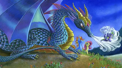
gainst that. A sort of purple palette against the cool blue. This one is a little more shifted to the blue. Shifted to the green. And here this is sort of purple. A kind of late day verses the hot sun. And again here, the difference between the palette and sort of the time of day. And so this student was testing that to figure out what would be the best choice for the finish. What's interesting though is the palette for this and this are not different. They're really the same palette. It's just dialed to the hotter range of that color combination. And here to the cooler. So I'll show you some close-ups of that. So this is a contrast of these two -- the same moment with two different versions of the same palette. And the way that I'm sure of that is I can see that the same blue that made this green color is here in this blue. I can recognize that it's the same. And that's probably just, you know, from experience. I also see that this yellow is the same color here. So they had to choose like, what's really capturing the emotion of this moment better. And I believe this student was really much more engaged in the end in something that felt a little bit more lighter time of day, a little less somber then the green. And the same for this piece, which is really interesting. Same palette dialed into two different sort of times of day. And they're both really beautiful. She went with this one because she thought it was more dramatic. The contrast of the purple late day with the light. But in both illustrations, it's really interesting, she saved that little pop of opposite color because the ground is quite warm is this little green note of this characters shirt because it's a main character. And so it sort of pops in this scene because there's nothing else that's green, that vibrant green in the scene. So you save out -- it's the pop, it's the snap. It's the thing you want your eye to go to, should be different then everything else around it. That's the one thing that you -- you don't want it to be in some cast off side space. It should be on something you want the viewer to see. Now this student absolutely struggled with color the whole semester. This was literally the finial project. And she was very nervous that she wasn't getting it. She didn't understand color. So what we came up with for her to do, which anyone can do, is that she studied how to use grounds and limited palettes observing the real world. So just about everything here is observed from a real space. A few were from photographs, but most of it, this is Providence right here, Providence, Rhode Island, where RISD is. These, I believe these were from some photographs of places she'd been to and some of these are just objects that she set up and painted. But by doing this, these are tiny little paintings, and they're gouache. By doing this, testing a ground, putting the color on top of it and doing it from observation, she was able to figure out what worked and what didn't. And I was really pleased to see that she was finally turning a corner with color and she was very excited. And I have to ask you Kenna. You know when you look at these are there any that pop out to you as being particularly emotive or interesting in terms of color expression? There're a lot of them here, so. I know there's a lot (laughter) And you can tell me left or right. I can't really see from my angle. I think that, and maybe I just am now, was looking at the landscapes and such but some of the ones where there is that contrast. In here? Yeah. Up there and then even the mountain scene, for me. Here, here? Yup. Yeah, you picked the ones that have the best color use. Nicely done. Yup, and the reason isn't part of it's the emotion of us recognizing a landscape, but the other part is the under pending color, you can really see it here. It's this pink. It's reacting to the greens on top of it. And this is dialed in the direction of warm but its purple to orange relationship sort of dialed back. But because she used contrastive value complimentary colors, and really looked at the light, all those things together made a stronger piece. The ones that are least strong are the the ones where she removed everything except value. These were actually her first images. And they're probably the least emotive because she was afraid to play with anything except for value. I'm gonna look at the color of the object, it'll go darker in the shadows and lighter in the areas of light. But that did not create the same kind of sensibility as some of the later paintings that used other issues of contrast while still observing what she was looking at. But I was really proud of her. This is just one sheet. She did many more. She did like 100 of these. This was a similar kind of exercise, but this student didn't focus on things that he was observing. He wants to do sort of sci-fi, fantasy, gaming work. Landscapes and environments for gaming. So he focused on fantasy spaces from his imagination. So he sketched them out in pencil and then started to focus on what the light and the color would be for this imaginary space. Now I'm wondering, I'm gonna ask you, if there's any here that strike you as being a little more compelling then then any other. I'm curious. Well what's interesting is that to your point of in a single image those contrasty things are the ones that pop out at you first. So even within this compilation the orange and yellow, that one starts to pop. Yup. Are there any that are subtle, but have really good use of color? I like, and I'm gonna just look on this screen here, where I have them as well. I like the use of color in the top right hand. The purple and greens. One more over. This one? Yeah. Yeah, and that really relies on the complimentary relationships. So you've chosen two that are dialed up in terms of complimentary relationships and it makes it feel really otherworldly and a strange environment. You feel like you're in a fantasy land but it's probably another planet. So these were two I felt are the strongest use of high contrast complimentary relationships. The others that I felt did that were, they're more subtle, were this one and this one where he dialed back the contrast of compliments but it still existing, it's still there. So he has the range of going full power to moving it back to it's more about the light but it's orange light and purple-blue shadows with some warmth in them. This is a blue-green light with kind of orangy-brown shadows but it's just not quite as highly saturated. So you picked actually, these were the two that I picked out were his strongest that were high key, or highly contrasting in compliments. And then his two more subtle pieces. And probably the ones that I would say would be the weakest, and I'll tell you why, is this one. Which you have a really saturated color shoved in the corner of the picture and so it almost makes your eye leave the picture. Because it's like you're focused on that and then you're not brought into the rest of the picture. And it's separate from everything else. So it's not an ideal, you know, sort of image in terms of decision making. I'm curious if that's the same. Because I am drawn to the one, two, three from the left and then down two. With the bright green and then the orange. Sorry, in the third column, the second one down, that one. This one? So I'm really intrigued by what's going on in the right hand side Yup. But my eye keeps going to that right To the color. Right, and so even though I wanna be looking at there I kind of get a little bit -- It's really similar. Yeah it's a similar reason. Look at how this picture is divided in terms of color. Half of it's green and half of it's a neutral sort of tone with a little bit of green in it. This is so overpoweringly bright that you keep going to it because it's symmetrical, it's like broken in half, we have no reason to go to the other side. There's nothing directing us there. So it has potential, but like this image it's not composed well in terms of where the color is directing your eye in the piece. Nicely done. Good crit. So this is another series that a student did for a final for this class called color works and what I love about this is you can see her thinking. You can see how she's exploring different palettes and different ground choices even within a range. There's pure blue, really more purple, somewhere in between and darker, and you can see how that would react to the colors put on top of it. This palette relates to this study and this palette to that. This was all done with acrylics and some gouache mixed with acrylics so that's why it has a kind of a little bit chalkier flavor to the color. But this was a wonderful study for these paintings and a really effective use of the material. What was really interesting though is I want you to remember this moment with fire. Because I felt like this study, I was like wow, fire is hard to do. You need contrast, you know. The fire's light and what's around it has to be dark. So she really caught it here in a very simple gestural study. And I was excited to see that. So here's the first two paintings besides the color relationships. They're very emotive in terms of this is sort of a -- it's a cool forest scene. So she dialed things in the direction of a cooler palette. The marks are also softer because the light is sort of passing through in a sort of gentle way. As apposed to this scene, which has a lot more contrast of shapes. They're both strong. But this is a different time of day, this is a kind of a different mood and moment. So they're related from the same series, but they have a different mood in terms of palette and in terms of the use of contrast and how the light is functioning in the scene. She did something interesting though. She wanted to combine stylization with the kind of realism. So when you're stylizing things you need to hold onto something the viewer recognizes. Give them something so that they can believe your world. She captured the sense of light that we recognize. You know, this looks something like we could imagine seeing. But then she stylized all the trees and objects and rocks and even the people to have these outlines. So they're not really realistic. But we believe her world because she gave us something that we recognize. And that's I think an important thing to remember especially when you're creating highly stylized work or something that's fantasy driven. Give the viewer something they recognize and especially when it has to do with color. But let's go to the fire scene. So if you think back to the piece you saw, I think this was wonderfully illustrated. There's a lot here that's really working. But the piece that's not working was well as the study, can you guess what it is? I can go back to the study if you want. Is it that it's too bright? Or not enough -- I'm gonna go back because I want you to see. That's the scene. Right. Okay. And now go forward. If I can. There we are. What's the difference between those two moments? It's the same scene. The fire. Right. Does that look like fire to you? Does it look as believable as the other one? Oh I see. Not exactly. Yeah. Part of the reason why is that look at the lightness of this value and the lightness of the fire. They're super close. Right. In the study the value contrast was really high. And when you see fire, what makes it look like it's fire is that it's really light against something that's dark around it. So what I recommended once I saw this piece was deepen the value of the ground around you and warm it up so it looks like heat is being cast on the skin, on everything around the fire. And that's just observing what fire does to make it more believable for us. Otherwise, it's beautifully constructed as a scene. This student would recognize that, and she admitted it, she's like, "I always tend to do cool palettes. I have a hard time with heat." So, again, it's like you've got these things that you do that if you can recognize it's sort of an Achilles heel, and like you need to dial out of it. She knows that so in her next semester she pushed the heat which was really great. Now we'll start with, this was actually one of my pieces, Dragons on Dazzle Island. And when I start, particularly with pieces that I know the ground will be dark, I draw the line work in a much more heavy fashion so that I know it'll show through the color on top of it. Because if I don't do that I'll loose my drawing. So I do the pencil drawing. I then transfer it onto watercolor paper but I don't redraw it. Partially because I don't wanna say its because I'm lazy, I'm very hard working, but it's because you capture the drawing, you've nailed it, you've got it, it's what you want. If you have to redo it, as an artist it's like oh my god, I have to draw that whole thing again. It may not be the same. It changes when you redraw. So I take my drawing, I print it onto watercolor paper, just any kind of printer. I go to a place that does this for me because they're oversized. I let it cure for 24 hours so that that ink is set into the paper. Then I can watercolor on top of it. And the first thing I had to decide was what should the underpinning color be. And I felt like a purple blue would work well with a green dragon. With a green dragon that has yellow and red sort of bits on it. And the ponies of course. They're often times warm tones, so I thought, Oh, a purple-blue. Not a super cold blue, but a purple-blue will have a little more magical feeling about it because it would feel a little less cold, a little more heat in it. So that was my test. The nest thing I had to decide was the light. Which direction is the light coming from? So what I did is I did a simple -- you know I had a little sketch of the dragon and the scene and I threw a piece of tracing paper on top of my drawing, I covered that tracing paper with pastel and then I just used an eraser to erase out where I though oh what if the light is coming from the left side of the piece? As soon as I did it I knew it was wrong. I knew it was a bad idea. And the reason why is because the main action's over here. Not in the backside of the wing. So what do we need to see the backside of the wing for? So I reversed it because I just said, you know, that's not gonna work and put the light on the right side streaking across. So that made the wing not so important, it's back here it falls into the darkness. The focal point is the face of the dragon and the characters, so that worked out well. And that took me maybe five minutes, 10 minutes. Saved me so much time. So that when I went to do the finish I'd already had the drawing done. It was on the board. I had it stapled. I then covered the whole thing with this purple tone I'd chosen. And again subtracted, just like the landscape, subtracted out the light to help me understand the value construction of the composition. And this just helps me so much. To give me a foundation to layer the next colors on top of it. And so again, just like with the landscapes, with and illustration, I think big picture shapes first. The grass, the wing. It's like one tone here. It' looks like a lot more but it's not. It's just one tone. And then I do the spots of the smaller areas. But I think big picture color first, it helps with the composition. Now for this piece, I decided to bring pastels into the sky I wanted some softness. So you can see them here. Same methodology with the tape. And as I'm building these forms I'm really trying to concentrate the most vibrant colors in the area of focus. I would never throw a red, orange, yellow because it's gonna pop off that blue, back here. That would be a real mistake. It would send the view out of the picture. So the idea is that you're gonna follow the texture of this dragon to the focal point or land here and then move across. The other thing I want you to notice is that by using water color and pastel there's texture here. There's texture to the grass, it's different then the sky and it's different then the dragon. Even different then the wing. Variation of texture of colors again, whether it's Photoshop or traditional media, whether it's literally textures you're illustrating or textures that come out of your brush there has to be contrast or it will be a less interesting picture. Now this is just a close up on the palette that I used which ranged from a dark value blue through cooler and warmer sort of greenish-blues, to pure greens and reds. The palette looks complicated but it's not. It's actually, you know, not as many colors as you'd think. And I try to make every color as combinations from what I'm working with. Mix that red with that green to get my browns. Mix this blue with this yellow-green to get a different kind of green. I don't use black. I almost never use black. And the reason why I think it's a color that should be put out of the palette unless you really need to add it into something is that black is a color killer. It de-saturates dramatically. So when you put black into the side of a face our faces are translucent. Skin is translucent so the black shadow suddenly looks deadening and it takes the life out of the color. So I tend to remove black from anything that I do unless literally I need to tweak it into a pupal or something like that. But the other way to have a black is to take this purple-blue, mix it with green and red. They are complimentary colors, they'll make like a dark brownish black because you have the value and you have the contrast neutralizing colors so I make homemade black instead of using it like out of the tube or with a stick. And that's the finished painting. And what was fun for me was that I felt like I captured a really cool world but I didn't want it to be somber. I wanted there to be excitement and drama. So there was enough heat and contrast to make that happen, which is was really pleased by.
Class Materials
Bonus Materials with Purchase
Ratings and Reviews
MikeD
I have to say, this class and the companion class were very humbling. I assume I am not like most people who would watch this class in that I have no such artistic talent. I cannot draw at all (limited to "Spike" from TED Talks), but I had no idea such thought, imagination or ideology went into creating these designs. Professor Begin has an amazing presentation style, she is clear, concise and thoughtful. The subject matter was amazing and I can only see it helping me in evaluating my own work and taking a whole new perspective on art, light and evaluation. I highly recommend this class whatever no matter your creative bent. Thank you Creative Live for hosting this wonderful speaker.
Cassandra Bailey
Outstanding course from an engaging, skilled instructor. Mary Jane explains color and composition in a very clear, accessible way. She also puts theory into practice by analyzing a wide variety of illustrations and pointing out what works, what doesn't, the reasons why, and -- for the critique portion at the end -- ways to fix it. Highly recommend!
PETE
What an honor to be able to study anything Begin teaches. The depth and breath of knowledge she shares is astonishing, and she puts it in terms easily understood without diminishing it. How refreshing to be able to watch a brilliant professional, especially after seeing so many who show quick easy ways to fake art.
Student Work
Related Classes
Illustration