Lesson Info
4. New Color Horizons with Collage
Lessons
Introduction to Abstract Collage
04:21 2Collage Materials & Techniques
10:25 3Collage for Simplification
13:13 4New Color Horizons with Collage
10:41 5Collage as Catalyst: Variation/Improvisation
11:42 6Collage: Remnants of Consumption
13:32 7Biomorphic Collage Expansion
14:56 8Deconstruct/Reconstruct: Cubomania
16:15Lesson Info
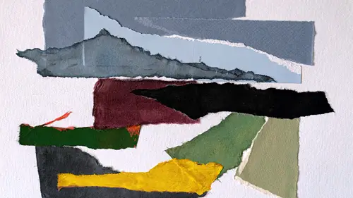
New Color Horizons with Collage
collage is a great way to explore new color horizons. So I think many of us, including myself, we get sort of in a loop with the colors we like and we start to maybe lean on habit a little bit, I'm just speaking for myself. Um and I think that collage because there's this opportunity to constantly change it up, there's an opportunity to constantly try new things side by side without making a big commitment to it. I think collage is like an incredible way to expand the colors that you might choose to use. So I use it a lot for that. I do a lot of different color schemes based on one image actually in an effort to create variety, but also in an effort to ask myself what's the strongest way that this image, this abstract image might manifest based on the shapes and the colors and the dance that they do. So this is the collage that we made in the previous lesson, It has rather subdued colors. These were colors that I chose because I like them. Uh and we put it together, you know, it's not ...
really hooked to the reality of the scene, but it has sort of a natural naturalism to it. So I thought what might be interesting is what if I tried to investigate flipping the value of the colors? So the value of a color is its darkness or its lightness. So a color that has a very light value and here's just sort of a filtered version of this collage, a color that might have a very light value would be something like that, a color that would have a very dark value would be something like that. So what I did is I actually made a new map. I'm into mapping. I made a new map of the image. Actually made 2, 2 maps of the image. One map of the image I made really based on what was happening in the true value range for this image. So took the black and white. Darkest shape, darker shape, light, a shape, light a shape, definitely a little more extreme. Right? I made a map using the shapes and I named them a color and name them. And I'm using right here a range. This is what this is the color range. We did use the paint, the green, the dark brown, beige and the light brown. Now I'm using a range of still just five colors white to black with three mid tones. So what I did was I used the same map and these little color swatches here are an effort to show that, you know, number five is my darkest dark, number one is my lightest light, three is my mid tone, four is my mid dark and two is my mid light again simplification. Like really dialing it down. If I was looking at the photograph of this, there'd be a lot more variables, right? But I'm working from the collage. So I made this black and white version. Um, I really like it. I think it's very uh, you might not enjoy maybe black and white images, but there's a possibility to it. There's a lot of artists who use shades of gray and black and white. So then I thought like what if I flipped it? Like what if I took this idea and I flipped the values. So I made another map and in this map you'll see the difference. Look at that. So I have in this case My one is lightest light five is darkest dark. I basically flipped it so darkest darkest lightest light. Lightest light as dark as dark. The Midtown stays the same. These flip and these flip and it's just an effort to show you that in just working with five colors, you can do things like this, you can do things like flipping values. This is a very, very different image, right? It's a very different image because it's the inverse. And so working with things like in versus working with things that show different kinds of gradations and I again, I really do feel like having a map to go by is a very useful thing because when you start with the map, you can do your planning and then once you have the plan down, then you can play. So this is just one way to play one way to play with collage in a very subdued color range, right? In a monochrome. So that might be appealing to you. So the monochrome might be appealing to you. This sort of color range of these subtle colors might be appealing to you. But you might be somebody who loves like fluorescent or you might be somebody who really has like a high key color scheme that those are the things that you like or things that maybe you don't like. So sometimes actually trying color schemes that are not familiar to you that you've never used before that make you maybe feel a little uncomfortable can be really fun. So, we've done the monochrome, we've done the neutrals and I pulled some colors that I consider quite bright and these colors actually are ultimately going to be creating the same collage, the same collage of the boat that we have been working with. And but it's gonna have a very different feeling, right? This versus that very different feeling. So, I pulled colors that are very, I mean, I wouldn't say they're garish, but they're, they're like really zingy And I'm curious to see the effect of this as these colors come together. So this is my muse, this is my model over here. And let's just see what these color shapes do in reference to that. So, we've got the black, we've got these colors, we're gonna transition here. So, I've arranged them here. I've precut them because it takes a little while to cut them and we've gone through how to cut shapes and all of that. So let's start to play a little bit with these colors. These color arrangements. So this is that that's actually kind of interesting too. If we just substitute right? Like just substituting a color, look at how much that changes the feeling of that collage. But I'm actually interested in making something totally brand new. So I've chosen this very bright orange for the beach. I've chosen this yellow for the middle section here. I've chosen this very like hot red for the grass. I've chosen this very extreme blue for the sky and this purple for the distant buildings already. It's like a very different image, right? And I'm actually really in this case like really enjoying having these fissures, having these gaps between the shapes because in choosing a much darker background, in choosing black, it amplifies the color. It makes the color more dramatic. And I think that that's something to consider as you're working. Like it doesn't always have to be a white ground or it doesn't always have to be a realistic ground. It doesn't have to be a neutral ground. I highly recommend that you play with different backgrounds and also that you play with like different distances. Like maybe you want just a tiny little fissure. Maybe you want something broader what really enhances the image. What makes it most interesting depending on what you're trying to say. So this says something very different, right? Than this And these both say something very, very different than this one, right here. So, all of these images born of the same muse born of the same picture of boats depending on the color scheme and depending on how you nuance, the relationship between the shapes and the background can give you a totally different image. So this is sort of a testament to how collage and just the piecing of shapes can create incredible amount of variety. And and also like a gateway to experimentation and giving you the opportunity to maybe push through some hesitation around trying something new. Because guess what if you decide, you know what? I don't really like that base shape. Well, this isn't glued down yet. I can replace, I can change, I can put um ultimately I can sub things out and move them around in any way that I want based on just what I'm inspired to do. So it's very, very playful. It's very, very fun. And I highly recommend that you get a range of colors, even colors that maybe really aren't your preference and play with how they work together. It's all relative and it's really like this beautiful puzzle to work through
Class Materials
Bonus Materials with Purchase
Ratings and Reviews
Susan Gold
Fantastic class! I am a beginner when it comes to abstract collage, and Amy demonstrates a generous number of techniques—all accessible and with clear instructions. She shows how each step can yield exciting variations, and she inspires play. Many of the techniques utilize a photo as a “muse” or “mother image," and it’s fun to discover new possibilities for my photos.