Setting Up for Color & Basic Tools in Illustrator
Lesson 2 from: Drawing with Illustrator: Color and TextureStewart Scott-Curran
Setting Up for Color & Basic Tools in Illustrator
Lesson 2 from: Drawing with Illustrator: Color and TextureStewart Scott-Curran
Lesson Info
2. Setting Up for Color & Basic Tools in Illustrator
Lessons
Intro to Color & Texture
10:34 2Setting Up for Color & Basic Tools in Illustrator
06:35 3Efficiency of Workflow & Prepping for Live Painting
11:04 4The Live Paint Tool in Illustrator
11:05 5Creating a Color Palette in Illustrator
11:08 6Creating Dimension with Gradients in Illustrator
11:21 7Exploring Other Color Options in Illustrator
14:11 8Compound Paths in Illustrator
06:50Lesson Info
Setting Up for Color & Basic Tools in Illustrator
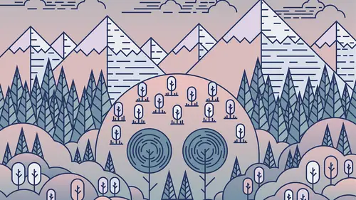
How do you be? Dive into that. Okay. How do we those old source of ways that we can we can bring color to our illustration? You know, the obvious way would be to select a new element. Um, Andi, in our swatches color palette on the left, we have a variety of, like, pre pre loaded colors, and we can we can click Lewis and we can select those and we can We can change them up. That's that's great. But I think we want to be a little bit more. Consider about it. I think we wanna think about what the color palette is gonna look like. How do we construct that? How do we choose those colors? You know, there's a little bit more thought behind that, but the first thing that we need to do, I'm just gonna under those steps. The first thing that we need to do is that we need to prep the document in the illustration area for color. Okay. And the main way that we do that is by using this to which is the life paint bucket on. That's actually like a really powerful to um, which is which will automatical...
ly help us select, uh, these flat areas of color, Um, and be able to bring them to the forefront. Okay, so we want to make sure first of all, that there's no felled. It is here. You know, if we apple why that gives us the wire frame over, and we can see all of these lanes. They're all, like, sitting nascent Tate each other. OK, what we want to try and avoid is having a big gaps between these lanes. Okay, so we want to spend a little bit tame just going through the illustration and making sure that these lanes are freely take okay. It doesn't necessarily Maher, if the lanes are overlapping a little bit. Um, but then again, we don't want those two, um, of the river lapping too much. You're going to start to see these come through is like loose ends, okay? And we wanna and we want to avoid that. Okay. So? Well, I generally do before I start adding color is that go through? And I make sure, although these lanes or sin pretty tape to each other Well, I usually do for that. Is that if I have an overlap I will select the lane. I would select the scissors to. We used this quite a lot in the in the last section. Make sure has brought to the front and we're just over over on. Well done. We'll click it when they're okay. No, What we want to make sure is that we have our smart gate's turned on, okay? And that the lows as to fame, the hedge, it will automatically find the edge of the lane on the illustration. Okay. The other thing that we can do, obviously, is that we can just, uh, lane ourselves. Okay, You notice that because we have Smart Gate's switched on when we get, they will automatically intersect with Were those lanes touch? Okay, So what would probably want to do is go through the whole illustration and make sure that these lanes are, like pretty well pretty and that there's no big gaps between any of those. The idea is that wherever these lanes touch, that's going to become Ah, Fellaini off. It's on the recon color independently. Okay, We may have the odds in the old lane, which is which is setting. I would say it is maybe not quite lined up properly. It's no a big deal. Remember that we have a certain thickness to these lanes. Um, all of these lanes, I believe, are, uh, said to four points, you know, so we can we can get away with hate in some of these loose ends. But if we have, like, little areas where you know lanes are setting week unjustly move, there was a little bit. The other thing to be remained is that we have a lot of detail here. We have a lot of elements like, say, for example, like these tree branch ease. Okay, these are not going to get a fell, you know, these are gonna be these are going to remain as vector lanes were not gonna, and the lane color can change is not gonna have a fell color. A saying too. So we don't need toe worry so much about those, um being open or being too close or being fired away. What we really need to concentrate on are the areas where the large areas of color are going to intersect. You know, like the section here, the section here, down here. We want to make sure that those are like prey Tate. There's no, like big gaps. We can get away with a little a little gap, but we just want to be careful, Um, having too many too many gaps in there again. Like when we go through and we and we life Penis, none of its fatal, you know we can. We can manually adjust. We can redo elements. We can revisit parts that we think may not be working as as well. Um, so nothing's nothing. Sentence door. Nothing's nothing's finalized until we until we do save.
Class Materials
bonus material with purchase
Ratings and Reviews
Anita
This is one of my favorite classes ever! I watched Stewart's first class on Drawing with Illustrator and loved this second part on working with color and texture. As soon as I saw the artwork he created for his classes, I knew I had to take them...his artwork resonated so strongly with me, I HAD to learn how he did it...I learned so much from this course...I work mostly in Photoshop, and work with gradients more than half the time, and had no idea I could do so much more with gradients in Illustrator. Stewart did a wonderful job of explaining each tool and setting he used, and I loved how he explained his creative process as he worked through each step...I'm excited to put to use all that I've learned...I highly recommend this course!
Robert Mathas
This is my first real project in Illustrator, having taken a different Creative Live bootcamp and then Stewart's classes. Yes, as some commented, some of it is slow and repetitive. However, I liked the the idea that it was a simple enough drawing that I could customize and eventually finish. I learned most from the mistakes I made, not exactly following Stewart's directions, and having to figure out how to fix them. I was pretty happy with my final result. Interesting enough, watching a lot of TV during Covid, I actually saw a commercial (can't remember what...maybe medical center or health group) of a white outline city and rounded trees and clouds so I was able to see this technique in the real world. :)
EKerger
This was such an amazing class! The instructor did not move too fast and was very specific and clear throughout. I learned so much and would recommend it to anyone.
Student Work
Related Classes
Design Projects