Tonal Rendering in Natural and Artificial Light
Lesson 2 from: Drawing Fundamentals: Tonality and ShadowsAmy Wynne
Tonal Rendering in Natural and Artificial Light
Lesson 2 from: Drawing Fundamentals: Tonality and ShadowsAmy Wynne
Lessons
Lesson Info
Tonal Rendering in Natural and Artificial Light
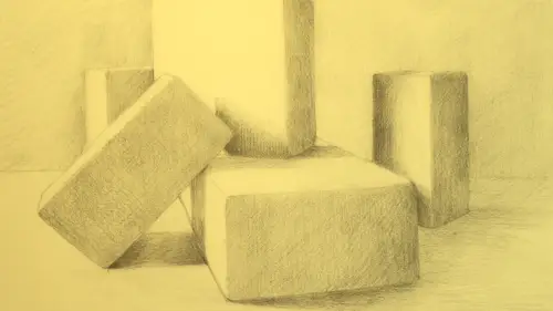
When it comes to tonal rendering one of the most important things to consider is your lighting. You'd never want to draw something if you come into the studio and people just flick on the fluorescent lights without any sort of mindfulness around cast shadow, or the direction of the light. The light can be something that really makes or breaks a drawing. So I want to show you a couple ways of lighting things that might help you, sort of, understand what your options are and there's no hierarchy to this. A lot of it has to do with your own personal aesthetic and what you want the drawing to feel like. So, natural light is amazing in a lot of situations. Here in this creative life studio we have a northern exposure. The light's raking through the window, it's really steady, it's really beautiful, it's kind of a cool light. Northern exposure is a situation that artists have preferred over the centuries because it's a steadier light. If I had a western exposure there'd be a sunset perhaps h...
appening and there'd be a lot of change really quickly. So I'm really happy to have this northern exposure. Our subject, these monochromatic wooden blocks are currently hit with natural light. It's coming from the side, it's illuminating one side, it's raking across the top, there's a shadow on the other. And the light, as it come across the table, the shadows are soft, the edges are soft, there's some varied kind of shapes happening and it's really beautiful. I would be inspired to draw this for sure. But the thing too, about natural light, it is gonna change. If you have a synthetic light set up, it's gonna be really steady and really constant and you'll see that in a few minutes that we'll have some sharper shadows. But this has a real organic quality to it, it has a real sense of daylight and a time of day. So if I was gonna work into this as a drawing, I'd be working with a range of marks that maybe they weren't really super dark darks. There'd be kind of a mid ground and a light. So I want to show you how a synthetic light might look and some of the options around that. So natural light, super soft. You can establish yourself to the light with some sense of choice. But again, natural light is going to be shifting a bit and it's gonna possibly have a softness that you may prefer or not prefer. Another option is to manage the light yourself, in other words, reduce the amount of natural light coming in and rather than relying on the sun and mother nature and the changeability of that, you can actually just turn on a direct light, like this desk lamp here. So choosing a desk lamp or a lamp that has a very direct sort of cone of light is preferable in that, if I turn on the fluorescent lights or I turned on a light really far away that had a more dispersed light, it wouldn't be giving me the option to have some many clear cast shadows. And of course, within this, there becomes this whole list of questions, like, what side do I put it on? Do I light from the front? Do I light from the back? So I'm gonna show you what happens with those options. But I also want to speak a little bit to, sort of, the history of lighting from one side or the other. So historically, if you look at European still life painting paintings of objects often in western art, they're lit from the left. And you know, that might not be something that you noticed, just off hand, but the next time you go to a museum, take a look and see, you'll notice a lot of the paintings are lit from the left because in western culture, we read from left to right and so it's sort of this organic tendency that artist often use. It's not a rule but it's just something you might notice. So I invite you to notice that and then I also invite you to notice your preferences and challenge your preferences. Like if you find you're always lighting from the left, like why not light it from the right, or why not back light it, or change it up a little bit. So those are some thing you can play with on your own, with your own set up. So having simple objects, having a particular light with a real clear cone of light, having two lights creates a lot of shadows, so I like a single light source when I'm working. And I want to show you, just by moving it around, some of the things that might happen. So right now this light is coming down on these objects at, more or less, a side angle. So the shadows are being cast to the right, the left side of the objects are illuminated. If I bring it down even further and have this light hit these objects at more of a direct 90 degree angle, the fassades that are facing the light are super luminous, the sides that are away from the light are some of my darkest darks and then the cast shadows are really clearly raking across the paper here at a particular direction. So that's kind of beautiful, but I play around a lot before I get started. So if I brought the light a little bit further forward, and maybe down a little bit, the shadows start to move on more of a diagonal. If I bring the light and turn it in this direction, where the objects are more back lit, that's also super dramatic. In this case with this light so close to the table, I not only get the sense that the objects are back lit by the direction of their shadows, but I also have this kind of beautiful intensity to the table itself. The table itself has a real light spot here but as you look across the table, it gradates to something darker. So that kind of gradation, where you're managing your light, so even on the surface your objects are lying on itself, there's like a subtle gradation can really make the drawing dramatic and it can also create a sense of space. So we'll work with that. So I'm playing around with this a bit. If you light from directly above, the shadows are just pooled around the objects and that's sort of interesting but I love the abstract shapes that shadows cast, just inherent to the way that you light them. Particularly from an angle. So I'm playing here, I'm trying to find my perfect angle. This light is great, just a regular desk lamp that has the ability to move back and forth is really nice. I always feel like shadows reinforce the reality of the object, right, because the object is there, the light's falling on it, the shadow's raking across the table. It kind of gives some solidity and weight to the objects, so we want to work with that idea here. So I'm starting to arrive at a moment here that I'm kind of enjoying. What I love about what's happening here right now, is that the light is hitting this foreground block. It's allowing that block to cast its shadow on the block next to it. So by arranging situations where objects cast shadows on each other, which is a scenario that usually is most easily achieved with the industrial light versus the natural light, you can arrange things in a way that is a little bit more manipulated and sometimes a little but more interesting that way. So I really invite you to try both and see what your preferences are around that. So right now, this object's casting a shadow on the this one, this one has a shadow coming off of it. And what also starts to happen, particularly with the incandescent light, is that as shadows come off the objects, right up close to the object the shadow tends to have a little bit more darkness, a little bit more intensity and then it tends to gradate out and get lighter towards the edge. So that's similar to the gradient of the table but it, again, helps you work with that sense of space and the way that light attaches to a surface. So shadows are the product of the lack of light, but it's not an absolute lack of light, so when we move into establishing our shadows and then ultimately go to draw them, we want to remember that shadows are luminous. If we don't draw the shadows with a certain amount of luminosity, if we draw them too dark, they can tend to feel like a hole in the table. So we're gonna work with this idea of establishing a really smart tonal range based on the position of our lighting and then work within that to establish tonal facets or tonal segments that really create a sense of luminosity and a sense of drama to our sketches. So we're gonna go ahead and start to sketch this out a little bit so you can see how I might, on a preliminary basis, work with this type of lighting situation with the incandescent light. So I love this lighting situation that I set up. I spent some time, I experimented. I love this sort of warm incandescent light and one of the things I love about it is the fact that there's some bright, bright, light falling on some of the planes of the objects. The shadows are really clear. They're raking on a diagonal across the page and some of the objects are interacting with each other through cast shadows. So some of my favorite things are going on. So the first step to working this up into a tonal drawing, I'm not gonna work it all the way up now because we'll get there, but it's just considering some of the things, I'm gonna kind of speak out loud what goes on in my head as I'm working this and I think a lot about mapping. The mapping that goes on about the way that the shapes interact and also, the relative dark and light of the shapes. So I'm gonna work in here. I've worked up just some basic shapes for these blocks and one of the things I'm looking at, in terms of these basic shapes, now if even working with this idea of a basic block shape seems daunting, you can certainly go back and look at some of the lessons we did previously that have to do with establishing drawing with perspective, simple, simple objects. But I like the way these are set now on space. The next thing I ask myself is where is the light coming from? So lights coming down from the left side and sometimes I like to think about having ... Sort of, acknowledging that by drawing a little arrow that helps me understand where the light's coming from as like a little reminder. This wouldn't necessarily be in my final drawing, but it does help me remember oh it's coming left to right. I'm recognizing first of all, what are my brightest brights? Definitely super bright on this lower left corner because the light's coming right down onto the paper. Definitely very bright here, it's also bright right around here and here. All of these planes, this one, this one, this one and the ground plane are all receiving really dramatic direct light. So I know those are gonna be some of my brightest brights. Then I look at maybe what are some of my darkest darks? The darkest darks have to do, in this case, a lot with cast shadows. So the cast shadows are the shadows that are coming off the objects, that are raking across the ground plane and in some cases they're hitting other objects. So I'm gonna very lightly, just go in and actually map my cast shadows. Now I'm not going in to map the cast shadows with a line like this, like super dark because I could never really make that go away. So notice how lightly, sort of with light pressure, I'm pressing on my pencil. I'm noticing that there's a diagonal shadow coming off of this block, coming across, slipping behind the light corner of this block. So it's slipping this way, the light's coming this way and then, the other side of that shadow actually slips behind this taller block. So I've got this shadow zone here now and in addition to that, what I think is really beautiful, is that the cast shadow from this block here, comes across the ground plane and then it hits the block next to it. So they're having some communication, they're having interaction. There's the reality of this block based on the fact that it's actually casting it's shadow on the block next to it. So I'm very lightly making that shape to keep its place and then I'm also mapping the shadow off on a diagonal from this block here and then off on a diagonal on this block here and I'm noticing where these shadows intersect the blocks to help me place them high and low. And then, the other thing that I like to do is notice where the table ends. It's like my horizon line here, it just gives me a moment to sort of ground things. Without that, things often feel like they're floating in space, but we just want to have that horizontal ground plan established. So I just made a map, a really basic map. This map has to do with the areas that are receiving the light and the areas that are receiving the shadow. I'm not gonna work this up to an extreme extent but I just want to block in the shadows lightly so you can see the rhythm of that. So the light's coming in from the left and so when I'm starting to block in some simple shadows being cast from the blocks, I'm actually gonna mimic the direction that the light is falling with my line on the ground plane. That starts to not only show me that that area's getting darker but it's also showing me, sort of ... It gives the eye a path, a direction to the light. So this shadow's falling off to the left and I'm just gonna start to lay in some basic hatch marks going in the direction of that cast shadow. And they sort of fan out and they slip behind the second block. So I made my map, I know my shadow shape, I know it's tucking around this block and then I also know that it hits the one here. When it hits this one, I'm gonna change the direction of my line and I'm just gonna go up and down because this block is vertical. So you see with just a few line change, the direction, change in the direction of the lines, you can start to create space with this. Same thing can happen as we're moving off from this block going to the edge of the table. And right now I'm really only working with the mid tone and we'll get to this and some of my brightest brights. And then this one here too. And in this case with this block, you can really see how up close to the block, it's a little darker but as you move away, it gets lighter again. So that's something that can start to elevate the drawing and really make it dimensional. The other thing that we'll get to but I just want to tuck it in here a little bit, is just noticing the negative shapes between the blocks. The negative shape between the blocks is an area that you recognize, it's like the block is a shape but so is the air in between the blocks and in between these two right here is my background, I'm kind of going off the edge of the table. And so back here is actually one of my darkest darks in this case. So not only is the table top and the block important, but so is the air that surrounds it and hugs it and if I start to lay in some of that, you can start to see how spatially the background starts to go back, the block start to come forward and you can even start to lose some of the outline around the blocks by these shapes of dark coming in. So these are really the next steps to what would happen if you had a real conscious way of mapping your shadows and also taking time to really decide on what kind of lighting situation do you love. Because, you know, this isn't a dress rehearsal, right, this is like your drawing and if you have choices, if you're setting this up yourself, why not set it up in a way that's absolutely inspiring and beautiful? So these are some of the things that I do to ensure that my drawings have a terrific sense of light and dark, drama, luminosity and that luminosity and that drama, that tonal range, is really what gives them dimension and beauty in the end. So drawing in that kitchen was amazing, the lighting was beautiful and you got to see how there's so many choices you can make around lighting your subject. Whether you're working with a model or a still life or even choosing a time of day to work outside, time of day, mid day on a bright sunny day, shadows are very short, but on the cusp of the day, in the morning, in the evening, if you're working outdoors, shadows get longer. So there's a lot of ways you can apply these choices about lighting. So what I wanted to show you here on the table is just how that drawing evolved. I just worked on it a few more minutes and started to build up some of the mark making and you can see how, you know, it's not a completely finished drawing but in terms of how the blocks start to get hugged by what's happening around them and the cast shadows, we can take a look at that. Just so you can see where it ended up. Great, so here it is, I've filled it in a bit more, I've created a boundary for the composition and I've definitely gone in and darkened the background, I've darkened some of the cast shadows and we're gonna get more into choosing tonal notes and calling things our lightest lights and our darkest darks for sure in later drawings but I just wanted you to see where this ended up.
Class Materials
Bonus Materials with Purchase
Ratings and Reviews
user-7963ec
The package of four drawing basics courses by Amy Wynne are very well organized. Each section builds on the other. By the end, she has given us a technical understanding of how to use marks and tonality and shadows and highlights to develop a beautiful drawing of anything. The illustrations of important points were very helpful. HIGHLY recommend.
Ariana Graf
Amy teaches a straight-forward approach to tonal rendering and mark-making that builds on her previous courses on building basic line drawings. She makes beautiful and believable tonal shading attainable. Loved it!
Student Work
Related Classes
Illustration