Lesson Info
23. Creating Chrome and Color Reflections
Lessons
Introduction
01:14 2Materials and Tools to Use when Drawing
14:27 3Preliminary Furniture Plans on a Floor Plan
07:45 4Using a Scale Ruler and Templates
05:36 5Rendering Furniture on Floor Plan to give Volume and Depth
06:06 6Line Weights and Adding Texture
04:24 7Architectural Lettering
08:11 8Complete House Floor Plan
03:23Isometric Perspective
03:42 10Why 3-Point Perspective Doesn't Work
04:05 11Benefits of Two-Point Perspective
03:06 12Preliminary Sketches for a Living Room
11:29 13Using Different Textures of Materials in your Drawing
03:51 14Adding Color to the Couch to Create Shiny Leather
11:26 15Rendering Soft and Shiny Textures
09:09 16Starting Elevation for the Kitchen
07:54 17Full Rendering Elevation of the Kitchen
07:28 18Putting the Elevation at a Different Scale
10:33 19Two-Point Perspective for Kitchen
10:04 20Canson Paper with Pastels
05:35 21Transfer Line and Heights
08:27 22Finishing the Rendering Using Canson Paper
08:48 23Creating Chrome and Color Reflections
10:43Lesson Info
Creating Chrome and Color Reflections
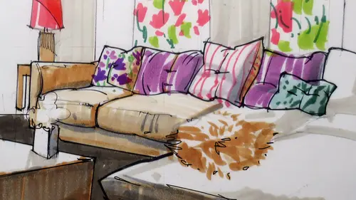
All right, so this is just a quick, um, demo on how to work with reflections. Um, there would be times I know we have covered already reflections on the floor, but there would be times when you would have to add little elements that are quite reflective. Like, for example, faucets. And how do we work with those faucets? First half a lot of them are kind of chromed. So what I would recommend that you dio is first work with you without in this case, I have C eight gray marker you work with first a dark tone on the center and then notice how I have some blue tones. I went into some blue tones. Um, that is that shows the sky, You know, the reflections that we would have we would have a sky directly above our heads. I know we don't on an interior, but that's how you basically do Chrome's you try to find if it is coming from above. You know, that would be sky. So you would have blue tones and then a dark line in the center, which is what we have over here. Once we have that, we can just go a...
head and work with our outlines to define the shape off our faucet in this case, All right. You see here the outlines off my faucet I have working on thicker on the outside again and then thinner for the inside inside lines could be a bit thinner. I am working on my, um, dark tones even further. All right, What if I had a sink that was also quite reflective? It was shiny metal. I don't know if I would recommend that, but let's say sure, let's work on that. I would need to add again a very broad shadow and then some blue tones speaking up, some reflections from the sky in this case, is this cakes? We have a window there, and it's on the areas that are on the top so I can do that. And then I would just work on outlines to define the edges. What's this? Is the single this mountain under social and have added blue over there. Um, how do I fix that? Well, it depends on the type off counter color that we have. You can do a regular blue tone here. This would be maybe like a soapstone type off grayish blue tone, so that would be a very nice counter that we can use. Then I can add the reflections of blue on the shiny sink Come lower in the drawing. All right. To get my reflection was done, I would have to add some extra touches using my special black pencils, Uh, which I keep in a separate container so that I don't mix them up with the rest. You can see the they are more powerful. They cover quite nicely. My big surfaces can do something like this and more texture. And then this would be the edge of my counter. And I can work this way. See how I added some reflections over here. This is soapstone, but still somewhat reflective. My work that way I had some shadows like this. Let me show you just to wrap up some extra reflections that I had worked on on past demos Thesis, for example, a kitchen, a set of cabinets that are red on my floor is green. How do we do that? So we have a green reflection here. What I did is extend this line down and then very gently I added some red pencil tones in the reflection, not using markers this time, but just red pencils just to get slightly reddish tones. If I had used these, Red would have growing itself. Be sure to work with markers or pencils chest to get to the right combination. Another thing that might happen, and with this, you know, we will wrap it up. If we have a kitchen over here. I mean, we have a window. How should it be reflected on the floor? You see these distance from here to the ground you duplicated, and then you add the window, so it's one dimension to dimension. So there's one here, and then this one over there. That's how you would have your reflection basically, on a floor, you can do something like that. So when I added, But you have to plan ahead of time. I added my green tones for the floor, using vertical strokes minus where the window would be located. All right, just to make the reflections more reflective or more true, I added my great lines for the floor in this case, my grid. Linus, my tile over the reflection. Because the grid line is true, it's tiles placed and I can see the grout lines. So it's really so I added, on top of the reflection, and that gives me another level off, um, credibility. I have two more drawings. Teoh Well, for more drawings that I can share with the class very quickly. This is another technique that we have not covered in this class, and you might just want to try it. At some point, you can dio transfer. You can transfer your lights instead of cancer. On paper, you can transfer them on watercolor paper. So that would be you would get a different type of textural together. You notice how the border is different. So I taped it on a piece of wood so that the paper would stay flat. And then I used my brushes to kind of create an overall tone. The whites that you see, I reserve them using a special liquid to block my white of the paper. Then I would rabbit off its latex and then a lot of pencil and black lines to bring the shapes up. So this is another option that you might want to try another option? Yes, you can do all very preliminary sketches directly on tracing paper. This is the same place in paper that I got in the past, but cut out from a role so that you can trim the part that you want and then render directly on top. The only thing can these are my closing remarks. When you sketch out yes, tracing paper will be limiting. You can only use three or four marker strokes, and after that, the caller, the paper will not accept the ink anymore. So just be careful about that. This is more like different materials, different papers that we can use and you put some white underneath. This is vellum, which is like a plasticky paper. In fact, if you tried to rip it, you won't be able to rip it because it's made of plastic. You can do very good renderings with this paper. It's more expensive, But the nice thing about this one is that you can use the front and the back of the paper. So, um, I don't have the camera, will pick up the habit Chinea on the back. That's when I used my black and all, the caller said, used on the other side. Miners the black. All right, so the black appears slightly more muted because it was supplied here. It's shiny or brighter here, slightly more muted here. So another interesting paper to use You see, the reflections here and the grade that I had used, right? This is another interesting one. Just using ah, furniture piece. In this case, I just wanted to show a client how they could have just, um, glass. So I have a very dark How do you show glass when you have it's see through. You cannot really show glass. If you have a white background, you don't have a lot is like trying to do a painting off a polar bear on ice. Like, uh, I don't have enough. So I added a dark background. Once I had a dark background. The blue tones off the glass popped a lot nicey on. Then I added some pink tones, some sort of a flow, uh, flower vase to add some contrast, so you can try that, too, at home. All right, so I hope that you enjoy this class of this. Certainly a lot to cover in the short session, but hopefully you got a good sense of what it takes to complete renderings from beginning to end. We covered a lot of different techniques materials such as black pins, markers, pencils and a lot of different terminology that hopefully you will be able to use when you render your kitchens and living rooms have fun, Thank you very much.
Class Materials
Bonus Materials with Purchase
Ratings and Reviews
user-d2a6ef
Creative LIve Why don't you re-do this class! Its a great subject.....get a new camera operator, who knows the concept of learning from watching.