Lessons
Day 1
1Day 1 Pre-Show
05:43 2PSE for Photographers and Scrapbookers
37:32 3Editing Photos in Photoshop Elements
45:20 4Favorite Features
39:30 5Typography
23:24 6Creating Textures
33:57 7Making Patterns
45:25More Typography and Simple Backgrounds
19:54 9Tools and Techniques
31:41 10Creating Layouts with Digikits
27:43 11Day 1 Wrap Up
01:28Day 2
12Day 2 Pre-Show
11:08 13Using Thumbnails, Templates & Masks
18:38 14Designing a 2 Page Spread
38:57 15Photo Composition 101
22:04 16Poster Creation
27:19 17Card Creation
37:18 18Custom Brush Creation
26:23 19Layout Creation
15:28 20Working Creatively with Brushes
38:01 21Social Cover Templates
45:56 22Create a 10 by 10 Layout
30:54 23Day 2 Wrap-Up
02:33 24Thanks + Credits
03:55Lesson Info
Typography
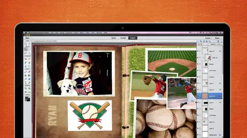
Now let's move on to typography. So go here. We're doing pretty good on times. That's good with, um, scrapbooking. A lot of times you're gonna have a title or a headline. Depends. You know, first grade, Great. Whatever. Graduation. So be thinking about not just using one thought for that. I think about two different fonts may be two different colors. Maybe playing around with, um not necessarily having it go straight across. Just always think about how How can I creatively do a title that's gonna look appealing to the eye? Or be a little bit more fun than, um, just having a go straight across and just one thought. So, for instance, if you have Happy Valentine's Day, maybe you take the word Valentine's making making that a bit little bit larger or taking first day of school, I thought, Well, let's use the primary colors for first day of school. So used primary colors there. The Amper Simon sign is really a lot of fun to kind of play around with when you're talking about typography and a...
lso bringing in images from your graphics area and kind of tying images into your text. Rotating Texas so easy. And sometimes we forget that we can rotate text Putting text in the background like the lyrics to the Brad Paisley song would be kind of a perfect thing to Dio I could have done that in the background and then changing the color of that background eso that it pops and it doesn't really distort everything. It doesn't really focus on that background. But when you look closer, you want Oh, that's the lyrics to a song or maybe a letter or something thing. So think about things like that. Nesting text is also another fun way to do it. And using that clipping path and creating an image inside of that text did you guys ever done before where you put a photo inside of text? So we're gonna go through a few of these and, ah, start from scratch with them. I'm gonna listen here. All right, so some of these are very, very straightforward, but text in Photoshopped elements isn't as easy as it is in photo shop, because Photoshopped elements doesn't allow for Kern ing. And let me bring this up because I think I have a little demonstration here. Where is that? There it ISS. So if you study the history of type, there are different pieces. There's the A center, the Dee sender, the font size, the camp height Tracking is a big thing Kern ing. So tracking is the space between each letter, um, of each of each word, and turning is between two letter. So if you ever see a billboard that sometimes drives me nuts when you see a billboard in its W. A. And it looks like they're spaced a lot further than the other words, you might want to go in there and pull those to just those two together. And that's Kern ing, and we're getting a little bit technical, but it kind of is important. The leading is the space between the bass lines so you can pool letting and make letting a lot looser or a lot tighter inside a photo shop elements, and we'll cover that in a second. But basically it's just the typography is the art and technique of arranging type in order to make language visible. The arrangement of type involves the selection of typefaces, point size, line length, letting, adjusting the spaces between groups of letters or adjusting the space between pairs of letters. So be thinking about that. You can always change the letting in there, but you might have to go out and purchase Photoshopped elements. Plus, if you want to do everything else so that's just for graphic designers. Photo shop has the tracking and turning, but Photoshopped elements does not. So you could just append a $ little plug in called Photoshopped Elements. Plus, if you needed Teoh, I never have needed to. But I know a few of my members who work with type A lot, and they went out and purchased Photoshopped elements Plus and they said it works wonderfully. I've never used it, but I believe him. Okay, so let's just go ahead and do a couple of these layouts. Think the fun one is probably inter mixing some of the graphics with that. So we'll talk about the basketball one and you have all kinds of different graphics inside of Put a Shop Elements. Let's go with a new blank file. I'm just going to go with seven inches wide. 300 maybe. 05 go eight. All right, so we're gonna is gonna dio jump shot. We're gonna bring in and we're gonna tie in some graphics, so I'm gonna go get my text tool. I'm not gonna worry about the type the color just yet. I'm gonna go ahead and click one time. This is gonna be 100 points, and I'm not gonna choose my font just yet. I'm just gonna go ahead and type it, okay? I have a good opportunity here. There is an O in here, and that would be perfect spot for that. Um, basketball. I always like to do mine in 100%. So let's just apply that. No, I did do this in resolution. That's okay. All right. So this font is not really what I want. It's not the color I want. So let's just go ahead and select it, and then go back to our text tool, go into our font and click inside there and just start kind of looking. That's not too bad. That might work pretty good. And going through some of our different font choices that we have. Some of them are just definitely not gonna work like script E ones. Usually I look when I'm looking for my fonts, I want something that's very readable. So because it is the title and you want to be able to read it pretty well, so I'm kind of looking for that. I'm looking for not something frilly because it's gonna be for a boy layout. So maybe something heavy and thick I like that one is not bad. I'd like impact a lot, So I kind of tend to go towards that a lot because it's so easy to read. It's a good solid font, but the O doesn't look very good. It's not round, so I don't think I'm gonna use that impact. So maybe I will go in here and just kind of look, because it does give you a little preview on there. I don't know if the Max give you a preview. I'm pretty sure they dio so you can kind of see a little preview Now we don't have the O in there, but, um, I'm thinking that this one might be a and if they have a bold, which is perfect, it's more of a round font for that. Oh, so now I have my oh, I'm going to pushed down a little bit. It's pretty pretty circular there. Now, I'm gonna go into my graphics panel, so I'm down here in my layers. We have effects. We have graphics and elements. Has a lot of graphics to choose from. We've got backgrounds, which we'll talk about later so you can drag and drop them into your page. We have frames a lot of different frames, and then we have graphics. You can sort them by type activity and so on, so forth. If you don't see your graphics really big, all you gotta do is go to the right hand side and shoes large thumbnail. I always have it set that way. But yours might look something like this, and you can see more graphics at one time, or you can do them. I guess you can't do them as a list. I figured you probably could, but we're gonna go with large thumbnails so you can see him a little bit better. And then we can scroll through here and you have all different types types of graphics to choose from. And there were pretty decent. Some of them are a little low quality, but, um, you know, it just depends on what you're gonna be using a four. So I'm gonna go in here. Here's my basketball. I'm gonna go ahead and drag it and drop it into my page, okay? And I'm gonna scroll in a little bit and shrink it down. Always one of shrinking things down. My eye leads right here. Constrain proportions. I want to make sure that that's always checked. Otherwise it could shrink it or condense it or whatever. So I always when I'm taking that tool, I'm always looking down here to make sure that I have constrain proportions selected. So I'm gonna put that over the top just to kind of cover it. I could go in there and I could go. Let's apply that. I could delete that. Oh, if I wanted to If I didn't know if I was definitely going to be able to, um, cover it up. So now I could put it right in there. Let's zoom back out. And this gives me a perfect opportunity to copy and paste that a few times and maybe have it kind of come over here. So let's go into our layers. This is a smart object, which is nice because we can shrink it. We can enlarge it, shrink it, enlarge it over and over again. But what I'm gonna do is I'm gonna right click on it, and I'm going to choose Duplicate that layer. Now I can control J toe. Also, get me that point to that point. But I'm gonna show you both ways. So now I've got a copy of it. I'm just gonna put it over here. I could go control J. And that will get me another copy. Control J again. Another copy, Control J, maybe two more. And then we're probably set with basketballs here. And then I'm gonna chart start shrinking, some of them down. So it looks like it's going from small to large. And you could do that individually. If you want. Teoh, I'm just gonna kind of eyeball it. Oops. I wasn't looking at constrain proportions, so let's not do that. Or I can hold on my shift key that's caught by too small. Make sure. Yep. And then I would I should have done is I should have put the drop shadow on probably first. I wasn't thinking I had because now I have to go back and do it to all of them. But that's OK because I have a shorty command. Let's just pretend all of these are in alignment and we're all good and I go back to that very bottom one. Then I go to effects. I go to my style's. I go to my drop shadows. I'm just gonna put a standard one on. It's pretty big go. Let's not do that one. Let's go Toe layer layer style style settings Let's take that opacity and distance way down. There we go Something like maybe like that. The first thing we have that drop shot right there. And I think I'm gonna put a stroke on that as well. Maybe a black stroke to match the font. Or, if I'm gonna change the font color can change it that way. Let's go with a dark, dark brown, pull a color from there and then pull Pull that dark brown. Maybe we'll use that as our jump shot color as well. So now that we have a couple of different styles on this, we can take that one style that we just did and right click on it and shoes Don't let me. That's weird. Oh, I know why. Click on OK and then right. Click and choose copy layer style and then hold down my shift key while I select all of those. And then right click and watch what happens when I choose pace layer style. They all do the exact same thing. So it's not that big of a deal. If you don't remember to do that, you can always copy and paste that all those If it's 10 or 12 or whatever, how maney effects you have, you can do it all at one time. All right, How's it going? All right, let's go ahead and move on to another one. Do you guys all know how to do the clipping mask for text? Okay, so I don't really have to cover that one. All right, let me just go with this one. Real quick clipping mask. It's very easy. You just go ahead and type in over the top and I'm gonna go ahead and enlarge this one. And if I want this to be cut out of this area, it's called a clipping mask. And take that background. If the background has ever locked, the easiest way to unlock it is just to double click on it and then click on OK, and it's gonna unlock it. Then you can move it around. I have had people all the time say, Michelle, my background layer is not moving. What is going on? And I say it's locked. That's right. So you just double click on it. And now we're just gonna right click, create clipping mask, and it will go ahead and clip that out of the text. The cool thing about this is it. When you move this around, you can position it. However you want Teoh. Now, another cool thing about this. If I don't like this font after the fact I can even shape, I can change that thoughts. If I wanted to be a thick, fought like impact, I can change it and it will go ahead and change because it's not hurting that font, which I love Nondestructive. That's a mask again. So I wanted to make sure that ship was in there, and then the people in there I can move it in position at the way I wanted Teoh and I don't have to stick with that particular font, and I can go back into effects. Do my drop shadow do the stroke around that, go back into a layer, go back into a layer style, make it just really pop. We can put a stroke around that to really make a pop, and we could put a background background on that as well. With try the bevel, see what kind of devils weaken dio to make it. Really, really. Look three d. There's always a raise around to make it not look so flat. And then if I go back to the layers and I go and create another layer below it, then I can fill it with whatever color I want Teoh to make it really to make it stand out a little bit. So that's kind of a fun thing to do with titles. If you wanted to drag and drop just the title onto a page, all you have to do is take these two layers, right click shoes, merge. Let's see, we might have to simplify the layers first, so you had to be perfectly sure that you want to do that. Simplifying it is going to take that text and create into a graphic. You can no longer change the font of that. Once you simplify it, does that make sense? So now I can go in there, I should be able to merge those two together, and then I can take these both of the same time and drag him to whatever page I wanted to drive to Michelle just to reiterate what you were saying because Abby cat wanted to know, Can Ewan merged layers. And you're depending how far you got? Because you can control the a few times. So it depends on how many controls these. You have it set up. I think I have it set up to a lot. So you can if I go control Z control Z c, I can unm ERT on merge them. But once you save it and flatten it, then you can't. So be very sure that that's the phone that you want to use before you simplify it. And before you merge it. Good question. Okay, Now I want to do Oh, this is fun. I just, um, was working on this the other day, so I like to use my some of these brushes, and Karen's gonna go into more detail. She's like the expert on brushes and patterns and textures and things like that, and I just kind of dabble in them every once in a while. And, um, I was working on something. I wanted to kind of use some brushes in with my taxed. So this is kind of the same concept that you can use. You can purchase brushes out there on the Internet, but we also have some fun brushes that are standard on Photoshopped elements. So I basically use the same kind of concept. I clipped some of these brushes into the tax, so let's go ahead and start from scratch on this. Let's go file and new. I'm just gonna go with 72 because that's what the screen sizes, so I'll just keep it small. And when you double click on the zoom tool, that'll put it to 100% right off the bat. There's a couple different ways you can zoom in and out. There's probably six or seven different ways. You also have the one, um, so what ratio? Excuse me and in a fit screen and then fill screen. But I like to work with one on one because it is 100% in it. It's the cleanest whenever I'm teaching. So I'm just gonna go ahead and take my tax tool. I don't care what color I'm using right now. I'm just gonna do brushes, brushes, and okay, I'm gonna get a nicer, thicker fonts, So I'm gonna go get my text tool go into my brushes are into my fonts. I didn't find something that's a little bit thick. I need to kind of go back and find some better fonts because I'm kind of getting tired of the ones that I have. Okay, let's just use this one that's somewhat thick and thin. And in certain cases, so what I'm gonna do is I'm gonna go ahead. I always have to remember in my mind. Now, which layer does this need to go on? So I'm gonna go Ah, layer above and I'm gonna go ahead and start pulling in some brushes and I'm just gonna make it. Who? Whatever. It doesn't really matter what it looks like, but this will give you the concept. We've got default brushes. They're all pretty simple. We're not gonna probably use them, But we also have see here some assorted brushes Oops. No, but I want to go on that one. Let's just stick with what We have basic brushes. No, don't really see if we got something here, that's gonna be good. Okay, Yeah. These stars will work. All right. So I'm gonna go ahead and bring in some of these stars over the top. I'm gonna go with maybe a white car. Um, yellow color. I'm gonna come in here, get a yellow shade and start clicking. Now, I can use my right bracket to make the brush size bigger, of course. So medicine of randomly dio different sizes by clicking on the right bracket and the left rocket, someone go with left bracket to make a little bit smaller and just randomly start clicking. Now, if you click and drag, you can set different. Um, what we call it the going to hear the brush settings. You can set these brush settings like the jitter in the scatter and all that. If you want to play around with that, and so you can change that. If is well, I usually just go ahead and click, Click, click. Just cause I have a little bit more control because that scatter in jitter and stuff like that. It doesn't give you as much control. I was gonna go ahead with that. And let's change the color of some of these. Maybe we'll go with Green and we'll go back to get a different brush. So what's this guy? That's kind of interesting. Let's just throw a few of those in there, all right? So if I go right click and I create clipping path, it's gonna go ahead and clip it into that text. And here's the cool thing again about this is you can go in there. You could change that font if you don't like it and you can change the color. So if I go back to my text tool and I highlight that text and I go in there and I'm gonna go to my color sometimes it's confusing because you'll go over here and change the color of the text here. But right here is actually where you're gonna change that color. I'm gonna come in here. I'm gonna go into this little color wheel, click on that and see yellow. It's go with something like a deep Let's go with this so we can see it. Keisel zoom in there. So it kind of gives you some fun, little, little things you can do with those brushes to make your text look a little bit more sparkly, I guess, um and then you can go in there and it's really flat. Let's just boost it up a little bit. Go back into our layer style. You're probably gonna go back in a few of these over and over again so you can get used to that. Um, take that down to maybe one No. Two points. It's fine. And change the color of that. Let's maybe pull out some of the screen. This is not looking so good. Sorry, guys. Uh huh. Yikes. Yeah, Exactly. Somebody will like it. All right, Let's see if I can get one more little thing in here. The background one. Okay, let's talk about that one, because that's a good one. All right, So I'm gonna go file and new and blank file, and I'm gonna go with eight by five. And let's just say we wanted the whole entire background to be filled with some text. Doesn't really matter what it is. Um, like I was saying lyrics to a song. Happy Birthday. Whatever you want to put in there now this is work is a little bit tricky with Photoshopped elements not Not bad, but it's not is user friendly as Photoshopped. So we have left justified Middle and that center and then right, right, justified. I'm gonna probably use something really simple because you don't want to be too crazy like I'm just going to use Ariel are about a car. I think if you're on a Mackintosh, call Helvetica and probably just regular and let's go with Maybe I'm gonna pick maybe 14 point auto letting, and we're gonna talk about letting here when we're doing this. So this it's kind of like type whatever in there like a copy and taste a paragraph from the Internet. But let's just go ahead and do it this way, and we feel this all with this text, and the leading is the space between each line of text with the bass lines of text. So if I wanted this leading to be looser, that's what they call it In the graphic design world, I would go ahead and select it, and right down here is where it says, letting I'm gonna push it and drag my mouse over to the right. See how it's giving me a lot more space. I'm just gonna push it off the page, basically giving me a lot more space in between each line of text. So if I wanted to tighten up this, I would go in there. I don't think I select all of it, but that's OK. You get the idea. I'm gonna push this now to the left, so it's gonna be a lot tighter. So in this case in the background, we're probably gonna want to fill up pretty much the whole page. So just gonna go ahead and select all inside of there and make sure that my letting is all set to maybe 12 point. Let's just copy and paste that, and that's going to be our background. And maybe I just fill it all the way. And again, you might want to change the color of that cause it's way too crazy for being a background. So we might go with a really light shade or if you were to do a different color, you could do a light shade of whatever color that IHS
Class Materials
bonus material with purchase
bonus material with enrollment
Ratings and Reviews
Prairie Chicken
I found this an excellent course on the use of PSE--not just for scrape booking but for any use. And of course the scrape booking ideas and methodology was great. I enjoyed Michelle's approach very much, and also liked Karens.