Lessons
Day 1
1Day 1 Pre-Show
05:43 2PSE for Photographers and Scrapbookers
37:32 3Editing Photos in Photoshop Elements
45:20 4Favorite Features
39:30 5Typography
23:24 6Creating Textures
33:57 7Making Patterns
45:25More Typography and Simple Backgrounds
19:54 9Tools and Techniques
31:41 10Creating Layouts with Digikits
27:43 11Day 1 Wrap Up
01:28Day 2
12Day 2 Pre-Show
11:08 13Using Thumbnails, Templates & Masks
18:38 14Designing a 2 Page Spread
38:57 15Photo Composition 101
22:04 16Poster Creation
27:19 17Card Creation
37:18 18Custom Brush Creation
26:23 19Layout Creation
15:28 20Working Creatively with Brushes
38:01 21Social Cover Templates
45:56 22Create a 10 by 10 Layout
30:54 23Day 2 Wrap-Up
02:33 24Thanks + Credits
03:55Lesson Info
Tools and Techniques
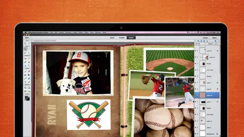
all right. So some tools and techniques. Let's go ahead in talk about some of the ones I use on a daily the cookie cutter tool sometimes forget about, but it can be really nice for different borders. And, like, for instance, this right here you can make your own cards. You could make your own invitations. You can create kind of funky borders, throw in a little bit of text and use the cookie cutter tool for that. So I'm gonna go into this photo here and down here, where the crop tool is its hidden. It's inside the crop tool area. I think they change that from 10 to 11. Somewhere around there they change where you can find that cookie cutter tool. So if you have a hard time finding that look under the crop tool and it's right next to the crop tool and you have different shapes that you can use. So let's just say you wanted to do a plane heart shape. You can click and drag around the area and move it appropriate position. You just click on commits, and now you have a nice little border. Q...
uickly, don't undo that. Hidden in there. Also, my kind of stumbled illness is some of let's go down to all elements. And again, you can make these larger gonna go ahead with large and you can scroll through all of the different various shapes. But what's interesting is some of these crops shaped tools, and you wouldn't think about it. But they are really good to use as funky borders. Um, and you can also buy overlays and things like that to use as well. Go ahead and take this one on a click and drag around this area here. And there's a nice little border for you. Yes. Can you add shapes? Can you load shape? Yes. You can get shapes off the internet and then file name. Oh, what is that file name? I don't know. I might have to tell you about tomorrow. Okay, cause I'm not sure I've never loaded him, but I know you can. You could do pat, you know, patterns and brushes and shapes and draw something. Although didn't is the ship if you had it in the correct file format? Exactly. We gotta find out what that is. I know there is one, but I all the top of my head. I can't remember what the what it is. Yeah, good thinking, cause I love it whenever you stumble upon something, like, probably draw our own little border scanning in or whatever and bring it on in if we know the proper extension. There's all kinds of foods in here, and you're gonna you know, you never know. Never know. Um, animals I was trying to do one for with my dog, and it just didn't look right, so it didn't bother doing that. So once you're done with that, then you can go into file and maybe you want to do a I don't know, a postcard an invitation. So I will go with five by seven, because that's a pretty normal standard size, and you can get them for really inexpensive. I'm going to an RGB. Sometimes people will say, Michelle, why is everything grey? I can't figure out why. Can't add color. What color mode do you have it set in? I've done this before, too. So if you ever have questions, this email, me and I'm probably I've probably made that mistake along the line somewhere, and if not, I'll try to find out the answer for you. But every once a while, it'll just go to gray scale. You may have not even noticed that you did it and you'll go to gray scale. Um, it's like, Well, why can't I add color? Just go back to your color mode and make sure that it's RGB When you started, I think, Let's see here Image mode. This is another way to check. You can go to image mode and then check to see if it says RGB there because it'll probably saying grayscale if you can't add color, I venture to guess All right, so I'm going to go over here. I'm gonna take this, drag it and drop it in there and maybe I'll pull some color out of the photo and then we'll add a little bit of text and create a little birthday card or something. Just drag this, drop it on in, and I can close out of this if I want to. I'm gonna go to my background layer and go into my set foreground color pool. Maybe this color or the pink color from there. Click on OK and I could do it a couple different ways. We can just go ahead and take it, get the paint bucket tool, click and drag our click, and I'll fill that whole entire background with that. So it kind of has a nice little rough edge, but it doesn't stand out a whole lot right now. It's pretty flat, so you can go into your effects panel and put a little drop shadow on there to make a boost up a little bit. Well, that's pretty red there. I'm saying pink, but it looks ready for you. Um, and you can put strokes on. There are devils and all that kind of stuff. I'm gonna go ahead and move this up. I'm gonna show you a little bit about where you confined. It's gonna preferences if you are really, really picky and you want to make sure that everything's lined up perfectly, you can go into preferences and check out how big your, um, that's the good. In general, that's usually the easiest way. And then go to guides and grids and you have this set here where you can turn on your guide and grid and change the color and change the subdivisions. So I'm gonna go into view grid, and now we can kind of lineup the text accordingly. I always say, Make sure you have at least 1/4 of an inch away from the sides because you never know how it's gonna print. You don't want something to be printed and cut off if you don't want it to be cut off. It's called the bleed. If you wanted to be cut off that, make sure you're definitely over the edge. But if you don't want it to be cut off, especially tax to get at least 1/4 of an inch away because when they're printing it out, it might be a little bit off had that happened before. So just make sure that you kind of are, um, watching that. So now I've got at least 1/4 of an inch right here. My grids air perfectly. So I'm gonna stay within that area, so I'm just gonna keep I'm gonna turn those off. Actually, I was gonna go back to Control Plus, or you can go up to the menu bar, go back to my text tool, and right now we have the vertical set. I'm gonna have to go back to the regular type tool. And I'm just gonna go ahead and use that font 18. Fine. For now, when I go ahead with the auto letting and I'm gonna go with center and I'm just gonna go, you're invited, all right. Looks like it's the same color, so you won't be able to see it. So we are going to change the color. Highlight that. Let's go with maybe this tan color, see if that'll show up a little bit. That doesn't look too that and then you can add all of your drop shadows or whatever. We are a little bit too close to the side. So I am going to make sure I have my guides up or my grid up and it's just right on it. But I'm gonna pull it in just a little bit. Someone zoom in a little bit, pull it in from the side, and I'm gonna go a little bit more than 1/4 of an inch just a bit right. And put that drop shadow on there so it stands out a little bit. So that cookie cutter tool, you never think that you would use it, But you know, you never know with with different layouts. It might it might work out for you, and then he would save it. Offers a J pagan and PSD if you need Teoh, Here's a hum paper. I think this might be part of the part of the, um, the bonuses. And I've talked about this already, so I'm not gonna talk about it too much, But you could go into layer. And if you don't want to use that color, you can just go up to the hue and saturation changes to whatever color you want it to be colorized and go through all the different ones and save it off. Okay, The next thing years filters and I don't care and talked a little bit about filters. But there are a bunch of filters that are already pre made for Photoshopped elements. Some of them are not so good, and some of them are pretty good. So I'm gonna turn this grid off. I love this, um, texture right here, but I also love this filter that makes that texture really stand out even more. So I'm gonna go to artistic and let's just go into color pencil it is the potent poster and let's try profits. I think it's the fresco, but let's just try poster edge. Actually, this is pretty cool. I really liked that. Teoh really makes that those wrinkles pop, and we don't have to do any kind of photo retouching on him. If we did, we'd be in big trouble. So there's a poster edge. I really like Fresco. That one's kind of cool. It gives it that, um, watercolor look. And maybe this will be something that she would do when you, um, printed onto a canvas. So it looks like it was a painting. Here's another watercolor, but actually I like fresco better, but you just have to. It just depends on what photo you're using. Everything is gonna look a little bit different. We have the dry brush, all kinds of different brush strokes down here you can use distort the glass a little bit, just too much distorted. So I don't really go venture down there too often, and then you can just click on OK, whichever one that you want to use. But just remember that those filters are there to use to kind of give it a more of a creative look and to you don't have to just do it to the whole entire, um, photo. You can take bits and pieces of it and just apply a filter to parts of it. So I'm gonna do something kind of funky. I'm gonna take this top area, and I'm gonna go back into the filter. I'm gonna go to artistic. And let's just pick one and just create that filter the film brain there. And then maybe I want to do another different filter down here. Go to filter. It's too poster edges there, and then another. You can get real creative with this, or you can take your lasso tool and just go around a certain area you don't have to do. Use that rectangle marquee tool. Um, let's go. Something totally different. All right, That's another option. Yes. Is there any way you can blur between the filters that you were just applying to make it look like they gonna blend log radiant like, or something? Well, toe make it look like they blend into each other. Yeah, Um, yeah, there probably is. It might take a few steps, but there is a blur filter, huh? So I wonder if he would do all of them and then apply a blur to all of them. So they kind of all blur together. That would be my first thought is to do all the different filters and flatten it possibly and then go back and select everything and they go to the filter blur. There's like four different blurs that you can use ghazi and blur, and you can apply as much blur to that as you want. Teoh. So like, for instance, if I went file and open and I'm gonna go in and just kind of quickly do it to this one, just to see if that's what you're kind of getting that go the filter. Artistic. Be a dry brush. I go to another one, do a little bit more obvious poster edges, see if there's another one. That's kind of different. See Sketch. Oh, there's one I really like. Let's see here, Uh, sketch and graphic novel. I like that one. This is kind of cool. Now this one looks like it might do it to all of it to the whole thing to see here. I did so we might have to put on a separate layer. Possibly interesting. Now let's say you wanted to blur the whole thing, so we have the whole thing now. We don't have to. Even we didn't even cut it up. So it's all in one layer. We go to filter, blur and gauzy blur. And let's just put a big old blur on that. That's a little too much, but so, yeah, something like that, and you could use it as a background or whatever. All right, that's it. Answer your question, All right, Fun with frames We've already talked a little bit about. But there is a place that's looking here and see where we have all kinds of frames. Other than the guy, the quick mode, I think it's when we talked about it. So you go to the graphics, and then, instead of going into graphics by type, there's also a drop down that says by frames, so you can pull and drag all of these frames any of these frames into your page. So they have. I don't know how many. They have a lot of different frames. If you don't know, remember how to make your own frames you can come in here and I do have some scrap bookie looking frames and just drag it and drop it into your page. Then you can change the size of that photo. And if you don't like that frame, you just go in and drag another one into your page. Some of them are kind of hokey, but some of them aren't too bad. Just pull in. Um, I want to try and get There was another frame that looked more Western, but all right, now also to if you notice here on the right hand side, there's like a little bitty blue corner the very first time you possibly bring and drag that in, it might say you need to register with Adobe. Does anybody ever stumble upon that at all? I think the first time I loaded this, it said, make sure you register with Adobe because I don't know if it it connects with adobes library or not. But, um, you shouldn't have to pay for any of these frames. At first I thought, Oh, they're making me pay for the frame, but it should say, Just register with Adobe and then you should be able to use all those frames for free. If you'd stumble upon that. I don't remember if it did it for diversion 12 or not. But, um, and you have all these little frames here. If you want, these little bubbles might want to use that. All right, spot healing. We covered black and white. Reverse out. I don't think we talked about that, but let's just go ahead in here. A lot of people used to do this. A few years ago, there was a designer who did the cards, and I think the rose was in color, and then everything else was in black and white. So if you ever want to do something like that, you can use your quick selection tool. You can use masking, which we're gonna cover in detail tomorrow. So I'm not gonna get into that today. But if you wanted to do a really quick selection and then make everything else black and white could go ahead and get your quick selection tool, which is really usually easy to use if if the contrast is there, sometimes the contrast is not their meaning that if there's too many like pixels, it might select things that you don't want to select. So I had a whole two or three hour session in the intro class with selections, cause there's so many different ways that you can select that. You might want to take a look at that if you're not really good with selections. But let's just say we wanted just that to be in color and everything else in black and white really quick. Way to do that is just go ahead and do a select inverse. The best way to do it is what we're gonna cover tomorrow with masking. But if you wanted to do a really quick one, you just select inverse. Now everything is selected outside of that area that we just selected, and then you can go into enhance and convert to black and white. Simple is that and there's all different options with the style. So we have. You can just kind of look at it and see what you're photo is doing. Um, sometimes it tries to pick the one that is gonna be best for your photo, but sometimes it doesn't. So I think I liked I kind of like that one because it gave it more of ah contrast someone go ahead and click on, OK, You can also change these intensity levels here with with red, green and blue and contrast. So you got so many different options to work with. It's gonna make it really contrast e. And there you have, like a little black and white reverse out with color. A lot of people like to do that heart. The next thing I want to talk about is Oh, this is the one. Okay, So my poor son, we were taking pictures of the other day and we're trying to get the dog involved, which sometimes can be not so good. So we could get the picture with the dog looking. But then my son was slouching, and then we got one with his face, All good. But then the other dog was looking away. So we have. We finally got three pictures, so we had to combine kind of the three, um so the dogs looking pretty good here and I was kind of getting really picky. This is totally fine. But my son slouching a little bit, so I thought, Well, I'll bring this to my class, cause I know this happens to you all. Especially if you have a dog involved and kids that do not want their picture taken. And then I have this photo, which he was getting pretty frustrated with me on here. Like come. Are you kidding? Another picture like, come on, do it for me. So but I kind of like that one and the dollars looking away too. So let's say we wanted to Let's say the dog is looking at us on this one, and we want to take his face, maybe from here, and put it over here. You could do it a couple ways. The easy way for me is to go ahead and zoom on in there and take the lasso tool, and I'm gonna put a little bit of a feather on it. So I'm gonna go down here and I'm gonna go. Maybe I don't know. Tickets Taking a guess. 12 pixels. It might be too much. It might be too little. Sometimes it's trial in there, so I'm gonna come in here and kind of get a little bit out, you know, right on the outskirts. Right in here. I'm gonna take this cute little face and then take my move tool. It's got a little bit of a feather. That might be too much drag and drop it over here. I must see if I can't line it up so that you guys would never know that he was actually smiling. I'm gonna put it on top. I'm gonna go to my layers and I can turn it on and off he's sideways. I hope he's not watching Put its sideways because he is tilting. And I want to make sure they line it up with his eyes because I don't want his features to be too big for his face. So I'm gonna come over here and I'm a go down in opacity size that my eyes lineup, I wrote Hate it just a little bit. Put it over the top there. See, they're lining up pretty good, but I think it's a little too big because his eyebrows are a little too big. So let's shrink it down a bit. We're going over. Um, maybe not. And then go ahead with that. So I got this in this. If I zoom back out so much fun was one of my wise just so fun. It kind of looks weird for some reason, but I think it might be because it's not rotated. It might be too big. Oh, I know my opacity. I gotta put my positive backup. That's why it was like Something looks weird with this. Take me rapacity all the way up. Just nudge it hopefully into place. I think I need to go up a little bit more. There we go, much better. So now you guys would never know right that he's actually very happy that I was hugging him. No, because it's that big group photo, everybody smiling. Except for the one person who's not. Yeah, and actually, there's really a really cool comment. This also highlights the why and also the how for making scrapbooking accessible for everyone be, Trumper says, Hi, I'm a quadriplegic, and I use a Mastic to type one letter at a time. So are there any one click shortcuts they could use to sort of enhance their process of digital scrapbooking? Right? There's a lot of short key commands, and I haven't really been using him because I'm trying to talk my way through it. But if they go over and they highlight over the top of the tool that they want to use. Like, for instance, if they want to bounce to the quick selection tool right there, it will tell you the A. You just press the A on the keyboard and jump right there. As far as like a quick selection for doing what we just did, There's really not one or two buttons that you can push, but those shortcut commands worked wonderful. And then do you think like, ah, Wacom tablet might be a better? And you know the reason why I don't have my mind died about a year ago, and I just haven't. It's hard to get you guys use welcome toilets. It's hard to get used to. So I was wanting to get the latest and greatest, and I just time goes by and I haven't done that yet. So, ah, lot of people do use those, and there's so much easier to use one. To get used to him, you have to almost hide your mouth, give it to your husband or somebody and tell them to lock it up because when you first start using it, it's like hash. I can't get used to it until you do. You use it for, like, a a few weeks. Okay, so that was pretty self explanatory as faras taking a face of one picture and moving on over. Make sure you put that feather on there because otherwise it's gonna You're gonna probably be able to tell that feather makes it look a lot more smooth. And it's going Teoh not make it look eso harsh. I guess so. Now we gotta work on the dog. Don't way. So let's just Let's just go back in here. I'm gonna close, start from scratch and go in file and open. So our good dog is right here, all right? And then our bad dog is over here. Let's use this one. This might be a little bit tough because, you know, I oh, he's he's looking away. So it is gonna be a little bit tough and I get get people all the time. They'll send me their family photos and the lighting's difference and the skin tones different. And sometimes it can take a lot of time. Sometimes it's really easy, just like what we just did. And sometimes it's like you know I don't want to spend two hours on this. So you got to kind of figure out How much time do you really want to spend on this to make it look perfect? Then it doesn't have to always be perfect, but let's just see what we can dio. He's looking really kind of to the side. But let's see if we can't fool people and just take this coming here. Since he's a lot of white, it might be pretty easy. We will check it out and just take his little face over here. Moving on over, I'm gonna have to rotate it just a bit. And we're gonna have to do a little bit of stuff over here because we got that little nose sticking out and let's tone it down a little bit like this. Maybe a little groups all not good, not good. Don't want to do that. I want to close this one out so I don't get So What I just did was I kind of squeeze this face in, but he's a dog, so he's not gonna worry. I I won't tell them. All right, now we gotta get rid of that knows back there. So what do you guys think? We should use couple different tools we could use. You use the clone tool. Let's go in and use the climb. Thinking that's probably gonna be the best route. Because I don't know what's gonna happen with the spot healing brush. I think it's gonna be noses all over the place. So I'm going to go ahead with the with this Ah, clone stamp tool. So I click on the I'm gonna go to the layer, make sure you go to the right layer, click on Ault, give it a target, and let's just get rid of this. We got lucky because yeah, kind of got lucky here, and I was gonna move this back on over. Who? His high. Let's see if we can't, we might have to work on the I, but I'm not gonna spend too much time. If you didn't know that we did that, you wouldn't be able to tell. So now we've got well, you know, we put we still pull that nice face on there, and then we got the perfect photo. All right, so I really like that, um, feathering and selecting tool All right. So we are right on time. This is perfect. Smart brush. Okay, this is kind of fun. Ah, another little feature that I think was in 10 and 11. So if you don't have the latest and greatest version, your you should be fine. I think definitely in a version 11. And it does a little bit. I'm asking for you. So I'm gonna pull up the original photo and got the brush here. So you just go over to your brush till you hit the F on the keyboard. If you want to use a keyboard shortcut. And you know, I had some of them, most of them memorizing. Then they kind of changed it around a little bit with each version. So that's always That's always fun. Um, down here is your smart brush feature. So you have all different kinds of presets. We got the black and white, so if you wanted to try it that way, you can go in there and just kind of do some do some real quick. So if you wanted to do this is another way of doing that. Black and white. Reverse out. I just took that black and white smart brush. Click and drag around the area that you want to select, and it's gonna make a mask over here. So if you didn't get everything that you wanted, Black conceals, White reveals, you can go in there and you can start painting in the areas that you want. Teoh. Now, if we don't like that smart brush, we can just undo it. Go back into all of our features. We have so many different ones to choose from. Let's just go with the large one so we can see him a little bit better. There's a block, all the black and whites we have all purpose, so you can. When you highlight over the top of it, you'll find out what it would actually will do because some of them that you can't really tell artistic. Let's just try this one. The pencil sketch and I need to probably make my brush size a little bit bigger, cause I'm taking too much time to select. You can also go in there after you do make the selection and take that opacity down. So if you want to show, um, want some of that background is shine through. That's another option. So it's not so stark because he really there's not a whole lot of of. I'm trying to think of the word you don't get ah, lot of freedom, Teoh say, Hey, I want that smart brush to be darker or lighter. You can mess around with the capacity, but it kind of does. Would it? What it said to dio Undo that and just try one more smart brush and then we'll move on. We're going to create a layout here before before the end reverse effects. So I don't know why you to use this one but create a rainbow around your selection. Never know. Some of the features are kind of funny. That one didn't do too much difference. But trying to think if there's anything really in here, that would be fun. Okay, this is kind of fun. Never know. Actually, I did this to the, um I did this to the tiger. I think last time and then you could go in here if you wanted to not make his face rainbow. We can go in there and get my brush and brush his face back in. Oh, nice brush. Let's go get a nicer. It was like the brush we use for our typography. Think so? Let's go in there. And we can put him back to being normal instead. So see him. See, over here, we just paint. You got that mask over there. We can change it back to white. What did I do to bring it back in? O slow down. All right. Makes sense. Kind of fun. All right, let's go in to see what else I have as faras the tools and techniques, Okay? Backgrounds. I tell people all the time I members, I say, take pictures of whatever you think you might use in the future. We thought this background was pretty cool. We were taking pictures of that carpet, sometimes fun. Go to Vegas. You got all kinds of crazy carpets. Um, I take pictures of rocks and, um, bricks. And you never know when you're gonna use them. Just because it looks like Has this color you? Can you just use that hue saturation to change the color you got at your fingertips? Right over here. Change the color if you want to, and save it off as five or six different colors. You might want to start a library of taking pictures of different patterns and papers. Karen talked a little bit about that today, and you guys are gonna finish up that layout that you started. So let's go in there. And I you know, this is just grass or hay, but it does give you some textures, so when you zoom in really close and you can change the textures on that
Class Materials
bonus material with purchase
bonus material with enrollment
Ratings and Reviews
Prairie Chicken
I found this an excellent course on the use of PSE--not just for scrape booking but for any use. And of course the scrape booking ideas and methodology was great. I enjoyed Michelle's approach very much, and also liked Karens.