10:45 am - Postcards from Digi-Kit
Lesson 22 from: Digital Scrapbooking for BeginnersMichelle Stelling
10:45 am - Postcards from Digi-Kit
Lesson 22 from: Digital Scrapbooking for BeginnersMichelle Stelling
Lessons
Day 1
19:00 am - Intro & Michelle's History
38:59 29:45 am - Intro to PS Elements & Organization
44:46 310:50 am - Using Quick Pages
36:10 411:30 am - Second Quick Page Example
15:42 511:45 am - Useful Tools
12:08 6FreePreview: Red Eye, Feathering & Collages
34:33 71:30 pm - Creating a Simple Cluster Page
16:301:45 pm - Different Modes & Making a Bookmark
31:54 92:30 pm - Creating Cards With Digi-Kit Elements
41:29 103:15 pm - Constructing Cards Without Digi-Kits
33:30Day 2
119:15 am - Collaging: Alignment, Guides & Grids
23:50 129:45 am - Paint Bucket, Brushes, Gradients & Text Effects
45:13 1310:45 am - Cookie Cutters, and Personalized Background
22:38 1411:15 am - Frames, Filters, & Blurred Backgrounds
42:12 1512:45 pm - Photo Restoration: B&W and Color
37:22 161:30 pm - Photo Retouching
44:41 172:30 pm - How to Use a Pre-made Template
37:02 183:15 pm - Creating your Own Templates
38:31Day 3
199:00 am - Creating Your Own Paper
36:09 209:45 am - Photomerge: Panoramic & Style Match
21:18 2110:15 am - Text Clipping & Guided Modes
17:05 2210:45 am - Postcards from Digi-Kit
50:20 2311:30 am - Postcards from Scratch
17:40 2412:45 pm - Creating a 12x12 With a DigiKit
34:01 251:30 pm - Creating a 2 Page Spread
44:18 262:30 pm - Creating A Collage
48:47 273:30 pm - Second Collage Example
21:25Lesson Info
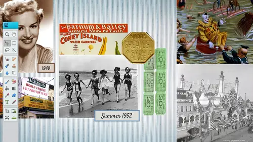
10:45 am - Postcards from Digi-Kit
I always like to begin with the end in mind so that you can see what we're going to actually be creating so we're going to create this little postcard could do a five by six for by sit whatever size you want it to be but normally I keep it at a basic size so you khun dio I think this was a five by seven let's just go in there and look at it real quick we're going image mean to resize and it is a seventy seven by five so we're going to start from scratch but I did want you see exactly how this was constructed so that you can visually put this together so hopefully by the end of the next in this next half an hour you will be able to put your own post cards together it's really simple really basic it does include a cluster so that is the part that is you can purchase it's snickerdoodle designs cluster and I will show you and tell you the exact name of it as well but it's just a little bit of text in the background a little bit of texture and a couple photos so let's go ahead and start fro...
m scratch always start with a new blank file I'm going to go with inches because I like to work in inches but you whatever is most comfortable for you seven wide by five high and I'm gonna go with three hundred resolution you can actually name your file at that point I just keep forgetting to do that but we'll name it and save it here in a few seconds I mean to stop you but there was a clarification that came up about automating the pixel size three hundred not me and you do that so where you don't have to fill it in every time um you know what I'm not off hand I don't know where that isthe kevin you can do it yeah okay well usually defaults the one that you did before oh I see yeah so it always puts in the one that you had before so usually does put in that three hundred but good to know yeah yeah yeah all right so we're gonna go ahead I like to bring in my photos first or my cluster first so we are working with sweetums cluster gift bye snickerdoodle design so if you needed to purchase that it does come like in a package but you will get that with your package if you purchase this class so it's a really cute little cluster I'm gonna go ahead and open that and I'm going to drag it and drop it into my page the reason I bring this in first is because I like to work with those colors that come with it and then I'll have a palate that I can pull from because some people say, why do you always pull in the cluster first and it's just a preference it's not you know you don't have to do it that way but I like to pull colors from that clusters all compatible next I'm gonna bring in my photos something go file and open and I'm going to bring in this photo first it's going to be the one on the left hand side and again if I wanted to bring in that whole photo I can or I can just go ahead and get my techs are my rectangle marquis tool and drag around the area that I want to cut out and then move it into place it's going to be a little bit bigger because this is shrunk down to a five by seven so I am going to shrink my photo down a little bit it's always okay to shrink your photo down if you in larger photo just be careful because it can pixelated kind of bad but shrinking it down not a problem going enlarging just be kind of careful on that now this is on a layer that is above the cluster so that's ok, we're just going to move it a below there but I'm gonna bring in my other photo first some go file and open another photo here we are going to be recording a postcard for an ice cream party so I'm gonna get my rectangle marquis tool go ahead and pull this piece right here I love it because my little nephew right here he doesn't look so happy in the background I'm cutting him out you look like he's mad at somebody go ahead and get my move to a ll drag it, drop it, shrink it down from one of the corners remember to make sure that you're constrained proportions has checked in the bottom left hand corner because if it's not you could alter the shape of that photo so just kind of I always just glanced down there every time I do this just to make sure it's checked and I'm not doing anything funky because sometimes you don't even realize it and you will alter the shape of that photo we've already used this cluster so we can close on out of that and again I'm going to shrink it down to fit and now we can start pulling it behind that cluster. We talked a lot about layers on day one so if you are not following along with the layers make sure you purchase it and watch day one because we talked about layers moving them, adding them, renaming him and things like that I'm gonna double click on this layer and just call this photo too double click on this layer and call it photo one and I will go ahead and name this cluster cluster's can be found all over the internet just type in digital design scrapbooking clusters and you can find all kinds of digital designers out there who create them and there's some awesome looking once out there, so I'm just going to drag him and dropping below that and now I can position them behind that frame rotate them however I need teo just kind of moving around with the move tool the rotate tool you go into the corner, it will turn into double arrows and then you can click and drag and I'm gonna make it a little bit smaller just needs to fit behind that frame and let's, go ahead and click on ok and take the other photo, shrink it down a bit, move it up, rotate I want a little bit more than that I'm showing so let's, go ahead and put it up there a little bit larger just there we go and you could always nudge it with your arrow keys on your keyboard as well. Kim k is asking that they think she uses clusters, but she often finds it very, very hard to keep the photo from showing in the other frame, but you're not having that thing that's easy to deal with if I did have that problem with me, I do have that problem because I know some other people have that problem too you can just cut it. So let me do that. Let me do I had to show what happened. Thank you. What she's talking about is she'll have sex a little bit of excess on the outside of the frame. And how do you get rid of that? Very, very simple. Let me pull in a another one. Let's. Just say we over and over did this one, and we come in here and all kinds of ways you can do this, too. So I'm just going to show you one way, but that's a big picture, bring that down a little bit. So she's talking about is maybe she has stuff that's outside of the frame. So thank you. So bleeding onto the other side. So it's interfering with the other photo into the other one like something like, well, it's just pulled on that layer so you could see more. Probably something like that. Okay, cool issue. Okay, let's, just do it on both sides because you stayed on both sides there because it could happen on either side, actually. So what, you d'oh a couple ways you can do it. Problem? My easiest way. We're just to go that layer, turn off all these other layers, actually not that player, but this layer okay so if you have something that happens where it's bleeding off on either side you could either a go ahead and cut it that way out of there so I'm just gonna do this let's go to different ways I can either eh select around inside that frame go teo select an inverse now I'm going to be on that layer that that that photo is on and hit the delete key so now that it's gone that's one way there's like five or six others I'm gonna show you one more way or you could just take your lasso tool or any of your tools I'd say the rectangle might be the easiest one go in there clip it our select around the area you want to delete hit the delete key and then it's gone we do the same thing on this side you've got to pay attention to what layer you're on hit the delete key and then it's gone that's another way five more ways teo thanks michelle no problem I love these questions because I don't think about them I'm always you know thinking about how the way I do it so I love having questions from the audience well all right so I'm gonna delete that layer because we're gonna get rid of it right click to delete and she was delete layer okay and again you can rotate them if you need thio by just clicking on the corner rotate I mean a little r jack just because there's a little bit down there that needs to be in the scene gets more that ice cream in there question what if you want the girls facing inward, you can do that. Yeah, well, how do you do that? Okay, let me think. Here you can go, teo image transform free, transform. Well, I have to figure out how to flip it. So let me see if there's a flippen there are no there is but right off you could well, I'm not I'm not gonna tell you this is the way to do it, but you could do this. You flip it that way, but you have to make sure that it is transformed perfectly see how she went from one side to another. Yeah, but how's that function because yeah, it's really great to know that you know, if something's not looking the right way or facing the way, I'm just actually one thing that you have to keep in mind though if your shirt says something on it in a flip it it'll be backwards. So just be careful that in fact she's got a hat on and people probably wouldn't even notice what it says something on there, but if she is flipped it's going to be backwards so just kind of keep that in mind I remember when I started out when I first got into college and I went to an ad agency and I flipped something I wasn't even thinking about that it it ran an ad way, and they're like, oh, the shirts back backwards and I'm like, oh my god, that was me, that was me, so yeah, but it sometimes you just don't even think about it because it's really, really tiny, but somebody's gonna catch it all right? Let's rotate that back and sew her hat would be it would be backwards, so we probably wouldn't do it in this in this case, but you usually want people facing in into your from a graphic design point. You want people facing into your layout, so these guys are kind of facing out so it's kind of like a no no in the graphic design world, but we'll go ahead and and let it slide this time, so you have to figure out a way this is comes backto thumbnails and I do have a thumbnail I'm gonna show you for our next digit kit, but you have to kind of haven't begin with an end in mind, so you have to think, what is the title going to be, how big is the title, how much information needs to go on this postcard? Where do I want to put the text so you'd want to do like a really quick thumbnail bring out a black, bring out a white sheet of paper, get your pencil out and just do a really quick way out and you can get ideas from all over the internet so if you are not creative like a lot of people say, well, what if I'm not creative go out on the internet going pinterest go there's all kinds of different people who even sell templates for postcards as well I'm gonna go ahead and shrink this down a little bit actually I can shrink them all down at one time, which is what I need to dio so I go over to my layers panel and I hold my shift key down and I select three layers at one time and then I can reduce it in size all of them at once so you don't have to go in there and, um finagle with each one you could even merge these together if you know for sure that that's the pictures that you're going to be using but I usually don't merge them and unless I know for sure that I'm not going to need to move them anymore, you could also put drop shadows on clusters this one I don't believe has a drop shadow on it so let's just go ahead and go there um, I'm going to select the layer that has the cluster I'm gonna go to effects, I'm gonna double click on the soft edge and putting drop shadows on just gives it a little bit more of that three d look that a lot of traditional scott booker's kind of worry about when they transfer from traditional to digital, they think, oh, you have a flat piece of paper it's not near as nearly as nice, which I totally agreed, but one way that you can give it a little bit more of a three d look as to put that little drop shadow on there, you can also kind of do hybrid digital scrapbooking, where you do put pieces on top of your postcard as well. The cool thing about digital, though, is you can make twenty five, copies of this is we want teo, whereas if you were traditional, you'd have to do it all by hand. So that's one, um one plus on going digital, the next thing we're gonna do is we're gonna go ahead and bring in, go backto our layers here, clothes out of my adjustment layer, we're going to just bring in a solid background and maybe add a little bit of texture to it, or we can pull a paper from another digital kit and turn it into a pink paper instead of whatever color it is. So this is where we're starting to combine everything that we've learned in the last three days everything's going to be tied together now from here on out so those of you who did miss the first couple days it this is a little bit too much advance then he might want to check that out sometime go file and open I know I have a did you get a bunch of did you kit so lets go to day three let's go teo see where I have them put them in tickets in this one actually let's just we have all kinds of papers in here so they're not pink the same color that we want as faras the scheme goes but maybe we want one of these nice paper so I'm just going to go this is from the artist in me I'm gonna pull this paper out and I'm just gonna pull it and drag it into my layout and now we have a nice textured background we didn't have to make it ourselves and we can change it to a pink color if we need teo so the way that we do that as we go upto this little, um dropped down from our layers panel we got a huge saturation, we're going to colorize it and then we can just try to find the pink that we need it's a little bit stark there. Just pull it down. We can make it darker if we want to or we can make it lighter. Okay, so you do not have to make your own papers. Just go buy a digit kit and you can tailor to whatever color that you wanted to be. Another thing, too, which is really nice as you can move all kinds of papers they can, you can move it to where you like the textures, there's a little bit more texture up here in the upper right hand corner. If you move it around, you'll be able to see where you can, um, leave it, actually. So I like the texture that's up here. Or if you want teo, you can zoom out and you can pull this paper and make it smaller so that the texture is a little bit is a little bit more apparent. See this paper right here to twelve by twelve and that you'll know there's little notes up here, you can pull it down or up, and it'll cut out. It'll bleed off the sides so you don't have to worry about. None of this will be printed up here, go ahead and zoom in a little bit. If you want to lock that paper down, you can go ahead and lock it down if you think you're going to be moving it sometimes you get you get to be really fast and you move stuff around you don't even realize you're moving it around so you can lock papers and I don't think I mentioned this but backgrounds locked all the time but I can click on the laki and the upper area of your layers panel and then a lock that layer so now you see a little lock simple there and now you won't be able to move it sometimes I locked the back ground layer just because I don't want to pick it up and move it somewhere and I don't realize that I did that you just have to remember that you did lock it and if you try to move it then you have to unlock it and you can work from there I think I'm gonna go ahead and merge these guys together because I do know that that's where I want them to be someone a highlight all of those three layers I'm gonna right click choose merge layers now there will be one layer now I can move them rotate them I don't have to worry about individually moving them okay, so my headline is going to be ice cream social or it's an ice cream party or something like that and I think I'm gonna have a really fun really kind of fought so I'm gonna go ahead and look in my thoughts area my clothes out of all these other papers because we don't need them they are all copied and pasted the original is not going to be hurt I'm going to select the very top layer I'm not gonna worry about the color just yet I'm gonna make it um black for now I'm gonna click one time and I'm just gonna call it it's an ice cream party this ice cream two words or one okay all right pull this down so it's fits inside come on little guy sometimes it's hard to get that little node to follow you all right and I don't want this is my faut it's too boring needs to be fun it's going to be a little parties that we have to have a fun thought and we have to have a fun color too so but let's go ahead and work on the font first I'm gonna get my text tool go inside of my area I can just go ahead and if I know exactly what I want I want to use I'll just go ahead and pull it from this font list but let's see what do we want to use here think I'm gonna go with let's see what happens when we go with I think this one was kind of fun and it's funny, because some fonts, they'll be a lot bigger and they were a lot smaller when you choose the other a different fun. So this will just go ahead and shrink down. I think I'll use this is a little bit thin, but I think it's kind of like a fun party font. You have this kind of float all the way across, and now I can think about what color I want to use for this now, there's a couple things that we talked a little bit about what we didn't get into as much, but I am going to show you some different, uh, effects that you can do with the text I'm gonna go to effects right now and you'll see that there is a outer glow that you can use now some of these air really crazy, and I'll just pick the craziest one right now we've got the fire, but we really don't want to use that for this postcard. We've got something like that kinds of different defaults, none of them I really have ever used. But I do want to show you that they are there. Actually, this one wasn't so bad for this for this type. It does make it stand out a little bit it's not so bad but I don't know if I would want that text to be that color so let's just say we did want that but we really didn't want it to be that stark we can then go back to layers go into our effects right here f x and we can adjust that outer glow okay so we can make it really big or we can pull it back in and then we can also play around with the opacity so it's not so stark so actually in reality this outer glow isn't so bad I don't mind this one um because it does work with this type of a layout it's kind of a fun really fun so I'm just gonna go ahead and use that it will allow that thought to stand out a little bit more and if I don't want that font color to be black I could just double click on it let's go with maybe a really deep darker maroon arm I don't know salmon color I guess you would say it's gonna pull it in the same family here and see if that works and that's that's okay that that will work out okay so what we have on the right hand side is an area we can put the time date our spp uh whatever you want to in that area I'm gonna go to my very top layer get my text tool I'm going to make a text box so it's different than what we just did because we just clicked and then we started typing but when you make a text box you click and drag so now we have a text box I don't think I want to use that thought as my my body content so I'm gonna do something a little bit less really and I also want to take it down to maybe seventy two point and let's just say um what do we want to say here this saturday or go saturday? It's a little bit too big still so let's get that let's get that going to smaller forty maybe twenty four let's go a little bigger saturday december and our leading is way too too loose so we won't have to go in there let's see fourteen with having today at one o'clock all right so are letting his way too loose solicitous select all inside there go down into our leading area and see how it says one sixty two we need thio push that way up and we could have done this at the beginning to so either way is totally fine go ahead and pull that up I think I'm going to go ahead and make sure that we can pull this text box out so that the one will the one will go ahead and automatically go to the list onto that next page so let's get that it's not going in there to do this I like that and maybe we get a little bit smaller it shouldn't move up but for some reason my computer's a little finicky and we can say where it is located so I'm just gonna go ahead and put um location and then r s v p it will play around with the typography here in a second put your baby or email address and that that's fine with all the information now we have to button it up so by that I mean going in and making sure that the text sizes are okay so if we want this to be a little bit bigger just highlight it go in change the font size if you wanted to just move part of the text you can push it up by just highlighting it taking the leading and pushing it to the left or to the right and I'm gonna go ahead and make this a little bit smaller and maybe make this a little bit larger it doesn't have the capabilities that photo shop has but it's getting closer we don't have the kern ing and all that so just know that that's not part of ah elements and if I wanted to go right justified instead of left just go into our text who'll write a line what else could we put on this car location and then see, we could just go ahead and put anything else missing from this postcard saturday december fourteenth at one pm birthday celebration spell it right first all right? I don't know if I like that font after I see it so I can go in there and take my text tool and just kind of go through some of the different fonts that might be a little bit too chunky but I think I liked it better because it is more readable let's go with this one right here and then we can also play around with a different colors of suzman for nine is asking would how difficult would it be not just the text but maybe put like a chalkboard background around the checks and I think they'll be too funky for this but can you do things like that? Yeah oh yeah definitely just the background behind the text itself yeah like a chalkboard something like yeah yep definitely if you can't see the text very well, you can always put like a a talk border or just even a plain box that's filled with a color a certain color because sometimes when you have a lot of textures in the background you will not be able to read the text and you could put like a light let me just do it real quick because I think that would be something that people would want to know so if you couldn't read this text text very well and if you wanted teo, you could go in, I'm just going to another layer a lot of people do this, so I think it's pretty important to just kind of throw that in here now I could put a white background or a white chalk border, whatever behind there fill that with a white and then I don't need it so stark I would go in there and probably do a maybe in opacity change. So if you do have something that's, texas on top of a bunch of textures, it's a good idea to put a white box maybe in between there and then just take that opacity down to whatever you need to be. So the higher of course the opacity it's not gonna be see through as much, or you can bring it down and then your text will be a little bit easier to read. I'm just gonna throw that in the trash can and now we can go in there we can change the different colors of the text, so maybe we want birthday celebration to stand out a little bit more. Well, go ahead and get our the color down here in your text box down in the bottom and I am going to pull a color from my layouts I'm gonna click on the little box in the bottom right hand corner and I think I'm gonna pull in this cream color click on okay so what you want to do is you want to change it up a little bit work typography changed color change size don't have everything the same size may be something that's more important like the date you want to make it a little bit larger um the r s v p isn't as important so maybe it's the smaller of the of the text and maybe it goes down towards the bottom might make it just a tad bit bigger maybe will punch in twenty two and maybe saturday needs to be a little bit bigger so after you get the text laid down after that I go in and I do go ahead and alter it a little bit and sometimes it takes a while to figure out what's most important and what you need thio enlarge you know what layout you're working with how much space you have let's go a little bigger on saturdays through ten saturdays like the big key word there is a little bit of space in here that kind of bothers me so maybe the location stands out a little bit too I think you have any questions? Well, I was just wondering if you knew you were gonna do a lot of manipulating on the text would it be better to put some words on a different layer you could and if you're not real good with doing the kern and tracking than a lot of people will have several layers it gets a little bit tricky sometimes because text you khun select and then you move it around and then you don't have that capability of um you know, right justifying our left justifying but sometimes people will put it I remember when I was teaching I had a student who had prior like fifty layers of text and because he didn't realize that he could do it this way so and then it just got so tricky because you had so many different layers the less amount of layers that you can get by with the better as far as when you were working with text but no, that would be a way to go if you needed teo um kind of just things and all but you can change like if I didn't want um saturday to be that particular font I can go in there and change just saturday to a different thought yeah, not that one ah, a slight clarification mackey wants to know could you have color to the text box or do you have to create a new layer that's the first question and she said she made a new layer I'm just wondering if you could affect the text box and keep the layer down? Does that make sense to you yeah yeah I'm trying I'm reading and I'm thinking let's start with the first shot I heard a first question says you have to have a white text box or can you change the color of the tag ridge and add color to the tech oh, you have to create what we were talking you out okay, I think in cork express or some other applications you could have a background text box color I think that might be what the question might be and as far as I'm aware of, you can't been photoshopped elements okay, well then that is unaware of yeah, but I mean, you could do whatever color you want to but that would be nice to be able to still that text box with a certain color and then but as far as I'm aware, there is not an option and that seems to be answering the question with mackey says okay oh okay, all right, so we kind of have everything we need, but if we wanted to keep adding and adding we can at the end if you wanted to go into I saved that guy save it, I always do that I'm always telling people you need to save more often will I don't know I kind of get carried away and I start working on it I forget to save all right let's just call this postcard and again I'm saving it I know I'm sounding like a broken record but I am saving it as a psd therefore I can go back and if I want teo and I can go into my graphics if I want to just throw a few more little things on there we didn't even have to use we could have used one of these backgrounds if we wanted teo you know you don't even have to go out there and by city kids if you don't want teo everything is right here inside a photo shop elements so you could have used this background this back any of these backgrounds changed the color whatever you need teo I'm gonna go in there and there are some graphics and here is well although some of them are a little bit you know cartoony but you will be able to find by type like activity color event mood object seasons um style all of those so let's just kind of see what we have if there's anything related we have tags you were talking about tags one time this bar is like could you put text in a tag to make it stand out more? That would be a perfect thing to use in a postcard if you needed to um there's lots of little flowers in here that you know girlie things but we can throw in just look through it first then maybe choose something paperclip there's a little paper clip in there and we have corners sometimes I used these little corners just around photos you need to bring in photo our corners all you do is you drag it drop it let's just put a little corner up there and you can re sais that if you want to get a little bit clunky so I'm just gonna make it a little bit smaller I'd be really kind of careful though with with corners because you never know when we're talking about printing that could be kid cut off make sure that your text is at least a quarter of an inch from aside and corners are are a little bit tricky so you might stay away from them but just know that they are there if you need them maybe I'll put one corner on each side it is to kind of balance it out and then I'm gonna shrink that one down as well it's a little bit little bit big still wants this fine one little graphic to pull out while we're here maybe this flower here maybe we'll just pull this out bring it pull it on top and see if that comes in all right we're good with that but you also have different backgrounds that you could have used different shapes they also have text in here which I have never used but just know that you can get all these different text flavors um there's some fun things in there I guess I kind of forget about us well yes how would you use those text would you put it right on top of yeah yeah basically I think what you do is you drag it out it's been a long time since I've used this you see where this isthe let's put on a different layer let's actually put it on a totally different blank file so that we can kind of see it better blank file I believe. Okay so here let me just try this because I haven't used these in years but I do want to remember how this is text okay so I think what you do is you just use that and then you come in here and you double click on that okay that's what you do okay do that did you see that text? Yeah so let's do it as a thicker font let's to it has impact which is one of my defaults whenever I always uh and so basically you just type to text out first or yeah type it out first then you come over here and then you click on one of these so if you wanted this one you can double click on it you have to click commit that didn't do it yeah I'd had to check that out sometimes that well that one worked so maybe that some of these don't work yeah, she took off heading type it out first go into your text double click on the tax and it should apply those elements tio tio one four nine out of probably numbers of suzy if you use one of the elements with the blue corner in a project will it still exist in your project even if you aren't online? Okay, yes, okay, yes, it will but you do have to be hooked up to the internet for some of those that you pull out. So yeah, good question and one thing we're talking about yesterday is that each version that comes out may not have the exact same ones that were in the last version. So if you really love a background in one of the versions, I would suggest that she pulled out save it like as a psd aura's, a j peg or whatever so that if it doesn't come into the next version, you always have that because there's a couple things that I didn't do with like version five or six that I didn't realize that they were taking him out. I'm like, where is that background? So if you love a background, go ahead and save it so that you can always bring it back up later hopefully that makes sense since we are talking about backgrounds just for a moment there's actually a really good question johnny johnny loves peter wants to know if we want to make pages and sell them on dh using the psc backgrounds but changing them to match that the theme are they caught be righted by pfc because they started with the psc background you have me I checked with their copyright laws everyone's a little bit different so I can't really answer that unless I really check it out but I do know that and also every digital designer has a copyright page that you can read so basically when it they first got started some people would take it and then sell it as their own which is not cool so they have all kinds of what is the tea copyright laws and stuff and they're all kind of individuals so you have to read each one to see make sure your trademark and copyright yeah waking up yes, my husband's name is tom milkha vic and we call him t m oh yeah that was mine. Thank you for helping me on that one. All right, well, just be a toc document in there I think it's what they d'oh everybody's a little bit different but just read those read up on those I do know that you can usually use everything for your own personal use pa's faras like selling and making money off of it it always depends on the person that's selling that peace good question all right, so we are close to being done with this one, but we're going to go ahead and button it up and then save it on out unless anything else, you can think that we need to put on here because you always want to make sure you double check to make sure you have everything that you need because you don't want to miss out or put the wrong date or the wrong information on there, because when I did a spell in fell wrong, let's, just check that out info at an a o d s. All right, so do a final check through before and I don't have an s on there, so let's, get that in there, it's oops. I need it to be in the outside of that ice cream party. All right? We're all good there. We did our check on that saturday, december fourteenth at one location birthday celebration. No typos that we can see. And we can go ahead and go file, save our last save as a photo shop documents and then we're gonna flatten it that we can take it to the printer. If you're printing it from home, you don't have to flatten, it is printed directly from your psd. And you're good to go a lot of people have you can print the five by sevens at home and I want you to twelve by twelve it's a different story usually I take mind teo a different printer like persnickety prince to have them professionally printed, but we're going to be pretty maybe twenty five of these so wood is probably shoot that toe walmart or wherever is the closest and then pick them up and then you can go ahead and use his postcards could put you could put that on back of a like a card stock if you want teo however you want to everybody who's was traditional has all kinds of options out there to make it spice it up a little bit something go file save as choose j peg from I dropped down find the folder that you want to put it in, go ahead and save it I save it high click on ok and now you have your personalized postcard so I used to do this all the time when I first started kind of gotten away from it a little bit, but they're kind of fun, especially if you kind of this is your hobby and you kind of like to do it it's fun to do the personalized postcards any questions that seem pretty straightforward, vicky okay, cool, all right so now we're goingto dio a layout from scratch unless I was thinking we would do another postcard, but I think I want todo layout from scratch because we we started, we did that postcard the other day, a little bit of that using that cluster, so I think a lot of people would be interested in maybe just a blank sheet of paper starting from scratch with just a layout. So let's, go ahead and do a twelve by twelve actually gonna show you what lay out we're going to do, though first, because I think it's cool to see what the end product is gonna look like. So this is going to be the end product. Here is where I have my thumbnail. I've been talking about thumbnails now, these air very simple to do you just get out a blank sheet of paper. This is going to be a very kind of basically out, but we are going to start with a a blank sheet of paper and we're not going to use any dj kits because some people were asking, well, do I have to have a digit you don'thave tio, I just like I prefer working with did you kids because there's so many cool ones out there, so we're going. Start out with a blank sheet of paper you do not have to have this in your computer, you can have it sitting right next to you just so you know what you're working on. You don't want to get started on something and not know what the end results going because that's going to get you really frustrated. So this is kind of my little thumbnail, very simple. I'm going to have a colored photo back here, a tented photo over here to left bottom left and then title here and then text here fairly simple and and I put little stars where I'm gonna put embellishments, so I just put little stars there that's that's where my embellishments are going to go? Yes, you start out with a digit kit do you kind of look at all of your options first? So you think, well, I know that I want this embellishment here here, tor legit, ok, ay dio um or I have to go back sometimes I do sometimes I don't sometimes I will not practice what I preach, and I just start throwing things on there and then it works out sometimes, and sometimes it doesn't so that's why do do the film nails, but I do try to gather those embellishments and papers into its own folder before I get started, because did you kids come with so many embellishments and you get overwhelmed and you think I want to use this one only use that one and I just go okay? I'm just gonna use four five embellishments because you can really over you do it so I'll pull those in to my folder along with the photos I'm going to use and then I don't even bother with the other pieces because it gets just too overwhelming doesn't make sense okay, great in free hand creating things from scratch is michelle shows now do you really like the digits mean what's your preference when you're working you can't because it saves so much time I mean, you can design your own if you have a lot of time yeah, but the others there's so much easier, I think yeah, much quicker you absolutely I think michelle sort of so many great shortcuts as well as have to use this. Yeah, I know I when I first started out even you really know about did you kids just like kind of this was back in two thousand, maybe five when I kind of well, actually early in that two thousand five actually was when I first started doing him and then, like a year later I stumbled upon a d cup designer I went to photoshopped world and I met a designer and I said that's cool so I started looking at her stuff and I'm like, oh my gosh, I could just buy these for a couple dollars and so much faster and that's when all the did you get designer started coming out for those of us with no artistic ability teo design things like the little pieces you were using yesterday or even the cluster yeah, I would have taken me days to kind off it's gordon some of the pieces just score just unbelievable how much patients they have I don't found that patients in fact it's like there's like every kit you get like twenty five buttons but you know, once they designed one but they can have five or six different colors and then as you see it's pretty easy to do that but some of them are just like totally different than the other. So yeah, I love our chat rooms too, because another reminding us that teo you the terms of use if you do get into it, you sons of you there's a piano in there, I just want to ask before we get going really started to keep throwing you off here, michelle, but are you going to be using different color backgrounds going to color background this because we've had some questions saying they want to go back to that, but if we're going to be doing that here than different color back stay with this yes and they're asking how you re color backgrounds position specifically with multi colored papers so if we're going to get into that sarah is part of that great. So that's your question different color background yeah are we going to use it and then have you re color them how you re color when you've got specifically with multicolored papers that you've already used great so it's going to look somewhat similar to this as faras the layout goes so we're going to start with new blank file and inches and I'm going to go twelve by twelve three hundred gone okay now I'm going to answer that first question first multicolor backgrounds or changing colored background changing background colors so I'm gonna go with a solid right now I can fill that with the whole solid if I want teo I want to change that solid color I can go into hugh saturation and then change it to whatever color I want to colorize it I want it to be red green blue whatever so that's kind of changing the color change the saturation moving it around that's an adjustment layer there's a multi color background if I brought that in I would go let's just go find one multi color background where would I have one of those I've got that in my digit kit maybe in my artist papers so here's a multicolor background hoping that I'm answering the question so I can pull this in use at the back mind if I wanted to change the colors of that pull this in here I can then go the same route go to my drop down you color saturation color eyes and make it whatever color I want to in their toe multicolor background are to a take that hugh saturation there's all kinds of ways so it kind of brings me to another point to you we haven't really talked about these we are probably talking about them well bit but we have this drop down so you can go in there and change the um what do they call that place their blanking out right now somebody's gonna be answering it in a chat room sure. The mod blending mode thank you and neither I think it's blending mode change the different blending modes by just now we started out with normal so I kind of jumped a little bit but I do want to mention this there's different blending mo's thank you, vicky and you can go through them but with clicking inside of them and then using your arrow keys to change it as well and some people forget about that they just stick with normal and they don't go into the different blending modes and it does some really cool things look how nice that background is with the paints you know all over um but going in there, I'm on linear burn right now and then I'm just gonna go through some. Some of them don't work out so good, you just have to keep going. Colored, dodge, lighter color, soft, light, hard, light, vivid, light. Just go through the different different flights, different exclusion, hugh, and so on and so forth. Okay, could do the same thing with. I think you can do it with solids, although it's just not, uh, doesn't work out that great, but so there's. A different lending mode you want to play around with, and it works with photos to it doesn't have to be papers. You could do that with photos as well.
Class Materials
bonus material with purchase
bonus material with enrollment
Ratings and Reviews
PJ
I really enjoyed Michelle's teaching style. I'm new to digital scrapbooking and am on my way to becoming an die-hard convert. Thank you so much for explaining everything so clearly. I'm so glad I bought the course and all the extras you gave me were wonderful - a quick way to get started. Hope to see you again on CreativeLive soon!