Lessons
Class Introduction
04:01 2Get Started With Page Setup
15:51 3Setup Type & Styles For Layouts
17:45 4Add Color Palettes
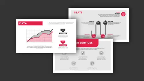
15:23 5Add Images & Graphics
06:41 6Page Transitions, Export PDF File & Presentation Mode
20:56 7Buttons & Forms
19:12 8Add Hyperlinks
03:19Lesson Info
Get Started With Page Setup
First off, when we go in and create a new file, and InDesign, we go into the New Document, and here's one of the great things about presentations. They don't have to be a particular size. We're not limited to a 10 by 3/8ths at seven and a quarter, whatever size horizontal. We can have any size, any format that we want. And, normally we do a horizontal format simply because that's gonna fit most screens and monitors. But we're not limited to eight and 1/2 by 11. If you have a presentation that requires wider images or graphics or charts, we can go in and we can create a different size page in the presentation, and not all the pages have to be the same size. So as we go in and we create a new document, we have different presets here in the start-up screen. We've got Print, we've got Web, and we have Mobile. Now, when you go through, if you want to go ahead and create a very universal presentation, we can stick with the print side of things. And this doesn't mean that it's print only. It ...
means it's going to be based in inches which is what we're used to for measurement purposes. And as you see when we go under Print, there are several free templates that you can click on and use, and some of these will be presentations. So, this is all part of the Adobe stock program, but there's a lot of cool things that you can have access to if you want someplace to start. If we use the Web presets, this will go through and allow you to give some basic presets here if your web presentation is going to be specifically viewed on a monitor or say a tablet where you wanna be very specific in the size and aspect ratio. For the most part, if we go ahead and we use a print set-up, and we use letter size, or whatever size you want, this is going to work just fine. So, to start up the document, I'm going to start up My Document, going to have a letter, going to have it horizontal, and I'm going to click Create and here is my basic set-up for my page. Now, we can create anything that we want to on this page. So, here's a couple tips on how to get the most out of your layout. First and foremost, we don't have Clip art in here, and we don't have any type of assistance on copy, so I just can't grab something and have pre-made templates, with an InDesign. I have to open up a template to begin with and all those settings would be baked in. So, when I start up my document, I wanna go in, and I just wanna get a quick little grid structure going, so that I can actually control my layout very well. And then what I'm going to do from there, is I'm going to build on my pages, I'm gonna change items, and get multiple different pages so that each page of my presentation can have a particular look and feel, and have some continuity going through the entire file. So one of the very first things that I do, is I start off with my page, and I create a grid structure. And a grid structure is going to be used so I can lay these things out really easily. I'm just gonna give you a preview of what the grid structure is with the templates that I've created in here, so that we can create any type of layout. So you can see I've got several different slides or pages that I've created. And how do you go in and get everything to look just like it should? Well, it's this grid structure that I've created, and we're gonna do this and you can see this grid structure allows me to go in and line up all my content, based on this grid, so that it makes it very easy for me to plug and play in this file by simply snapping everything to this grid. And this grid happens to be locked in it's own layer so that it doesn't get in the way, and I can turn it off, but it's great for going in and referencing where I'm going to put my file together. And you can see, it makes life really easy. So that's what were gonna start off with is creating a grid structure. So I'm gonna go back to my new file that we have, and what I'd like to do is that I wanna build this grid structure so that it's available on every page as a reference. So the first thing I'm gonna do is jump over to my Pages panel, and I'm going to build my grid on the Master page; therefore, everything that I do is going to have this grid structure on it, so that I can go ahead and use this as a reference, and build everything with this template. So in my Pages panel, I'm going to double-click on the Master page icon, and that's gonna bring me to my Master page. If you're not sure if you're on your master page, on the left-hand lower side of your InDesign document, there's a drop-down menu that will show you when we are on the Master page. So, I'm gonna jump over to my Layers Panel, and I'd like to put my grid structure on it's own layer. That way, I can just turn the layer on and off at any time and it doesn't interfere with my building of the file, but it's a really quick on and off switch, so I can see it as a reference and then I can turn it off when I don't need it. So, I'm gonna go to my Layers panel, and we're gonna click on the New Layer icon. I'm gonna double-click on the Name of that layer, and I'm gonna call this "My Grid" and click OK. So, it's now selected, gonna back to my Pages panel, I'm on my Master page, and I'd like to create a grid. Easiest way to create a grid is to use your rectangle tool, and draw on the entire document from margin-to-margin. And then, while you're holding your mouse down, don't let go of the mouse key or else you'll have to start all over, you're gonna to use your up arrow, and you're going tp create rows, and use your right arrow to create columns. Now, my rule of thumb is, when I'm building a grid structure here, you can see I've got six columns here, so this is gonna give me six separate columns or three sets of two columns. If I use an odd number of columns, this will give me an odd number of columns, so that I can create like two, two, and three width, or I can go a two, three, two, so kinda create a little bit difference balance in here. When I create that grid structure and I like what I've done, I can let go, and this my entire grid structure. Now, I wanna put a slight border around my grid structure just so I can see it; and therefore, I can see that in the background, so I'm going to go to my Stroke Panel. I'm going to put a black stroke around there, but I'm gonna cut it way back so that the black isn't intense black, so it's gonna interfere with my layout, so I'm going to do the black, and I'm going to do a tint of 20% around that border. And if I click off here, you can see that I will have, I go into preview mode by clicking "W". There's my grid structure, it's on my Master page, but it's also controlled by my layer. And I can turn that on and turn that off, so I can use that as reference for building my file. So, there it is on my Master page. I can double-click back on my first page here to get back into my layout, and my layer, I'm going to put all my content on my layer one here, which is going to be my presentation layer, and I'm going to lock my grid layer so that I don't accidentally put anything on there. Because I want that grid layer to be on top, so when I add pictures or color, that grid layer is still available for me to use as a reference, but I can also turn it off and not turn off anything else on that grid structure. So, with my presentation layer selected, this is where I'm gonna build all of my content. And, because my grid structure is based on my Master page here, every page that I add to the document is going to have this grid structure on it, so that I always have this reference. So, the great part of using this grid structure is if I do go in and I do use my Type tool, which I'm going to need to go ahead and create text containers, because I have my grid structure here, you can see that my content or whatever I draw, will always snap to that grid structure if I have my Smart Guides turned on. Now Smart Guides are turned on automatically, but if your Smart Guides aren't on, it's something that you definitely want to have. So if you go under your View Menu, under Grids and Guides, your Smart Guides are something you definitely wanna have on because that snap affect is going to be very, very helpful for you to be able to use this. Now at any point, if you'd like to edit your grid structure here, you can go back to your Master page, and you'll have to unlock your grid layer here as well, if I go back to my Master page and I don't like my grid structure, you can change it at any time. Now, in order to edit this, I"ll have to go back in and redraw it, because the way I put this together is that once I draw it, it just becomes basic shapes. So, I could go in here, and I could make it smaller or narrower, which is going to change it everywhere. So, if you'd like to create a new grid structure, you certainly can, or you can go in and simply use the one that you have, manipulate it on the Master page, and there you go. So this is the best way to go ahead and get started, and now you can start putting your content in. With this grid structure, now I have the ability to put any content wherever I'd like. Now generally when we have slides, we wanna go ahead and have our headline or our subhead, we wanna have our master slide, we wanna have page numbers on here or any other standing elements. And this Master page is a great place to go ahead and put them on because then they will appear on every single page. So, one of the things that I could do, is if I do want a logo or an icon, or color bar or text containers here in a certain area, I can put those on a Master page in order for me to have them be on every single page. I can also set up my text, so that my text is on the Master page, so that I don't have to keep picking the font and setting this content up. So what I'm gonna do is that I'm gonna set up a lot of information on the Master page as my template. This way, whenever I need another slide, I don't have to keep picking a different font, adding colors to the boxes and so on, everything's gonna be done on the Master page. So, if I go and double-click on the Master page here, anything that I build here is going to be on every page in the document. Now I can create as many Master pages as I want, which is the great thing about this, and I can also insert them at any point along the run. If I want five different Master pages for five different layouts, I can. I can have three of one, two of another, and rearrange them throughout the entire presentation. So starting off with the basic layout here, if I go onto my Master page and I would like to put content in here, I'm going to start off, and I'm going to make sure that I'm on the right layer, my presentation layer, make sure I'm on my Master page. I'd like to create a header on my file, so that is going to be at the head of every one of my pages, and I'm gonna pick a color that I'd like to put in here, and I'm going to go ahead and we're gonna make it an orange here. So now we're going to dial that in, and we're gonna make that an orange and I can go ahead and put my container in there. I'd like to round the corners a bit because It's nice to have rounded corners. Go into the object, corner options, and I'm going to round the lower corners. And I'm going to unlength this, that's unlength right there. I can set my corners here, so that I can have some nice rounded corners on my file and there's my header right there. I'd like to go ahead and put in some other elements here. I'm gonna put a line all away across the top here, and I'm going to beef that up a little bit, and I'm going to make that black, but I don't want solid black. I'm going to go ahead and use gray. Just a word of advice, when you use solid black, it tends to look a little bit harsh, and even with text, it's great to be able to go in and use black, but use it as a tint of black. It just makes the presentation look that much nicer, and a little bit more sophisticated than using 100% black. I tend to use 80% black for my headlines and my body copy, it's just a little bit softer, and looks a little bit better. I'm gonna go in and duplicate this line so that it appears on the top and the bottom, kind of giving me an area for me to go ahead and put my content in. And because I do this on the Master page, it's on every single page. I may wanna go in and put a logo or a picture, something like that. I certainly can. Automatic page numbering, I wanna put that in, too. So, in order to do the automatic page numbering, I'm gonna put this in on the Master page, and the number requires a text container, so I'm going to draw on the Master page, I'm gonna put my text container here, and insert an automatic page number. Once I draw my text container, I go into the type menu. I insert a special character, and a page number as a marker. I'm gonna insert the current page number, and it inserts a letter which seems quite ridiculous simply because it's like how does a page number become a letter? Well, it's because we're on our A-Master page so when we insert an automatic page number, it reflects the Master page letter. You can't just type in the letter A or the letter A will show up on every page. When I select the letter here, I'm going to choose a font that is going to be specific to what I want, and so I'm going to choose from my font menu and I'll put something in here that's gonna work great. Now one of the things that you do run into, is you run into the issue of font usage when you deliver this to somebody else or making a template available. So, it's not a bad idea to go ahead and use Typekit fonts because then anybody who's using the creative cloud can synchronize their typeface with the typeface that you're using. So, Typekit fonts show up in your font menu with this little TK right here, and if you want to go ahead and specify Typekit fonts, you can always go into your drop-down menu in your type, click the add fonts from Typekit, and it's gonna launch the web browser and you can go in and you can pick from a whole slew of fonts that are available to you. And this is all part of a login to the creative cloud which is what you do for all of your Adobe software, and you go in and you can highlight any font that you'd like, and you can load this in; and therefore, when this presentation gets to somebody else, all they have to do is log in and synchronize the font, and that font is available. If you pick a specific font on your computer, the end user may not have that file, so when you go in, it's not a bad idea to use a Typekit font. I'm gonna choose a font here that I've used before, and this is going to be my page number. I'm gonna make that bold, and I'm going to put that down on the lower right-hand side. I'm at the bottom of my container, so I put that at the bottom. I'm going to go under Object, Text-frame options, and I'm going to have the type sit at the bottom of my container, and I'm not gonna make this solid black, I'm going to make this about 80% black just so it's not as harsh of a page number right there.
Class Materials
Bonus Materials with Purchase
Ratings and Reviews
Patricia Green
I've taken several Creative Live courses taught by Jason Hoppe. In fact, I would say he's my favorite Creative Live instructor. This course is just as successful as his other courses. I learned a lot about InDesign and presentations in general. I wish the tech was flawless in the video, but sometimes that stuff is unpredictable. He did present some solutions. Overall, I was very pleased with this class and will take more from him in the future. I highly recommend this class.
marianne
Jason Hoppe is a fabulous instructor. I have been designing for many years and I learned so much; from a time-saving way to make a grid to creating animated InDesign files that can be published online with automatic updates. Excellent, clear instructions and valuable methods for creating files. You will be so glad you ordered this class.
carlos Álvarez
So great, athough the instructor should have included icons and PNGs for the student to follow along the class easily and not just the InDesign templates. Notwithstanding, really useful tips, tricks and advices to boost your InDesign knwoledge. Thanks!