Completing Marketing Materials with Photos, Graphics and Text
Lesson 9 from: Designing Marketing Graphics in Photoshop and IllustratorPaul Trani
Completing Marketing Materials with Photos, Graphics and Text
Lesson 9 from: Designing Marketing Graphics in Photoshop and IllustratorPaul Trani
Lesson Info
9. Completing Marketing Materials with Photos, Graphics and Text
Lessons
Class Introduction: Design Fundamentals
07:33 2Creating Graphics in Illustrator
13:12 3Using Type in Illustrator
16:43 4Creating a Branding Library
08:17 5Creating Effective Marketing Graphics
06:03 6Global Image Adjustments
11:13 7Touching Up Photos in Photoshop
08:12 8Selecting and Removing Backgrounds
06:59Lesson Info
Completing Marketing Materials with Photos, Graphics and Text
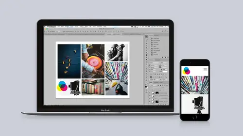
Now, this is the fun part where we start bringing it all together into Photoshop. So, we're gonna have imagery, text, the colors to make these marketing materials. Here's my image. Let's keep in mind, everything is on separate layers. So, I have the hand, and then the body, and then the background, and I wanna start integrating some type. So, starting out with the text tool right over here, I can click, start typing in. I can see, oh, guess what, this is awfully large. I can come up here to my options bar at the top, and I can select from this dropdown. Sure, that works. Or you can actually click and drag next to any number, and these are like scrubby numbers, so I can scrub it that way. So, that's what I wanna do. I can do something like that. "A Classic." And, at this point, I actually wanna use that text, that character style that I defined actually in Illustrator. So, with this text selected, I can go to my handy libraries panel. Going down here to character styles. Sure enough, ju...
st clicking on it, it changes. This makes it really easy for me. I can make further adjustments with it. But, since I have everything sort of on separate layers, I can take this "A Classic" and bring that down. And sure enough, I can kinda put it back there. From there, I actually might want to make a couple more adjustments. Let's actually just work on some of the spacing in between the letters. And I can also size it down by doing command t for transform. So, that's what I'm doing, starting to layer this together, "A Classic," clicking again. "Since," let's bring that in front of the body like that. I don't know, I'll just be working with this a little bit. Lastly, "Right Now." So, you can start to see how this is flowing together. I want this to be in front of everything, and this text, ultimately, all of these layers need to be a little smaller, but this is when we get down to just really finessing this design. I'm holding down just the command key to select them all, and I can transform, command t, to scale them all down, just getting a nice composition, playing with some of this text, maybe moving that down there, and making for a unique design, 'cause what I wanna do is I wanna be able to kind of surprise or delight the viewer, essentially. Since this is a square photo, it's ultimately going to be like an Instagram post in this case. Scaling that down just like that. Some more little adjustments. And, just like I did in Illustrator earlier, if I decide I wanna add any additional glyphs or alternates, in this case, I can take a look right over here. As I select the W, I can add that curl. Same thing for that C. As I select it, you can see, I'm adding, again, just alternates for these individuals, making something a little bit more unique. So, that looks pretty good so far. And I'll just scale this all down a little bit more. And that's pretty good for this design. I do wanna make sure I have my branding on this image, so right over here, you can see that I have this small white logo. I can drag that in. This was made in Illustrator. Drop it right down in here in the corner, shrinking it accordingly like that. Command zero will fit it all into place. Lastly, what I wanna do is I wanna color treat this, like I did earlier as well, selecting the adjustments option down here, going to, say for instance, color lookup, and picking the color lookup that I like, which will be one of these. I'll just kind of click through some of these. But basically, I think I'm gonna go with drop blues, so kind of dropping out the blues and just kind of changing the color a little bit. I can get more drastic with this. Notice how I actually have these colors in here that I might potentially wanna use as well. So, let's take a look at adding colors, even. So, what if I wanted to add this specific pink, or even do a transition? There's a couple different things we can do here, 'cause really, I can select any one of these colors. This says "create new layer." I can select a color, right, and this is the color that I've selected, is that teal color. I can actually use that teal color throughout the whole design. So, go to fill, and I can fill it with the foreground color. Right, so check this out. Since we're combining all this together, I can use the color that I've picked from my color themes, and this gets to be really exciting as well, so check this out. I can go beyond, say, color lookups, and add layer blend modes. Right over here, with that layer selected, I can change the blend mode to say, for instance, overlay. Since this is a branding color, I can give it a tint of that color, as you can see. And I can click through all of these as I start to select different ones. So, if I happen to like this one, I can maybe play with the opacity and get something that I like that meets sort of my brand requirements. So, this one looks pretty good. Notice how it's already square, so I could just go ahead and, you know, save it out as a JPEG if I want to. But let's kinda take a look at how I got there. So, here's an earlier photo. I can crop any photo and, of course, make it square using the crop tool. So, focusing on this second one, I can change the ratio right over here, one to one square, we'll make it that size. But check this out. Right up here at the top, this is what I wanna do, right up here, this little trashcan, it determines whether the data will be lost. If you're cropping it out, is that data lost? I'm like, no, I don't want to do that, so I'm gonna uncheck that. That means I'm gonna still have access to those individual pixels, if you will. From there, I have this square photo. I could go simpler with this. Maybe I don't wanna do a lot of layering with text. All I really wanna do is just drop in the logo in the background. I'm gonna go ahead and select this small logo black. Since this was made in Illustrator, I can size this up all I want, and position it right there. So, it's kinda like he's looking at it, but guess what? It's gonna be behind him. So, just like I did earlier, I can select this layer, do a focus area select, it's gonna automatically select that focus area range. Let's just make sure it gets more of those pixels. And it's gonna output a new layer with a layer mask. All I'm really concerned about is that side of his face. Clicking okay, my two layers, dropping that back down there, and now I have that kind of behind his head. Guess what? Just like I did with one solid color, I can start to go through the different blend modes in here as well. Maybe I change that to overlay, and now we have a nice hint of that logo in the background. From here, I could do more color adjustments, but I have this set up to the Instagram size, if you will, the square size, and then I can just do a save as. Sure enough, as a JPEG in this case, making sure it's high quality to post to social media. As I save that out, that concludes, really, making marketing materials in Photoshop. In Illustrator, you can see these final composited shots, as well as this library that I can take with me. It's always gonna be available to me in Illustrator and Photoshop for me making further graphics as well. So, I hope you enjoyed watching. Thank you so much.
Ratings and Reviews
Tomas Verver
It's a fun beginner class/project. I already has advanced experience in the programs, but as a part of Creative Pass it's still an intresting/fun watch. I played on double speed:) because the information was not really new. Still you see the teacher is engaging and inspiring.
Christine Wigaard
This was a great and informative class. Even as an experienced user I got great value out of this!
Lacey Heward
This was by far my most helpful class for graphic design!! I've watched so many classes, and even went to school and didn't learn the tricky tools in Illustrator and Photoshop I just learned today! And it was so short!! I didn't have to watch hours of tutorials to learn it! In one day I already feel like a master designer! Thank you, Paul, for sharing your expertise, tools, and tricks! You solved so many problems for me today! :-)
Student Work
Related Classes
Adobe Photoshop