How to Drape on Pattern Mock Ups
Lesson 26 from: Design Surface Patterns From ScratchBonnie Christine
How to Drape on Pattern Mock Ups
Lesson 26 from: Design Surface Patterns From ScratchBonnie Christine
Lessons
Day 1
1The World of Surface Pattern Design
35:40 2Living Your Creative Dream
22:15 3Introduction to Illustrator
27:16 4Basic Tools: Pen, Text, & Blob
22:28 5Color & Function Tools
32:27 6More Tools: Rotate, Duplicate, & Replicate
19:16 7Custom Color Palettes
18:49Essential Tools for Pattern Making
41:59 9Tools for Sketching Inspiration
27:50 10Inspire & Nourish Your Creativity
34:55Day 2
11Creating Objects from Scanned Sketches
17:04 12Tracing & Coloring Sketches
30:46 13Tracing & Coloring with the Pen Tool
37:44 14Working from a Photograph w/ Live Trace
36:24 15Hand Tracing Over Photographs
31:27 16Building Pattern Tiles in Illustrator
21:13 17Adding Textures to Illustrations
28:52 18An Unrefined Look in Illustrator
26:10 19Typography & Students Homework
21:39 20Legality of Design w/ Annie Tunheim
27:33 21Trademark & Licensing w/ Annie Tunheim
27:50Day 3
22How to Design Repeating Patterns
18:52 23Complex Cluster Patterns - Part 1
27:38 24Complex Cluster Patterns - Part 2
28:35 25Getting Noticed: Portfolios & Trade Shows
39:43 26How to Drape on Pattern Mock Ups
19:07 27Fun Stuff: Desktop Backgrounds
19:42 28Fun Stuff: Gift Cards & Tags
29:05 29Fun Stuff: Clip Art & Shipping Labels
28:17 30Spoonflower: Stephen Fraser
29:04 31Uploading Patterns for Web Printing
20:29Lesson Info
How to Drape on Pattern Mock Ups
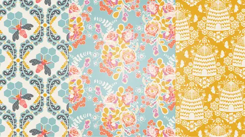
I want to go ahead and jump right into my portfolio and show it to you. I can also explain to you some of the feedback that I got. This is my portfolio. I mentioned that I took a bookbinding class. I'm not going to go into great depths on how to bookbind. This is called the drum leaf bookbinding method. What that does is allow the pages to lay flat when you open it, so this is one giant piece of paper here. It allows the book to lay flat when somebody's looking at it which is really nice for artwork. I'll just go through the pages. Like I said, this is about three years old and it's kinda yellowed. It is what it is. I'm going to show it to you. I put a little envelope on the inside cover because I was including cards for the company that I was sending it to, just a little hello. I knew two people were looking at it. This was my intro page with my logo on it. I mentioned I kinda wanted it to be a book, and so I included a table of contents. I want to say really quickly too that this is ...
just book board that I covered with linen that I had ran through my printer. I didn't have any fabric printed at the time. You could also use Spoonflower, which we're going to be talking about later today. I ran one of my designs through my printer and covered it using that. The pages I printed myself using Epson Premium Presentation paper. This is all in the industry resources pdf kit that comes with RSVP or Anytime access to this course. My printer, the ink that I use, the paper that I use, is all in the industry resources pdf available for this course. So table of contents. This was my online presence page. This is where I described what my blog was about, how many followers I had at the time, what my webpage looked like and the major online features and magazine features that I had had at the point of sending this book in. This is giving them a way to get a glimpse at what I'm doing, even though they may not be sitting in front of their computer and able to head on over to my website. Plus you can find all this information on my website, followers and things like that, but they would have had to open up my Twitter account, Facebook account to see all that. It's called At a Glance, I wanted to let them see what I'm doing online, what I have to bring to the table at a glance. This is funny because none of these are in production like they are right now, but at the time, I called this one Naturally Sweet, I believe. This did get turned into a print. I didn't show you but my first fabric collection was called Reminisce, and this first pattern collection pulled a lot from it from here. I give an intro, this is Naturally Sweet, I have a paragraph about it which is much like what I just showed you. Then I go right into the pattern collection, so I think I have 12 patterns on this page that I had made. One of the biggest feedbacks that I got was chaos. Does this look a little chaotic. It's very busy, it's lots of main prints. It's maybe too many bright colors or maybe the same color palette throughout, so what I have learned over the years is to tone some down, simplify some prints, and make sure that I also have cohesiveness in hue, so some lighter prints, some darker prints, so that you have a lot of contrast. That is what I was working on or didn't know how to really work on when I created this portfolio. This is the same collection in a different color story. I suggest offering two color stories of your work when you build a portfolio. This will really give people a glimpse into how you can put color together and that you're aware that a lot of times, you'll have to recolor your artwork. This was the next pattern collection, the Honey Pot. This turned into be much of Sweet as Honey. Things evolve over time. It's probably important to be willing to change as well, and be able to kind of mold your ideas and your themes and your names with things. I believe I just did one color story in the Honey Pot. Basics I did, I'm not sure that I would recommend that you do this, but I did a line of basics because I wanted companies to know that I was aware that we needed some simpler patterns and the idea behind the basics collection was that you could take anything off this page and put it with any collection that I put out. I'm not sure that it really was important but I did it. The next thing I did was include samples and examples. I draped my patterns onto some examples so that they could really start seeing my work on products, and that is what we're going to do here in just a minute. I draped my patterns on iPhone cases and pillows and all kinds of stuff, just so they could start getting a glimpse as to what this could look like on a product. Next, I wanted to show them a little bit into my working method, so I took a picture of myself sitting at my computer. This envelope, don't think it's in there anymore, had a literal page of my sketchbook folded up inside that they could take out and look. These are pictures of my process, so I wanted them to know that sometimes I work from photographs, sometimes I work from hand sketches, and see a little bit into my process. The last page is just telling my story, a little bit of why I want to do this, why I'm passionate about patterns, and then my contact information on the back. This is where they can call me, find me on Facebook, Twitter, that kind of thing, and some pictures of myself. Then a nice pattern on the back, and that's it. Your portfolio definitely does not have to look like that but I do suggest including at least two pattern collections well-rounded, with themes and stories and names. Let them get a glimpse into how you work. Drape your patterns on some products so they can see what that looks like. Give your contact information of course, and if you have an online following, it's huge, so be sure to include your online following with these companies. I want to go right into Illustrator and show you how to lay your patterns onto some mock-up images. Ready to do that? Sounds good. Okay, so these patterns are some of my patterns that I had made for Winged. I should let you know that they are out in the world on fabric and available and that kind of thing, but these are just the AI files. I'm going to use these to drape on my pattern mock-ups. You can use them in the same way. I just need to get them both on the same document. I'm gonna grab these six and copy and paste them over onto my pattern mock-ups Illustrator file. I should also just point out, we've been talking about Pantone colors and things like that. My pattern collection that I just imported in is all colored into Pantone colors. I don't have the Pantone color system installed on this computer, so I can't take you through it in-depth, but I just want to point out over here that these color chips have that triangle in the bottom right-hand corner, which means they are Pantone colors. If I click on one, instead of CMYK value up here, you're going to see what Pantone color it is. This is Pantone 14-0226. I could then come in my Pantone color book and find this color, 14-0226, which I'm not going to take the time to do now, but it would be somewhere in the green section. There's a guide in the back that makes that really easy. That's how we work from a book online to colors. I'll hop right back into Illustrator. I think I'll start with probably the simplest mock-up on this page is the cellphone case. I'm just going to select that and hide my edges by hitting command-H so you can really see what I'm doing. I am just going to use the eyedropper tool to grab one of my patterns and fill this case up with. The keyboard short-cut for that is I. I think I'll just do this green one because in fact, this is my cellphone case. I have this green pattern on it. That is as simple as it is. If you want to play with the scale or the movement of this pattern, all you have to do is click on the object, right-click, go to Transform and Scale. We can click over to transform patterns but not the object, and start playing with the scale of this, so if I take it down to 50%, you can see a little bit more of the pattern. If I took it up to say, 200%, you get this really big effect. I think I liked it around 50%. The other thing you can do is move the pattern within the case. In case you wanted, this seems kind of jumbled up here, if I wanted to bring it down here, it's under the same Transform under the right-click, and you're going to go to Move. You don't want to transform the object like we do when we build patterns, you want to transform the pattern. This kind of jumped to a random value but you can come in and edit that. I think that looks pretty nice. 50 vertical, we'll take it up, and I'm happy with that. You can also, I believe, if I scroll, yeah, if you just hold your mouse on top of this 50 points, you can use your mouse to scroll up and down. This is something I learned last week by accident I think, and really is nice. You can get your exact placement of the pattern that you want on your mock-up. I'll do the same thing with the pillows. These are just some pillowcases. I'll grab one and with the eyedropper tool, we can make it maybe this and this. You can see kinda instantly, it's going to bring your patterns to life and help people envision what this really looks like. I'm going to decrease the scale of these as well by going Transform, Scale. That already looks better. Let's see what 25, well not 5, it's way too small. Let's go 35, and I think that looks really nice. The pieces of pattern that you brought in, those are your pattern tiles? Those are my pattern tiles, and so I'm just going to hop right over to the triangle print that we made earlier today. I can draw a rectangle. It's already filled but if it wasn't, all you have to do is fill it with that. I can copy and paste it over here, and I'll use that for one. Oh look, it has that seam in it because that's what I was showing you guys. I think it's the one over. I think so too but I will just do this to make sure that we are good. This one should have no seam in it so we're good. I'm going to copy that and bring it right over to the pattern mock-up. I will use that and I'll stick it right up here and use it in just one second. The one thing I want to show you about this one is, the pillow is on a tilt and our pattern is not, so we can tilt our pattern. Right under Transform, and we'll go to Rotate. We don't want to rotate the object. We'll just start at zero so we know what we're doing, and I think I can scroll here too, and just kind of tilt that to where it makes sense, say right there. That looks really nice. I can fill these vases with this pattern that we just made. Just select 'em, hit the eyedropper tool, and do that. The other way to do this is that when you import a pattern, I'm going to make these a little bigger, see if I go to the flyout menu on the Swatches panel, I have small thumbnail view. You can go to large thumbnail view and really get to see what you're working with. The other way to do that is if you build in a pattern, this one automatically showed up in my swatches panel. If it doesn't, you can grab it from the fill box and drag and drop it to the Swatches panel. Then if you don't want to use the eyedropper tool, you can just use the Swatches panel like that. The eyedropper tool to me tends to be really easy. I want the colors out of this pattern that I've used in my Swatches panel, so that I can color these two black stripes. I'm going to select the pattern and add a new color group. I'm not going to name it, I'll just hit okay. That way I'll have those three colors, so can come in here and grab these two black stripes and either make them just teal or that peach color orange, which I think I like orange, and maybe don't even want it on there. We're just rolling through, I'll do the dress, because I think we're going to be able to kind of have fun with this. What I had to do is, this is all grouped together, so I'm going to just go into isolation mode. I just double-click on it until I can just get this one panel that I want to color. I needed to go into isolation mode one more time. Now I just have this one little panel selected and I can grab my eyedropper tool and come in and I think I'll use the bird print. I need to reduce the size of this print, but right now I'm just gonna fill it with that. If you don't want to go into isolation mode over and over again, you can just use your direct selection tool or the Y-arrow tool, by hitting A on your keyboard. You can just grab one section at a time. I think I want to make the dress this kind of dark, this is called Nesting Blooms. Then I can decrease the scale of these patterns, so I select it, you can kind of batch decrease the scale of patterns if you have more than one selected. Just Transform, Scale, that is already looking better but what if we take it down to 15% or 10%. I think maybe 15% looks more like what it would really look like if it was. I can change the color of these buttons to match the dress, so I just come in here with my direct selection tool, grab those and change 'em to maybe the dark color here. You can also change the color of this black outline. If I zoom way in, I might be able to grab the whole thing with my ... No I don't think I built it that way. To change the black outline, you can go into isolation mode and let's see what that does. That changes the whole dress. One more time. Just grab this black and what if I just delete it totally or change it to the dark color, which I think that's not what we want to do. I'll leave it black for now. The buttons disappeared too. Bring back the black buttons and change those dark, and we'll leave the lines black for now, but maybe I'll be able to show you later how to change those. We can change the color of the mannequin itself. Just something, I think black is so stark, like maybe just warm it a little bit with teal or maybe brown. You have something to say? So for the mock-up page that you did, it's nice that you already have them all sort of set up. You used the pen to create those objects? I did, I used the pen tool to create all of these objects. If you wanted to have anything you want me to throw a pattern on, if you wanted to create something yourself, just grab the pen tool and start drawing. If you're not sure how to do that, make sure to refer back to session one. We went over how to do the pen tool and do things like block a hole out of an object. You can do that with the pathfinder. I want to just quickly work with the purse really quick. I am going to grab the main body of the purse and fill it with this print right here. I know that this color is right here and my Swatches panel too, so I can color the black elements to match that as well. So why am I doing this? I'm going to scale this down. This is a great way to show the people that are maybe interested in your work, start helping them envision what your work is going to look like on a product. It's one thing to see a pattern, it's a whole 'nother thing to be able to see your pattern on an object, so it really helps people start seeing the ideas that you have behind your work and why they may work well in the industry.
Class Materials
bonus material with purchase
Ratings and Reviews
Emily Leggett
I am so glad I took the time to sit through all 3 days of this course. I have been to hour long classes that I can't wait to get out of and this one I sat in for 3 days and I am wishing it wasn't over. I take a lot of continuing education classes and am always trying to learn new things and I have to say this is by far the absolute most informative, educational, inspiring, and motivating classes I have ever taken. Bonnie Christine was an amazing teacher. She took the time to take us through all aspects of the process and even beyond showing us so many things that can be done with everything she taught us in this class. I think she did a great job with the class, was easy to follow and is someone I would love to learn from again. Great job on everything. I would recommend this class to anyone who wants to learn about surface pattern design and Illustrator. Great job to everyone involved in putting this course together!
a Creativelive Student
I'm about halfway through my first viewing of the course and I have to say, its been electrifying! There is so much quality information here, its an excellent starting point, and I do think I can start working towards a career in design now. It also makes me want to find more information and courses in the art and design area. Bonnie is such a joyful, honest and enthusiastic instructor and really, it feels like she';s hosting an amazing party for her friends. Thank you Bonnie for doing this course and thank you CreativeLive for pricing it so affordably
a Creativelive Student
Awesome awesome awesome course! Thank you Bonnie! Thank you Creative Live! I have learned so much... so much great information packed together in one class. I am so glad I bought the course so I can rewatch it any time I need to.