How to Design Process Page & Collections
Lesson 11 from: Design, Print, and Build Your PortfolioBonnie Christine
How to Design Process Page & Collections
Lesson 11 from: Design, Print, and Build Your PortfolioBonnie Christine
Lesson Info
11. How to Design Process Page & Collections
Lessons
Part 1
1The Importance of Having a Portfolio
09:03 2What to Include & Why
09:27 3How to Stand Out from the Crowd
10:59 4Having an Online Following Behind You
06:25 5How to Show Your Work & to Whom
15:47 6Gathering Inspiration
08:33 7How to Set Up Your Artboard
05:38How to Build Your Intro Page
09:12 9Build Your Table of Contents Page
10:05 10Creating Your Online Presence Page
11:12 11How to Design Process Page & Collections
21:01 12Build a Sample & Examples Page
07:12 13Create a Contact Page
17:30 14Printing Options & Digital Publishing
13:29 15Ready Your Supplies
05:09 16Going Over the Process
03:48 17Prepping Your Pages
09:09 18How to Build a Portfolio Cover with Fabric
42:13 19Add Final Touches on the Cover
07:19 20How to Stack & Bind Your Portfolio
08:41Part 2
Part 3
Lesson Info
How to Design Process Page & Collections
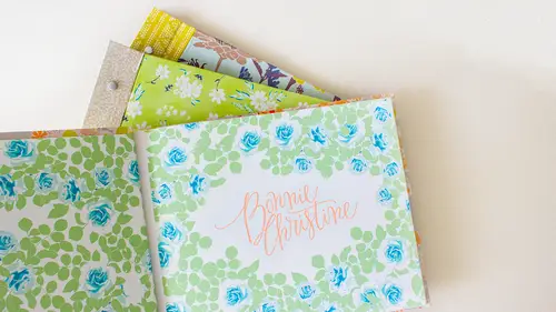
The next page that I want to design is something that shows my process, so for me, I'm going to include some sketches and because we're working an illustrator, I have they were pen in paper sketches that I've scanned in using the live trace tool. S o, I'm gonna put the vector rise version of my sketches over just so they can see what I'm doing, but I do suggest, including some kind of a process page, whether it be just however you work in your medium, whether it be painting, are or whatever, but give them a glance, a glimpse into how you work. So these are the sketches they're just in black and white, and I think they give kind of a nice way of seeing what an initial sketch of mine would look like before they get put into repeat and colored in the whole nine yards, so this would be another great place to literally attached in my book pen and paper sketches to so I'll grab these and copy and paste them over, uh, over to this document. So I'm just going to title this page again. I believ...
e that this tag is in a different placement from this one on the page, because this has a border, but if I don't have a border, I want to keep these banners kind of in the same place on each page so that they they flipped nicely so the easiest way to do that is to grab both of those hit command see and then if I select this art board that I'm working on um I believe if I hit command f that's that's paste in front command f you can also find that under edit you can paste or you can paste in front you can paste him and back you can also pay something on every art board so if your have your logo and one place on every single art board then put use this command paste on all our words and they'll be exactly lined up on all of them that way I can just change the title of this but I know that the banner is in the same place another thing that I have just learned by trial and error is not too you can but you should just think about it ahead of time I don't include page numbers I used to on my table of contents have page numbers and then all the pages numbered that this really limits you when you have any work that you want to add because all your page numbers get messed up so I omitted page numbers and ah and don't do that anymore so um just depends on if you want to keep your is highly editable or not so if I zoom back in this page is going to be titled sketch this sketch is so I think the the lengths of my banners are going to be different on every page but I don't need this gray background so I'm going to select it and delete it and then bring this out and just ah with my white arrow toole grab those two anchor points and bring over to the left um and all I want to show on this page is are a couple of these so I'm just going to arrange them around I would hide my edges so that you can see that how I'm placing these and I'm just using the scale and rotate tools in order to get these placed where I want these are some trees and then finally this um floral motif down here okay, so that just kind of shows some of my process the next the thing I want to get into is showing kind of the body of my work and a couple of collections so the way I like to show collection is with I always have a logo for collection and a story to go with it so I wantto first show the logo and the story and then all show the actual patterns so for this kind of miniature portfolio I am showing a collection that I've made called winged it's about butterflies and flowers of course and things of that nature, so I'll grab all of that. Um, okay, I'll grab all of that and also, uh, I'll start with that copy that and paste it over now these squares I'm not going to use to the next page, but I just brought one head and brought them over, so I'm gonna I'm gonna put them there. I do not need this gray background, so the first thing I want to include is, uh, the logo so I'm gonna put that there and increase the size here is something like that. And then I have my story written out about this right here already typed it because I don't think you guys need to see me type a bunch just use the textile, but this is a good eso when I copied that it's really long and like runs off the page, so a great way to get past that is to use a text box. So in order to do that, you can you can actually use any shaped like a star or circle or anything, but I grabbed the rectangle tool and I can just draw in the area where I want this type to go, and if I select t for the type tool now, you can see that when I start to hover over it, it changes tio that type symbol which will turn it into a text box which means now if I paste that over it's all confined within that box um so I could have hit enter you know and done this kind of a long way but this allows me teo um if I have it all selected I can increase in size and it all stays within that um within that uh text area and the other thing I want to do is align it to center so you should have your paragraph um options up here if you're working with text or type you'll have this available to you at the top and I just wanted a line center so that introduces my collection on a really simple I think clean way it just introduces the title of the collection and the story behind it and then I will on the next page is they open it have the entire collection so I'm going to zoom out and I'm just working right down my board here I'm going to use these over here s o the options for displaying this are totally limitless whatever you think fits your style than that's what I would do but I'll show you I have ten prints so in order to fit those on here I am just going to really roughly not pay attention too much too my dimensions right now I'm gonna start with a rectangle and duplicate that across the board so I'll grab it with the black arrow tool and I hold my shift key down to keep it in line directly horizontal and it snaps to the edge there because I have my smart guys on so if I hit optioned, it duplicates that for me um and then one of my favorite illustrator tricks is command the duplicates blacks at the last action that you just did um so I can hit command he twice and that will um replicate the last action I did it identically so I came up a little short all I need to do is select those four and with the scale tool I'll hit scale and you can see that it puts thes scale tal right in the middle that doesn't really help me because if I go to scale it's going to scale up from the middle so what I want to do is scale it from this left access right there so I'll drop my point it could be anywhere on that line and then if I hold my shift key out, I can just drag to the right until it hits the border there um okay, so that's four I need six more, so I think I'm going to do ah to here in the middle because generally I'm just lining that up with this line right here and I'll duplicate it to the other side I do that exactly if I zoom in I have got to scale this one a little bit you can see I didn't get it all the way there um generally I'll have main prince in a collection and then coordinate prince and so I might want my main prints to have a larger area and then I can grab these top four and bring them to the bottom so that gives me eight uh you can see I ran off so you know, none of this matters because they're just solid colors right now I can just select everything, hit the scale tool and then scale up from this point up here and just take it straight up after the art board ok? So then I have ten places to put my my working so you can create whatever you you want to create that you feel like best showcases your work um so in order to start feeling these, I will grab them and just start using the eyedropper tool and the patterns that I copied over to fill them up. So if I have the first one selected, I can grab the eyedropper tool and hit the first one to get that they're, um one other thing that's ah kind of a cool tool and illustrator is that if you're using a tool and you need to switch back and forth between a narrow tool, you can hold down the command key and it will take you temporarily back to either the black or the white arrow tool whichever the last one is that you used so I last used the black arrow tool which will let me come in and click on this box to select it so if I hadn't have done that and I came over here that I would have changed my box back to gray which is not what I wanted to do so I have the eyedropper tool selected I want to grab the black air tools I hold down command make my next selection and when I release it it automatically jumps to move back to the eyedropper tool and that works with any of the tools and then either the black or white hair a tool that you last used so that allows you to like very quickly jump back and forth to fill these in just by hitting the command key um of course you can manually come over and switch to if if it doesn't come natural to you so if I grab this center one I'm gonna fill it with my butterfly print here and this one I want to fill in with this floor print ah and just because well I think I'll leave it that's kind of a small scale but it shows everything so I think I'll leave it that way so I have four more to fill in here we'll go this swan ah, I think those are two two similar so I'm going to put that one over here and then I can do something that has more contrast on that part like this okay, so that puts my ten patterns nicely displayed I can delete these down here and each of these also didn't mention this but all of these you can probably hardly tell it but if I click on it you can see that they already have a three point stroke around them in white which gives them a border so that carried over with the eyedropper tool so if I select all these on dh hide my edges you can see what it would look like if I didn't have a border they be butted right up against each other which is fine but I I like a little bit of a break so I put a white stroke around each of them uh uh just in white so ok, next I'll just sleep that um yeah, regarding the scale when you because I know those are not all you must have a larger prints that I mean there to scale or their scale. So and how does that work for a portfolio then? Is that yeah, so this is just if you're surface pattern designer and you have patterns you're working with like this, you kind of just have to the side I have and I don't have it here in my first portfolio that I showed shipping on the first segment I scaled everything to fifty percent and I put a little box and corner that said scale fifty percent um I have since learned that the scale really it doesn't matter yet it matters right before you go to print I mean it's very easy to change the scale you know idea right click and say change the scale so personally I feel like it's more important this stage to show the full repeat so that they get a sense of the pattern however you do want it to look like a cohesive collection that you do have larger and smaller scales so like this butterfly print in reality um it does like it does exist on fabric I don't have it with me and so on fabric it's a much larger scale then you see here but if I took this I mean, you know what I'm you know I mean if I took this the actual scale is probably something like that berm or if I took it up the actual scale they have no idea what this pattern actually looks like, right? Do you have a big piece of paper to put in for for you so you just need to decide how important you think that is for who's viewing it and if you want I've also um once I also did it this way, and then included like a pack of three by five. Or maybe they were there five by seven cards that were at one hundred percent. So the they were all too big to actually see. But at least they could see that I have given a lot of thought to the scale and that they do. I do have larger and smaller scales. Um, so it's, always a balance whether you want them to see the full repeat or you want them to see what scale you envision this ad, but technically speaking, if they want that pattern, they'll know that they can request it in any scale that they want. So is it all to the same scale? This one is not okay. I have ah, this in particular. One is not so someone might be fifty percent. Some might be twenty five. Yeah, ok, I'm not saying that. I recommend that, but ok, mine right here, all in line, because I tend to move them around so much. But like I said, I did do one where everything was twenty five percent or everything was fifty percent so that they did get a sense for exactly what the ratio was between the prints. So probably it's probably good if they're going to do your portfolio to actually know what skill everything is because sometimes I judge things around like all nineteen percent that looks great, but in all reality I don't know what it is offhand but a nice person and l same scale on you could say that's twenty five percent of what it what it does primarily is left the end viewer know that you're in that mindset that he no scales important you've given thought to smaller and larger scales because a complete collection will have small, medium and large scales. I'm so so yeah, it's definitely important to let them know that you're in that mindset and, you know, you just have to decide exactly how do you want to present it, whether you want it probably probably putting everything at a particular percentage is it is a good idea, like everything is thirty percent ok saying that someone it's a relief, actually, yeah, it really is. And mines all over the place first time, right? It's beautiful. So s o the next thing you might want to do is, um, if you have it like, this is the only collection I'm gonna build out right now, but I always do two different color stories in any given collection, so I name each color story, so, um in my in my print portfolio I have at I'll just do it here I've added a little tag not really banner because I don't want to take up too much space but I'll add a tag here ah I don't want the see I wanted to be cream so I'll throw this trick at you two I want access to the colors that I've used in this pattern, so the quickest way to gain access to those is to have its selected and over in your swatches panel you can select new color group and you can name it if you want you don't have to and that has put all the colors that you have selected down there this is really what I was looking for if you scroll to the bottom it's also right there in this folder, says new color group um so I just grabbed all the colors that I used in that pattern really easily and I want a color this phil and with the cream and I wanted to have no stroke so you can either select this stroke or hit x on your keyboard to toggle in between stroke and filled and I'll just uh so like none right there so that gives me like a little tag or a little tab and the name of this color way is northern migration so let me zoom out more because I want it to be I wanted to be champagnes and limousines I keep using the eyedropper tool but uh you know, you should also know that like the first time when you don't have something already built in you just come up to the character panel and all your fonts are selected right here so right now it's currently baskerville aiken scroll down and select champagne and limousines regular and that has changed into that. I like using the eyedropper tool because I have I have already set like the kern ing and the color so you could if you watch down here if I select this up here you can see it just jumps toe the same style that I'm using throughout so remains cohesive but you can always go go up and use the other one too. So what I want to do is just turn this up on its side so use the rotate tool and hold this shift key down to keep it at a perfect ninety degree angle and slide it down right there. So that way I have that labeled another thing um that I sometimes dio like each of these patterns also have a name so you can come in and add numbers or names or anything in the in a similar format if you want okay, we're making progress where have we are on our way to building a many portfolio? Andi I think I have to pages left. So I didn't even plan that. But that works that well.
Class Materials
Bonus Materials
Bonus Materials
Ratings and Reviews
user-d55306
Bonnie, I want to give a super big Thank You! You have helped change my life. I was recently laid off from my full time job. Due to your courses, I have dedicated my time to continue designing. You have helped my heart come out on the pages. Thank you sooooo much! :) thankful & very happy, Dawn Stratchko https://www.behance.net/dawnstrat5b137
KarenEm
I thought this class was engaging and informative. Bonnie Christine has such a natural way of presenting the information and never seems to lose her concentration. I really wanted to learn more about how to put together a professional but handmade portfolio and that is what you get. Thanks for the great class!
a Creativelive Student
Absolutely loved this course! I learned so much and feel confident now on how to present my company in a consistent and professional way.