Lesson Info
1. Steven Heller Interview
Lessons
Steven Heller Interview
08:40Lesson Info
Steven Heller Interview
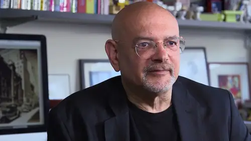
My name is steven heller, I am design writer, researcher, editor, I co chair, the designer as author and entrepreneur, department of the school of visual arts. I've written, edited, co edited, co wrote around one hundred seventy books designers today, uh, need to be literate. Literacy is paramount in any field, whether you're literate about plumbing supplies or literate about art supplies or literate about art, history or even literate about engineering history, you have to know what came before. You have to know what worked and why it worked, and that way you understand what you are doing or what wheels you're trying to reinvent. What is the criteria for a favorite logo? Is that the way it looks? Is it the way it functions and the environment is that the variations that it can be put through there? All sorts of criteria for talking about a logan when you do one hundred seventy books it's hard to remember all of them I'm proud of the poll rand book I'm proud of the alvin lusting biogra...
phy that I did with lane listed cohen I'm proud of iron fist spreading a totalitarian state, and I'm proud of mayors to emigrate avant garde magazines of the twentieth century, those air very key for me, but the one, I think, that or the two that I think that are most useful to design students are on different ends of the spectrum. One is called becoming a graphic and digital designer, which just came out in its fifth edition, which introduces people to the field. And it said five editions, because the field has changed so radically over the course of fifteen years that it's been out. So I think, that's, one that I always recommend to students who don't have a grounding and design fields. The other is one hundred ideas that changed graphic design, which I did with very meekly in, and that seems to be a very popular book, because it deals conceptually with what design is about paul rand was what we now call a mid century modernist designer. He was an advertising designer, book and book jacket designer on ultimately a corporate designer who brought to life a number of very important industrial logos on identity systems at a time when they were just burgeoning as international companies. When polar and began doing logos, he was brought into ibm. Now ibm had an identity. It was a globe with the letters ibm set in stymied, bold paul rand was asked to come in and refresh the look, which meant taking out the globe on doing something typographic lee that would make it look like there was a change, but not make it look like there was a revolution and what rand was really good at was understanding the parameters of a problem he knew that if you change something to radically it won't be accepted by either the consumer or management he understood that part of business and he understood that commercial art is he liked to call it was there in service to business, but it was there in service in such a way that it enhanced the business it offered information it offered inspiration that business didn't have on its own. The next logo was an interesting problem for rand because he didn't know what the product really wass and he made a deal with steve jobs who was starting this company after he was ousted from apple the first time that he would do one uh design idea and if he didn't like it that's fine and if he did like it he would carry it through so he created this booklet and rand was known for creating these pitches that would replace his presence in any board room he hated going in and selling his own work so he would create a script basically that others could follow well, this time he created a booklet on the booklet is in a sense one of the most valuable textbooks on how a logo is designed he shows all the different options for the logo on dh why he used certain made certain decisions to use lower case in upper case rand was a reductionist, so when he was asked to do a logo he would start with a lot and whittle it down to the essential parts while at the same time preserving it as something of interest. And in this case he took the cannot flow go, which is a borzoi dog and so many out other designers redid the cannot flo go for their particular book jackets on the spine and they did them more or less ornate lee uh rand was the first to just reduce it to a few lines in a dot and it works perfectly you know exactly what it is, but you also know that he did it or that somebody with a modern sensibility did it and it's just a great example of how something can work on one level when it's complex and how in its simplest terms it can work on the same in the same way when he was asked to do the westinghouse uh identity again, it was eliot noise who had been hired to redesigned and re strategize westinghouse's corporate identity and he brought rand in for the graphic part of it. The first thing he had to do was fix the logo with logo was a w and it had a laws in shape underneath it and sometimes it was in a circle, so basically ran looked at what he had before him and he said he had to tweak it wasn't about changing the logo it still had to adorn the packages it still had to be on the end of a light bulb so what he did was he took what seems to be uh a schematic of an electrical diagram and made that into the w he kept the law's ngeny kept the circle so he didn't do it an awful lot of change but the simple changes that he did do made it more pneumonic uh more recognizable on dh it's still used today when it was brought in before the board of directors everybody had a different interpretation some people thought it was a face of a clown some people thought it was a king so there were all sorts of things that people were applying to it which was okay because if you could apply something to it it meant you remembered it it was even used in this amazing lighting display that I remember as a kid coming off the long island expressway where it's animated and it starts with you know the dots coming on and then the lines coming on and it just is so thrilling that you leave the highway go through the tunnel and westinghouse's on your brain what ran did in terms of all the identities that he worked on was he saw it as an evolutionary process. You start with a fundamental alteration. And then you start refining things. I mean, design is about putting things together and taking things out. It's about addition and subtraction, it's, about chaos and discipline.
Ratings and Reviews
Ivan
Terrific, and personal for me. My father Arthur Boden, was the first designer Paul Rand Hired for IBM's in-house design dept. in the late 1950's. Dad worked under the aegis of Rand for 17 years. Now, 90 years old, Dad still loves to recount his days working with Rand, whom he adored as a mentor and friend. Dad was one of the leading designers at IBM, and worked on many campaigns, including the 1964 Worlds Fair, IBM 360, and was a favorite of IBM's CEO, Thomas Watson Jr., for designing his personal, annual holiday greeting card.
Brian Kolstad
Two American design legends. What's not to like? Heller does a wonderful job of illuminating Rand's work in this short, but wonderful video.
Tarek Ben Slimane
Love it. And thanks for the "free".
Student Work
Related Classes
Branding