Lessons
Lesson Info
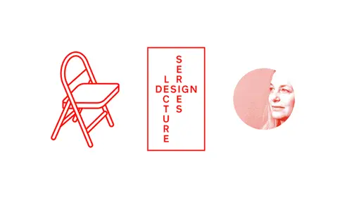
Paula Scher Lecture
I just want to start by by really thanking civilization for this amazing it's phenomenally generous um and I want to come to them I think it's just fantastic and the library is a beautiful place I'm glad you could all be here and uh I hope you all ask questions because I love them and let's get down to it so because we're in this nice social since situation and uh this is a free event I decided to put together work that is work I do that is either for free or for public places and spaces in my little town of new york city. So, um I've been working in new york city on lots of public places for about the past ten or fifteen years and some of that some of the places even longer and everything I selected are either things that I've done very recently or are still on going and sometimes the relationships are continuing evolved for those of you who don't know anything about and the high line is a old train track it was anel abated train that came down to an area of new york city cold chelsea...
where the meat market wass on delivered the cattle to new york city restaurants and in two thousand there were two community organizers who came around and asked me to design a logo for this place that they wanted to turn into a new york city park and at that time I had no idea where the highline wass or that this thing ever existed what had happened to it was that the train tracks were left in the middle of a busy urban neighborhood and it was up I say you couldn't get up there because it was closed off and all these weeds have grown in and I went up and I walked over this thing and it was absolutely amazing because you saw the new york city from the second floor and I fell in love with it I just thought it was astounding so I thought, ok, I'll give these guys a free go the reality of of it was these two people robert hammond and joshua david I had no experience whatsoever with any form of urban development they never work with city government, they've never made a part they were just two community organizers and chelsea he thought they could save this thing so the organization that they were representing was called friends of the high line and they were the fundraising organization and they were going through their neighborhood and they were getting people with money to give money to build this park I thought, well, this is easy, you know, it's a railroad track it's an age how hard is that there's the logo it didn't take very long it was a free job I was really happy to do it it was fine. I showed it to them and, uh, they said no it's friends of the high line I said that's a really bad track years later, they're still saying there should have been a logo for friends of the high wind. But we all live with us so we made we made stationary and we did promotions for them, and we did these things for them. For a period of eight years, we made books and documents and put on shows at the highline, raised money for them and made all these objects that were swag and little by little thiss thing became publicized and became a reality. Only the city actually gave money to it, and there were matching funds from new york state against the fundraising. We had this crazy show in grand central station where it was an open competition to design it. And then finally, there was really big money, and they had a really grown up competition with an invited group of architects and field operations and diller scofidio one and began planning it, and we'd brand campaigns, too fund the building of it called I built the high line, and people stood in front of a picture of the high line and that their pictures taken and they were sniped around the city, and more people gave money. And then there were more party invitations for rich people and rich people came and they gave even more money and then they're even more fancy gallons and anniversaries and parties and money and money and money, and then suddenly there was the real thing and uh this happened and opened in two thousand eight we did the science for it on you can walk up on top of a high line and see new york and it's quite a terrific experience if you've never been there and then this funny thing happened with it, um, by the way, when it first opened, this was the cartoon in the new yorker, which I loved because it showed the dogs weren't allowed up there knows everybody's doing sort of tied to the trestle, and I like the cartoon because they hadn't used my logo, so you know, it was the high line, so that was fantastic. But then this funny thing happened and on why I'm back involved with it again was that over the period of time that it opened, the neighborhood developed the real estate developers built more and more fancy buildings, the value of the neighborhoods went up, poor people were priced out and this thing and started as the most optimistic, wonderful thing from a community board in terms of making a public park for for new york city and now the biggest tourist track action in new york city is it changed the quality and life of the neighbourhood, so there's an administration now that actually thinks that this is a bad thing, and so we have to go back and readdress how we think about this place, on how people use it, because it is quite a wonderful thing, and it put me directly in touch with what happens with your best motivations when money is involved in our neighborhoods shift, we make these things for the public good, and yet somehow we don't totally serve the public good, and it is the question that we grapple with all the time when I worked for, not for profits. This is a similar situation, but I don't think the same thing will happen. Hurricane sandy devastated the coast of new york when you think of new york city, you don't think of beaches, but back in new york city is rimmed with him and their boardwalks and their communities and their community, community incomes and livelihoods depend on their beach activity, and this is a picture of the rockaway beach. After hurricane sanding, the community couldn't wait for a new boardwalk to be built. They had open the beaches right away because they would lose all the revenue, so I was part of a group that was helping to rebuild the boardwalk, and my job was to create a sign system structure that enable people to traverse this area and go pott passed the construction on the beach. I realized that it was very emotional because these neighborhoods were devastated. We wanted to do something. There was more than a street sign. But to put back some civic pride, this is sort of what's on beaches. This is what new york city sign systems look like. They're warning signs the really depressing, not hard to beat, but there they are. I thought that you could do something that would be an emotional sign system if the hurricane and destroyed the board. Boardwalk beach remained and the beaches were unique to a given area. So I thought you could take a picture of the beach as you entered the beach and they would all be the same and they would all be different. So we took photographs of every beach and created a system which were then turned into postcards and memorabilia, and the neighborhood's really felt grating out it because they felt like they were being paid attention to. Then there was, ah, navigational system that got you to walk past the construction on the beach where the boardwalk was being built, and the blue signs which stuck way up where a way of saying how many blocks you had a walk before you went back into town. And you could tell where to turn by painting the girders of right yellow then we redid the all the warning signs, so it was a design thing now here's something that was interesting to make was the's pods that were built by on architecture firm called garrison we're beautiful and we love them, but when they were on the beaches, they were totals a failure because the community felt that they looked like army barracks and depressing because on the beach color has to be bright and they were almost too tasteful for the beach life, so they're rethinking them. I think they could just probably paint them. What we did do is paint all these cement buildings that were on the beach, and we painted them with maps of the area and very bright colors. And so this is what it looks like right now, and this is all running up and down the coast of the rockaways. The next project is to rebuild the boardwalk itself, and I worked with an architect and clear weiss and she had developed this planking system that was waiting on one side where you could write a bike and then straightened out, and what we did is we took the form of the planks, which I'm showing you here, and each one of these clanks is thirty feet wide so the whole space that I'm showing you these four sets of planks is, you know, one hundred twenty feet and weigh turned it into typography and made this typeface that we named rockaway wide way contend it's the biggest pixel in the world and we need swag out of it and it's in laid into the boardwalk and they're still laying and there's new are I think it says aka way right now on, if you fly into kennedy airport, you fly right over this so you can see it in a day and at night we'll see what happens to that neighborhood. I think they'll be fine. I do a lot of work for an organization called the robin hood foundation in new york, which builds charter schools, and I began this quite by accident on it was largely for because of the school I had done some work with in new jersey and newark. It was ah loosen center of technology donation to an acting school that was part of the new jersey performing arts center and the I made a very important discovery doing this job, and that was there was an existing building that I had to change and there was no budget for changing it. I found the cheapest thing I could do to change the exterior of the building was too painted, and the discovery I made was that if you make a photo shop, a rendering of a building with typography on it or some kind of color system on it and you show it to your client and your client likes it what you make ends up looking exactly like the photo show surrendering and it changed everything for me it wasn't like doing a book jacket were never like anything like the thing came out after five years in the making changes the building like photoshopped entering this building looked like this it was a knoll directory building and pretty grim in a rough neighborhood and way covered it with typography what went on in the building that's the photo shop rendering that's with the people who painted it were sign painters who painted sides of garages like things like flaps fixed and this was their best job he ever had and they climb up in the building and they'd say paula way found that your letter spacing between the team he wasn't right way corrected it for you and thank god they did they did a great job the best part of the building where the air conditioning ducks that was really hard they had to run over spaces and really do this thing so as a result of that I begin getting calls to the schools which has become a very popular activity both in public and private schools there's the sort of messaging that exists in charter schools that is our old motivational thiss particular school system called achievement first what you're looking at is a siri's of stickers I did not design they were ahe color system the kids were given these slogans and they put them on their books and they put him in their lockers and they want to maybe use this for the building which I did on just made the stickers enormous by painting my walls and painting them in stairwells and gymnasiums can music and I would love it I love doing this sort of thing because I really like the city employees and the contract people who paint these things they get their painting a straight wall of black color it's really quite boring but this is a true challenge I remember when I showed it to these two workers they said lady you crazy on then they went and given this gorgeous just really terrific here's the school we did about a year ago and it's really the same thing but the difference is that it's entirely instead of in paint on the workmanship is just beautiful in this you know charter school that is in a very rough section of red hook and the kids just love it and it's wonderful doing this sort of thing because you know this is the point of it this is different of the new school is found in nineteen nineteen and it's a school for progressive studies it was supposed to lead public foreign engagement and in nineteen, seventy two and bought parcels, school of design and parsons school of design is about three times the size of the new school in both population and reputation, and the new school wanted to get its identity back. And parsons, of course, wants to keep its identity. They had done a pile of research about the perceptions of the new school, and the new school came off very weak against parsons and actually had to do ah lot of thinking about what their offer wass they came to the conclusion that what they needed to do was to be designed, infused, learning, and what what they meant by that was that you could go to parsons, and you could you could be studying design, but you could be taking your anthropology course. Is your social sciences at the new school and be a better designer, is a result of it, or you could be a journalism major league parsons and take design germans and major new school go to parsons and take design. You could integrate, you're learning so that whatever profession you were and you were, you had broader thinking skills to do that. They wanted to change the whole spirit of what, how the school related, and perhaps even the name of the school way looked at what they had over a million years, and they had redesigned this school a lot um the new school had a lot of schools attached to it they had a the man a school of music that was a very important classical music school but they also had a different school for jazz and you didn't know why they weren't wearing the same division and then you found out it was the way people gave money they had a method of naming schools based on what the programs were sometimes and then bitten named based on people another time so you couldn't tell which school is what it seems like the three famous schools was parsons man's in their liberal arts college lang and it could have been called parsons manus lang or it could have been the new school and been designed liberal lourdes and performing arts, which would also make sense but you couldn't do either of them because every time every time you did it you ran into another donor we thought they'd never be able to name the school and we never finished the job. This is the landscape of what schools look like particularly their competitors and it seems like people either have a sarah face or a sand sarah face and if they have a sand surf ace they're supposed to look modern sarah face they're supposed to relate to some kind of ivy league him and if you look at you a l which is what we pentagram did for the school in england. Parsons and the new school probably needed something like this, some sort of higher our deal thing that listed what was going on in that organization, but we couldn't get any decision made and taken about the name because they couldn't they couldn't resolve it. So I realized you had to do what I call designed for indecision. I mean, you make something that's essentially unusual that it doesn't matter what the hell it says because he look okay once you change it. And that's what that's, what we were doing. So I made a love of sketches of hierarchies, and I found that they were using a fault in one building that was designed by a type designer, and in peter b lock and that the buildings themselves have these siri's of stripes. Initially I did something with the squared type that was actually designed to nineteen, twenty nine. But everybody hated it because they thought it looked like atari. For some reason I said at what student knows when atari is now seem to make any sense to me? So we then I thought that the striping on the building was something that could be recognized and that s o n had built a new version of it on fifth avenue and this was the type that have the peter b lock type and the peter b like type existed in all these various faces because it was supposed to differentiate schools, but when you listed them, they didn't really work together. So I took the peter b lark tied used the most ordinary version of it stacked it like this with two lines enabled them to make it in three lines if they had to and then coupled it with the secondary schools not unlike what you saw with you uh you ale that was the response response from the faculty and they just thought this things, fellas, dishwater now I had at this point in working with him for almost a year because they couldn't make a decision of the name of the school. And so I thought, oh god, this guy's air going nuts on me so I thought alright, we'll extend it they said no, not enough. Ok, all right, we put it there and then I got this comment ok? Making a little what really said no, so he took him down a bit at this particular point of craziness. In time I realized that I had put together a situation where there were three wins of this typography. It was a face cold irma, the peter b lack of design and that it could probably be programmed in a way that it would create a kind of language that would be you need to the school, so if they school would be recognizable no matter what it said, and that if they change the names of the schools in the middle of it, it didn't matter, because you'd be recognizing the former, not the name. So these are the winds of the three owes these three alphabets, and we re drew this thing. So was programmable working in three sizes. This is the controversial w you're looking at, that was wind, so that the counters didn't fill in, and that when you break it down into the headings of the schools, these were all individually crafted. But in fact, when they hang together, once you look at it there really interchangeable, even though individually all the names of the schools have the room character established to it, there was secondary type for hierarchy, and then ultimately we programmed the thinner fund of herman, too, so the secondary schools have the same thing happening to them with a lighter weight, and this is the way it holds up in that original landscape I showed you. So this is the fondle together in three ways. This is what it looks like as text in all caps here, peter be locks, drawings, way had to redo that doubling drove everyone nuts and, in fact, the new school logo it can change every year because there were thirteen configurations and possibilities of how those letter forms can work together. This is the lighter weight we're working on a lighter weight now, but these are the amount of breaks of words when you change them. So this is a system that school can make, do whatever and they want to do. Right now, they're doing some wonderful things with a really, really rapid exile in with it. So we made this thing, and then launched, uh, last march, and then all hell broke loose. But it really is very identifiable in new york city, because you can recognize it without a logo, just beginning to see the typography. And it works especially well in digital media. If you go to the website right now, it looks exactly like this very rock solid and then way made all the swag things for the kids have school in the house, are department started taking it over, and we are working on a science system now for the whole school. We did this for the opening in the launch, beside which went up very quickly, and the students began making things, and the students participated in this mural that's around the elevators and the water tower, so I love working for museums, and usually they hire made us all very specific problems either it's a renovation or a perceptual change. And in the case of the philadelphia museum of art it was both frank areas renovating the museum he's digging a tunnel under its very broad staircase. That's very fast and way began redesigning the identity two years ago it launched last year and it's an ongoing operation you must recognize this this is the famous front of the philadelphia museum of art that nobody knows what it is it's famous because rocky balboa ran up the steps and jumped up and down and people come to philadelphia and they go to the steps of the philadelphia museum and they run up the steps and they jump up and down and they never go into the music. It's a really serious problem to make matters worse us vester stallone taking the museum this gold statue of himself they're of city made them put it in front of the museum which are every curator, so they sort of hit it behind a tree. But wait, try living with that what's sad about this is this place has a great our collection it's a terrific museum really underrated trade and it deserves much more than this, so my job was to actually get people to know what it wass and where it is and that there's lots of art and it here's a problem if you go to the take the train into philadelphia when you get off the station you say taking the philadelphia museum of art they say, where is that it's practically right next to the train station but the cab driver never knows when you tell them what's the big thing on that you know the thing rocky ran up the steps of the says oh that's the art museum because they don't call it the philadelphia museum of art because they're in philadelphia and then really care about so if you look at the sign and the arrow and it says art museum this was their previous logo and there's nothing along with it it was designed and avenir which they use throughout the building I think quite well and it had this griffin that's carved into the building uh but the problems it looks somewhat like a school where nobody knows where the griffin comes from and it looks like on that temple and if it looks like the whole place is an edifice that is sort of a little for voting also ironically, there was drexel university about a block away and then this dragon sort of seemed like maybe he wouldn't confuse them, but they're both kind of flying things with little closet centering it certainly seem right I thought they should get rid of griffin, you know people want to hang on to it is a pit and I said, you know, let's, just kill it way did, uh, griffin is has gone away, and what we did is is take the avenir, redraw it, and then create a system by which the a continually change to demonstrate the breath of the artwork inside the museum and way drew them about two hundred days and way said, well, you can pick five different ones for your stationery and nobody could make a choice. It was really quite crazy. Here is some of these and, uh, they picked the most conservative a's that you barely could tell the difference on the station. When we show our front center, we leave a neutral like things like the annual reports, et cetera and all their literature. But digitally, the a's move and we use them for things that you get when you come to the museum like tickets and badges. And it becomes things that they sell in the art store and becomes the play part of the museum or on children's projects and toe launched it. They have the show on the renovation and frank gehry was going to achieve so I had a draw, these forays that very graciously did and that's that's how we're going to use it, which was a lot of fun, I have a a person who is running the art department there is name is louis bravo he's worked with me before a jazz at lincoln center on dh uh metropolitan opera when redesign and I'm very big on building an ounce our departments so I'll take people that I know I mean they're taught our work for me and install them to set up the department and then what they do is they build very good department so when they leave and go someplace else for someone to take it over in the identity stay intact this is really important when you're designing for institutions because you give them a kit of parts and they can't execute it very often I'll see something that we've designed a pentagram we'll see only the original cops we did and nothing never followed because it got messed up after the thing launched so I think that part of the project in these living breathing identities is to figure out how do they continue and grow and get better? Well, you're not doing it and so I'm really thrilled with what louis did. For example, at the beginning of the project they didn't want to invest in re digitizing and redrawing the avenir but live lewis was capable of getting that done about three months ago and could create all the products with it in relationship to being able to redraw the fund now he's working with me on the building science and every day this thing it's bigger and stronger and more visible and it is a long, long process I think it will take four years to actually get through converting everything that has to be converted in this man's place but it's terrific to see it happen and I think my my favorite piece of press on west from this little rag called celebrity in philadelphia, if you can read it, I'll read it or even when all said and done the combined projects meaning gary in the identity will amount to the most intense efforts and being human being organization of ever taking to wash the stink and still mistress alone can't do better than that. This project is something I accomplished last year, and it is a complete surprise to may and what I love about it is how little I had to do with its engagement and success and how a public can make their own spirit of design happen in their own relationship with something uh I had I had a call from a former client of mine, a director named george c wolfe who used to be at the public theater, and he went on the board of the national center for civil and human rights they have a logo that looks like this on the logo seems to be related to the building I don't totally understand and it's a brand new building and they asked me to make a mural, which is what you're seeing for the front of the building and the mural was composed of posters that they had sent and what was fascinating about the whole issue was initially in the lobby they had intended on a the's posters for civil rights organizations all over the world and when you looked at them, the posters weren't that engaging and they weren't that engaging if you didn't know the cause, especially if it was in another language because they actually are in great pieces of graphic design like I looked at and I thought all silence equals death that one's really good because I am that one, but if you didn't know them, it seemed very other so I took the posters, cut them into radiated strips and inserted a hand in the middle of it and this thing is thirty feet wide by fourteen feet high and it sits in the front of the museum like this and it's actually dimensional. You can tell from the photograph I did this quickly because they didn't have anything to go up in space and they want they were opening in a month, so I designed this thing. I gave him a plan on how to build it I've never seen I've never been there I have no idea about what it actually really looks like in person except for the images I've seen you see it from outside the building and you see it at night, and on the opening of this thing, somebody discovered if they walked up, they put their hand on the glass and match the hand of the mural. So people started taking pictures on that spontaneously that people would go there would take pictures of their hands. These are things I pulled off twitter. This was like the first week it opened there is all this crazy stuff started happening where it became this call to action. It was your way of touching the history school kids go there all the time. We have a daily influx of it. It's actually a terrific museum. From what I've heard, I've never seen it's a big spot your picture taken and this was in the new york times almost every civil rights leader leader makes a pilgrimage there. They have dance classes there, they need swag. And then they made an apb out on what the app does is it tells you what the posters are. So the thing that it was supposed to be in the beginning, that would not have resonated because you would not have gotten it because of the emotional connection you have to be art there you can click on the and we shot this by the way from an image on my computer because I've never been there they sent me the yeah, and I just did this right on my computer and pulls it up and you can see with the poster is and find out what the cause wass and it does the whole thing it's own interactive piece and that's john lewis from I've been working in new york city for theaters for a long time, and so I'm going to show you two one that I just did very recently and one that I've been working on for twenty four years uh, I redesigned of the atlantic theater, which was founded by william macy and david manning it seats about one hundred fifty people it's where spring awakening came from, it has terrific shows and nobody knows when it is a rare it is, and the reason it doesn't is because it's the way they promoted themselves, they promote themselves like this, they have a play to get somebody to make a poster for it. The posters don't have any connection to each other on ly one hundred fifty people see the play if they see the play, they don't know that the play before it came from the same place because there's nothing connecting it and if something goes to broadway it gets its own identity anyway, so people don't know that spring awakening came from the atlantic theater because there's no memory of it now I had may is saying discovery a bit with a public theater which is the problem and I've worked on for a long time that actually in the small repertory groups the identity of the place is much more important than the individuality of the program because it's the love of theater that matters I mean at the atlantic theater is totally fund and they can't make money on one hundred fifty seats so they have to be supported as the organization we also have an acting school that's tied with anyone you know and they have a very high reputation in people in theater with the outer world doesn't know so I took the letter a uh from the word atlantic and created a spotlight, a megaphone whatever you want to call it as a basis for housing typography that would be their place in their season and they could promote on then they would have individualistic little images inside brochures or post core zara's web banners line and this is the way they promote themselves and it really is amazing that it was one of the most seen and recognized things austin instantaneously when it launched I haven't had that happen on time but it was is that everybody is suddenly discovered with the atlantic theater wass and they've been rolling out there shows you see this in subways around town and suddenly, it's a sense of place on identity and, uh, big problem is, how do you evolve in the next season? No, I've been working thinking about how these things growing evolved for a long time, and when I started doing the public theater in nineteen ninety four, I thought about visual language really very much in the same way parsons was that there would be some time a graphic family that you would recognize that would be the public. And this is my early sketch for in ninety four and the way we did the advertising in ninety four. But then what I do is individualistic posters that sort of had a connective style, and, uh, this was problematic in and of itself because the posters weren't seen enough because place weren't big enough. The only thing that was ever recognized individually was bringing to noise bring into fun because it went to broadway, but most of the other things except graphic designers. Nobody remembers any of those images, so that when chicago came out, which had a much bigger budget and used a typographic system that I'm like this, people thought that that was a look of chicago. So I began changing the posters for each play, and just using the public logo liked what the atlantic theater was doing. But it buried the lead, which was the theater in the summer. I did this shakespeare festival in the typographic style of it, but then I would change a cheater and it began to lose its identity in two thousand eight with a new director, I decided, well, it has to have a a stronger look that's that's the same all the time like what I did with the atlantic and we did this for lots of materials, but the public theater's a lot there than the atlantic theater and they also have joe's pubs they're making so much stuff that it became monotonous in two thousand ten, I redesigned the lobby of the theater and way invented the typography into the walls and there's the shakespeare machine it was designed by then rubin and I made him digitised champion the public space and it runs thirty nine shakespeare plays and blades on the chandelier, and the typography is all embedded in the walls and around arches, its incent, the donor's walls of bricks popping out and the posters air encapsulated behind mark sauce and around the building. I knew that I couldn't do individual posters for the show's anymore that they had to have a connected low, but there had to be a way that they wouldn't be manias, so this is the season after that we had launched the lobby, we did this poster for the shakespeare festival in the summer was a comedy of errors in love love, labor lost and I like the color system and I thought, well, you could use the color system for an entire year and whatever stylistic new ones the poster had, you could repeat it in a lot of materials and it would hang together now at the public theater there's a woman in kirsten huber, who is my student four years ago, and she's, the art director inside the public theater and she's got a staff of about five people and they make a myriad of things and they make all that joe's pub promotions and tons and tons of crap hole that has to be made every day when an a result kinds of stuff he blasts and we created this system and she sends me pds this every day and it all has one time together, unified look and just the point where you're really bloody sick of the damn thing it's the next season and we change it again. So the following here this was this was two years ago, the following here there was a common in a dark drama, and I designed this poster that was much ado about nothing in king lear, and I love the scheming on it, but I didn't really like the color and the posters, so what we did as we took the scheming form and just made it black, white yellow ended another season at so it hangs together like that and you can differentiated place somewhat and imagery obviously but it's more the totality of the individual thing there are millions of workshops, they're all kinds of labs there is such an active, exciting place with so much going on so much to promote its a great job for the kids they really well it on we're building this stuff all the time this was this past season's poster and in this poster I slashed through typography and I realized if you could slash flu typography uh in a cut way could you could slash through photography is well so this became the basis for this year's season that we're still building out and here it starts to become individual plays and promotion fees and more plays these air one ofthe things that go on there like one nine performances is joe's joe's pub and they get really raunchy as joe's pub gets more joe's pub joe's pub has a show a night just to give you a sense of how much is getting promoted. This is this is a daily labour done by four kids so what has been interesting to me is this balance of building identity systems, figuring out how they live and breathe and how they get carried out and I couple that because it's, instantaneous and done often with other people with this sort of very personal work I do that is this map painting and I do them on weekends at my country house and there's a book here on the maps. This is the cover of the boat. The painting is about fourteen feet wide by nine feet high, a painting of africa thiss was ten feet by ten feet a painting in manhattan, a painting of london. These things go on all the time and I got known for it and a za result of it. I was asked from the one percent of the arts commission in new york city to do a design or created mural for public high school, and it wasn't the same as my environmental graphics. It was it was through a city commission and there are certain rules to it. And this was the space blue area was space for the mural and they brought a map of manhattan would be nicer map of queens with school wass and I looked at it and I thought to be quite awful actually looking at it in that space it seemed absolutely dreary and what I thought would be interesting because the space has a skylight would be to create something that used the whole area that was going to be used for p t a meetings and for special events this is the painting I created for it but to sell it I actually used one of my original paintings they painting a manhattan and we broke it up into a virtual reality form like this to show them how the painting could actually phil the walls on how it could cover every inch of the space being that was twenty two feet high and started about ten feet off the ground. The title went up ten feet and it was on two levels and there was a cat walk and you could you could walk inside queens or all of new york city. So this is this is this virtual reality was from the actual painting, but when I went down to compete for the commission I really wanted because I went in with a piece like this because it shows how you could think about the space. So what happened here is designed married painting way took the painting and we broke it up into these large scale panels. That was a repainting of my painting, a higher a sign painter and we projected the painting on the wall at the brooklyn navy yard where we rented some space here I am holding up the original painting against the scales. You can see how much bigger in is and the painting is broken up into these panels that were like, I think about four by eight feet and the panels are all painted there's campus on powell's it's been screwed into a one assembled this way and it has to be removable in case of a fire flood the fire resistant there's a special service put on top of it and here's the finishing a dream so when I didn't uh the school teachers around proofread the painting they found twenty five spellings so I had to go in and correct all the spellings really in technical you do it by hand that's fine second painting because there were two atriums was an area of queens and they had asked me to demonstrate all the languages they speak in queens, of which there are at least twenty on your there's korean and there's chinese this japanese and there's greek and there's russian and there some arabic there's far scene and hebrew and what I wanted to do is translate all of the place names the little towns and queens little areas into their language and I asked the school for help and they said no we can't help me with that have to do that yourself so I did it on google translate I don't know what these damn things said I painted him on there they're in every language I finished the mural on gave it to the school teachers and they said I said you pro freed this for me and they said no we're not gonna prove free that that's art so if you want to know the difference between art and design, you don't proofreaders I got one letter from a korean woman who said, dear miss, you, I like your now very much, it makes no sense, it'll well, I like doing this so much that I last year a tower school or my alma mater asked me, teo, they haven't award they give where it's an alumni award, you you go down and you haven't exhibit, and the exhibit has to involve the students, so it doesn't really feel much like an award. It feels more like a job, but I thought it would be nice to revisit what happened with the school and to pay philadelphia in this three thousand foot gallery space, except for I don't want it didn't have to do that much work, but it don't. I may have it involved the students, I wouldn't have to do that much work because they could do the work. So I painted a small nap, a philadelphia and black and white digitised it turned it into color, build a model that put the model, and this is the space, the gallery that's sort of how it would look if you went into the gallery and it has a lot of white space, is that I thought the kids could fill up so I took a section of the painting I think the pieces were something like two feet by four feet or something like that there is slices of paintings we know our way and we distribute them two hundred fifty students and this is the manual that god came for a little lecture and they've got the manual when they got a section of town section was key to a map of philadelphia and then you can go to google maps and find out what went on that territory and I'm a little sample of what that should be like general source of things they couldn't do if they like to but the most important things that with breast strokes it was actually a style guide for making your painting because it didn't matter what they did or even if they screwed up as long as the big lines held the whole painting together that but any damn thing in there I was really amazed at the result I did the floor, which was a rug and I think it's the least interesting part of the room except in the content of the floor if you read it was hilarious because the whole thing ended up being churches and pizza parlors that's all that seems to be in philadelphia here's the space and it was styled out of paper we push paying the paper to the walls on the rug was installed and because the map is so busy, it's very forgiving so that corners and things that attach together you really don't mind it. It's not, you know it is paper. It is a maid thing. Like here, you see the floorboard. What we did is we play. We painted the floor boards because the paper didn't line up with the rug, and then we would just simply paint over the the little molding and finished what the yellow. But you can see sort of the, you know, the light fixtures coming through in the lines of the paper together, and it didn't matter at all. It was sort of a surreal environment that happened with the help of one hundred fifty people. So I feel like this is sort of a direction. I really want to go in thiss kind of communal art where, in a funny way, it's. Another identity system that gets played out with the help of others on can extend infinitely on a personality on and they build and continued on and it's a hell of a lot of fun and invited to do want you.
Ratings and Reviews
Joan ONeill
Paula and her work are so refreshing. Love seeing and hearing how she works, her ingenious solutions and what a delightful person she is. Thank you for the class.
Tim Tourtillotte
I am a new fan of Paula Shur… before this lecture, and watching the Netflix series Abstract, the only designers I cared about were my instructors and myself. Paula has disrupted my thinking in transformative ways. I love graphic design and typography more so than I ever have and I thank Paula for that. I highly recommend this course.
Nelson Mueller
A very inspiring lecture. Glad this is available on CreativeLive.