Designing the Poster: The Process
Lesson 5 from: Poster Design and the Screen Printing ProcessMama's Sauce, Clark Orr
Designing the Poster: The Process
Lesson 5 from: Poster Design and the Screen Printing ProcessMama's Sauce, Clark Orr
Lesson Info
5. Designing the Poster: The Process
Lessons
Studio Tour
09:59 2Introduction to Screen Printing
07:26 3Choosing Paper: Deciding Which is Best
10:05 4Selecting Ink Color: Using the Pantone System
11:16 5Designing the Poster: The Process
09:40 6Preparing digital files: CreativeLive Poster
09:20 7Preparing Digital Files: Hill Valley Poster
06:20 8Halftone Hacks in Illustrator
07:34Lesson Info
Designing the Poster: The Process
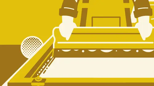
already. How's it going? I'm Clark, or I am here talking about the design process for a silkscreen poster I've been designing for 15 years. And I got introduced to silkscreen posters through going to concert. So I started seeing, you know, two and three color band posters for a ban that would be playing a certain night the week, and I wanted to start drawing them. So that's how I first learned about silkscreen posters. Um, I am, ah, really influenced by by older artwork, a lot of commercial art, anything from old advertisements to package design. And I'm gonna show you kind of my start to finish process and designing a silkscreen poster. So first and foremost, you want to make sure that you have your concept ready. The project that I'm gonna be working on today is one that CREATIVELIVE tasked me with a poster to celebrate silkscreen printing with. They asked me to do a two color poster that was gonna be on 18 by I generally start looking at inspiration either through dribble online dr...
ibble dot com. It's three bees or Pinterest. Ah, I also look at old old books. Um of a collection of old artwork and, um, just different prints that really inspired me today. But most of most of the inspiration that I have is from several decades before I was even born. All right, so now I'm gonna open up my inspiration folder for the Project for Creative Live Onda. Let's see here. So my inspiration here were old matchbooks from the forties and fifties. As you can see here, the this burlesque club matchbook is what it looks like is three color. So it's black and pink. And this project was for a two color poster. So this already has kind of the feeling going for in terms of working with dynamics and only using two colors. Um, here's another one. This is, I guess, about four colors, therefore colors and, uh, again, like uses the strong dynamics and bold colors, something that is really important when you're working with the limited color palette for a silkscreen poster. So from here, I go into my my sketch phase, and this is around the time that you're gonna want to be starting to think about what? What the actual finished product is gonna be looking like. Um and how that affects what you're actually gonna be using for inks and paper colors. Eso before you get too far into this process, you just kind of wanna be planning ahead in case you need to talk to your to your screen printer about in any special thanks or papers that you might want to use s again. This this posters for a, uh, just celebrating silkscreen printing. And, um, I worked with some custom type in this eso. Generally, I get started in blocking out kind of the general skeleton of the print. So dynamics are really important when you're using a, um, limited color palette. You really want, um, the the poster toe look like a poster that, you know, since that's that's what you're doing. So, um, just going here and block out kind of skeleton of a poster. I generally try and do posters. Um, are the sketching phase of ah opposed to pretty bare bones. I have enough room, actually g o into the file toe to create, um, edits or like, new parts of a poster kind of in post post production. So I'm gonna draw little little guy here, little silk screen printer. He's pulling like a squeegee. Well, hands from a squeegee. And I silk screened myself. So knowing kind of what the process, you know, feels like and actually all the steps to do it. Help me out. Ah, in this project for creativelive. So from here, I'll go into a little bit, Maura Fining of a process. I I I sketch pencil a paper. Sometimes, if you will use a tablet to go into the computer, I'm a little more traditional and old school in this I like to use pen tells twisting race. Um, it's just what I'm used. Teoh has plenty of a racer because I made plenty of mistakes. Um, so go into the sketch and kind of refine it a little more. Um, I have a tracing table or tablet right here, a little like table, so I can actually, um, draw on top of older previous sketches. You can also use tracing paper if you don't have a little light table. This one, actually, I just got a target. It's like a Star Wars one. So you can really get really real bare bones about it. Um, so from here, I get a little more technical, tighten everything up, give my typography going, Keep it real loose so I can still work on everything and on Illustrator. So from here I trace this and, um got it a little tighter. And as you can see in the final outcome that I don't fully, uh, stick with with the sketch, I'll get pretty close and move elements around. But that's why the computer is great for what I dio. A digital illustrator is being able to move elements and tweak them as I see fit. So from here, I'll go in and scan this into the computer. Already have the scan here, and we'll go ahead and show the under base file, which is the sketch for the project. And I'll show ah kind of layers as I go. So you get a night idea of what the steps, um, toe completion are so from here, I block in a lot of the shapes. I know it jumps like straight into a pretty detailed illustration. That's just how it work. When I worked with an angled type, you can actually see right here, I try and make it a contrast in color so I don't doesn't really get lost, um, over the sketch, but you can see it's still still there. I like to work on custom angled type on a straight line and then angle it from there. So I have more flexibility and actually working. You can see I kind of start start to tighten everything up and Adam or elements. And what I ended up doing was I wanted to do kind of a crazy things called like a Dutch angle, where the content, the main content is angled. And then eventually I wanted to straighten it out because it ended up causing me problems. You can see I'm not not married to the to the sketches as my final, but you can see that I'm working with two colors white being the background, and I'm using that as 1/3 color, which is really important. So from here I started editing some of the blocking colors started tightening, tightening up some of the finer details, and then this is where I ended up. Straighten everything out and adding in some of the background details, you can see it went from this Teoh, a pretty dynamic shift in, um and layout, but At the end of the day, it still fits. A skeleton of it is nine, so I'm getting pretty close to the final version. I throw elements out to the scientific side so I can drag him into the the art background. And then I'll skip ahead to the final piece. And this is where I ended up, and I can take out the background sketch. So this is the final final version. From here. I would go into sorting out colors, says two colors. It's pretty easy to change the colors toe, whatever I want. I can make the orange like a yellow are a green. You can see right here that I, you know, ended up making it on orange color. So if I wanted to turn this into, like a yellow diseases, they're dragging a color moving some, uh, some of the the color guides around. So maybe I want to do like a, uh, like a dark blue, like a dark royal and maybe a little bit lighter Green would be my final one. So the editing in the final colors is the easy part, the making, the design, uh, functional and really just kind of telling a story is the tough part and making your hierarchy really strong, UM, is the difficult part, and then going from color selection and then paper selection to your printer is the next step that you need to be thinking about.
Class Materials
Bonus Materials with Purchase
Ratings and Reviews
AJ Estrada
Man, I've been waiting for a class/tutorial like this for years. You've both cleared up a lot of confusion that I've had about the this process. Love the final design and colors you went with. More classes please!
Mjose Mab
Hi, I'm Spanish. I would like to know some company that works with silkscreen paper in Europe.Me You can say some european brand. Thank you.