Editing Samsara Shoot #1 - Working With Backgrounds
Lesson 34 from: Creating a Fine Art SeriesBrooke Shaden
Editing Samsara Shoot #1 - Working With Backgrounds
Lesson 34 from: Creating a Fine Art SeriesBrooke Shaden
Lesson Info
34. Editing Samsara Shoot #1 - Working With Backgrounds
Lessons
Class Introduction
07:25 2Overview of Brooke’s Journey
20:13 3Your Timeline is Nonlinear
05:37 4Using Curiosity and Intention to Build Your Career
03:26 5What Factors Dictate Growth
08:24 6Organic Growth vs. Forced Growth
05:18 7Niche Branding
04:57 8Brooke’s Artistic Evolution and Timeline
24:27How Can You Get Ahead if You Feel Behind?
10:02 10Ideation and Conceptualization to Identify Meaning in Your Art
05:54 11Idea Fluency
10:33 12How to Represent an Idea
07:01 13How to Innovate an Idea
07:07 14Creating a Dialogue With Your Art
05:48 15Conceptualization For a Series vs. a Single Image
03:43 16Transforming a Single Image Into a Series
03:12 17How to Tell a Story in a Series
03:28 18How to Create Costumes From Fabric
07:20 19Brooke’s Most Useful Costumes
02:19 20Using Paint and Clay as Texture in an Image
02:56 21Create Physical Elements in an Image
10:22 22Shooting for a Fine Art Series
05:45 23Conceptualization: Flowery Fish Bowl in the Desert
04:08 24Wardrobe and Texture
04:54 25Posing for the Story
05:32 26Choosing an Image
01:23 27Conceptualization: Rainy Plexiglass
11:34 28Posing for the Story
04:17 29Creating Backlight
02:37 30Photo Shoot #1 - Creating a Simple Composite
17:51 31Photo Shoot #2 - Creating a Dynamic Composite
06:31 32Photo Shoot #3 - Creating a Storytelling Composite
07:40 33Shooting the Background Images
06:14 34Editing Samsara Shoot #1 - Working With Backgrounds
24:35 35Editing Samsara Shoot #1 - Retouching the Subject
04:20 36Editing Samsara Shoot #1 - Color Grading
02:45 37Editing Samsara Shoot #1 - Floor Replacement Texture
15:24 38Editing Samsara Shoot #1 - Final Adjustments
03:21 39Editing Samsara Shoot #2 - Cropping and Editing Backgrounds
05:25 40Editing Samsara Shoot #2 - Selective Adjustments
03:55 41Editing Samsara Shoot #2 - Adding Texture + Fine Tuning
03:21 42Editing Composite Shoot #1 - Compositing Models
06:58 43Editing Composite Shoot #1 - Expanding Rooms
02:17 44Editing Composite Shoot #1 - Selective Color
02:47 45Editing Composite Shoot #1 - Selective Exposure
04:04 46Editing Composite Shoot #2- Masking Into Backgrounds
10:45 47Editing Composite Shoot #2- Creating Rooms in Photoshop
06:11 48Editing Composite Shoot #2- Compositing Hair
05:07 49Editing Composite Shoot #2- Global Adjustments
04:49 50Editing Composite Shoot #3- Blending Composite Elements
05:00 51Editing Composite Shoot #3- Advanced Compositing
08:46 52Editing Composite Shoot #3- Cleanup
03:34 53Materials for Alternative Processes
06:20 54Oil Painting on Prints
05:41 55Encaustic Wax on Prints
03:09 56Failure vs. Sell Out
05:14 57Create Art You Love and Bring an Audience To You
03:35 58Branding Yourself Into a Story
05:40 59The Artistic Narrative
05:26 60Get People to Care About Your Story
03:36 61Get People to Buy Your Story
11:36 62Getting Galleries and Publishers to Take Notice
03:41 63Pricing For Commissions
06:43 64Original Prints vs. Limited Edition Prints vs. Open Edition Prints
02:11 65Class Outro
01:00 66Live Premiere
16:14 67Live Premiere: Layers of Depth 1
04:41 68Live Premiere: Layers of Depth 2
07:12 69Live Premiere: Q&A
16:10 70Live Premiere: Photo Critique
47:33Lesson Info
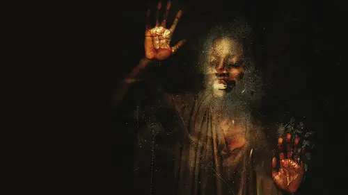
Editing Samsara Shoot #1 - Working With Backgrounds
I am so excited to edit with you today because we have so many fun images. Specifically, we're going to edit some some Sarah images today for my new Siri's, and we're going to talk about how to edit for cohesion in a Siri's. This is going to be really helpful because we already have some star images to compare it to. So we know what we're going for, because I have already established what the images should look like. I've mentioned that there really dark, dark backgrounds. Ah, lot of contrast and yellow tones overall, so I know where I have to go with it. But it could be really tricky to edit a single image, knowing that it's going into a Siri's. So we're gonna keep checking in with the rest of the Siri's to see if we're headed in the right direction, that the tonality makes sense and it flows with the rest of the images. If the contrast is boosted up enough and all those little details that make it really, really fit. So we're going to edit to some sorrow images, and then we're going ...
to jump into the self portrait composites, which you should have as downloads, so you can edit along with me for that portion. So first we're jumping into the screen and I want to show you what we got yesterday. I'm just working in bridge right now. And these are the images that I captured right off the bat. First test shot was this one and I started to a just ever so slightly. We darkened down the frame just a little bit so that it was a little bit moodier. And these were some of the first shots that we took. These four images were the images where she was more hunched and they were just a little bit sadder and a little bit more Hi. Just a little bit more quiet, I think, than the others. And I really like these images. I'll probably choose to edit one of them. There are a couple of things that I need to be aware of. One of them is the glare on the glass bowl, so we're gonna have to get rid of that later. But that's okay. We can do that. And another thing is just picking which angle I liked best. So we've got here. We got kind of close up, down low with the foot coming toward the camera. Like I mentioned during shooting. I really like that when there's some distortion in the image where ah, foot or a hand or something is coming toward the camera. It is a really fascinating method of painting. In fact, when you have something coming toward the camera and there's a distorted body shape because of it, well, when is painting? There's no camera but toward the viewer, I should say. And so that's what I'm going for Here is just that little bit of distortion. So I like these images where I'm down low and it's just a matter of Worthy's second set of images too low or not. What kind of distortion are we looking for? So we're gonna have to make that choice. And then from there we moved on Thio, having her look up and having it be just a little bit more hopeful. Then I think that out of the three poses thes were my least favorite because I think this was just more dynamic with her arm coming up, she's filling the frame a little bit more, and I love the way that the flowers look in these shots. So I think I'm gonna go with that rather than the others. So now we have to pick from these pictures. What? What's it gonna be? What are we going to try to edit? I think the first one was a little bit bright for me. Which, of course, we can fix later. But I like that we took some of the clay off of the skin so that it was more speckled in this particular shot. So I'm really a big fan of this one. And that's probably the reason why I would choose it over all the others. Because the texture on the skin looks the best. You might make a different choice. And that's totally okay. You don't have to agree with me about this shot. This is a gut instinct thing mixed with what is most important to you and really taking that into consideration. So, for example, if the lower angle where her foot's coming toward the camera more is more important to you than choose that, But for me, I'm gonna go with this one. And I'm just going to mark this, uh, Enbridge and label it selected so that we can come right back to it now, going back to look at those other shots, just taking a look to see which one I like best. And you see how I had her spread her knees apart a little bit more for some of those that really added a more dynamic look before she was kind of compact, turned to the side to the camera, and I think that that it kind of looked like, almost like she just kind of squatted down and we took the picture and there wasn't as much thought put into the angle. But when her legs kind of spread open a little bit more, it added more triangles to the shot, more areas of connection between her body parts. So I think that's the direction I'm going to go. And now it's just a matter of which one. The closer shot or the further shot meaning less distorted or more distorted. And I think we can go with more distorted for that one. So I'm going to go ahead and mark that and label it selected. Okay, so let's bring both of these images in because I'm not sure which one we're going to end up with so we'll see. And right now we're in camera. Raw in camera, raw. I mentioned that first image is a bit bright, and I wanna make it darker because I already knew that I overexposed slightly. So let's take the exposure down just a little bit. And even the white point can come down because that's the part that I don't really like, uh, happening on her body. Same with the highlights. So bring some of those down and I'm happy with that. And then the other image didn't really have any issues with the exposure I was happy with. That is pretty dark, and I know that you might think that's too dark. You shouldn't shoot so under exposed. But that's how I like my images toe look. So I just prefer starting with that slightly darker look rather than brighter. But either way is, of course, totally acceptable. So I'm opening both of them up into Photoshop, and while I do that, I'm thinking in the back of my mind. Which story do I want to tell? Because I won't use both of these pictures in the Siri's unless I'm making a dip, tick or a trip Tik. And that's totally great to Dio. And in fact, they sell really well in galleries. So it's something to think about is creating two dynamic images that go together that I meant to be viewed at the same time. Two or three, I should say, because trip ticks are also really wonderful and in fact, really help a gallery out because it displays differently instead of just single image, single image, single image. It's an opportunity to group images together, and it creates a more, um, interesting look on the gallery wall. Okay, let's take a look at this one. First, we've got the kind of hunched over look and what I like and what I don't like. So what I don't like about this image is that it's not quite as interesting with the angles as this one. I think this one uh huh in a way stands on its own a little bit better. And this one looks a little bit too posed to me. Even with the way that her foot is coming toward the camera. It looks beautiful, but that's kind of my problem is that it looks beautiful. I'm not going for beautiful in this Siri's. I'm not saying she doesn't look beautiful in this shot because she does. But we've got this foot that's arched on the toes that are spread and it looks a little bit more animalistic. So I think that for the purposes of the Siris of keeping with Samsara, I'm going to choose this image to edit. So I'm closing out the first one. Bye bye. Here is the, uh, Siri's just taking a look at it again so we can see what we're going for. The yellow tones across all of the images. High contrast, dark background, that's what we're going for in all of them and that the tones differ slightly from one to the other. Some are more pinkish red. Some are more yellow, some are more blue in the overall tint, these air a little bit more green. But in general there's that extreme yellow undertone, no matter what. So keeping in mind what we want to go for, we're gonna open up Photoshop and get started all of my images or square. So I'm going to definitely keep a square frame and the first thing that I want to do when I have an image like this is establish the frame. What's the ratio going to be? Where does the subjects it best? I'm going to click on the crop tool, and we're going to start to expand the frame out because I want to create a square. So I have to make sure that I have the right ratio happening in this picture. I just expanded arbitrarily, so I don't actually know if this is a square. I just kind of went out because I know that's the direction that I needed to go. But I know that I can figure it out by holding shift. While I'm clicked on my crop tool and clicking and dragging to make a perfect square, I was really close. Wow, I'm never that close. So I'm just adjusting a little bit to get her right in the center, because the hallmark of my images personally is that I create center compositions where my subject is in the center of the frame. So I'm going to stick to that because the more visual cohesion that I get over the course off the Siri's, the better. It's going to look when it's all in a wall together. So we've got this beautiful square frame, and now I'm going to think about how to fill in those sidebars that I just created because we have to white strips down the side. Obviously, we don't want to white strips down the side. So instead I'm going to click on my brush tool, and I'm just gonna go in and take a look at how hard and large the size is. So I'm going to go up, and that looks pretty good. And then make sure the hardness is down to zero. So I have a nice, soft, fuzzy brush, and I'm just gonna fill in the edges with whatever color is naturally found around that edge. So here I see in the background, we have this beautiful sort of deep blue color. I'm going to hold Ault and click, and I'm on a Microsoft surface studio, by the way. So because I am on a Microsoft device, I'm clicking Ault. You would click option on the Mac to sample the color in the background while you're on your brush tool clicking and starting to paint. I want to make a point before we get very deep into this edit right now, which is that kind of like I mentioned before. We're so overloaded with tools, and that is never more apparent than in Photoshop, where there are a lot of people explaining how to edit all the tools and what they all dio. But this is going to resonate a lot more for you if you think about how each thing that I'm doing applies to your method of working and your method of creating imagery. So if expanding the frame is something that you wouldn't want to do because it just doesn't fit into the way that you work or your visuals don't take it. But do think about how this technique might be applied to your work. So maybe not in the same way, but a similar kind of theory can apply. I'm gonna do what I just did by Ault clicking in the background on this side just to make sure that there is that color continuation and bringing it all the way down. Now there is sort of a brown on the floor that isn't found on this side because I painted it blue so we might sample that area and Right now, I'm not worried about colors, not blending. That's not really the issue here, so I'm not gonna worry about that right now. Go ahead and click in the background again. I'm just kind of blending wherever the there was a window light hitting the background. So I'm just getting rid of that a little bit on just going over and clicking and blending. Now, in order to make it blend even more seamlessly, I'm going to take the opacity down on my brush. I just went to 38. It could be anywhere in that mid range. I'm going to click the color that I want and just gently blend it in so that there is a soft transition between where I've painted and where the actual background waas. It's not perfect, and that's totally fine because we're going to do two things to fix. That one is that we're going toe overall, dark in the image. So we're gonna let that fall off into darkness to we're going to add texture on top of it because that's part of my style. So don't worry about the image not quite blending it, because it will. I promise the next thing that we're going to do, though, is continue to take a look at this background and say, What's wrong? What do I not want to show up in the final image? And one thing that I know that I don't want is this seem where the backdrop touch the floor. I don't want that visible now. We could take this away by using the brush tool and painting right over it like we just did with the sides. Or we could use the heel brush tool, which is a really fun way of using the hell brush tool. Ah, lot of people use it for skin blemishes and things like that. I use it for dramatically blending one pixel into another. So I'm going to duplicate my background layer here just to preserve it a little bit better. Going over to my heel brush tool just the regular healing brush tool, and we'll make that brush size bigger with my right square bracket, and I'm going to again, all to click to sample a portion of the image. And then I'm just dragging my stylists my pen over the area that I want to blur. So you see how that's just fading into each other now, instead of covering it up, it's just blending one pixel into another. And as I do that, I start to think about all of the different elements in this photo. So I have not practiced editing these pictures. This is the first time I am looking at them, and I find that really inspiring. So I'm just zooming in here to take a look and I'm going thio. Use my healing brush tool right up to the edge here of her skin as faras Aiken go with it without mixing her skin into the background. Because I certainly don't want to do that. That's not my gold. But as I think about how I can use this tool, I wanna actually see if I can blend her leotard into the skin a little bit. Let's just see how it looks as a creative effect, because this Siri's is very painterly. That means that there are blurred lines between costume and skin and sculpture and skin. So let's see if we can come in here old click and then just create these little strokes right along where the costume is. So it's blending into the skin, and we might take that even further so that there's a more seamless blend by moving up through the costume. And this is going thio, take away any any sort of, ah, harsh lines in the costume any really recognizable places where it was fabric, and we're just blending that right down in to the leg. It's creating a beautiful, painterly texture anyway, which I just adore and is really helpful for the Siri's that is meant to blur those lines. So I'm just doing that for each part where I see the fabric particularly appear, it's gonna be a little bit more difficult because the line is really extreme. But let's see how it goes, and you can practice with going up and down when blending side to side. It's going to make a totally different effects. So play with the direction that you are brushing a swell, which is why I love using a computer like this, because I could easily just rotate it. Thio, uh, you know, support my hand on my wrist rather than moving my wrist to support the strokes. So this is kind of a fun way of working for me with my device, so it's go back and rotate it and choose a new point. So maybe something down here and it's always good to just, you know, refresh where you've selected your sample from. See if it makes any difference when you are, uh, using your pen, your stylist or your mouth or your track pad. Um, whenever you used to edit your images here, I'm just almost getting rid of the strap, just really going over it and not letting that get in the way. They're too much blending with her skin here, where there was less, uh, clay. So keeping in mind how that might look, Here we go. And this might not work for you, like I said, but there are a lot of different ways of using the hell brush tool. Um, one of my favorite things that I do with the hell brush tool is messed with backgrounds. So if you have a background, let's say that has straight lines. Maybe there's a tile in the background or any line in a wall or something you don't like. You can use the heel brush tool to go through the background, and you can actually get rid of any lines by making it look really textured in the background. So that's a really fun use, and we might come back to this technique. But you see how we have, um, really blended, uh, the costume in And you might think this looks really weird so far, but this is where editing becomes kind of interesting when it comes to the final vision. I have a final vision of what I want this to look like, and I know that this painterly, smeary style is going to fit right in. So I'm happy with how this looks even though it looks really weird right now. So let's go ahead and change the background a bit. We're gonna go in with a lasso tool, and I'm just kind of sectioning off my subject here by doing not a very good selection of her. But that's okay. It doesn't have to be. It just has to be really rough. And what I'm doing by selecting her is making sure that this next change that I make does not affect her. I don't want to make her darker. I wanna make the background darker because I want to draw attention to my subject. So I've just selected all around and I'm going to right click and feather, and here we'll do a small feather. Maybe we'll try 50 pixels to start. Okay, right click feather and going into curves. Now I use curves for everything, and you can use curves by going to image adjustments, curves and applying it directly to the layer. Or you can use an adjustment layer and go into curves. So now, in this curves layer one, you can see that she is sectioned off with a layer mask, and that's great. That's good news, because that means that what we're about to do to this image will not affect her. So let's go ahead and start to make it darker. And I forgot to select inverse. So select that selection again. Right? Click and select Inverse. Okay, now, here we go. Now we could make just the background darker, and she's pretty well preserved there, and I don't wanna go too much darker than that yet, so maybe just a little, little more. And we're gonna keep finessing this. So we're making it darker so that she stands out, which is great, but in the original image. When we shot it, I talked about how I wanted there to be some cracks on the ground around her. Well, there aren't any to begin with here, so we're gonna have to add that. So no matter what I do with making this area darker, I know that we're going to be transposing another image onto it. So I'm not really worried about that. What I am worried about is this Whatever this was a piece of paper or tag that was intersecting with her body. So let's get rid of that. Before we do anything else, I'm gonna use my clone stamp tool and maybe take the hardness up a little and all click to define a source point and then just sweep that right across her leg. Okay, so we've gotten rid of that. And whenever I use the clone stamp tool with any hardness, I always go in with that. He'll brush, tool, all click to define a point and then just soften the edges of where I ran the, uh, clone stamp tool. So that takes away that hard edge of the brush that we don't want to see. Okay, we've gotten rid of that. That looks great. I'm not sure about this. I was kind of hoping to keep it because it looks kind of interesting, But why don't we go ahead and fix that while we're at it? So we'll go ahead with our clone stamp tool again and just get right in there to get rid of it. Perfect. Okay, Good. And again, we'll go in with the hell brush tool. And these are the kinds of steps when we're taking away these hard edges that you think nobody's gonna notice that. But if I print this really large, which I plan to do, people are going to notice it. So those little tiny things that you think won't make a difference often make a huge difference in print. Okay, I like how this looks so far. And I wanted to kind of see what happens if we play with the texture of the clay on the skin, because it actually went on a little thicker than I would prefer. And I want to see what we can do to lessen it and to create more cracks in the skin. You know, as I edit, it's important to note that I had a vision for this image, so everything that I'm doing is in support of that vision. Whenever I take a look at this and I think what's the next thing that has to happen? It's really asking What's the next thing that has to happen in support of the final image that I'm aiming for? So when you're editing just like having too many tools being blasted at you all the time, try to think in terms of why do I need this next step? What is the next thing that's going to make this better for me? And what is the simplest tool that's going to get me to that place? So that's how I work. I'm looking at simplicity in my workflow and effectiveness in getting toward that final image that I really, really want. So I want to pay attention to the skin here and go in, especially on the leg where it was really thick. I'm gonna use my lasso tool again just to select her leg and again not doing a good job of it. It doesn't matter. I'm not aiming Thio make a perfect selection here. Gonna feather. I'll say 50 pixels again, and this time I'm using a curves adjustment layer. But this time to create some contrast and see if we can bring out more natural skin tones. So do you see how, when I create more contrast, I make some of her leg darker, some of it brighter? It's really just taking away that, uh, effect of the clay by being so bright. Now. I can't do this to that extreme because it's going to look quite strange, but I could do it a little bit and start to bring out some of the more natural color of her legs. That way, I'm clicking on that curve three that we just made because there is, ah, layer here that we can fix. So I'm gonna go in with my brush tool and on the layer mask. I'm just going to bring back some of that around the outside edge of her leg so that there's a smoother transition in there. I think that looks pretty good and you can see what that did. If we just do mount, we can see that it's darkening the leg down to create mawr texture in the leg, and that's what I want to do everywhere. Which leads me to the conclusion that instead of selecting body parts, it looks like I need to overall add contrast to the whole image, which is very good news, because all of my images need to have a lot of contrast in the Samsara Siri's. This is how we edit for a Siri's. We choose this visual through line and we follow it. And if something cannot fit into that visual through line, ask yourself. Does it really belong in the Siri's? Can you redo it to fit? Is that its own thing? Where are you going to feature it in the Siri's, but have it be distinctly separate from the other images. So here I'm going to add a new curve layer on top of everything, and I'm going to do one thing that is my signature move, which is to get rid of any black points by pulling up on the blacks. Then I am going to pull down in the mid tones and up on the highlights. This is going to create some contrast here. So we're seeing how much contrast is too much contrast. I actually really like that and It's easy to think that this is too much because of where we started. So let's look, that's where we started. That's where we ended up. There is quite a bit more contrast. And we did do that leg separately. So just seeing what that did is well, if you ever think that an adjustment layer that you've put on is too much, you can always take it down with the opacity on that layer just to a just a little bit, which I think I will do on that leg. I brought it down to 62% opacity rather than 100%. So we're just letting it be a little bit softer. Ah, in there.
Class Materials
Bonus Materials with Purchase
Ratings and Reviews
a Creativelive Student
Brooke never fails to deliver. I found this course superb from start to finish. From exercising your creative 'muscle', demystifying taking self portraits, and showing that they don't have to be perfect before you begin editing, to walking you through her editing process and how to price your work. Brooke's enthusiastic personality and excitement about the work shines through it all. Definitely recommended!
Søren Nielsen
Thank for fantastic motivating an very inspiring. The story telling and selling module was very helpful - thanks from Denmark
Rebecca Potter
Thank you! Thank you! Thank you! Brooke for this amazing class. Inspired and so full of practical knowledge, this is the best class I've ever watched. You have given me the confidence to pursue what I've always been afraid to do. Watch this space!