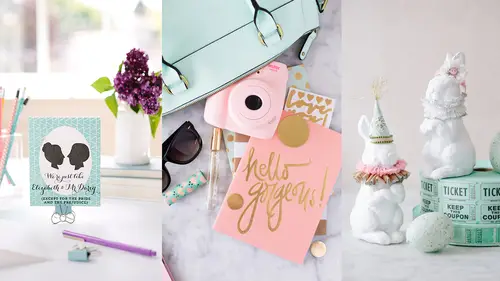
Lessons
Session 1
1Introduction to Craft Photography Fundamentals
04:59 2What Your Visuals Say About Your Brand
04:56 3How to Become a Photographic Author
10:44 4How to Use Natural Light for Your Product Photography
10:00 5Setting Up Your Photo: The Basic Rules
09:07 6Becoming the Viewer to Take Better Photos
10:30 7Shooting 3 Setups: Creating the Backstory with Images
34:32Shooting from Top Down with an iPhone
19:49 9Shooting Paper Products with an iPhone
10:54 10Shooting Jewelry with an iPhone
19:01 11Editing on your iPhone
15:28 12Finding Your Brand's Aesthetic
18:39 13Find Your Product and Customer Target: Exercises
11:12 14Figuring Out Your Audience
08:46 15Interview with Gilit Cooper of The Bannerie
08:45 16Branding Beyond Instagram
19:47 17Looking for Natural Light in Your Home
19:36 18Building a Styling Prop Collection
08:22 19Creative Backdrops
13:52 20The Essential Product Photography Props
11:18 21DSLR Basics
02:39 22Understanding Shutter Priority And When To Use It
26:29 23Understanding Aperture Priority And When to Use It
37:16 24The Basics of White Balance
12:52 25Photographing Jewelry
37:27 26Setting Up a Bedroom Set and Photographing Pillows
19:59 27Photographing Greeting Cards
06:53 28Shooting Products on a White Background
17:24 29Top Down Photography on a White Background
13:06 30Shooting Products on a Black Background
07:23 31Shooting Reflective Items
12:20 32Shooting with Backlight
04:01 33Top Down Photography: Shine & Reflection
24:50 34Basic Editing in Lightroom
31:37 35Batch Editing in Lightroom
06:00 36Editing Jewelry in Lightroom
10:01 37Editing White on White in Lightroom
06:54 38Editing Shine and Reflection in Lightroom
17:03Session 2
Lesson Info
Basic Editing in Lightroom
It took me a really long time just to even try it. When I went to school I learned Photoshop, I took multiple Photoshop classes. It was Photoshop 2 at the time (laughs) so, that's how far it's come along and how long it's been. And so, because of that I was super familiar and really comfortable with it. And so, when other programs came out I just wasn't that interested. But when I realized the capability that you have of batch editing which basically means being able to edit multiple images at one time and save and resize multiple images at one time without creating an action or without going to a whole bunch of work, I realized that this was the program that would work really, really well for me because I am photographing multiple items at the same time on the same sets. Being able to edit them all at once because the lighting and the exposure was the same was extremely helpful to me. I really, really love Lightroom for multiple reasons but that is a big one that can save you a lot of...
time. We're not going to like, start from the beginning and talk about organizing and setting up catalogs and all of that. If you want that there are amazing Lightroom classes here at CreativeLive and I know Kenna knows what they are. Yeah, absolutely. I'll just chime in. I mean we have a number of classes here on CreativeLive. There is a specific one that is on Lightroom for beginners with Jared Platt. And so, that could be one. It's a lot shorter than some of our longer ones and I think it's pretty cheap as well. If you're looking for some more tips Jared Platt's Lightroom for Beginners I think is what it's called. Thanks. This is another thing that I fell like in my life that I've made work for me. There are multiple ways just like in Photoshop and Lightroom for you to be able to do things and adjust things and edit things. This is just the way that I do it. This is he way that I find best but it may not be like the most perfect, scientific way. Let's get right into it. We're gonna be talking about the develop module today. And I am not seeing my panels to edit from. No, the panels you have to click on the sides. My panels. Oh here we go, all right. It's set up a little bit differently than I normally have it. Let's just look at his really quick. Here on this left hand side is where you could install presets if you want to. In Photoshop they're called action, in Lightroom they're generally called presets. And you can see here I have this color VSCO presets. I bought them because I wanted to try them. I thought it would be fun and they are fun and I use them a lot more in portraiture than I do in my product work just because again, I want my products to look exactly as they were in real life so that people buying them will know. I'm not doing a lot of funny color things to my images, I'm only trying to correct and make sure the color is correct. I don't use presets generally. Here on the right is where we start really working on our images. But before we do that let's go and just choose a few we wanna work on and I think we wanna start with white because I'm guessing that's what everyone wants to know the most. Your thumbnails will come up when you bring them in and I can see them, I can change the size on them if I want to but I like to see multiples at one so I know exactly what I'm doing. Then we can see which ones we've underexposed and which ones we've overexposed or correctly exposed depending on how you wanna say that. And I'm looking right now at perspective mainly. Where did I get my lines the straightest and it actually looks like this one to me. That's the one I'm gonna choose to start working on. And I can also see those thumbnails when I come to the bottom along the bottom so I can work from there as well if I didn't wanna see them a little bit larger. Let's start working on this image. First things first, we need to rotate it. We're gonna rotate it right and I'm just doing it from the menu so that you can see that but there is a shortcut to doing that as well. Gonna flip that around, okay. Now you can see that I was a little bit top heavy on this. I was closer to the top of the card than I was to the bottom of the card and because of that I'm not getting a true straight perspective. Also, I was using a little bit of a wider angle so it was stretching things a little bit and that's an easy thing to correct. First of all, I can go to this little square at the top and this is my crop tool and I could crop if I wanted to. I don't want to on this but I do wanna straighten out the top of my card, that top line. All you do click and hold it down and then I can rotate it however I want to until I get the lines straight and then just click done. And that's already much better. But I still wanna change that perspective so I'm gonna work on the perspective before I work on the color or anything else. And so, I will go all the way down to Lens Corrections. I'm gonna click on that. This is another tool that I think is amazing in Lightroom. You can click on the enable profile corrections and it knows what lens or camera I use and it's already adjusting for that. Now because I was using a normal lens, the 50, there's not a huge adjustment. Do you see it's slight but it is making it better. Now, I'm gonna blow your mind one more time. This is where we can transform our lines so I was a little bit closer to the top than the bottom so I need to bring the bottom up so it matches the top. I can do that in my vertical lines and do you see? I'm doing it a lot so you can like really see what's happening here. You don't wanna use this in a really strong way, okay? It's a slight one or two to five kind of deal but just by going to the plus five I've already really fixed that issue that I was having. Let me go back to zero so you can see that. See how the bottom of that card was just really, the lines were really bad. Now I can correct that. And I wanna try and always correct that in the best way on my own when I'm shooting. But if I've made a mistake this is a really, whoop, we jumped to 14. This is a really nice way to be able to kind of go and then correct some of those things. If I was maybe leaning to the left or to the right in a horizontal way, I could change my horizontal lines but they were okay. I was okay in that way. I can also change the scale and the aspect and all sorts of things. Get that back to zero. Okay and then you can see as I did that now I have like a little bit of white showing on the edge. I need to constrain the crop, I just click on that and it just crops it to wherever was extra space along the edge. I'm feeling like my proportions are like a lot, a lot better here but what I don't like now is that the card is off center when I change to that. So, I'm just gonna come in and crop a little bit so that it is centered again in my image. And so Candice, you can just click on the arrow on the right. If you like hard click on it then your dialog box will stay. It'll stay? Okay. Did I get it? Yes. Okay. All right, so now we have that. I'm gonna close this. Perfect. Thank you. There you go. Okay. Now the card looks good but now I need to fix the white and I need to fix the card itself. That's when I go into my basic panel and then my basic panel I have exposure and contrast. I can adjust my highlights and my shadows separately, I can also adjust the whites in the card and the blacks in the card, okay? I'm gonna just start slightly adjusting. I feel like right now the background it did have a little bit of blue in it. We're in a room that has like a lot of cooler tone colors and it's kind of in the shade right now, just the direction of the windows. And so, I'm gonna add in just a tiny bit of yellow to warm that up. And these are slight changes. Because the way we were shooting, we were really, really close to having the proper exposure and the proper colors. We only have to just slightly adjust things and then I just went a little bit towards the green. And I almost always add contrast, I just really love contrast. Keep adjusting adding in a little bit more yellow because when I dropped in the contrast I could see that my shadows are still really blue so I was adding in some more yellow. And what I love about this is if you're a new person to photography or to art in general, you can see what the opposite of the colors are. If I needed to get rid of blue I just go towards yellow or if I needed to get rid of a warmth I could go towards the blue. Unlike Photoshop it's telling me exactly where to go to fix those colors. And then I just start going in and because again, I love contrast, I'm gonna deepen my shadows a little bit and brighten my highlights just slightly. Same, I'm gonna lighten my whites quite a bit because I want that white pure white. And because on the card I don't have any detail on the white so it's okay to brighten that up. And then I'm just darkening my blacks. Clarity you wanna be really careful with and same with vibrance. I rarely use clarity or vibrance. And then saturation I'll just bump up the saturation a tiny bit. I don't want it to be too saturated because it'll not look, it might look great on screen but then later when I'm printing it it can feel really overwhelming. I adjust that slightly. Okay, so we're actually pretty close on the white, right? It looks pretty white but here's another tool that's really helpful when you're trying to figure out if you're really shooting, if it's really white. When you're on this gray background it's gonna look white even when it isn't so you can click the soft proofing button and it's gonna put it next to white. And now, do you see it's not white. And that's what happens a lot of times when you put it up on your website. You're like, I thought it was white. I didn't see where you just clicked. Soft proofing, it's in the bottom left right down here. Oh, okay. And you can't edit while you're in that, it's just a preview. It's basically like letting you know if you're on white or not. Okay, so we've got to do something to fix that but I don't want to go any higher on my whites because look at what starts happening to the yellow, I start to lose it. I don't wanna go any brighter than this because I want it to match the card. I'm going to go in to this tool up here, this brush tool you see on the right hand side. It's just an adjustment brush and what you see and I've already done because I must have been using it already for this is I turn my exposure all the way up and I turn my highlights all the way up. Now when I come over here, see my brush and there's two circles on my brush. Anything on the outside circle in that outside circle is going to start going white or sorry, on the inside circle it's going to go pure white. In between the two circles it's looking for items of contrast so that it doesn't affect that area. I can start painting out the gray and if I go over the white a little bit, do you see it's not taking it away. It's leaving it alone and that's pretty amazing if you're like me and it's really hard to like get straight lines with this. I can go completely around my subject and start knocking out the white. And I kind of usually do like a first pass. We're gonna go a little bit smaller when we're going over smaller areas so that I don't go too far over the envelop. Let's see how I can overlap that a little bit and it's still okay because it's a different tone. And then when we get into the corners we get even smaller as we do that. Now, I have to make a decision here on whether I want the shadows to show or not. Because it is pretty contrasty there the brush is reading it like a little bit funny, right? I think I want a little bit of a shadow because I want that separation from the white but I don't know, it's pretty blue so maybe I'll just go right in and start painting it up. And as I get closer in dealing with the shadows I usually make my brush a little bit smaller so I have a little bit more control. Okay. And I would just keep going until I brush everything out. And you see how I can go right up to the card and get rid of all of that. It's just a much easier way than doing like selections and all of that stuff and I would keep doing this but let's just show you really quick. When I go in and I soft proof, now do you see how it's really white. It's dropping a shadow behind the actual shape of it but when I look at it next to the white, it's white. It's a pure white. And I didn't affect the integrity of the product that I photographed because I am not touching it, I'm just getting rid of the background and it's just a really easy fast way to do that as opposed to going in and making selections on everything. I have a question. Yes Are all these adjustments on a layer or you're making those adjustments straight to the photo? This is straight to the photo but on this left hand side, if I click down I have a history of everything I've done. So, if I don't like something, I make a mistake, I could go all the way back and start again. And it's a separate file so I always have the original that I didn't mess up. And is it possible to do masks versus using the brush in lightbox. Lightroom. I've never tried that. Okay. So I don't know personally the answer to that. I would guess yes but this is just the way I found is like the fastest and easiest to really get rid of the gray and go right into white. I think on this one I actually would getting closer and really cut out the rest of the shadow too. And you can get in closer and really look and go right along that line and get rid of it. But again, if I go over it a little bit I have that layer in between the brush that really helps protect the image. Thank you. Now, let's make it go away. Okay. I can really go back any steps that I need to but once I start again those steps that I skipped over are gone. Okay, let's pick another thing to work on now that we've shown that. Maybe one of the darker. I can also just click through here and see which one I liked the best. And I think I like the last one the best. That was the one we decided we are good with. And I also mark these. See that little thing that came up so I know that that's one of the images that I really liked. And I would again, this time because I'm not as worried about the perspective, it looks pretty good, I would just start in my basic panel. And I like this nice and cool. Again, oops. I was in soft, it won't let you edit while you're in that. Okay. Again. I feel like we're super close on the exposure so I'm really not going to adjust very much. I'm gonna go a little bit cooler because again I feel that like it makes it a little more editorial, a little bit more high end so I'm going in to the cools a little bit. And maybe a little bit towards the green. I'm adding in contrast here because I like it when my darks get really dark. And I'll play with my shadows and brighten up that candle so that it really was the white that it is in real life. And I might bring in my saturation. I'm gonna talk about the orange because I feel like the orange is getting really orange. And another nice thing about Lightroom is I can then control the saturation and the hue of every single color within my image separately. If I feel like the bright orange is really taking away from my product, I can now go in. I'm gonna click on saturation, I'm gonna click on orange and I can take that down. Do you see the difference in that? Let me just go back so that you can see that. There it was super bright and there I just took away a little bit of the saturation only in the orange. I left everything else the way I wanted it to be and that's another reason why I just really love Lightroom for products. Because if I happen to use a prop that then I feel like started to take away and I didn't notice it as I was shooting, I can go in and maybe desaturate a specific area. This is not like I'm gonna make the rose red and everything else black and white. I won't do that. This is just seeing something that is too saturated and is taking away from everything else. It's just a little step. All right. We haven't talked about detail yet but that is where our sharpening takes place. And I generally sharpen to around somewhere in the 50s or 60s and I just changed the radius to like 1.4 generally. And this is something that everybody has a different opinion on sharpening and what you should do and what you shouldn't do. This is just personally how I've done it. Another thing that's really great about Lightroom that we don't need because we were shooting at a low ISO, but if you have a lot of noise in your image there's a noise reduction panel which I feel like is actually pretty good in Lightroom. We could adjust and take out some of the noise if we needed to but we don't because we shot at a low ISO. And then again, I almost always go into my basic and at least click enabled profile corrections. Do you see how that just straightened out that candle a little bit. And the other thing you'll notice is several of your images or of your lenses, I'm sorry, when you start to really open up your aperture they start to vignette your image so the edges get a little bit darker. And so watch the edges of your image when I click this. You see how they just got slightly lighter. It corrects for that as well. And a lot of times I like that. I like the edges to get a little bit darker because I want the center of my image where my product is to really stand out. It just depends on the specific image but here I like the correction it's giving me so I'm going to choose that. But I always come in to lens corrections and look at that and decide. I might get in just a little bit closer, if I needed text this would be a great place to add text, right? If I didn't need text I might come in a little bit tighter. And I feel like that's all right right there. I try to always crop in camera as opposed to doing a crop like I just did. And that is because the more you crop in and then the bigger you blow it up the more quality you lose in it. It's better to blow up a bigger photo already than to take a little part of that photo and blow it up. I really, really believe in cropping in camera. Look at all the edges of your frame, this is something I should have said as we're shooting. I always check all the corners of my viewfinder to make sure that there's nothing there that I don't want in there on my corner. But this it, I feel like this is perfect. Now you can go and do effects and there is vignetting. Fake vignetting is not good. If you want to darken it just a tiny bit that's okay but those heavy vignettes or like when people fade out the edges it's just very out of date trend wise and it will date your images by a lot so just don't do it. Okay and that's it. That's how I would edit an image. I feel like this is exactly where I'd want it to be and then I would go in and save it. And I wanna show you how to do that. Instead of clicking save it's called export and this is another reason why I love it. I can come in here and I can export this image and I can pick the folder I want it to be in. And right now we're in my CreativeLive power point and then we're in a subfolder images. If I wanted a subfolder in my subfolder I could just click put in a subfolder and I could click candle because it's a candle so it really helps me stay organized. And then I can rename any of my items and if I am saving several at the same time it'll just rename it, like right now it says reflective good. It would just say reflective good one, two, three, four, five, six and it would just number them. I can rename from there which is really nice and then here's what I think is so amazing. If you know exactly what the image sizing is for your Etsy shop, for your website, whatever it is. Let's say it's 2400 pixels wide, that's what it is on ours, then I can just come in here. I can set my width and height. I can set my dimensions, I can set it for the long edge, I can set it for the short edge. For me if I'm always, I'm shooting all vertical and I know that they need to be 800 pixels wide to go on my website or 24 which is what we use, I would just put in 24. I keep my resolution wherever I need it to be, whether it's being printed or on web and then I just click Export and it resizes all of those images at one time as opposed to going in and saying image size or save for web or doing all those extra steps. It does it all in one easy go. That is all I would change here. You can also change the quality but don't, leave it high. My color space is sRGB because that is what you want for the internet. And it's saving as a JPEG. So then I just click Export and now you can see it right up here as it exports the file. I have a question. Yes. I was curious about the lens corrections. You said that it will detect your or you need to put in the specific lens that you have. Does it automatically know that or do you have to put that somewhere? It knows. Okay. As long as you have like a current, if you have like the latest camera and you haven't updated Lightroom then you might have to like plug that in. But it recognizes the camera and the lens you're using and it also as you can see up here it's telling me all my settings that I was using as well. It's really, yeah, it's really nice. I had one other question. Yeah. What is the big difference between adjusting for blacks and shadows? The blacks is it's really just adjusting anything that is a black, appear black. It's like a certain number in your scale. The shadows are the darker areas not just blacks. Let's do another image. I wanna come back up to the first ones we were taking. First I wanna discuss them a little bit and then I want... We're gonna go back in the library just so you can see the thumbnails a little bit better. Again, I would start looking through these images and I wanna pick one that was like during that time period where we were taking super crooked images so that I can show you how we would fix that. Whoops. Let's find one of those. That's pretty crooked. Yeah. Let's take that one and let's correct this one. I'm gonna brighten it a little bit and add in some contrast. And I would like to point out here that this is why you don't want two light sources. Do you see on the highlight side it's pretty white and on this shadow side do you see how it's getting pretty warm in there. That's because we had these lights on back here and it was adding in. And if I start going too cold it might fix that side but then the other side starts getting blue. It's just so much easier and better to have one light source to adjust for because I can just take these sliders and adjust for them. And I can also come in here and I can change my white balance just by a click of a button so that it will adjust it for me as well. I like it kind of cold like this so I'm gonna leave this blue tint in because it feels like a clean bathroom to me. There's a lot of contrast already in this image because it was, everything's black and white in the image. We don't have to add too much ourselves but let's then fix these lines on the back. Let's fix them and I don't know if we'll be able to because it was the board and not necessarily the camera. This is something that you have to be so careful of. Maybe we can because then your product might start going crooked in the image and your lines are straight and then you have to decide what you care about more. So that's why I really think it's important to do it in the first place but I think we might have just fixed that, let's see. It's a lot better than it was, right? And our product still looks pretty straight. And then again, this is why it's best to shoot just slightly wider because if you do adjust perspectives it's cropping in. So we're gonna crop that. I feel like I want it to be just a hint brighter in the front. Okay. And then I would just go in and sharpen. And that is it. I think it looks really good. Now, yes. The same way you adjusted the orange to take down saturation, could you adjust the white specifically to like remove blue or add yellow or? Not necessarily. Those are more colors, let's go in there and so, white isn't an option because it's a color. When you're adjusting your whites it's when you're adjusting this overall white balance. That's how we bring in the blue. If I didn't want blue I would just start going the opposite direction towards the yellow. Do you see now, it's like a more pure white as opposed to the blue. I like the blue but if you didn't like the blue you could just start going towards the yellow. And then a lot of times I find that my whites get a little bit of the magenta, the pink kind of look to it and that would just be going in towards the green. But you wanna be really careful with green especially if you have people in it because green is not a good look on face. But yeah, so, that's really where you would adjust how it's affecting your whites. Okay, we adjusted that and then I'm gonna go in and just check how I feel about this. Really didn't change anything because we had already cropped in. And I think it's good.
Class Materials
Bonus Materials with Purchase
Ratings and Reviews
a Creativelive Student
This class taught by Candice was amazing. She teaches in such a step-by-step, easy to understand pace. She shares so much of her own tips and tricks she uses to create beautiful images without spending a fortune or having all kinds of expensive equipment. Having the DSLR lessons included was really great for anyone who wants to do more than the camera phones are capable of. Learning the basics of how to use a DSLR is confusing for most people, but Candice broke it down in the simplest way possible. Social media is all about imagery, so if you want to put out the most beautiful eye-catching photos, then you want to learn how to use more than the camera phone. I don't have a business where I need to take photos of things I sell and I still enjoyed her class so much. As a photographer, I am going to use her ideas and insight when I photograph things for fun. There is so much to gain from this class. I would highly recommend taking her class. She is a wealth of great ideas and information and has that friendly personality of someone you'd want to sit and have coffee with.
yomichaela
A wonderful class to get you going with craft/product photography. Candice provides (and shows) fantastic examples and it's really fun to watch her work through a shoot, moving items, etc. to create the final image. She also covers some basic photography tips which is very helpful. Great class! I definitely recommend to others!
Melinda Malamoco
I loved this class! Candice is so personable, clear and relatable. I would want to hang out with her and be creative! I have been taking pictures for YEARS, and for my Etsy store for over two years, and I still learned a lot in her class. The lessons are set up in a way that you can follow, take what you want and don't worry about what you don't need. I will say that I got a TON of ideas for how to better display my brand, what my personal style is and how to be consistent with it. I so recommend this class for anyone who has small business or just wants to be able to take better pictures of their products. Okay, off to build a prop kit!