Lessons
Class Introduction
01:56 2Understanding the Basics of Color
04:10 3Color Contrast and Hierarchy
15:18 4Saturation or Vibrancy of Color
09:27 5Ground or Surface Color
07:32 6What is Color Harmony?
11:00 7Color Palette
11:11 8Set-up Chalk & Charcoal Demo
03:40Demo: Sketch Simple Still Life
05:48 10Demo: Establish Value Structure
09:06 11Demo: Find Temperature Balance
09:47 12Demo: Shadow & Highlight Placement
17:10 13Demo: Establish Dimensional Form of Object
04:49 14Set-up Watercolor Demo
11:50 15Demo: Establish Color Ground
05:26 16Demo: Establish Colors for Object
05:30 17Demo: Sketch Object onto Watercolor
03:20 18Demo: Color Subtraction & Value Range
04:42 19Demo: Color Blocking for Composition
04:25 20Demo: Establish the Shadow Tone
05:11 21Demo: Utilization of Opaque Color
11:51 22Desaturate Image in a Picture
05:37Lesson Info
Saturation or Vibrancy of Color
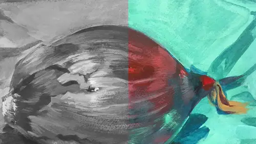
So, saturation. This is yet another element that also has a scale. Saturation is a color's thought to be saturated when it's at its most intense or vibrant. To reduce a color's vibrancy is to de-saturate or neutralize it. If you think about it, I think it's easy to think about it in cooking. Like if you have a really sour tasting thing and you add sugar, the opposite thing to it, you're going to neutralize that sour taste. So the same thing in color. If you have a super vibrant color, you can neutralize it in a couple of different ways. One way, which is my least favorite way, is to add the color black to a color. The more black you add to a tone, it de-saturates the color. It's a valid way but it's not the most interesting way. If you add the complement to this, if the complement of red is green, the more green you add to red, you're de-saturating it. But there's more energy to that color because they're opposites, they play more. So it's a really interesting way to do it. Another way...
is to add white to a color. That will also de-saturate it. But saturation, the most saturated color, go to the next slide, to the least saturated color, that contrast is again, where our eyes are going to tend to go in a piece. Now, like value, temperature and light, using that contrast is something I try to use in my images to make sense of a picture and keep the person moving around the image. I saved my highest level of contrast for the vibrancy of the eyes, you can see right here. It's super saturated. There's nothing that's more vibrant than the eyes of the cheetah. You might say that the temperature, vibrancy and saturation of these elements draw your eye. And they do, they're meant to reflect the face but because a) we look at eyes, b) I have kept the level of contrast of saturation, value, temperature through the face. There's much more here that's contrasting than this. This actually, because it's like an arrow, points you back into the face. And this is meant to direct you here. In terms of saturation, the last thing we're looking at are maybe the hands and the newspaper. This edge is meant to push you back into this but it's a softer relationship of light to dark and also, this is a little warmer, that's a little cooler. All these colors were..I used a red, a blue and a yellow. It's a limited pallette but I'm trying to control all these elements I'm talking about to really keep you in the focal point, which is in this case, the character's face. Now if we turn the saturation down, you can still see the value structure works. It's still functioning but the thing that isn't happening although some people say 'oh it looks really (speaks French)' which is kind of cool. It does. I like that. But what happens is, we don't tend to look at his eyes and that's because the value of the eye is almost the same as the value of the jacket. It's kind of unavoidable in creating work to make everything absolutely a different value. It's just not gonna happen. That's where you use another tool and here I use saturation. Like 'Okay, I'll make his eyes super saturated, really vibrant and warm against that cool blue sort of rim and that will get us to that spot.' So that's how you're still controlling each of these aspects of color. So this is another one that again, not in every work of art will you use opaque and transparent color but it's really useful and it'll be the way I'll use color today. It's really useful as another element. Opacity and transparency. A color is said to be opaque if it hides what is below it and transparent, it lets light pass through. And on the screen, it's probably a little hard to discern it but basically you've got your most opaque color where there's no white from the background coming through it, and the most transparent on the opposite end which is letting the white behind it come through. And like I said before, the white de-saturates the color. It'll be more clear I think when I do the demo, what that means. On a screen, it's a little bit different. But see the contrast of the most saturated, excuse me the most opaque to the least opaque is making an edge or a contrasting space and it's easier probably to say.. Oh yeah. Should I go back? I was just wondering what the difference between value and opacity/ transparency is. So value is always referring to the level of grayness, blackness or whiteness of something and opacity has to do with when a color is sitting on a surface, can we see through that color or can we not? So they're really separate issues. They can look and appear like that last image. So you might look at this and say 'Well this color is darker than that color.' It's true. It's also in addition, more opaque than that color. Again, it'll be so much easier when I put a piece of paint on the paper, you'll be like 'Oh I get it.' It's a little harder on the screen. Okay. And so when we're talking about value, we're just talking about black and white. Just about black and white. Value is exclusively that and the weird thing is when you're looking at color, if I'm looking at you, I'm assessing your value structure. It's like you have to turn a dial in your head. If you're on a computer where you take a photograph, you can de-saturate and then you go 'Oh there's my value situation.' But that's hard to do when you're looking. You have to train yourself to see those values because it's not literally right in front of us. So this is an image that shows what I'm talking about here, the level of opacity is in the area of light where transparent and translucent color is landing in the shadow. When you start to look at this, all of those things we were talking about. This is a painting done by one of my students from RISD and what I start to have you think about here is all the things that are working in concert. You have a super opaque piece of color here. This is all paint and it's thick. You can't really see what the ground color is and the ground is just the overall tone of color. It's the first thing that was laid down, in this case it's purple. You can't really see that at all where it's most opaque because it's blocking what's underneath. As we move through the other colors in the shadow of the pumpkin, it's more translucent which is semi-opaque, semi-transparent or purely transparent where you can actually see that purple pretty well. Orange and the purple are sitting on each other, they're really neutralized. That contrast of the light and shadow, of the opaque/ transparent, of the warmest thing against the coolest thing, of the lightest thing against the darkest thing, are all right here. So we're supposed to look here and then suddenly move down to the other lesser contrasting spaces in the picture. A question has come in from Mora Law. Can something be dark and transparent? Seems like we're kind of seeing a little bit of that. Yeah because the transparency, like this is the darkest shape and this is the darkest shape and they are both probably the most transparent elements here and you see that in this shadow here and here. So value again, is an addition to transparency and typically, this is kind of jumping ahead, but shadows, the way that I'm gonna structure it, tend to be more transparent, translucent. Light tends to be more opaque and it's a system that was established by the Renaissance painters, and the masters so I'm standing on the shoulders of giants to really understand this but absolutely. Because I think that's a little bit counter intuitive. So that's really interesting. I'm curious to know, counter intuitive. What makes you say that? Well because I feel like if something is opaque, I think of it as thick and therefore in my mind, dark. And then again, so the fact that the shadows are more translucent, you would kind of think they were gonna be. Well so the other thing I'm gonna say is the things that I'm talking about might break some notions that people have and that's not uncommon. I have students in my classroom where I say 'Your head's about to explode' but it's good! Explosions are good. So really good questions. So now, this is probably one of my most favorite aspects of color is complements. That refers to colors that are opposite on the color wheel. We've just chosen one here, which is two secondary colors. Purple opposite a yellow. Again, it can be used in terms of a scaling. A hierarchy of contrast. The highest level of contrast is the two at the end. All the things in the middle are going to create less contrast. So thinking about this in addition to all those other things, again it's like how do we play with that issue of contrast? The cool thing about complements. I like to think of colors like people. So purple is probably, maybe kind of quiet and dark and brooding, and yellow is really loud and vibrant and when they're at a party, and they stand next to each other, there's tension because they're opposites. It works the same way with colors.
Class Materials
Bonus Materials with Purchase
Ratings and Reviews
Anna Kotzè
I really liked the informal demonstrations and I also liked the way she set out her pallet with warm and cold colors. This was not only an informative class but inspiring. The casual and relaxed working style, encourage playfulness. Thank you for an awesome class.
Laura
I’ve had foundations in many of the color instruction that was presented here so the information was a very good revisit. I also think it was explained better in this presentation than in the other training I’ve had. I enjoyed listening to the lecture, thankfully they weren’t drawn out until you want to stop listening. The demonstration was best after we moved off the charcoal drawing (although that was interesting to watch) because using the paints really brought home to me the application some of the lessons learned. I wish that part would have been more robust so that all of the elements in the lecture could have been directly called out in the demonstration. The instructor was most effective when not trying to multitask too much. Overall, I recommend this course.
Robin B.
I had previously learned basic color theory, but this instructor took my knowledge beyond with layered instruction about value-contrast-complements-hierarchy, etc., and she does it in such a fun way with her own examples of work and great stories! I like her poise and confidence and think this series is a terrific value.
Student Work
Related Classes
Illustration