Lessons
Class Introduction
01:56 2Understanding the Basics of Color
04:10 3Color Contrast and Hierarchy
15:18 4Saturation or Vibrancy of Color
09:27 5Ground or Surface Color
07:32 6What is Color Harmony?
11:00 7Color Palette
11:11 8Set-up Chalk & Charcoal Demo
03:40Demo: Sketch Simple Still Life
05:48 10Demo: Establish Value Structure
09:06 11Demo: Find Temperature Balance
09:47 12Demo: Shadow & Highlight Placement
17:10 13Demo: Establish Dimensional Form of Object
04:49 14Set-up Watercolor Demo
11:50 15Demo: Establish Color Ground
05:26 16Demo: Establish Colors for Object
05:30 17Demo: Sketch Object onto Watercolor
03:20 18Demo: Color Subtraction & Value Range
04:42 19Demo: Color Blocking for Composition
04:25 20Demo: Establish the Shadow Tone
05:11 21Demo: Utilization of Opaque Color
11:51 22Desaturate Image in a Picture
05:37Lesson Info
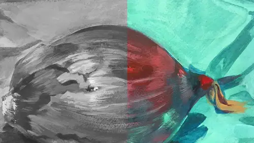
Demo: Sketch Simple Still Life
Let me start with our pepper. So as I look at the pepper I'm trying, I'm doing what's called, actually first I think I'll land this wonderful diagonal line. The edge of that piece of paper on the purple is pretty dynamic. And it's at a slight angle, it's not straight, which would be really kinda boring. So I'm gonna land that just about here. About, it's called a three-quarters roll. And that is when you're trying to break your picture apart in shapes don't land things right halfway in the middle anywhere. Because then it's centralized, it's boring. So I'm gonna do this about two-thirds of the way down is where I'll start my purple edge of the fabric. Then I'm gonna adjust and figure out what is the size of that pepper, how big is it? Then I'm just gonna map out its general sort of shape and size. And what I'm doing right now, just to get the feel for this thing, is I'm doing, I almost call it, it's not blind contour but I'm trying to follow the contours of the overall form, and then I...
'll get in and noodle it out just a little bit. So let me start with that. Pepper. And I'm also making sure, this is just a compositional thing, that when you're trying to compose with color you want the shapes to all be varied sizes. The shape of this, the background, the shape of the foreground, and the size and shape of the pepper itself. We don't want them all to be the same size because that's really incredibly boring. Okay, so I can sorta see the bottom side, the most beautiful part of this pepper is kind of its bumps on the back. So now I think I have the right size relationship of our pepper. And the next thing I'll look at, is where that beautiful highlight is on the top there's a little peek-a-boo of the green. It's just a stem but it's super short. But that's kind of a nice focal point. That green, that little stump against the red of the pepper. It's sorta cute and it's noticeable. And then I know there's a round shape at the top. Another round shape for the pepper, and then there's a little small one in the background. So now I'm trying to refine the interior structure of this form to make sure I'm landing my highlights. There's a highlight right close to here, it's sort of a little triangle, I'll map it out. Sometimes I'll draw in the highlights, sometimes I'll just, you know, I'll find it again when I'm making the picture. But if you're not sure you go ahead and map it out. The structure of this is a really beautiful, it's a beautiful form and shape so that makes it fun to draw. So I'm gonna just draw the line of the pepper. And then the second sort of larger, I dunno what you call that bit of the pepper, I have no idea what that's called. The sections of a pepper. But the second section is probably the largest and then there's a little one right at the bottom. So what this is, what I'm doing is I'm trying to create, let me grab my eraser, the linear structure of this pepper in order to draw it in charcoal. Some people work directly with shape right off the bat, they don't even start with the linear structure. Most artists I know though find it easier to think linearly first. It's just mapping it out all in line. And I'm one of those people too, I really like that. So let me get this shape right here. And there's another, there's like secondary little highlights on the back side. They sort of compete with each other. When I look on the screen actually it's really interesting because the highlights on the opposite end on the left side are actually larger and more prominent but from my angle the little peek-a-boo green is more noticeable. So I'm gonna have to choose which one is the focal point so we have a little bit of a hierarchy. Otherwise they will compete with each other and we don't want that. Okay, so here's the structure of my little pepper. I'm gonna map out that second little highlight just right around here. And then there's, I'll find those, I won't have to map those out. Okay. So, again, another little compositional note. There's a shadow shape over here so I'll establish that. And there's a little bit of a shadow shape underneath that pepper that I'm gonna push a little further. The one thing is when you're making a piece you don't have to be rigidly wedded to what you're seeing. This is your picture so you can take artistic license and edit. That's part of being an artist, you have that license. Everybody has that license because we are all creative people under the skin, everybody is, just some people don't know it. But I say take the artistic license where you want to. And I think if I cast a little deeper shadow under that pepper than what's there it'll make it feel like it's resting on that surface with clarity as opposed to floating. But the one other thing that I just wanted to mention was this distance of the pepper from this edge to this edge, the bottom of the pepper to the edge, is different than the distance between the top of the pepper and this edge. If I'd shifted that pepper over a little bit it would be smack dab in the center and it would be equally weighted, boring. So there's always a symmetry. You're always trying to shift things so there's variation throughout the piece. Okay, so I'm drawing this dark enough hopefully to be able to see it when I lay down my tones.
Class Materials
Bonus Materials with Purchase
Ratings and Reviews
Anna Kotzè
I really liked the informal demonstrations and I also liked the way she set out her pallet with warm and cold colors. This was not only an informative class but inspiring. The casual and relaxed working style, encourage playfulness. Thank you for an awesome class.
Laura
I’ve had foundations in many of the color instruction that was presented here so the information was a very good revisit. I also think it was explained better in this presentation than in the other training I’ve had. I enjoyed listening to the lecture, thankfully they weren’t drawn out until you want to stop listening. The demonstration was best after we moved off the charcoal drawing (although that was interesting to watch) because using the paints really brought home to me the application some of the lessons learned. I wish that part would have been more robust so that all of the elements in the lecture could have been directly called out in the demonstration. The instructor was most effective when not trying to multitask too much. Overall, I recommend this course.
Robin B.
I had previously learned basic color theory, but this instructor took my knowledge beyond with layered instruction about value-contrast-complements-hierarchy, etc., and she does it in such a fun way with her own examples of work and great stories! I like her poise and confidence and think this series is a terrific value.
Student Work
Related Classes
Illustration