Lessons
Class Introduction
01:56 2Understanding the Basics of Color
04:10 3Color Contrast and Hierarchy
15:18 4Saturation or Vibrancy of Color
09:27 5Ground or Surface Color
07:32 6What is Color Harmony?
11:00 7Color Palette
11:11 8Set-up Chalk & Charcoal Demo
03:40Demo: Sketch Simple Still Life
05:48 10Demo: Establish Value Structure
09:06 11Demo: Find Temperature Balance
09:47 12Demo: Shadow & Highlight Placement
17:10 13Demo: Establish Dimensional Form of Object
04:49 14Set-up Watercolor Demo
11:50 15Demo: Establish Color Ground
05:26 16Demo: Establish Colors for Object
05:30 17Demo: Sketch Object onto Watercolor
03:20 18Demo: Color Subtraction & Value Range
04:42 19Demo: Color Blocking for Composition
04:25 20Demo: Establish the Shadow Tone
05:11 21Demo: Utilization of Opaque Color
11:51 22Desaturate Image in a Picture
05:37Lesson Info
Color Contrast and Hierarchy
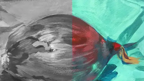
Here we talk about contrast, and that's the state of being opposite or strikingly different one thing from another. Now, you can't see the white square because the background is white. But contrast is basically where our eyes are tending to go. When you look at this whole screen, we're looking at the black square. We're looking at the edge that happens from the square to the white background. It's the highest level of contrast on this whole screen. As human beings, we have a tendency to want to look at the most high contrasting elements. And that's a critical key of color. I'm going to bring that up again and again through all of the elements, highest level of contrast between the darkest thing and the lightest thing, the brightest thing and the least bright. So, that's a part of this conversation. If you look at this piece, I've turned down the volume of the value structure so it's super gray. It's barely discernible and that's because our value system is gone. So, what happens a lot ...
when people are using color is, because they're working with red, blues, oranges, yellows, they're forgetting about value. And their piece, if they looked at it in its value structure, in gray form, desaturated it, their piece would have no value contrast. And that becomes a problem when making a piece. So, we always want value to still exist even when you're using a full color palette. A hierarchy refers to the arrangement of elements to imply a level of importance. Now the hierarchy is what is the most contrasting thing to the least contrasting thing, what is the brightest thing to the least bright. So, hierarchy establishes what's most important to look at in a scene and what's least important. And with this piece, as we look at this image again, I want you to consider the highest level of contrast that exists. Now, if you look along the edge of the figure, you can see that the highest level of contrast is right through the nose shape. We tend to follow along this edge of brightness, because the figure is actually white, all the way down to a really key important element which is this little otter, who's been lost, by the way. He was lost and these two characters were looking for him, and this godlike figure rescued it. So, this little triangle of dark value is actually sort of pointing you to focus on that character. The idea is the highest level of contrast is along the nose. We travel down along this deep edge of tonality contrast, land to a kind of secondary space that's close to the nose but a little less contrasty, the value through here. I also direct your eye with this light to these two figures, one is in dark and one is in light. But their level of contrasted value is secondary to what we're supposed to look at first, the eye and the nose area. So, you're following this, and then I tried to leave this little edge of light and this figure a little lighter, kind of to help you move backup in this direction. So there's a hierarchy of value contrast in this piece, even though it's in color, I kept looking at this piece in value to make sure that that existed. So, this also has a similar sort of structure. It's a piece from the same book using the same kind of value contrast hierarchy and the same kind of range of values from black to gray to white. I also paid attention to the darkest value against the lightest value. If we look at this illustration in color, the value didn't disappear, it's still a part of the picture. So again, if you track where the eye is going whether looking at the black and white, or the color piece, we're tending to start along the edge of this form because this spot and this part of the head are the highest level of contrast, and this right here, this edge right here. So, the eyes went to land on the figure and go to this spot. In black and white, you might tend to start at that high level of contrast which is at the tree edge. But that was one of the reasons why I decided to put some of the brightest colors in the figure, to get us to go here first and move up to this scene, notice the skull face. Poor Mully is terrified that he's gonna get eaten in this scene because he's in the wild wood and it's really scary. So, I wanted us to see his psychological state. So that's part of the reason why I built all of this into the scene. I want to add another term here that's really important, and it's easy to think about. It's temperature. We know when something is hot, or cold, or neutral to the touch. The same thing applies to colors. Once again, if we think of color and temperature along a scale, just like we did with value, you can go from the warmest color to the coolest color. So there's a temperature range. It just basically refers to feeling, how we think about something would feel if we touched it. Temperature contrast is really important. It's the coolest color contrasting the warmest color. And much like we saw the black square against the white edge, our eyes will tend to go where something has the most heat and the least heat. That contrast is where the eye will focus. Now, if we look at the two images, we can see where the hottest color next to the coolest color is. Our focus is on what's called the focal point. By putting high contrast of temperature, like value where you want someone to look first in your piece, it's always a good idea. The first place you want to look in your image is called the focal point, and in this case, the focal point is for this, the character, and over here is this character. So that's where you want just the contrast not only in value but also of temperature. The one thing about temperature I want you to think about, well, there's a couple things, but one of them is about the temperature of the light. In this scene, the temperature of the light is really cool. Now people often don't think about, when they think about light, think oh, it's light. It's lighter or darker. But temperature plays a role. It's really cool in this scene, so the shadows tend to be warmer. And I wanted it to be cool because it's kind of a frightening scene. This scene is lit by a really warm light. So, the temperature is so much warmer and the shadows are cooler. So, it's kind of an opposite system, but that piece is magical, it's supposed to feel warm, and friendly, and loving. What I'm curious about because I'm seeing this just because you showed the slide about temperature that was the blue versus the red, and that being the highest contrast. Yep. So, I'm seeing now that the blue and the red is next to the point, like you said, the focus point. And with regard to the values those two strongest point. And the same with down below that you've used the red and the blue down there next to again where you wanted that other focal point. Whereas I would not have even seen that before-- You've got it. Or noticed that, but that's where my eye is going to. That's exactly right because what you're doing is you're trying, it's like you're building a case. I'm gonna get your eye to go there. I'm gonna use value and I'm gonna use temperature. And so, the temperature relationship, here you have this vibrant reddish orange next to the blue. Your eye is sort of locking on this zone and it's pushing you right towards the face. The high contrast of warm next to the cool shadow also moves you along here to the next part. So, I'm trying to orchestrate that system in every picture that I do. And it works that way here, too, just slightly differently. I used a warm, the warmest thing in this picture is the red on his scarf, Mully's scarf. The most blue thing is his jacket. So, those two things are sitting next to each other. So, instead of going maybe where there's a really high level of contrast along this edge, we've got you here, and they you're moving. We look where figures look. We always look where characters are looking. We look up to this face. So again, I'm trying to orchestrate those things in tandem. Thank you. You're welcome. So, light is a really important aspect in addition to temperature. And light is just the colors are not not visible without the light, and light is a powerful design tool for expressing emotion and functioning in a design. And not every artist uses light as part of their dialogue. Some people work really flat, and light is not a piece. It isn't a voice you have to use, but if you're going to use it, you want to use it wisely. In this first example, there's an illustration from one of my books entitled R is for Rhode Island Red. It's an ABC book about the state of Rhode Island. And I've illustrated this scene, this is U is for Underground Railroad. And here this is a young boy who is seeking out sanctuary during the civil war, and he finds it at what's known as the Touro Synagogue in Newport, Rhode Island. And so, when I decided to illustrate this, I was like, well, I want the boy to be entering a space that feels warm and inviting. So, the temperature of the color and the light, and the light itself is really important. I wanted the warmest light to be in the in space where he's going to enter and become a part of. He's about to walk in the doorway. I designed this so that the light kind of made a diagonal shape of warmth, so that it goes right to the boy. And that's a really critical piece in terms of emotional story telling. But the other thing is, I've also used the light in a designer way to move your eye, much like the other piece. That diagonal leads you to the boy, or you could start at the boy and move this way. And, hopefully, the window also leads you down to the typography, which is a really important part of its being a book. We want people to read what the text says. But if I change the equation, and we shift the color to cool palette, it's a really different story. The message seems to be more ominous and threatening, maybe a little bit melancholy. Thinking about the temperature of light and images has a tremendous effect on the meaning. And in imagery I try to communicate with color. And people often say, well, do you use color with a theme in mind, and the answer would be yes. I do think about that. I think about, because I'm a storyteller, I think about the narrative aspect of color. Because color can be symbolic. It's not universally symbolic. A color in the West can mean a really different thing to someone in the East. So, I say rely on what the color means to you. It probably will connect to other people in a similar way, it may or may not. But there are some associations that, like red is one of those colors that, at least in the West, implies danger, or intensity, or passion. So, to know those things is really important, but that you can trust your intuition on. But this piece here, when I change it to the cool, it almost frightens me to look at it. So, I wanna think about it in the warm zone. Now this is an illustration I created for My Little Pony Under the Sparkling Sea. I had to capture both the fact that it's under water and it's kind of a scary scene. So, what I did was, I created a whole underpainting of ground, and we'll talk about that in a little bit, of cool tonality. And basically I decided to make the character of Nar Wally, that's his name, a little bit warmer, a little bit pinker so that he would pop against this background. I also paid attention again to the contrast of the value of the light here, the light itself and the temperatures of the colors so that your eye will focus on the two faces. So, when you look at this, I used a little of what's called rim lighting, or it can be called ambient light, it's a secondary light source that's cool from underneath, just to make this form feel dimensional. Sometimes having two light sources can be really helpful. It's a slightly more complex way to use color. But if you pay attention to light in the world, that's how it functions. So, our eyes tend to go between these two characters here, but I want you to also see is that there's little tiny color pops of the red and the yellow against the blue, three primaries. Even though that figure, Arrow, is really tiny, he's been rescued by Nar Wally, it's really tiny, our eye will go there because that vibrancy is pulling us there. If I show the red, or the blue, or the yellow in the bubbles or somewhere back here, that's where I would go. So, I'm controlling that issue of light, temperature, and value in this scene. And the overall expression of color that the coolness tells about, it's a little big dangerous and it's also under water. I have a question for you going back to Nar Wally. Okay. Which I love the name. Thank you. And you're probably gonna get here but, in terms of hierarchy or just thinking about that, in terms of all these elements, when we're talking about value, and then these temperatures and contrasts, is there a hierarchy of all these things that you're thinking of in a particular order? In a way. So, the highest level of contrast or focal point should be the same thing. Because we know that people are going to look where the highest level of any of those elements of contrast will be, temperature, value, light and dark, because we know they're gonna go there you want to put it where your eye should go to, which is the focal point. So, hierarchy, that's the highest level of contrast, should be the focal point. Then you might say, well, how, the secondary, what's the second thing I want them to look at, where do I want them to go next. That's where you want to move them through the piece. Because if people enter an image, and then you send them out of the image because you're not keeping them there, then you've lost your audience. So, you want to keep them in the picture. Well, how do I do that? You have to have a level of contrast that's not as strong as the first but still exists to move them around the scene. And for me, that's second level of contrast is the edge of Nar Wally's body to the background. You tend to go here because those eyes, how can you not look at Nar Wally's eyes. The contrast of light and dark affect your two figures looking at each other, the intensity, or here. Then you're going to follow that rim edge, probably get here rather than here because of the highest level of value contrast. And actually, temperature, he's pretty warm to the cool background. We're gonna follow that along because it's sort of guiding us that way, it's a line edge of tone. Then we might look at the texture of the bubbles. But I made sure not to just make these lines of contrasting light and dark, and sort of more intense color against a darker, more neutralized color too contrasting but enough to move your eye down to these bubbles. I'm still trying to keep you in the frame so the tail edge is fairly sharp, but it's not as vibrant as this or this edge in value, or temperature, or any of the other issues. And it moves you back here. I swirl with like the last level of contrast, super soft down here. And, hopefully, that sends you right back here. So, it's a really good question. You're trying to use hierarchy to really move the person around the picture.
Class Materials
Bonus Materials with Purchase
Ratings and Reviews
Anna Kotzè
I really liked the informal demonstrations and I also liked the way she set out her pallet with warm and cold colors. This was not only an informative class but inspiring. The casual and relaxed working style, encourage playfulness. Thank you for an awesome class.
Laura
I’ve had foundations in many of the color instruction that was presented here so the information was a very good revisit. I also think it was explained better in this presentation than in the other training I’ve had. I enjoyed listening to the lecture, thankfully they weren’t drawn out until you want to stop listening. The demonstration was best after we moved off the charcoal drawing (although that was interesting to watch) because using the paints really brought home to me the application some of the lessons learned. I wish that part would have been more robust so that all of the elements in the lecture could have been directly called out in the demonstration. The instructor was most effective when not trying to multitask too much. Overall, I recommend this course.
Robin B.
I had previously learned basic color theory, but this instructor took my knowledge beyond with layered instruction about value-contrast-complements-hierarchy, etc., and she does it in such a fun way with her own examples of work and great stories! I like her poise and confidence and think this series is a terrific value.
Student Work
Related Classes
Illustration