Color Illusion in Practice
Lesson 6 from: Color for Designers: Exploration, Theory, & ApplicationRichard Mehl
Color Illusion in Practice
Lesson 6 from: Color for Designers: Exploration, Theory, & ApplicationRichard Mehl
Lesson Info
6. Color Illusion in Practice
Lessons
Day 1
1Why Study Color?
20:52 2Natural Awareness of Color & Playing
21:25 3Colors and Their Relationships
38:42 4Color Contrast of the Color Wheel
19:59 5Hands On Color Grids
44:31 6Color Illusion in Practice
13:10 7Interaction of Color Practice - Part 1
08:47Interaction of Color Practice - Part 2
18:27 9Illusion of Transparency
16:39 10Hands On Free Study Experiment
26:43 11Color in Action: Designer Pablo Delcan
26:37Day 2
12Color in Design: Tangrams
18:01 13Hands On: Tangrams
18:11 14Hands On: Leaf Composition
22:53 15Expression of Color & Opposites - Part 1
23:55 16Expression of Color & Opposites - Part 2
28:23 17Learning from the Masters
25:01 18Hands On: Cut Paper Illusion
27:04 19Everyday Found Color 2
32:02 20Colors in Nature with Rachel Gregg
42:39Lesson Info
Color Illusion in Practice
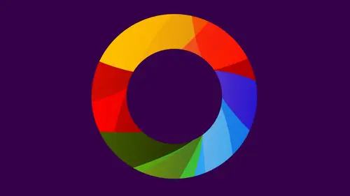
I talked a little bit about color illusion and Josef Albers a little bit earlier and of the relativity of color. And that's really what we're gonna be focusing on in this series of exercises this afternoon. And this is his book. Um, and we also have an IPAD app. There's a great of IPad version of the book that is available that we're gonna take a quick look at as well and maybe do some experimenting with. But this is also something that we're gonna be using cut paper for. Mainly there's the up. Okay, so this is an example of what his book looks like. And, um, it's gonna go back to this one. It's, you know, he has a lot of these experiments where we're trying to make one color. Looked like two or two colors look like one experiments with the illusion of transparency and then applications using these same kinds of color concepts in free studies with Albert's called free studies what we might just call collage or something like that. But where you're employing similar ideas of say, how to...
make yellow look different down here against the black. It has one kind of characteristic up there against the white. It has a very different kind of characteristic over there, with the different the dark sort of brownish purple and the blues again. Seeing these on different kinds of colors enables us to go back and say, Well, this is sort of a theoretical idea. Here's an actual in practice idea again. This great quote, uh, in visual perception of color is almost never seen as it really is as it physically is. Color the most relative medium in art. And that's kind of what we're here to prove this afternoon. Make one color look like to. So I showed you this before. We'll just kind of run through it again quickly. So you see the connection of the colors down below and the colors look dramatically different from one another. And there's a reciprocal relationship so that the X it's against the blue green. The dark blue green looks like the background on the pink side, and the X and the pink side looks like the background on the green side, and in fact they're the same color, and it's kind of a middle color and then make two different colors look alike. what we call subtraction of color. So those colors those two squares in the centre look very similar. They're not exact, but they're pretty close, actually did this last night. My computer. But we see that there actually two very different colors. So this is that, and that is that you see how different they look on these backgrounds. So essentially, what's happening is that the surrounding color is subtracting itself from the inside color. If you can conceptualize that, it's kind of difficult, you know, a lot of my suits. How do you subtract color? So you say Okay, light and dark, So a dark color you put that on top of it. It's attract itself, making a look later, the darkness is being subtracted from the color over here the opposite. So this color we put that on top. The lightness subtracts itself makes a look darker, so that's a very simple principle and something that you'll be experimenting with its once you are able to understand that or even conceptualize it even vaguely, it becomes a really interesting experimental tool and then eventually will go into this illusion of transparency. But we'll come to that back to that a little bit later. Um, so before we go to the interaction of color IPad, I thought I'd start just with some experiments here with paper. Yes, sure is there since there's the subtraction of colors. In addition, of course, that red plus yellow equals. Oh, so I don't think there is? No, it's, uh, it's also a little bit confusing because we can talk about additive color and subtracted color added a color being about light subtracted color being about pain. So those terms are there a little bit flexible? But there's no in this particular context. There's no addition of color, really is just this idea of color subtraction. Okay, okay. So just in terms of starting this idea and beginning to get a sense of it, um, and will do all do this experimental mainly. Together we can start with one que And since the oranges air right in front me, I'm just gonna start with that and I'm gonna start with a white board. White and black is going to give you very different effects. And what I'll do is I'll put down a dark version of dark variant of a color and a light variant of a color. Okay, maybe get this is more in the middle since and then using the square bunch. I'm just going to punch out some in between colors and place them on top again. I'm just being experimental here. I'm not really looking too hard at what I'm doing yet, cause I'm gonna be doing a lot and about trial and error. Okay. Very good. I would have a shadow there. So the idea is to try to use these colors in a way where again, this color starts to look like that, and that color starts to look like that. Is that working for anyone? You have to look at it for a little while so that inside square begins to look very different, even though it's the same color. So what I'd like you to do is choose a range of colors within a single hue and try this experiment so you'll have to backgrounds one dark and one light, and then choose an in between color that somewhere halfway in between and place it on top and see if you can get a very similar effect to what I'm doing here. You can start on a white board or a blackboard that's really up to you and always thinking about this idea that what you're doing is you're subtracting color, so the outside color is subtracting itself in the inside color. A darker color on the outside is going to make the color look lighter. Lighter color is going to make later color on the outside is going to make that center color look darker. You're really trying to find that middle color kind of like this effect, except we're doing it with squares. Albert's gives us these examples in his book, basically the same thing. You're doing a single Hugh with a color on top where the reciprocal starts to happen. So this starts to look like that, and this starts to look like this. So keep working with the center color until you really find that match. So, um, like, this is definitely too dark for that. This is looking a lot like that, but you could probably find a different middle color, so you might find one color that works better than others like, so the call around one ground might look really good, but it doesn't quite reflect the other side and it also helps a squint your eyes a little bit to reduce the kind of the visual noise around things. It, uh, squinting your eyes reduces the amount of light that you're taken in. So you're not quite seen all the exactitude of these colors and what we're doing Years we're proving the relativity of color. That color is always dependent on its neighbors. In this particular case, it's background. This is pretty close now. You can also change the background color. So what? Albert's calls pushing the backgrounds to get the desired effect. So if your background color feels like it's too dark and there's no way that that middle color is going to reach it, then try like in this case, try lighting up this color just a bit. And this is really the key to doing these Albers exercises to not get two locked into any one thing. You keep experimenting, always thinking about this concept of subtraction, always looking. Sometimes you're going to get a perfect match on one side, but then the other side is in quite right, and if you find that your hue is not working because there isn't enough, there's not in a wide enough range for you to achieve the effect, then try a different you. So sometimes you get these really dramatic results. And that's really kind of what we're looking for. This initial exercise where you're just working with one Hugh is just the tip of the iceberg. When it comes to Albers a Z, we progress through this. Now we're going to start to change the backgrounds and change the foreground color. So we're not just dealing with one Hugh anymore. Wow. That's can you see this green one over here? This is pretty fantastic. Are those really the same colors? Well, that's amazing. That's really good. Look at how different they look. Beautiful. Really good example. What would you call this color? Sort of, I guess. Like a really great line. Bright line. Yellow, green, yellow green. Absolutely. And very vivid. Very vivid. You started out with this one, and that didn't work, so I searched. This is a really good one. Very beautiful. Nice job. So you can see the principle in action here Subtraction. The dark ground subtracted itself from that making a look later, Lake around subtracted itself from this making look darker So we know that this idea of subtraction works really well with light and dark. But that's one thing. It does. Yeah. That's pretty good. Yeah. So, actually, the longer I stare at this one, the better it gets. Really? You do have to stare these a while in order for the effect to to take place. Yeah, that's definitely I mean, they look so different from each other for sure. Are you done? I couldn't. You definitely have this going. So in order to make this look more like that background, you have to dark in this ground slightly. Now that's gonna change this a little bit, but that's what I would try. He made a slightly darker ground, and that's really what this is all about. It's about experimenting, working with colors, figuring out what you have to do in order to kind of solve the problem. How we doing on the home front? Good. We got some interesting questions coming in that a question from Sam Houston is just reiterating rather than question, but saying the effect of color subtraction is affected by ambient lighting. Is that correct? Absolutely. Yeah. Yeah. Lady makes a big difference. It's like looking at colors at night versus looking at them there in the day, looking at colors and shadow. So for this, it doesn't really matter what light you're looking at. A zoo Long is the latest clear and flat, um, and similar across so shadows tend to be problematic if they're only covering up half. But ideally, you're looking at, you know, with even light over the entire surface. Yeah, me of like that water experiment where you put your hand in cold water and hot water. And then you put both of those fingers in the warm one and they change temperatures. Well, the one that you put in the hot water feels like cold water and then code feel like reminding me that in fact, Albers refers to that in his book as an analogy for this. So it's actually good that you brought that up. Thank you. That's perfect. It's kind of like that. It's, um, you know, making one thing seemed like to all right. And it has to do with our the way we sense things in this case are visual senses and our color sense. Now does this. Does this exercise typically work better with colors that are less or more vivid, like like the one of here. There's a little more grey, it looks like in there. Yeah, that's center color. You know, once you get into two different grounds, like right now you're working with a monochromatic palette. All one Hugh. Soon as you get into two different grounds complementary grounds, then you're finding that center color still. But that center color is not going to be like the other colors. It's kind of going back to what is the mixture of these two colors in a little bit, what you were doing, right?
Class Materials
bonus material with purchase
Ratings and Reviews
Nabha
The course was great. Richard was a very good teacher, appreciating the students’ work and helping them expand and improve on it. I learned from that alone. I feel more confident in choosing colors, and hope to bring a greater sense of fun to my design work. Thanks again.
PETE
How wonderful to have such an experienced, thoughtful teacher, who takes educating others so seriously. The depth and breadth of his teaching skill is matched by his knowledge of the subject. I studied art in school, own some of the color books he recommends, and learned far more than I thought possible. And he does it all in such a kind, affirming, supportive way. What a calm guide. How lucky are we to have access to a class with him!
Joe Loffredo
I was concerned that I wouldn't like watching everyone work, but I found that it was the best part! It allowed you to see Richard's lessons being put into action by the various students, each of which is talented in their own right. And Richard is great. Knowledgeable, intelligent, and supportive, he's got the attributes a great teacher should have. I'm a painter, not a designer, but the class really helped me a lot. When I go back to the canvas, it will be with a much deeper understanding of color, and how colors interact with each other.