Color Contrast of the Color Wheel
Lesson 4 from: Color for Designers: Exploration, Theory, & ApplicationRichard Mehl
Color Contrast of the Color Wheel
Lesson 4 from: Color for Designers: Exploration, Theory, & ApplicationRichard Mehl
Lesson Info
4. Color Contrast of the Color Wheel
Lessons
Day 1
1Why Study Color?
20:52 2Natural Awareness of Color & Playing
21:25 3Colors and Their Relationships
38:42 4Color Contrast of the Color Wheel
19:59 5Hands On Color Grids
44:31 6Color Illusion in Practice
13:10 7Interaction of Color Practice - Part 1
08:47Interaction of Color Practice - Part 2
18:27 9Illusion of Transparency
16:39 10Hands On Free Study Experiment
26:43 11Color in Action: Designer Pablo Delcan
26:37Day 2
12Color in Design: Tangrams
18:01 13Hands On: Tangrams
18:11 14Hands On: Leaf Composition
22:53 15Expression of Color & Opposites - Part 1
23:55 16Expression of Color & Opposites - Part 2
28:23 17Learning from the Masters
25:01 18Hands On: Cut Paper Illusion
27:04 19Everyday Found Color 2
32:02 20Colors in Nature with Rachel Gregg
42:39Lesson Info
Color Contrast of the Color Wheel
with the color grids you're exploring. Contrast of light and dark, warm and cool and vivid and dull initially. And what we're gonna be doing is a sign in each of you, um, and people at home to can choose perhaps what they want to focus on, Uh, but one of you will be, or several of you will be working on light and dark and warm and cool, um, and vivid and all. And we're just gonna be talking about those initially and then we'll get into these other things. Perhaps later, um, we'll be working with cut paper, as you can see here on the table as well as Christine is actually gonna do some work on the computer. So for those of you who would prefer to work on the computer, you can certainly do that. Well, the cut paper is the traditional way of doing these assignments, and we have these handy little square punchers which automate the process somewhat. Um, so we'll just get started. So initially, when we're talking about these color grids, this is kind of what they look like. Uh, and we're no...
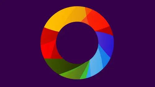
t using any glue today. Uh, you don't necessarily have to use glue. And in fact, what I recommend for my students is to keep the the squares. The color squares relatively loose until you're actually ready to glue them down, but in the process you might take photographs. So if you come up with a composition of colors and arrangement that you like, take a quick photograph with your phone with a camera and then you'll have a record of it, and then you can rearrange and come back to it later. But this is kind of how it looks, and sometimes it's probably very, very faint. But sometimes I'll draw a grid very lightly on a board, so I have a sense of where to put the squares You guys here are working with. The cut paper will just be working loosely with a grid, and you'll do your best to kind of keep them in order and will take a few pictures, maybe along the way, and see if we can protect some of the stuff. By the way, this is just ah, contrast of hue. So the primary colors red, yellow, blue, and that's a good place to start. If if you want to sort of experiment loosely with lots of different colors. Contrast of you is all about that contrast of light and dark. Uh, one of you, maybe two of you will be working on this particular contrast. So when we say contrast of light and dark, it could be one Hugh in this case, yellow, um And we have light variants of that yellow and dark variants of that yellow and you're trying to make a composition. And the composition can be very strategic. In other words, a very programmed, very structural kind of a composition, perhaps a gradation or some kind of a symmetrical composition. Or it could be very loose, like this, more asymmetrical. And here we actually see something where there's what I call a visual hierarchy and value system and ordering to the information that's there. So we have a very light grid square that kind of attracts our attention, and then we have other squares that are very insulated, dark. That move are I threw the composition. This idea of visual hierarchy is really important to us as designers, because for designing of communication materials, say, uh uh, an add on infographic, you want Teoh, determine where you're the viewer's eye is going to go first. Where Second, where. Third and you can do this with value you can do with light and dark. You do it with warm and cool. You can do vivid and dull. It's a way of getting the viewer's eye to move through the composition in a very predetermined way. Sometimes it works better than others. If you think about this, say in advertising, Um, how in a typical advertising like a page advertisement, whether it's on a screen or printed, the viewer's eye goes to one thing first say an image and then maybe to a headline second. And then maybe to a body of copy, some text third and then maybe finally, to a local fourth. So those elements are arranged in a way to lead the viewer's eye through the composition. And that's the way we create order. We think about how we read. We started at the typically we started the upper left hand corner of a page, and we move our way down to the lower right corner. So they're the hierarchy is part of the syntax of our reading. We understand that we're all accustomed to that way. But in thinking about art and design, it's different. The most important thing could be at the bottom of the page, and we can use visual hierarchy to move the viewer's eye to the bottom. So here, when I look at this, I tend to look here first just because it's so different that one squares very white or gray. And then I start to move around the composition from there. Contrast of light and dark, warm and cool. There we have arranged from magenta that color to a yellow, so we're moving from something that would be considered a cooler variant of red to a warm color, like yellow passing through oranges on the way. This is a really fun one, because you can work with one. Hugh, you can work with two Hughes. Are you gonna work with many, many Hughes or colors? Warm and cool colors Together, you saw some examples earlier of this again thinking about visual hierarchy. How do you use these colors to move the viewer's eye through the composition and a very programmed away? Given a dull of course, we have grazed layer and again thinking about colors that are very pure that are very identifiable. Yellow, red, green, blue, purple and then other colors that are less identifiable. They might have some kind of a chromatic presence, meaning what? We can see a little bit of color in it. If I look at this square here, it looks warm to me. So I know that there's a little bit of orange, a little bit of red in that gray, and we've heard of that is a chromatic gray. Other grays are more neutral. They don't have as much of that sense of color in it. But the greys, because of that absence of the identity of a color, can be thought of his dog again. Vivid and dull can be done with one Hugh or many hues, and you'll have that choice. Complementary colors will get to this later. Um, initially again, we're gonna be working with light and dark, uh, warm and cool and vivid and dull. Complementary colors. There, I think. Proceed. You're gonna be working on that of the computer because that's really that's our our means for mixing colors. And with compliments like this, you really have to think about the mixtures. So what happens when you mix green and red together. That's something we really don't know until we're working with paint or, in this case, working on the computer, and you might be able to employ a little opacity in order to create those effects. But all of these colors in this grid are created with red and green. That's it. All the colors air variants of red angry so mixture colors so we can create a gray, a neutral color by mixing two complements together. This is one of the keys of color mixing in order to get this color. It's a mixture of those two, um, compliments and every complementary set. Purple and yellow balloon orange, red and green have their own neutral mixture, colors that are a little bit different from each other. In theory, all compliments will mix to a perfect kind of gray, but it's only theory. It's very, very difficult. Pigments are so different from each other. What color is very different from oil from very different from wash or acrylic? Ah, the computer is going to mix colors very differently, but we're always going to be trying to get to this point where the center what I call the center of the compliments where that middle color is un identifiable. Oh has lost its its connection to its parents, basically, So we look at that. We can't say that's red or green. It's somewhere in between. And then finally, proportion. Now this is Ah, it's a interesting thing. It's actually based on a theory that Garrett came up with, you know, back in the 19th century, and it has to do with the light value of a color. So yellow is a very light color. It's high on light value scale. Purple is very low on the late value scale. Orange is close to yellow in its brightness, so it's also very high, but not as high as yellow. Blue is very low on the light value scale, so it's not his lowest purple, but it's low, and then red and green are actually equal in light value. So by using those colors, those color sets in different amounts in actually different proportions, you can create a sense of balance. So here, when you look at this composition, we have three yellow squares. We have four orange squares. Want to by six. Um, it looks like 1234567899 blue squares and funds 10 Purple squares. So you see the progression from yellow, the fewest toe orange to blue and into purple. And it gives us a sense of balance where no one color is so important or so dominating. Where the competition is just about that one color. We looked at this, and yellow has a lot of power sodas orange, and then the blue and the purple kind of work together to create a background that typically happens with contrast of light and dark to. That's what's happening here now when you're working with these grids, especially if you are working with multiple Hughes. Ah, lot of these contrasts are going to be overlapping, all right? And so even if you're working with light and dark, there might be vivid and all, or there might be warm and cool. But your focus is going to be on light and dark, so that will be your assignment. Um, we'll talk more about that as we could go in. I think that's it for these things. Okay, um, got a question from side to saying his tone different from light and dark. Tony is a great word. Um, it really describes any particular color. Ah, a tint or shade. It's not as, um, accurate, perhaps, or as exacting as tints and shades. But if you think about tones like, uh, it's almost a musical term, right? It's a tournament we normally associate with a music. Ah, note. A sound atone. Sometimes it's associated with, um, say an emotion, um, or a feeling. But tones definitely can be applied to colors as well. It's just not such an exacting term. I prefer tints and shades. Yeah, but we can say a warm tone or a cool tone. Yes, our SRV dog is also asking online. That's saying, How do you define the properties of the character of the tints and shades of a particular Hugh? Particularly. I think they must work in graphic design. They're asking about logos. Is it possible to define that? Yes, we could see you could say, um, a tent can be warm. A cool. It can be vivid or dull. A shade can be warmer. Cool. It can also be vivid. All but a shade is. I was always going to be dark and a tent is always going to be light. Fantastic. Thank you. OK, eso the first thing all show. And I think I should probably stand up for this. Or maybe they just sit down. So this is Johanna Sit ins book to the big version of his book, The Art of Color. It's ah, beat up because I take it to class with me every day and on my bike and tends to get kind of wrecked in the process. There's his color grid after its color wheel, and it's what I showed you earlier in the animated version. Um, the primaries here, the secondaries here and then all of the colors here, including the tertiary, is which are the in between colors as we move around. So this is his invention, and as we look at this, we can see light colors and dark colors. You can see warm colors and cool colors. We don't really get a sense of dull or vivid and dull from this, so that's a little bit different now. As we progress through the book, he's going to show us examples of these things. So here we have this wonderful color grid and It shows us ranges of light and dark of each of the 12 colors of the color wheel so we can see how. And we have dark purple and light purple, a shade in a tent. Now we can talk about saturation here, so less saturated, more saturated. Now what's interesting about this is that you can probably see that, um, the most pure versions of these colors are different points on the scales, so the purest version of the yellow is right here. The purest version of the purple is down here, so blue. As we move up, right, there's a purist version of the green, the yellow green tea the yellow and then back down. Now this is an interesting point, So yellow has very few tints, but many shades purple has lots of tents but very few shades, so colors are they have their own properties and each each color each. You has these ranges that have very specific ideas related to tints and shades, and it has to do with their light values. So yellow, very few tins, lots of shades down here, purple lots and lots of tents for a few shades. It's kind of interesting to think about colors that way, but it's what defines light and dark. This is a great example. Here's, um, kittens display of the complementary contrast, which is what you're gonna be working with. Yeah, a great example of the mixtures of red and green. So we see all of these different variants of the mixtures. Who would know that this is what you get when you mix you green and red together or even that. But over here he shows us he has the primaries. So red and blue and yellow and the secondaries purple and orange and green, and he shows us the mixture. So if he mixed the two compliments red and green together you end up with a gray or neutral in the middle. Same thing with the orange and blue. Same thing with the yellow and the purple. And that mixture color in the center is as neutral as you can get, but in reality. And I think you will find this when you're on the computer and illustrator that these center colors are going to change dramatically based on their parents, So a different yellow is going to create a very different kind of center color based on its purple, too. So these two colors out here are all going to determine what happens in the center. But this is something we're only going to get to through mixing now. We might be able to get some successful results through this, but it's kind of hard to guess. Could literally if you try to say, Oh, what is the mixture of red and green without really mixing it physically with paint or on the computer? It's hard to imagine that that or that means some people are able to do that. It's very, very difficult that weather waas It's not a nice example, though. Off Yeah, person. It was this, like years and years of study that he perfected this book, I think, was published in the early sixties, and he started teaching this in, like, 1919. So yeah, yeah, it's it's years. And it, by the way, didn't teach that the by host Larry Long, you think about the Bauhaus is this thing, and but it was really only around for about 10 years, and he was only there for about three years. But he initiated the full foundation course and the color course, and there was later top of the people Paul Klee, Kandinsky. And they kind of took over and have their own ways of teaching color. Here's saturation, vivid and dull. So we see these beautiful, vivid colors in the center and as we progress out to the outside, dulling the color down to the very corners where it's gray and then over here, vivid colors with variants of darker and also less colorful. So is we take the colors out. It has become less pure, diminishing their values. They become Don't out here. I think that's it. What we're gonna look at here and one other thing I want to show you before we move into the actual hands on is this wonderful thing. And the color star. Um, and I actually have to take this out of the box. But this is again. This is an invention of Johanna Sitton, and it's an extension of his color wheel. I use this all the time for creating color palettes. It's really very beautiful. So the color star has all 12 colors of the color wheel arranged here. And then as we moved to the inside, we have tents and to the outside. We have shades and he gives us the wheel here, and he gives us his wonderful little templates, which put over the top right. And so we immediately see these complementary mixtures who even refers to this is a diabetic color two parts and actually call some color courts just like in music. So if you play three or two notes on a piano or two notes on a guitar and they sound good together, we can think of that as a cord as a harmonic chord. Same thing is true for colors, and we see them this way. So if we spin this, and by the way, you can look at it with weight or black backgrounds, it's kind of nice to see, so you can start to see the variant various color combinations, and these are all complementary mixtures. So this will be up here on the table for you guys to take a look at, and perhaps it might give you some ideas about your own grids as you're working with him. Here's the Triad IQ cord, and we'll start with the primary colors really beautiful. So it's a three part color cord. Okay, secondary colors. Tertiary is my favorite. The split complimentary. So the split complementary literally is like a complimentary purple will be right here. So we have yellow and purple would be here. So this is, um, blue violet and red Violet. You see, red is right here and purples right there. So it's a really interesting way of thinking about colors and putting together colors in a certain way. If we move forward a four part Korda quadratic cord and just for getting ideas about color relationships really beautiful. So these are all very harmonious. Color relationships and color sets continue going through.
Class Materials
bonus material with purchase
Ratings and Reviews
Nabha
The course was great. Richard was a very good teacher, appreciating the students’ work and helping them expand and improve on it. I learned from that alone. I feel more confident in choosing colors, and hope to bring a greater sense of fun to my design work. Thanks again.
PETE
How wonderful to have such an experienced, thoughtful teacher, who takes educating others so seriously. The depth and breadth of his teaching skill is matched by his knowledge of the subject. I studied art in school, own some of the color books he recommends, and learned far more than I thought possible. And he does it all in such a kind, affirming, supportive way. What a calm guide. How lucky are we to have access to a class with him!
Joe Loffredo
I was concerned that I wouldn't like watching everyone work, but I found that it was the best part! It allowed you to see Richard's lessons being put into action by the various students, each of which is talented in their own right. And Richard is great. Knowledgeable, intelligent, and supportive, he's got the attributes a great teacher should have. I'm a painter, not a designer, but the class really helped me a lot. When I go back to the canvas, it will be with a much deeper understanding of color, and how colors interact with each other.