Lesson Info
2. Creating a Sketch and Adjusting in PS
Lessons
Lesson Info
Creating a Sketch and Adjusting in PS
So the first thing to talk about is how it is that we're gonna get this image that then you're gonna be able to use to do your mural. Um, so depending on where you're at, you can either sketch stuff out by hand. If that's how you're most comfortable, you can lay things out on the computer. You can work off of other pieces that you found that you really like. It's really about finding what's going to be the most enjoyable for you. This is This should be fun. This should be easy. This shouldn't feel at this stage like, um, like there any obstacles for you Yet the easiest way for me to work is to sketch on paper. That's how I prefer to start. So that's what I'm gonna do here on day. Since I'm here working at CREATIVELIVE, their slogan is create every day. So that's the phrase that I'm gonna be working with today. So when I first get started, I don't necessarily know yet where I'm gonna go with this. I'm not exactly sure what's gonna work best. I think there are a couple things that I want...
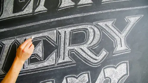
to play with, so that's where I'm going to start. I think I like the idea of combining three totally different styles for this. So I'm just going to start drawing the words, create every day in a bunch of different ways and see what's starting to work for me when I'm feeling. And then eventually I'll move onto the computer and work on creating my layout that I will be working from on the computer. So when you get started, really, you can work in any style that's most comfortable to you. I spent a lot of time, uh, doing sign painting and looking at a lot of fine painting work. So I tend to draw a lot of references from Old Sign ihj. New Sign Ege. Everything from neon signs always fascinate me like old vintage signs, Um, to the kind of signage that you would see in supermarkets, which are done really quick. You know, the things that change out every week. Um, so you know, I have this sort of arsenal of type going in my head all the time. And whenever I need inspiration, I I'll, I'll tend to look through my phone. I take photos constantly as I'm walking around, um, of different letter forms that I really like. So what? I'm feeling stuck. That's a really great place to look. Um and so I don't worry too much as I go around. A lot of times I start out with an outline sort of shape to block in where something is, but it really depends on the type of letters that I'm doing. Sometimes I start with more, um, of just the spine of the letters. So I might say, OK, this is the general space that I want this to occupy. And then I worry about building out the letters from here, Um, versus doing something where it's an outline first that I fill in. Since I'm done filling this it I'll go on to the next word. So I start off with just sort of the inner workings of the letters here, and I'm working on building it out into sort of giving it more body in style. I have a tendency to work on graph paper as much as possible. Um, gives me a great way to keep the words even I find if I'm working just on regular online paper plain paper. Um, I have a lot of trouble keeping a good baseline. The weight changes more than I would like it to between letters. But it all depends what effect you're going for If you're comfortable with that sort of variation. And by all means, you don't need to use graph paper at all. Ah, I just find it a little bit more comforting to get that that extra bit of, uh, consistency in there. So as I'm doing this, there are a couple things that I am not worrying about yet. I'm not worrying about my overall composition yet. That's gonna come later. I'm not necessarily worrying about the spacing that I have going on here. That also will come later. So I'm really now only focusing on the letter forms. Um, I don't need to get caught up in anything else besides just the style of the letters that you're looking at right now. Um, maybe you have some other go to styles for letters. Maybe you're very into calligraphy, and you want to start doing ah, lot of, um, script styles, and that's great to its whatever. Whatever feels most natural for you. And if none of this feels natural to you if you don't want to do any of this can happen right onto the computer and go straight into selecting funds that are already created when I tend to start drawing pretty, pretty late and then get darker as I get more comfortable. Ah, with the the shapes that I'm creating. Um, but I don't worry too much about raising, even though I have my wonderful little peanut or ease air here Faster Racer I've ever had. Um, because none of this is gonna be final. So if you've got three outlines around the edge of this are that is totally fine makes no difference. Uh, everything can be tightened up later. The sketches can be loose and quick, and then you can tighten everything up when you go into, uh, doing your final layup. Yeah. The graph paper here is helping me keep this in check. I've learned most of what I know about drawing letters from looking really intently at, um at other people's typography. Um, and so things that you can start to look for that will help make your type stronger Are things like where the weight falls in the letter that something that's super important, um, and can help make your help. Make your letter forms look a lot more comfortable than a lot more pro. So there's some things that you'll want to look at, like the's letters have really bizarre weight distribution. Normally, you'll find more weight in the horizontal than you do in the verticals, but a lot of sort of old Western e kind of lettering you see the opposite happening on it gives it a very distinct look in a very different feel. Um, so paying attention to the weight that's going on in your letters is important. Also, something like this is I start to get into, like, playing around with the baseline a little bit that that also can help inform the personality of your of your letters. Um, really Looking and practicing is the best thing to Dio you can start with looking at. You can print out a number of different either inspiration things that you see that you can look at while you're while you're working. Or you can print out some typefaces that you really like to look at while you're working. Um, but I would always encourage you to draw things by hand, as opposed to tracing whenever possible. Um, it will help make you look more closely and realize a little bit more about the letters. And it is important if you do. Ah, start off with an outline. You really want to look at the letter forms filled? Um, it might seem a little bit like a waste of time, but the letter forms will take on a very different feel once they're solid. Vs Justin an outline form if you are. If you aren't comfortable doing any of this sketching part at all, that's totally fine. You can go ahead and open up photo shopper, illustrator whatever you like to work in, and you can create your layout with fonts on the computer, and we can start from there. So when I do my sketching attempts to be a little all over the place and I'll cut out the pieces that I'm really liking in the end, and a lot of times my notebooks are full of things that have started and not quite come to fruition. But I'm gonna take all of these pieces and I'm going to scan them all in, and then I'm going to start picking which things are really working for me and which things I want toe just forget about and move on from, Okay? So once I have everything scanned in, I'm gonna go in and start selecting the words that I like the most on the script wasn't really working for me. I didn't love the way these letters were stacking, but what I really was liking was this create and this every in this day. So I went ahead and I took those on. I pasted them all in here, and these are just really rough. I am scaling these things. I'm not worried about resolution. I'm not worried about any of that stuff. Um, and when I first place them in, they were a little bit more awkward. But what I did was I put in some guides for myself because I really wanted this to be lined up, and none of my sketches were lighting up, so I put in all of these, and then I just went in, and I actually, you know, I resized some things I wasn't happy with. You know, this e seems a little shorter than the E on the end, so just the smallest changes in here. Just cause it's easier to do at this stage before I start drying again and lines air getting messed up, and it looks pretty growth. And that's all totally fine. Um, because this is really just to establish the layout. So things that I work on here are making sure that things are lined up, but I want to be lined up and that things are the right scale that I want them to be. Andi, that spacing in angles it's looking good, are looking good when the outline around these is really off. But I'm not gonna worry about that now. That's something that I could fix. What? I'm redrawing it. So I'm gonna take this. I'm gonna print it out. I'm gonna go straight to the light table and I'm gonna trace over everything. And when I do that, I'm tightening up a lot of stuff. Um, I'm still having some giant issues with spacing here that I'm gonna again scan this and I'm gonna go in and fix that up. So I went ahead and I created my next layout in Photoshopped. I fixed the spacing between D A and Wise and that was really off on my sketch. Ah, and then I wasn't totally feeling, uh, this little drop shadow along here. So I raised that on the computer, and I printed this out and I did a second layer with new addition on a light table again. And so now I have these additional pieces where I wanted to get a three d going on the day. And then I added an extra drop shadow on every and I added in some lines and some flourishes to really fill out the whole piece. But now, in order to show this to creativelive, I really wanted them to be able to see what the final product would more closely resemble. So I just inverted it and a pencil sketch. When you invert, it looks a lot like how shock is gonna look on a chalkboard, which is really handy. So this is what I sent off to creativelive. They were really happy with it. So then I am ready now to go on to discuss with you guys how I'm going to take this image and blow it up large to do it in one of their walls upstairs. And I'll show you different methods for that in the next section.
Class Materials
bonus material with purchase
Ratings and Reviews
Manish Gupta
Annica obviously has great talent, her method needs patience, truck loads of it. Of course, if you don't have patience, you should not purchase this course. This is a great course for someone starting off in chalk lettering. I would personally love to have a segment on the actual techniques used in photoshop to fine tune the chalk lettering done on paper/pencil. I especially loved the technique of doing it with paper pencil and just inverting it in photoshop. Overall, a great class. However, I felt, portions of the video could have been time lapsed ( like the wall mural segment) to save the students some time. Looking forward to seeing more from her.
Letter Shoppe
What a great class! This was the best online education I was able to find on Chalk Lettering by far. Annica's approach is fresh and she does a wonderful job of showcasing her process in a easy and fun way. Highly recommended!