Lesson Info
46. Image Color Balance
Lessons
Class Introduction
14:28 2The Power of Portrait Photography
06:52 3Introduction to Newborn Portrait
08:30 4Find Inspiration for Newborn Portrait
11:09 5Create The Scene for Newborn Portrait
05:58 6Prepare & Pose Newborn for Portrait
18:03 7Shoot: Techniques for Photographing Newborn
08:58 8Newborn Image Review
08:57Introduction & Find Inspiration For Child Portrait
13:03 10Create The Scene for Child Portrait
05:17 11Prepare Set for Child Portrait
05:48 12Shoot: Capture Child Portrait
11:40 13Image Review for Child Portrait
11:45 14Introduction & Inspiration For Teenager Portrait
09:05 15Create The Scene for Teenager Portrait
06:15 16Building Set for Teenager Portrait
14:01 17Shoot: Portrait with Teenager
10:43 18Shoot: Pose Teenager for Multiple Looks
14:23 19Image Review for Teenage Portrait
08:11 20Introduction & Inspiration For Adult Portrait
11:31 21Creating The Scene for Adult Portrait
06:25 22Lighting for Adult Portrait
04:51 23Tell Your Subject's Story
04:38 24Shoot: Lighting for Double Exposure
16:22 25Introduction to Senior Portrait
08:39 26Create Storyboard & The Scene For Senior Portrait
10:26 27Connect With Client to Create Portrait
16:06 28Shoot: Lighting for Senior Portrait
08:10 29Shoot: Be Creative on Set
15:09 30Image Review for Senior Portrait
14:23 31Portrait Shoots Recap
04:08 32Global Adjustments in Camera Raw®
05:37 33Editing In Photoshop® CC: New Born Portrait
24:41 34Editing In Photoshop® CC: Child Portrait
15:35 35Editing In Photoshop® CC: Adult Portrait
11:32 36Editing In Photoshop® CC: Teenager Portrait
11:28 37Editing In Photoshop® CC: Senior Portrait
13:46 38Introduction to Entering Print Competitions
02:14 39Process of Print Competitions
06:17 40What to Consider For Print Competitions
17:00 41What Judges Look For Overview
07:14 42Image Impact
03:42 43Creativity, Style & Composition in Images
14:04 44Entering Photography Competitions Q&A
22:50 45Image Lighting
05:43 46Image Color Balance
03:56 47Technical Excellence in Images
07:56 48Photographic Technique
10:15 49Storytelling & Subject Matter
09:28Lesson Info
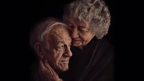
Image Color Balance
When it comes to color balance this can be a little confusing for some people. I see a lot of images with photographs that are really high contrasting in color. They'll use one color and then something that is the complete opposite in color tone in a photograph. What they don't realize is that those two contrasting colors are creating a distracting element in the photograph and taking you away from the main subject. It's really important in terms of that color balance that it brings a harmonious effect to the photograph. It can create some really dramatic effects as well. I'm heavily inspired by Renaissance paintings and you can see I've incorporated those rich royal blues and reds into this picture. I'll often, in the background you can't quite see it here on the screen, but that is a really dark green color. So there's greens, there's reds, and there's blues. That really warm rich frame, for me, add just this richness and this dramatic effect to this photograph. When it comes to edit...
ing a photograph like this, if for example, part of the image isn't of the right color then you can tone it done or change it to match the color that you want it to match in post-production. Tryin' to get it as perfect as possible in frame with that color tone that you want, but you can use things like Photoshop to really kind of enhance those colors to create that beautiful dramatic effect that you're looking for. When it comes to color balance, this is where, when we're talking about our other elements that judges are looking for, this is that creativity and style. This is impact. You can use these harmonious colors in terms of composition as well. It gives the overall image a feeling. When we look at a photograph we create an emotion. Some colors stir different emotions up in people. That's another really cool thing to factor into it. When I'm creating a storyboard another thing that I do is that I will search colors and I'll figure out which colors go best together in terms of those harmonious effects that I'm looking for. Also, what's the meaning behind a color? We use colors for different things and sometimes they can be used for definitely stirring emotions in people. When you are creating an image that has a huge emotional impact on it, you want those colors to go along with that same sort of emotional effect that you wanna have on someone. Whether you want it to be disturbing, whether you want it to be happy, whether you want it to be sad, creating that impact can be with colors. So with the dog image that I showed previously, that was a very gray monotone image. It really went with the mood. Those tones, for me, represented something really cool and dark and sad. They're the colors that I'm gonna use for an image like that when I wanna tell that sad story. When I'm talking about something that's really rich and joyous, something you're gonna look for there, the colors that I'm gonna use. With the twins in the bowl and they're all sort of brown and warm, it's gonna give you a really warm fuzzy feeling. Whilst there's still a kind a sad story in there, it's gonna make you feel something warm. Consider how those colors make you feel when you're looking at them. Do some research around them. It's really quite fascinating what you can learn when you start to look at different things.
Class Materials
Bonus Materials with Purchase
Ratings and Reviews
user-2c88c4
Among a sea of wonderful teachers here at CL, Kelly is the cream of the crop. All of her classes are outstanding and this one is no exception. Amazing teacher. Amazing class. Amazing education. If you are hoping to stretch yourself to create deeper more meaningful stories in your images, or are feeling the pull of print competition but need some direction, this is definitely the class for you. Thank you Kelly!
Melissa Soto
Kelly Brown is a true inspiration. She has been my idol in this industry since I began. This class was amazing. I love how honest, authentic and genuine she was. But most importantly I loved her wise direction and teaching style. Kelly brown thank you for this gem. You helped light a fire in me. I’m so excited to start telling amazing stories with the skills I have learned from this class.
Marjorie Stevenson
Just loving this class! Kelly is one of my favorite instructors. She is very good at articulating her ideas and carrying them to an absolutely wonderful end product. Her images are always stunning. I love that she always puts safety first with her models. Thank you Kelly for sharing your creative visions with us.
Student Work
Related Classes
Portrait Photography