Opening Images In Lightroom And Moving In Photoshop
Lesson 12 from: Capturing and Processing Night PhotographyTim Cooper
Opening Images In Lightroom And Moving In Photoshop
Lesson 12 from: Capturing and Processing Night PhotographyTim Cooper
Lesson Info
12. Opening Images In Lightroom And Moving In Photoshop
Lessons
Class Introduction
01:47 2Safety And Scouting
01:28 3Photo Pills App
03:45 4Civil Twilight Image Prep And Test Shots
12:40 5Setting Intervalometer And Capturing Cityscape
04:04 6Light Painting: Equipment Overview
03:20 7Light Painting: Composing The Scene
03:14 8Light Painting: Setting Sky Exposure Ambient Light
08:06Light Painting: Color And White Balance
05:12 10Light Painting: Mixing Warm And Cool Light
14:58 11Review Cityscape Library
02:01 12Opening Images In Lightroom And Moving In Photoshop
19:29 13Cityscape Image: Layers Theory
07:56 14Cityscape Image: Selections And Mask Theory
05:48 15Cityscape Image: Selection Using Color Range
08:27 16Cityscape Image: Altering Masks
05:36 17Review Light Painting Library
03:01 18Light Painting: Opening As Layers In Photoshop
11:00 19Light Painting: Layer Masks
12:05 20Light Painting: Edit Review
07:59Lesson Info
Opening Images In Lightroom And Moving In Photoshop
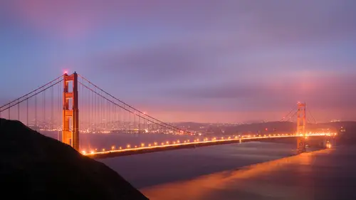
We're gonna head back into our Lightroom library here and last night we had some difficulties. And this is not uncommon. The weather, whether we're shooting in the middle of the day or whether we're shooting at night, always plays its part, right? It could be difficult to depend on that weather. So, what was happening last night when we were shooting was we had cloud banks come in. So, what I was hoping for was to get some really interesting cloud structure, perhaps even stars so we could do some star trails. But that's not what we got. But this is still interesting and I want to show you all how you can make lemons out of lemonade, right? So, we've got several images here that were a part of our first shoot and what we had started off doing was shooting right around, as you may remember, we were shooting right around dusk. We got our camera set up, we got our exposure, we got our composition set, and then we began making images. And you'll remember we shot three separate images, three...
separate exposures, and these are those exposures. Now, the reason we did that was because when we get into exposures like this, that seems to look pretty good at first, when we start looking in here, you've got a lot of really overblown highlights and car trails and that's just, that's not terribly exciting. With that exposure though, we get some nice interest in the bay and we get some nice interest in the clouds. But the darker exposures, as you'll see, allow us to get better detail in the lights, better stars in the lights, and so we need to blend those together. Now, even though we're ultimately going to end up in Photoshop, as I always do, we always start in Lightroom. We start in Lightroom, go to Photoshop, and you finish in Lightroom. So, what types of things are we going to deal with here in Lightroom? Well, I like to think of setting up my initial edits in Lightroom in a way that's going to make the best possible image before I go into Photoshop. The raw file in Lightroom is just a little bit more, shall we say, elastic, and it can suffer a few more changes. And some of the things in Lightroom are actually much easier to accomplish than other things. So, for example, darkening highlights or to some degree lifting up shadows or adding clarity or even using the dehaze filter. These are tools that exist somewhat in Photoshop but they're so easy to apply in Lightroom that this is kinda the place that we want to do it. So, the first thing we have to think about is we're probably going to want to apply similar settings across all of our files. Meaning, I don't want to change the exposure on this one the same amount that I might want to change the exposure on another, but my white balance and other types of things which I'm going to show you, we do want to set across all of the images. Alright, so take a look at these. These are going to be our three images again that we're working on. So, I've got these three selected and I'm going to tap my D key to go into the Develop module and click down here on the bottom of my screen so I can see my thumbnails and we're on the first of this image. You can tell that this is the image that we're actually working on because the highlight is just a little bit brighter. This is the active image and these two are selected but not active at the moment. So, when I start making changes to this image, it's only going to apply to this image unless I actually sync them. So, let's start with this brighter image and give me an idea of what we're looking at. And as we're processing these images, what we're thinking about is what parts of the image do we want to use. And how do we want to process them. So, for example, this part of the image, I'm really interested in the sky and the bay and the shadows. And then maybe in this image here I might be more interested in what the bridge looks like and what the car trails look like. So, what I like to do is I like to start off with my most global of adjustments and sync all of those first. Alright, so let's take a look at some of those. The first thing I would set would be I'm going to go into my basic panel here and I'm going to go down and reset this so you guys can see where we started. Double-clicking on the word Tone here will reset all of those settings. And I'm going to go down here and double-click on Presence and that resets all of those settings. Okay, now. Typically to any image that I'm working on, whether it's a landscape or architectural or a night photography, I'm going to add a little bit of clarity. Clarity is like a micro-contrast that you're adding at a really small level, it's actually just before sharpening, so if you can imagine sharpening makes your image obviously look more sharp, clarity's the next step up. And then above that we have contrast. And then above that we have whites and blacks in our basic panel that hit our overall contrast. So, I'm going to start by adding just a little bit of clarity in here and usually just as default I go up to about eight points and you can see what I'm doing here, I actually clicked in this box and then I just used my up and down arrows just because that makes it a little bit easier to control the setting rather than using the slider. Alright. Going down a little bit, I am going to go to Lens Corrections and choose Remove Chromatic Aberration. That's an important one. And then enable profile corrections. Now, I don't always use this Enable Profile Corrections. Simply because it does correct for the lens that you're using. It does do that. However, sometimes I really like that wide-angle look and I might want that sort of looming foreground or really small background. And so, I don't always check it by default but I tend to do it more often when I have architectural details. Here I kind of want the bridge to be straight, I don't want things warping. If I was shooting out into the open ocean I don't want my horizon line bending down like this, which is common with a wide-angle lens. So, I'm going to go ahead and set that here. Now, the last thing I'm going to set is something called the Color Profile. Now, this is interesting because this just got changed about two days ago. Lightroom came out with a new sort of interface and they moved the profiles up here. They used to be at the bottom down here under Calibration. And many of us were lobbying for quite a long time to have them up at the top and I'm really excited to see them here. This profile basically is the flavor of your file. So, back in the film days, we used to shoot a Fuji Velle Vie for outdoor photography or maybe we shot VPS if we were going to do portraits because those films had slightly different characteristics. The portrait was a little bit softer, a little bit less in saturation and contrast. While Velle Vie was higher in contrast and more saturated. So, I kinda think of this as the first step. And long before they put it up here, this was always the first step that I did. And so, I'd go all the way to the bottom and change it. Now the way these look are Adobe Color, Adobe Landscape, Portrait, Standard, and Vivid. And each one of those is going to have a different, again, flavor. Adobe Color is the newest one, that's now their default setting. And it's going to be a good generalized profile to use. So, landscape in this case is probably going to make it too dark and contrast. You can see how that adds contrast in here. And Vivid will probably be even a little bit worse, yeah. And so, by setting this, Adobe Vivid or Landscape, that may be fine for certain situations, but when I'm shooting night photography and I'm dealing with high contrast, I'm not likely to choose one of those. I may even choose Portrait or Adobe Color because I want it to be fairly neutral. Let's just leave this on Adobe Color for now. Alright, so. What I've done is I've set my clarity I've set my profile. I went down under Lens Corrections and checked Remove Chromatic Aberration and Enable Profile Corrections. Okay, so those are the overall settings that I want to apply to all of my images. So, now that I am clicked on this image and once again, I'll point out that you can see it's a little bit brighter than these other two. This is the one that I actually just set all that stuff on so I'm going to click here and click here by holding down my Command or Control key and when I have more than one image selected, this Sync button will appear and when I hit the Sync button, it's going to sync the settings from this image to these other two. So, I'll hit my sync button. And Lightroom comes up and says, "Hey, you wanna synchronize some settings. What synchronize would you like? What settings would you like to synchronize?" And I say, "Well, gosh. Really all I did was a few things." So, I'm going to hit Check None and I'm going to click on Clarity, which I did check. I'm going to click on Lens Profile Corrections and Chromatic Aberration. And I think that's it. Process Version and Calibration. There's the final ones. So, those are the four settings that I changed and I want to sync across all the images. So, I'll now hit synchronize and even though we won't get a visual here, all those settings are now in those three images. Now, remember why I'm doing this, because I'm bringing all of these images into Photoshop to blend them together. So, I want those settings to be the same. But now at this point, I may want to actually go to individual images and make different changes to them. So, let's again start on this brightest one and just a quick double-check, we are in Adobe Color, we do have Clarity up there. Let me reset the highlights. And it looks good. Alright, so the goal with this bright one now, remember, is to pull detail out of the shadows in here and it's also to get the color in the bay. The clouds may come into play, but I may actually wanna use the clouds from this image. Alright, what are we gonna do in this image? Well, here I'm looking at the bridge tower and the highlights. So, I am actually gonna process these two images now at this point a little bit differently. First of all, on this one, I'm gonna zoom in and look at the highlight detail. And it's a little bit overexposed in my opinion. So, I'm gonna grab my Highlight slider here and begin to bring that down and you can see how the light stars start to pop out, we get more detail on the traffic in here. And I'll just double-click on the highlights to reset it for a second so you can see where we were. And then down again. Doesn't really alter that much the rest of the image, but it does help our highlights. Okay, now. What I'm gonna do for this one is increase the dehaze slider, which, by the way, with this newest version of Lightroom, they also moved up into the present panel, the dehaze slider used to be down under Effects. So, that's also a really welcome change. So, I'm gonna hit my dehaze slider just a touch. Now, I want you all to see what's going on in the sky. I increase my dehaze and you can start to see better separation. The problem, however, is it's happening all over. It's happening globally through the image. And by increasing my dehaze on the sky itself, it may actually start to cause problems in the rest of the image. So, let's come back and think about that a little bit later. For now, I'm gonna leave the dehaze at zero. And I'll go to my bright image and bring that dehaze up and once again, you're able to see how we're starting to get more structure in this sort of featureless cloud. But again, look at what's happening in here, we're getting some sort of weird sort of artifacts. If you take the dehaze too much, it gets really super saturated and it starts to look really fake. So, this is one of those sliders you want to treat with kid gloves, just be careful, light, gentle, touch, don't overdo it. So, once again, I'm gonna set this to zero because I'm not liking what it's doing to the rest of the image. Okay. So, we took this image and we darkened down the highlights to bring out our star trails. And on this image... Let's see, what else will we do? Well, the sky's a little overexposed and the highlights are too. We're mainly thinking about opening up our shadows on this image, which means getting better detail in the bay, maybe some more detail in the foreground here. So, what I will do is actually bring down my highlights. Now, you may be thinking, "Well, didn't you just bring down the highlights on the other image?" And I did. The problem, though, is that if we have too much separation between the two images, it makes it harder to blend, it makes it look a little bit more fake sometimes. You may see that a lot with HDR images that are too many stops apart and the image just has this false look to it, and I don't want that false look, I want this to look real. Matter of fact, I want it to look like it did when I was standing there, which of course our camera can't always capture. So, by bringing these highlights down, I'm making it a little bit closer to this one. Just like I could take this image and brighten up the shadows a little bit to make it somewhat closer to this one. Anything I can do to get them closer together is going to help me with the blending process. Now, we did shoot this other image. This was our first image, it was for our highlight detail, but I think I'm gonna try it without it at first. And see if we can get away with this image. Alright, so, to recap. We brought the images into Lightroom and we did some global changes. We did a little extra clarity, we fixed our color profile, and we went down and changed into our lens corrections and fixed up our chromatic aberration and enable profile corrections. And just as an aside, remove chromatic aberrations for those of you that don't know what that does, it's especially important when you're blending images together, whether you're doing HDR or whether you're doing blends in Photoshop, simply because when you have chromatic aberration, which generally occurs on wider-angle lenses, or more prominent on wider-angle lenses, what happens is the colors don't quite match up, so if you can imagine light coming through your lens, it gets broken up into R, G, and B, red, green, and blue and all the different colors, it goes through the lens, split up, and when it comes out the other side, all those should align on one single point. But sometimes they don't. So, if your red, green, and blue, and of course, all the other colors, aligned perfectly, would look like this. But the chromatic aberration means there's an aberration in the chroma, or the color, it tends to look like that. That's the problem, you'll see usually a magenta or maybe green edges along things. And when we get into Photoshop, the edges are everything. I mean, everything. You can boil almost anything you do down to Photoshop to how well the edge looks. Selections and masks and whether you're compositing images or anything. HDR, those edges are super, super important. So, by fixing up the chromatic aberration, we're taking care of that. Alright. So, we've got all of our images synced on those settings and then I went back and individually changed this one by darkening down the highlights a little bit and increasing the shadows a touch and I adjusted this one by bringing down the highlights to make them closer together. Now what we need to do is get them into Photoshop. So, I'm gonna go back to my grid mode here and I'm gonna unselect that first one, which is the darkest one, and I did that just by Command + clicking or Control + clicking on a PC. And now these are the only two images selected. If you're like me, you probably would like to use shortcuts a lot. I find them very helpful. But if we hit our shortcut for Command + E or Control + E, then what that would do is just send us right into Photoshop. Edit in Photoshop. And that's not what we want to do. Because we want to start blending these images together, we are going to go down and choose Open As Layers in Photoshop. This is crucial, you guys, it's gonna take two separate files, put them into one file. Or, let's step back again. What it's going to do is it's gonna take these two images from Lightroom, create copies of them, then it takes those two images, layers them in one file and opens it into Photoshop. So, what we're actually going to have in Photoshop is a separate file from these two. It's gonna be a brand new file. Alright, so let's choose Edit in Open as Layers in Photoshop. Now, just as an aside, you're gonna see that Photoshop launches automatically and these two images are going to appear in there. The reason it's doing this is because they are raw files. Now, these are DNGs, but they began as NEFs, a Nikon raw file. And when we go from Lightroom to Photoshop by opening a raw file, we get no warning dialog box. Lightroom isn't asking us to do anything. The reason is there's only one thing to do, it's a raw file, it needs to make a copy. And it goes into Photoshop. Now, even though we are in Photoshop here, it says DNG, which is not technically true, cause at this point, this is not a DNG. It's just sort of a temporary Photoshop format and when we save it, it will become a TIF. And when we save it it will go back into Photoshop.
Ratings and Reviews
Phillip Ziegler
This course, along with the others by Tim Cooper, are outstanding. His demonstrations and explanations are so clear and easy to follow. I've been out doing long exposure night photography using what i learned from Tim and and delighted by the results.