Your Brand Book: Logos & Visuals
Lesson 7 from: Building a Brand Book: When, Why, & HowJosh Silverman
Your Brand Book: Logos & Visuals
Lesson 7 from: Building a Brand Book: When, Why, & HowJosh Silverman
Lessons
Introduction to Workshop
07:56 2What Makes Up a Brand?
09:39 3Why Are Brands So Important?
13:06 4Consistency & Setting Up Standards
17:51 5What Makes a Great Brand
07:34 6Your Brand Book: Story & Content Strategy
40:52 7Your Brand Book: Logos & Visuals
09:36 8No Brand Lives in a Vacuum
34:47Lesson Info
Your Brand Book: Logos & Visuals
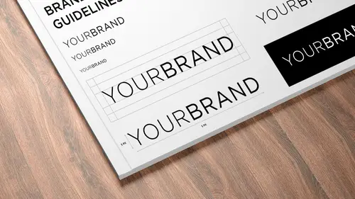
Once you know what the words are, it's a lot easier to think about the pictures. The place I like to start is with the logo. The word logo logos is Greek for word. Believe it or not, it's not pretty pictures. It's the word. What is the word eso when you're making a logo and you get to figure out what, uh, why is it's gonna be a lot easier to visualize how that expresses your brand. Then if you start with I like that type is, as we've said, so a logo is great. It's functioning. It's working when you can't remove anything else from it. Um, I've done that in my own practice when I've come up with an identity and then decided I'm gonna take out this little thing or tweet that other thing so that it is at its essence, Um, it is distinct because it's not like your competitions logo. It is versatile because it works across all media and it all sizes and scales. And if anyone here has tried toe, take a J peg and make it small or blow it up to print, that doesn't work. You need to make sure tha...
t it's a vector graphic that is infinitely scalable and thus versatile. It's appropriate to what you're trying to say and do to your business, and it captures your audiences attention and keeps them coming back. The associations they have with your logo over time, um, sticks in their memory, which is why we heard from the chat room that people just love the Coke logo or they experience it. They know what it looks like the same with the target logo. They know what it looks like without even having to look at it in person. So a couple more quick case studies here. Um, another good element of a logo is that it's not painful. This is the old identity for Dente Quest, which is the largest dental benefits administrator in the US In 2007 my company was hired to launch a subsidiary with its own identity event, marketing Collateral. Take away his video. It's custom soundtrack. We didn't hoping to stuff for a subsidiary, but in the process, I understood that the relationship between dente quests, subsidiaries and the parent company was a little bit broken. So I grew the relationship to a company wide national scale brand, refresh and, um, in the process of doing that work, we understood that the perception of this logo was that for a dental benefits administration company, this looked like a drill going into an orifice, which is not what you want if you're in the dentist world. So we made into a smile. I led the team that collaborated with C suite leadership in house marketing across four divisions, bringing cohesion, clarity and you guessed it consistency to the brand. We expect colors and typefaces respect safety zones, which is a common practice. We didn't even have a tag line, but we knew that it was going to go there. These were the subsidiaries. These air samples from the brand Standards book for Dente Quest. Um, and my favorite part of the book was how many different files we released of the identity in E. P s JPEG pdf etcetera because they had the parent brand and then all the subsidiaries, we had to release all those files to dented Quest. So here's another example that we might all be familiar with Made by Milton Glaser. The original Rebus logo is this very familiar mark, which has done wonders for the state of New York. Um, it's not just New York City. It's all of New York. The advertising campaign and supporting logo have been used for decades to promote tourism. New York State. Recently, they re buffed it, introduced a new type face, Archer and Gotham. Which pro Tip was made from Old Sign Ege in New York City, the Hofler and Fred Jones who actually made Gotham. Um, we're studying how Signs in and buildings in New York City looked in order to get inspiration for this wonderfully popular type. This, this is from their standards book Endless Studies prove consistency, increases awareness and help cement that emotional connection to the brand. Here, some do's and some don't don't use that, don't put a glow. Don't change the color, Don't squish it. And one more simple quick case study for male chimp and email marketing service With a lot of personality, I just want you to see that toggle. Yes, yes, so their brand is about your content, but they spend a lot of time working on their own content. Um, their competition is campaign monitor, which even by its name has a lot less personality than mill chip. So thinking about what Jennifer just said, male champ registered voice and tone dot com, And you get to see what messages you need to think about when the user is in different situations. This this is actually pretty important for you. Amanda. Um, if your user is in a success scenario you want, this is what the user is saying, and this is what Milk Jim says, back to you. Fine piece of work. You deserve a raise if the user is in an uncomfortable situation and they're frustrating, the tone changes. If the if the user is feeling confusion, stress and anger, you don't use the same sort of levity. The personality. It's much more strict into the point. So this is how content and tone changes are published across male chimps holdings. They also have on the Web style guide, um, with lots of subsections and words to use or not use. They don't use auto magical. They don't kill it. They don't crush it. Actually like that a lot, because I don't think that's a really valuable thing to say when you're feeling successful. Um and so this is how content and content strategy helps you make good choices for expressing your brand's values. Great, I have a question about you show these examples, and these are obviously pretty large companies, and they have these living online I know we talk about. The brand book is like a living documents constantly being updated, but we have some examples in the studio of these printed out hard cover brand, these air sort of living interactive brand books. Maybe you could talk a bit about, like the benefits of having one that's interactive like this versus having one that's, you know, thick and hard bound. Sure, I think ultimately it's a great question. Ultimately, I think you want to print it out. You want to shop it around or something different in terms of our interaction with an appreciation for a hard copy book. When it's in front of you when you're holding it, that helps paraded. That helps get people aware that it does exist a certain point. You probably want to collect your assets. We're gonna talk about that this afternoon. How to get it started, um, collecting your assets, but then at a certain point, you want to say OK, version one is done. I'm gonna shop that around. I'm gonna print it. I'm gonna get people aware that it exists. Um, so start collecting virtually and then publish physically so that you can bring it around and shopping around. Make people aware that Oh, wow. That red color on screen doesn't look like the red color when I have it in my hand. Same with blue. Same with green. Like a lot of a lot of colors. And rgb don't look the same and seem like a or pent up in this example with male chimp everything that they have here, there's a lot going into this. Now, this is probably a little bit more advanced than for some people. But what aspects of they have here are sort of like the bare minimum that people need. Like it is something like words to avoid something you should be thinking about right off the bat, or does that come much later? Um, it's a great question. I feel like you should start with, especially if you're a new company. You should start with who you are. Um, if you're defining who you're not, maybe you maybe that's enough for, um your your first generation of your brand guide. You don't need toe. Say, don't use these words. Um, maybe the words to avoid is ah, is a two point. Oh, yeah. Cool. Any questions for anybody here on our examples that were showing here? Yeah. Great. Pretty self explanatory. Cool. Well, coming up, we're gonna deep dive into to global brands, um, Pepsi and, uh, actually on intergalactic scale NASA a swell as the New York City subway system. We're gonna have to guests in the afternoon. One is the creator of two successful, super successful Kickstarter campaigns. Um, about standard manuals, one of whom created this wonderful book. A gift from my friend Met. This is the reproduction of the New York City Subway Standards Manual. This Kickstarter campaign was so successful that they actually reissued a smaller version of the book because this it 13 inches is very heavy, and they wanted to make it useful everyone. So they made a smaller version. So we're gonna hear from the guy that made this book
Class Materials
Bonus Materials with Purchase
Ratings and Reviews
Yi Ji
WOW, really worth the money, information is real, up to date, the quality of audient also good, they ask really real question, not those kind of 'performance' course. Thanks!
David
This class has potential, but misses the mark for me. The first thing that I noticed was the fact that the video and the sound do not sync with each other. It feels like you are watching a foreign move with English dubbed over the lip movements of another language. It is often hard to hear the audience questions as they do not hand around the usual 'creative live wireless audience microphone' and I think that was a mistake. The topic is a good one and the speaker is appears to understand his craft but a lot of the 'talk' in the first few videos could be removed by a clear definition of terms in the very very beginning of the class. If feels like it is flowing on an off the cuff manner and is lacking the structure that Creative Live known for. Instead of spending so much time asking the students about their understanding of what brand identity is and way to many quotes... I would like to see some practical how to advice early on in the class. I would love to see more classes covering this topic from people like Sean Adams or Alina Wheeler :) I am sure this class will get better the further I get into it and I normally do not write a review before I have listened to the entire class. Also I purchased it at a deeply discounted rate so even with those issues factored it is is still work what I payed for it. :)
Rifter
Absolutely relevant and interesting content, made through example classes. The way the material is exposed is very good. One single critic, since the headline is really precise on the topic I expected more on the "how" but the course doesn't really teach a "system" to create a brandbook, like choosing wich documents are to be included and how to make and expose them depending with the client needs. The course is all about the why explained through case studies, which is good but partly neglect the headline promise. Anyway this is still an excellent course but I thought it would be useful to point out this aspect.