Lessons
Introduction to Workshop
04:31 2The Anatomy of a First Impression
15:24 3The Truth About Online Business
06:18 4Etsy is a Tool For Your Business
10:30 5What is Shop Cohesion?
11:57 6Common Etsy Mistakes to Avoid
13:52 7Product Photography Overview
46:09 8Your Product Photography Checklist
02:58How to List Titles Properly
12:38 10Shop Cohesion Checklist
05:39 11Examples of Best-Selling Etsy Shops
22:32 12Get Your Shop Found On Etsy with Tim Adam
13:21 13Etsy Shop Critiques with Lisa and Tim
1:00:15 14The Etsy Buying Process
07:42 15Copywriting for Etsy
15:56 16Find Your Ideal Customer
13:11 17How to Stand Out On Etsy
09:04 18Find New Customers For Your Etsy Shop
20:39Lesson Info
Product Photography Overview
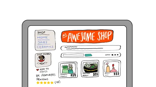
You can brand in a way that does not disrupt the buyer. You can brand in a way that isn't jarring, that isn't, doesn't throw anybody off, and my go-to favorite, if we're ever talking about product photography, my favorite example since teaching creative business for all of these years has always been Polestar, the shop Polestar. This business is run by Jennifer. She's an Etsy veteran since and she has over 30,000 sales on Etsy. Any time product photography comes up and that idea of, it has to be specific, it has to be styled just so, it has to be on white backgrounds, I'm grabbing her link. I need to show you what Polestar does with product photography. You can see by her photographs that there is no watermark. She hasn't stamped it in any way, shape or form. There's no web address on them, yet I would recognize a Polestar photograph anywhere. Online, on Etsy, if I see it, I know it's hers immediately and that, my friends, is a well branded product photograph. It is so her, and it is ...
so what you would expect from her and she has perfected her own photographs over time that you could recognize her work anywhere. You would recognize it as her photographs, as her jewelry. From this distance looking at the storefront, please notice how the images have a lot of different style, yet they all match. Not only that, there are a lot of different products in there. She is showcasing just in this brief clip, necklaces and earrings, yet the eye moves consistently across the page. Your eye isn't needing to get closer for earrings, it's not needing to back up for necklaces, she has them styled in a way that your eye just seamlessly scans across the storefront. In an online storefront, product photography is everything. It's the presentation. It's the thing that's going to pull your customers in, and for most of us, it's a DIY job, and that is a good thing. I love to look at a product as shown through a maker's eye. I think there's no better, that product was made with love and then it was photographed with love and I love seeing how the maker looks at their own products. Lisa? Please. There's a couple things that people online were talking about in terms of mistakes, common mistakes they make. So I wanted to (coughing) let you know about them and also the in-studio audience, if you have common mistakes that you've made that you'd like to share we'd love that. Ashley in Nashville says her mistakes are pricing too low, terrible lighting and scattered products. No cohesion which you talked about. And Anoushka says, "I still have a lot of work when it comes to," "I still have a lot of work to do when it comes to photos." And finally, two more comments. RedScorpio says "Terrible photos." "The worst, I've had to go through and fix everything." (laughs) And HandmadeByEdWillis says, "Poor photography, me too LOL." Does anybody, just a sense of how many people, are concerned about their photos and need help with their photography. Anyone else in here feel you do make mistakes like that? Yeah, I feel like I am always taking other people's advice, like white background, and then I go and spend a bunch of time and money to get this perfectly white background and have, I mean my product is a pillow, so it's not necessarily super high end, stylish white background material. So I think it took away the fun of my product every time I would try to make it look high end. I don't know. That was definitely one mistake I've made, is trying to do the white background and then it's never really white. It doesn't really match. Yeah, absolutely. Yes please. I have this tug of war with trying to find the image or creating the image that's seen first, right? The thumbnail that everyone sees, yeah. The main listing thing. And then, oh my gosh, do I need to fill in all the other pictures? Do I have to have a picture for each available slot and then I'm like, my mind starts buzzing, like should I get it from this angle? Should I get it from this angle? Do I need to distance it? And I just get overwhelmed and I don't... I'm just not sure, like I have this self doubt. It's like, what is going to work and what's gonna have people get a true sense of the product, so when they get it, there are no surprises. Yeah, oh yeah, absolutely. And don't you think sometimes we overshoot that because we're trying so hard to make sure, did you know this corner wasn't straight? It was a little rounded, you know, and we're so worried, but they just want to bring it home. Like, we've appealed to them, and they want to bring it home, and they're not worrying about the same things we're worrying about. That's a great point, though. Thank you so much for sharing. Please. So one mistake I made, my first month of starting my business, I was in such a rush to get my product online, so I would just find a place in my house, like, oh, this background looks decent, this wooden wall on my balcony, and I'd shoot the photo and I'd get all my listings out just so I could get the site up, and it wasn't until I had lunch with a friend maybe a few weeks after I had opened on Etsy that I showed her the actual product, and she looks at me, she goes, Erica, your photos are not doing your bags justice. (laughs) And I was like, wow, like, I'm so thankful that she was so honest about that and saying that the photographs that I put up were not accurately portraying the product and so customers weren't seeing what she was seeing in person, and it's so important that the customer behind the computer can see that same quality as someone would if they were holding the bag. I totally agree, I totally agree, that's a good point. In fact, I'm gonna show you, I've been on that journey and I'm about to show you my journey going through that and trying to, trying to evolve, and those are all great points, all great questions, and I've been through it, I mean, I really have been through it, and I can't, that makes me even more excited about this material that I have ready for you because, I'm not a photography expert by any shape of the word, but I have learned to take pictures of my own products over the years and it's an ever-evolving thing and I love it for that because once it gets good, it gets really good because now, you are giving, you are showcasing the product like I said from the maker's eye, and nothing can beat that. Not professional photographs, nothing. Nothing can beat the fact that you took the time to learn and now you know how to photograph your products and it looks like how you look at them, because I'm looking at, I have one of my bracelets. Note, I look at those bracelets and I think, I find them appealing, I find them interesting. Nobody else could photograph it the way that I want to look at it and the love that I feel for it and what I know that it delivers to the customer. Nobody. Nobody could replicate that or do it better. So I'm excited we're gonna talk about it. And I'm very excited to hear people are excited about it because, I'm excited! (laughing) Okay, so, we are going to look at product photography mistakes I've made so that you don't have to, and this is by far the best learning curve I can offer. Again, fully acknowledging the fact that I'm not a photography expert, but I can walk you through my own mistakes and I can show you the learning curve that I went in and I don't think that there's a quicker shortcut than seeing somebody's mistakes as you go through. And just like you said, all of the different things that I've tried, when you know better, you do better, so once you get it, then you get it and it gets really good. Okay. This is my first sale. And, it's one of the very first listings that I put up in 2010, and seeing this picture is actually the reason that I did not use live examples or audience examples in my slide today. I... I have a spot in my heart for this photograph. I have a spot in my heart for the person that bought this photograph in because now I see it for what I see. I have a trained eye, so I know better. I've learned a lot better, but, when I took that photograph, I didn't know it was bad. I thought it was good. I was still looking at a product that I loved. I was feeling for it, and I was trying to do, I was trying to do it justice. I certainly, just like you, I took it to a spot in my house, tried to do it justice, listed it online. So, at the time that I took this, I was actually decent with a camera. I have a DSLR, and I took gorgeous pictures of my family. Family pictures that five years later, I'm still proud of. I still love these pictures. It's not like my product, my overall photography has evolved that much, but I had never shot product before. I had no idea where to start, so the fact is that I could use a camera, but I didn't, I just had no idea how to showcase a product with a camera. That in itself is its own learning curve. So I didn't realize that anything was wrong with the picture. It comes from a very vulnerable place. I laugh at myself all the time, but I only laugh at myself because it was five years ago. Almost six years ago, now, and I thought I was so important. The impact, when I saw it in my own keynote, realizing how far everything has come, and telling you that because I was in such a vulnerable place, if anybody had critiqued me in a way that I didn't understand yet, or told me, given me advice that I wasn't experienced enough to implement, it would have crushed my hopes and my dreams. It would have made me self conscious on a thing that is not, no time to be self conscious about it. You have to be bold, and you have to be courageous and you have to believe in your product and believe in your skills and believe in your ability to evolve, in order to get things like this off the ground, and had anybody said anything that would hurt my feelings, at such a personal time, I wouldn't be standing where I'm standing today. So why the examples have been removed or why I won't show anything that anybody else is doing wrong during these next three sessions, it's too important. So this was shot, I had a kitchen island, it had some natural light, it was a different place where I live now. It's on a kitchen towel, as most of the next (laughing) slides of products are going to be, and I really believed in scale. I deeply valued scale. That quarter was important to me because I thought if you didn't put a quarter there, (laughing) nobody would know how big the bracelet was or if it would fit. So I was, scale was important, so, there you'll see a lot of coins in the next few slides. Next. Okay, there's the cell phone, because, I joke about this in blog posts. I say, believe it or not, I once took a pack of bracelets on a cell phone. I never found it and dug it up until I was putting this together. There's a pack of three bracelets on a cell phone because why? You know? (laughing) Because scale. Because everybody, everybody says, is this gonna fit? And then they lay it on a cell phone to figure it out, right? (laughing) I love, I loved scale back then. And then you can see, all throughout, this is, like, this happened over months of time. This is no short feat, like I didn't understand how to shoot products overnight, and I kept trying and I kept learning and if I had a good photo, I would try to figure out what was good about it, and I kept asking myself. I was constantly reevaluating. I was still shooting for all of these pictures in window lights, in window lights on my kitchen island, on kitchen towels (laughing) and bath towels. (laughing) I don't know why towels, but towels were always the base line. And... And... And moreover, like, I'll still put some bracelets on my arm to take a shot of how they look as a collection, but it's rigid. You can see, I had to be like (thudding) you know, and then take the picture like it all had to be right there, rather than just be like, clip and look how the picture would be with a pretty background in the back. So these are all first takes of product photography. I did not... I did not shoot it 20 times to then find good photos. I took five pictures, because there were five slots, and I listed them from there. I told you that I took the time to test the marketability and the durability of the product. I did not test product photography. I just listed. Again, they're rigid. There's, there... They're a little uninviting to me today, but what you need to know is that all of these bracelets sold. Everything was selling. I was selling out. I was marketing at the time, and items kept, continued selling out even with bad product photography. So, the point, and what I really want you to know, with product photography, is not to be the best right now, but to always be getting better. Don't be afraid to start. Don't be afraid to just start taking pictures and list them online and learn and go through the trial and error. Nobody sees it, nobody will know if it was bad, and so, one thing that I want you to also notice, you might not see this because it might just look like a bunch of bad photographs to you, but I notice that the product is starting to come forward. I notice that as I was looking through pages upon pages of bad product photography, I noticed that even from looking at the last slide, which is hard to take in and it's hard to find where the product is in that picture. It's blurred against a dark, a dark backdrop, and everything like that, I notice that down here, with the carnelian and the tiger's eye at the bottom right there, there, I'm starting to see it clearer, and of course you need a safety pin (laughing) to know if bracelets will fit. If you don't (laughing) if you don't put a safety pin beside your bracelet, you'll never know if it will go on the wrist, but (laughing) I kept going. I kept trying. There's three things here that I want you to notice in all of the bad product photography and that is the scale that I'm trying to demonstrate but I don't know how yet. There is scale. Scale is important in product photography. There is lighting, which I'm trying to get, but I don't know yet, and that's also important. And there's the perspective of the picture. Really, where am I looking in that picture from? All things, all very important to your product photography. So when you're learning and when you're adjusting and when you're evolving your own product photography, remember that those are the things that are gonna make or break a good photograph, scale, lighting, and perspective. So it's something where you want to work on and what you want to be paying attention to. So I'm showing you that, before, I'll call it the Kitchen Towel Phase. Before I left the kitchen towel, (laughing) before I left the Kitchen Towel Phase, I was watching, Etsy had a home page at that time where they showcased favorite products. They loved if you would zoom in close and it was really blurry, so that's what, like that. I would sort of get creative. I wanted to get creative with these photographs. I wanted Etsy to notice me. So I'm getting creative at the top, and I'm doing... I'm trying to make a better thing, and I'm also adding creative backdrops so there's fake hydrangeas in the background. I have no idea. They don't even match the kitchen towel in the Kitchen Towel Phase. I have no idea what they were doing there. But I'm really, I'm starting to experiment, so it doesn't matter that they're bad because I can see that I'm starting to experiment and that's the one thing that I need to do to start evolving, I need to start experimenting. And... I am still loving scale, because there's still safety pins, but all of these pictures are clipped in order so you're watching them evolve. What I like, what I'm seeing when I'm watching myself go through this as in my history, like, again, these are years ago, pictures I've taken years ago, is that bottom photo, something's getting interesting. I like it. That bottom photo is teaching me so much. I can see the different shapes of the gemstones. I can see the detail. I'm really starting to see a product that I love and now my product photography is starting to represent that product that I love, all through this experimentation. I think there's mood in that photograph. I don't mind that it's a little bit bad. I don't mind that there's a kitchen towel underneath the product. I like the mood, and I can see something is happening there. So now, things are getting interesting. White background phase, you said you would try whatever people tell you, and I did that too, but I don't mind it because seemingly overnight in my product history, all of the distractions went away, all of it. There were no more, there were no more different colors. There were no more kitchen towels. I never touched a safety pin again. It all, I realized that the coins weren't important. All of the distractions sort of vanished. And the extra objects were removed, and from that picture, the one I just showed you, that's carnelian, one of my favorite stones, where I realized I love the detail I find in that picture. I started focusing more on that. The extra objects are gone. I invested in a 50 millimeter lens. It's the one thing I know about photography, is the 50 millimeter lens is the thing that makes what you're focusing on pop and then sort of blurs the rest of the picture, and makes it, sends it to the background. I, love, it's, it goes with my style, and I love shooting product photography with a 50 millimeter lens. So you're looking at the amethyst, particularly on the bottom, you can see that's an example that I would use of a 50 millimeter lens. You can see how the front is very detailed, very in perspective, and then the back goes away, so that maybe, that wouldn't be a main listing, but that's one of my five listings because now you're getting a close-up. You're seeing what that gemstone looks with a little light into it, and that's some details, and details I love. Please. I'm just loving this lesson (laughing) and I think what's great about it is, like, I think people, we all share similar mistakes and to hear that you've been so successful but you went through a period where you also, you know, were using paperclips and quarters, like, it's great for us to hear that we're all sort of in this together. We all make those mistakes, and it's great that we're learning from your experience so we don't make the same mistakes. So it's awesome, but people are saying, someone said, "oh my god, you are adorable," "I'm learning a ton and enjoying you in the class so much," "thank you, Lisa." Oh, thanks so much. And HandmadeByEdWillis says, "I wish I saw this class before I started." And finally, Ashley in Nashville says, "She's hilarious, so great that she's sharing all this." And I just want to thank you for sharing your story because it's so powerful to hear about your mistakes and your growth along the way. Thank you. So powerful for everybody. There are also some questions that I'd love to get to right now, if you don't mind. So, LittleGirlsPearls says, "Does anyone know" "what the dimensions should be" "for product photos on Etsy?" Is there a dimension? There probably is. I don't have those numbers with me. Yeah, I don't even, that's a good question, but I don't, does anybody know? I think it's flexible depending on how you want your, like if you do square, it will set them all up as square. If you do them rectangle, it will set them all up as rectangle. I agree, because if you upload a pin sized listing, it appears and then it will be pinned as a pin sized listing. I agree, it seems to always adjust with whatever picture I'm uploading. I don't know if there's a standard or a best suggestion. I think they suggest that you upload a good size because they have that zoom in feature. Yeah. So if you have like a smaller resolution, it won't, when you zoom in, it might not look so great. That's my professional opinion. Yeah, I'm so glad you're here. (laughing) Yes. I do notice that when I have uploaded photos that are not square, when my thumbnails show on my storefront, the product gets cut off, so I usually aim for square or something close to square. I agree, I've seen the edges come up on my product photography as well. But yeah, but I don't have the specific dimensions, but that's a good question. Okay, great. And Diane had a question, also NalaCabala, it's a similar question. Is it better to show a product alone or in use, on a body or off? NalaCabala does jewelry photos and she's wondering, is it better to not have only the product shot but also a lifestyle shot with a model? So, is it better alone or in use, on body or off, on a model or not? I love it both ways, especially for jewelry, I love it both ways. We're actually going to talk about models and manikins and how they bring the product to life and how they do scale without overdoing scale, so I like them, I like them done both and I'll be showing you some examples of how that works, and I don't think, my example is going to be PixieBell. She's gonna come back up on the screen. She has every, every listing in her shop on a manikin or on a real human model, and... It looks great, that works for her, especially with the nature of the product. But when you are, if you have a product like my bracelets and then you get a model and then you have a handful of bracelets that are on the model, that will look good mixed in. Don't feel like now you have to get, that doesn't have to be completely styled, because if you're always on a model, you're not gonna be able to learn your product photography like you need to. Sometimes it has to be a standalone product as well. But it's good to have a mix, and I like both, actually. Yeah. And, finally, Anoushka asks, how do we make a good photo of a larger item? For example, she makes bags, big bags and totes, for the beach, and she feels, another woman, Diane, feels like large products are hard to take photos of. There's two questions from two different people about how to do that. Large products are incredibly, incredibly challenging. I absolutely, I can absolutely relate, and so when you say, my products are taken on a beach, then your product photographs should go to the beach. You should lay them out and take them. That's... That goes with perspective on our subtopic of product photography, and we are going to be talking about perspective. But let me give you a preview of it, because it's such a good question and I want to touch on it now. I'm going to talk about how to, where to place yourself when taking a picture of your product photograph. When I think of a large item, I automatically think of a blanket, because blankets are huge, and how in the world do you take a picture of blankets? And so I want you to be thinking about where you would stand in a store to view it and so, when I go through IKEA, they have all the blankets, I notice their display is all of the blankets hanging up above and why are they doing that? It's so that you can see and make out the entire product from walking past it, so we are gonna really get into it. It's a very interesting conversation. I'm looking forward to it. Okay, great. A couple more questions came in that I wanted to get to. Linda Metcalf asks, "What about people who sell art prints?" Do you like mock-ups in frames? Love 'em. (laughing) A little bit. (laughing) No, I, yes, I love them, yes. It's really great, it's a great way to help the customer try the product on in their home because, and we're gonna talk about this, we always try the product on in our mind before we actually bring it home or before we actually even touch it, so it's a great way to help the customer visualize what that's gonna look like in their homes. Love, love the mock-ups. Great. Very clear answer there. And SpookyMoo asks, "I think it's hardest" "when you want to take a photo of just one item." "Is it all right setting the scene" "with lights, et cetera, if you're spending all day" "taking photos of multiple items?" I think she means to set the scene once and take multiple photos in the same setting? Yeah, and yes, and that's another thing I'm going to talk about, too. I like to batch those, and I like to create what I call a photo kit, so my photo kit is gonna have backgrounds and materials that match my branding three adjectives. Everything is going to match that, and I keep the same backgrounds to keep things consistent and then I batch all of the materials into that little display. I have it all set up, I batch through. Thank you. Okay, great. Please. I'm just curious, throughout this whole process, are you evolving just by experimentation and your own desire to keep taking photos or are you putting these online and seeing what gets more favorites and views and then kind of altering it more towards that style because it has a better response? That's a great question. I'm not much of a data collector or an A/B tester. I try, because I know it's so good for business, but I'm not, so my thing is I'm just trying to, I'm trying to evolve my eye, so I'm looking at other, other people online and other photographs being, or other products being displayed online and I'm asking myself constantly, what's better about theirs than is about mine? I'm never trying to copy anybody but if their lighting looks good or their display looks good, I am immediately trying to say, how am I gonna incorporate it? So it's, it goes along with the, I'm gonna give you a checklist here in a minute that can help you kind of gage what's not working and improve it, but it goes along with the workshop materials we have here, too, because it's going to help you. It's going to prompt questions, things that you can look at in your product photography because that is natural to me, to say what, what is better about this photograph, and mine looks not like that. And then I say, oh, well they forgot the kitchen towels. Where's their safety pin? And then I realized all that stuff is unnecessary so it is a constant gaging, and that's just, that's more my testing and that's more my data collection style than watching the views and seeing what does better. But I think both work. All right. So I'm showing you this slide. When I look at this slide, this is The Energy Shop. This is... This is The Energy Shop to me. It is not professional photography, never claimed it was, but this is my eye, looking at a product that I deeply love. And me feeling the same way about that product when I'm taking the picture, that I hope that the customer is gonna feel when they bring it home. This is love, to me. This is learned photographs, but now, finally, my photography is catching up to the way I love this product, and what it means to me. And, notice here, that my biggest errors before become my greatest assets. The scale, the lighting, and the perspective are now exactly how I want them. I'm looking at the product in a way that's clear to me, that's concise. I'm showcasing the product in a way that I love it, and over time, I started to take my products online, I'm sorry, outside, to take pictures. Everybody says don't take pictures in direct light. That's like a rule, direct sunlight, avoid it. But for me, I just loved it. It cut down on my editing time. Yes, I get some harsh shadows, I'm cool with that. It's fine with me. I still see the product. It's still, it still works for me. So, I wanted to show you that I shot both of these photos and two to three years apart. That was my journey with products. It's been ever evolving. I hope it continues to evolve. I love taking pictures and showing off the sparkly bits and pieces that come along with my offer. This is one of my first listings with the three pack of bracelets to one of my first thousand listings to the hematite with the Swarovski crystals there, sparkling in high sun. And, I was just as happy with the first shot of the three pack as I was with this picture of the hematite, just as happy, just as pleased, just as ready to list it online, but I always knew that there was more to learn. So like everything, it's, everything, like everything in your business will be, this is going to be constantly evolving and as you learn better, as you know better, you'll do better. Guys, we have a question, I mean an answer for the question about the dimensions for the Etsy photos. Okay, great, good. So shout-out to Teresa for sending this to us, and per Etsy, she says, we, this is quoted from Etsy, "We recommend using an image that is a maximum" "of 800 to a thousand pixels wide." "Using an original image of this size" "lets shoppers use the zoom button" "to see the larger image." "We do not recommend using images" "that are much larger than a thousand pixels square." "Files this large can be difficult to upload." "They also say that square images are preferred." "Google is my friend. LOL." That's what she said. (laughing) So there's your answer. Thanks so much, Teresa, for looking that up for us. Great. Thank you so much. That's very helpful. I'm glad we have it here because it makes it more comprehensive. Okay, so the customer wants to take in the product. Their eye, when they visit your storefront, wants to be able to scan seamlessly and comprehend what you're offering. So in order to improve your product photography, you want to stage the photograph so that it's the same distance it would be if you were in a store looking at it. So that was my biggest tip, and I also, I think, I looked at Polestar a lot and I felt like, she's gonna come back up again in an example later where I'll show you some of the things that I learned from her, but, the distance... The distance where you would be looking at a store is a very powerful tip. Nobody's sharing it online. Nobody's thinking like that online, but, we often do it wrong, so here's, here's why this picture doesn't work. It's getting better, it's getting interesting, and things are working, but the top one doesn't work because when you're shopping, a bracelet in the store, let me see if I can get it right. Nobody goes like (laughing) that, to shop the bracelet. Nobody's doing that, like nobody's like, I don't care about these details. I just want to get right there. (laughing) And that's what that top picture is doing, and then, I don't know if it fits because the safety pin's not missing, so it doesn't make sense. And then the bottom listings, too, is just a little bit too close. If you were shopping a bracelet in the store, you would never hold it like this. So, instead, you would think, if I were considering this bracelet in the store, you would see it here, about that distance away, and if anything, I would try it on and look at it like that. So I'm a good distance. That's not a close up shot, right? And so, that's important to know. That's for jewelry. There are other examples. So. You need natural scale to improve your product photography. You need natural scale, you need proper lighting, and you need that realistic perspective. In the beginning, I was getting down there with the product. I was shooting from about this distance because Etsy really, I'm not, I wasn't making it up. Etsy loved closeups at the time. They were always shooting, they were always showcasing, you're nodding because you know. Yeah, they loved it, so it's kind of taught us how to shoot, and we were all shooting too close, so what I did over time is considered where I would be looking at that bracelet and I went from really this, with the product, to up here, shooting down, or out here, shooting out, and then cropping that square, and if I shoot from the front on the bracelets which sometimes looks beautiful, I still shoot at this distance because that's where I would hold my arm. That's how I would shop it in the store. So when you come, so coming up away, and shooting from that larger distance, and then cropping it for the storefront, which I'm gonna keep talking about, I'm gonna drop it here and then I'm gonna show you more examples later, but cropping it for the storefront so the eye can move consistently is a big, huge improvement for your product photography and your storefront. So, this is what is the result, so this is, these are all newer listings, and you can see I'm far away. I'm seeing this bracelet at about the same size and distance as I'm looking at here as I would look at it in the store, so I'm this distance away, and then when I crop it for the main listing, all I'm making sure I do is pretty much center the photograph, center the product so it's the main focal point of the photograph, and in then, if you put that on Etsy's listings, that's what keeps it neat and uniform and tidy. Makes it easier to understand, okay, these are gemstone bracelets and you kind of get that big picture when you land there. You can also note that there are some varieties to the backgrounds. I picked those and tested them carefully. I know they go well with the bracelets, and they match my three adjectives. They are, they're earthy and they're, and that's not one of my adjectives, but it's positive and life-affirming and they're everything that I want, like growth and living, that I want in my brand message and now I'm looking at them from a natural distance, centered uniform. My eye isn't jarred from closeups to really far away pictures whenever I'm taking those. You want to think about how far away would your customer consider this product if they were in person with it. So like I said with IKEA, there would be blankets hanging on the rack, you'd really get far away from a blanket, to then shoot and crop it for the place. The question that we had was, how do I shoot these products on the beach? Put them on the beach, stand way back from them, and then approach them as you would in real life to make you interested in that product. Hats, you'd look at on a rack. You'd look at those pretty close, or you'd want to see it on a model to see how it would fit or try it on. Jewelry, again, there's all types of different jewelry but I know how I would look at a bracelet. You'd look at it from an arm's length away. The necklace, you might get a little bit closer up on, because you typically look at your necklace in the mirror. That's how you wear it, that's what you would look at. You're looking for details and sparkle, and then earrings, that kind of thing, but there's all different perspectives and different ways that you would shop them. Art, like we had with mock-ups, I love mock-ups of art. Give me, the art mock-ups give you so much sense of scale and make you understand, is this gonna be floating by itself in a wall, or is it gonna take up a big space? Is it gonna be poster size? Do I have to shop a lot more to match and fill in that wall, or what's gonna happen with that art? Art mock-ups are a beautiful thing, and I'm so happy that we have them and that people are utilizing them. And then with things like papers and books, mugs and dishes, they're more of a table length away. You come up out of that, you would always see it from about this distance. You would never see it much closer than that. And so, if you use that perspective of how big the item is and how far away I would have to get from it to get full perspective, because I know it's a challenge, especially when you get blankets, up too close and you're basically showing off a pattern. The customer can't make sense of what that is. They don't know if they're buying a fabric or if they're buying an entire blanket. Up too close, it's confusing, so you have to try to back out, and then you have to try to crop it for a way that makes sense. So, we have simplify the backdrops. Don't take the creativity out of the backdrops. Don't take the brand out of the backdrops, but simplify them. I wanted to pull some in, but I didn't pull, but I pulled about three backdrops that I go, that goes with my photo kit, and they're like pieces of wood that I've stained from Lowe's, like wood that I've stained in a color that I like. A lot of them, the silver sparkle ones are place mats. The brown basket weave ones are place mats. Oh, and this? You know how, when a shop's doing well, a lot of people try what you're making to, like, I guess it's called copying. (laughing) But I don't mind it, I don't mind it. I think success leaves clues, that's what Tony Robbins says and they're just trying to pick up clues for what's working. I don't get too offended by it, but there are, what they're called copycats of The Energy Shop on Etsy, I don't mind it. They always try to copy this, and this is actually coasters that I bought in Africa, so I'm like, try to get it, you'll never get it. (laughing) Unless you go to Africa, but I'm not gonna tell you what country it was in. So, simplify the backdrops, get yourself a photo kit, put together things, three adjectives, things that match your brand, and then find consistent lighting, and it doesn't have to be perfect lighting. It could be mood lighting. It could be high lighting, like I love, but find consistent lighting and make it consistent because if these photos were going dark to light, you would not be able to make so much sense of that storefront. It would look like they all came from different places and different moods and different days. It has to be the same lighting, so once I decided I'm gonna shoot in high light, everything had to be high light, all the time. All the time. If it was cloudy, I didn't take pictures. And if that put me behind schedule, that put me behind schedule. Could not be taken in shadows because shadows would not make sense on that storefront. It would be jarring. All right, so I'm gonna pull up, I'm gonna pull PixieBell back up. PixieBell is a storefront run by Diane and Christopher. This is a model. This is not Diane or Christopher. This is what she calls the hat that started it all, and like I said, she's a huge presence. This is her profile picture, and I would recognize that model on the street, I've seen it so much. Cara is saying yeah, because she is prevalent on Etsy and if you haven't seen her yet, find her at PixieBell.Etsy.com. But I had the pleasure of interviewing her for my blog and she uses these models and they help with style and scale and they really help you understand, the hats have some unique details to them and you wouldn't know how that pixie hat would look on if it were laying flat. It had to be on the model. You had to see somebody wearing it to understand what it would look like on your own head. So she had some photographer friends in her local neighborhood, and she shares finished products with the models for trade, for trade of service. So they're all sprinkled throughout her storefront. She doesn't pay for the models, but she may pay for the photographer, and then they get to keep the finished product and it helps the models get some different, you know, head shots and different styles that they can use. I think that there's a couple more questions that came on through the online audience. Sure. And Lawrence Mazda wants to know, what if you have a rectangular art piece? If you shoot from a distance, you don't see the details. Also, they don't fit in a square picture, they get cropped, if you have a rectangular piece. Yeah, that would certainly be a challenge on Etsy. And if it were a large rectangular piece, and you, I would probably try to put it on, on the floor. I would try to, that's what I would go for. I don't have the experience shooting rectangular art, so I'm not speaking as an expert for you, but I would try to put it on the floor where it had like a good wooden background. I'm looking at mine because I'm standing on a good wooden background, and then I would try to climb up on a ladder and shoot down for a flat lay version, and then I would also try to use the mock-ups as much as possible, to show them on the wall. But that would be a challenge because on Etsy, we're definitely square listings. That's the way the platform hosts us, so, yeah. Definitely, I can see why that's the challenge. I would just keep trying and keep experimenting. And the next question from Ree Johnson, if your product is a pattern, is digital visualization okay, or should one make the product and have photos of the real thing? If you're selling patterns, can you just use a digital visualization as your photo or should you actually create the real thing? Oh. So if you have a pattern, I would need to see the product in order to sell the pattern. Yes, we all agree. Because, otherwise, the digital is never gonna do justice and it just couldn't be, it could never make me feel the texture or the details or anything unless that product was actually created. I think patterns are fabulous. I love them as a source of income, but I would never just put the pattern and then put up the projected result. Somebody has to make that, and put the projected result. What you could do is give that pattern away, let everybody send you pictures of their finished products, and then start adding those to your listings, that's how I would set it up. Yeah, so it's important to have something the people can touch and feel with their eyes even though they're not actually touching and feeling it. Absolutely, absolutely. Right, thank you. Sure. So, as we're wrapping up product photography, the main takeaway is keep trying. No matter what, keep trying. Don't be discouraged, but keep comparing, keep self critiquing, and your goal at the end of the day is to help that customer try on the product mentally, so just like that last question, even if you have a digital pattern, you need to give the potential customer a way to try that product on in order to sell it, in order to make them think about what it's gonna look like, feel like, and everything else. That's very important. The main listing that you use on Etsy should sell the product all by itself. The main listing, just like I used when I was talking about For Strange Women as an example, I didn't look at prices, it didn't matter what prices were. I was one time scrolling on Pinterest. This is where this product photography lesson really popped for me. I was one time scrolling down Pinterest, and there were these pictures, there was this picture of yoga pants, like a yoga style pants, just like comfort pants, like I work at home, I live in those kind of pants, and they were laid out like a flat lay. I could see all the details, I could see the way that the legs were gonna flare, and I could get a sense of the fabric because of the softness of the image, and I start clicking like a maniac, like, I didn't care what those pants cost, were priced, I didn't care where they were gonna ship from, I was gonna get them, because of that image, and I hate to tell you, but that image, that link was bad, and it went nowhere. I never got those pants, but it was a lesson that I learned about product photography, and that, I was willing to buy those because that image sold them to me. It was everything I was looking for. Your product images can do the same. That's what you want. You want that main listing to sell itself. You don't want people thinking about how much does that cost when they get there, you want that main listing to be so good and to be so detailed and to be so your eye in love with that product that it's just a no-brainer when they get there, that they're gonna buy it, they're ready to buy.
Class Materials
Bonus Materials with Purchase
Ratings and Reviews
Laurie
Overall, I thought this presentation was filled with lots of useful information about creating an Etsy store. I am new to Etsy so this was a good introduction to a lot of things I did not know that... I needed to learn about. I also pricked up a lit of good tips especilly from the QAs. However, the organization of the presentation was a little confusing. The slides noted general topics but the lecture tended to meander. I found myself writing a lot down but I will have to go back later and try to re-organize my notes to put everything together. I viewed a free broadcast so I did not have the course materials to use as a guide.
IdeaReturnTonya
Please have Tim Adam from Handmadeology come teach a class or two or three. That was the best part of this class! Seems like the 3 classes that Lisa teaches could be combined into a two day class. So much repeat info between the classes. Time is valuable when you are an entrepreneur. Basic info is out there...focus on the next level info to present.
Kentinada
I would recommend this course with 2 caveats: 1) The course was quite long for online viewing and it could have been significantly streamlined without losing any effective content. 2) The module with Tim Adam would have been better to have him on a live feed with GoToMeeting or something like that rather than just his picture. This was the one module that could have benefited from spending a little time explaining things.