What Makes a Good Flourish
Lesson 3 from: Brush Lettering: Flourishes & OrnamentationLaura Worthington
What Makes a Good Flourish
Lesson 3 from: Brush Lettering: Flourishes & OrnamentationLaura Worthington
Lessons
Class Introduction
04:46 2Overview of Flourish Parts, Styles & Functions
07:23 3What Makes a Good Flourish
06:16 4Flourishes for Lowercase letters
11:30 5Flourishes for Uppercase letters
07:06 6Flourishes for numerals
05:33 7Embellishment & Ornamentation
02:13 8Revise and Refine with a Pencil Skeleton
19:08Lesson Info
What Makes a Good Flourish
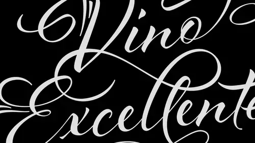
So what makes a good flourish? You know, there's flourishes are kind of dangerous territory you know? They have a lot of you know, extra stuff going on and they can really add a lot of you know, visual interests but they can also create a lot of visual distortion, distraction and just overall plain simple craziness so we really have to be thinking about how we're using them using flourishes sparingly and using them in the way that they complement the design and not distract from it so style is really important you know? One thing I've seen sometimes that people tend to design the style of they have an idea for a flourish that they want to use but that particular style of the flourish doesn't match with the style of the actual lettering itself you know, maybe they have this really loose wide open lettering style and then they had this tight curly little swash that goes in there that's an example of two styles not creating a very cohesive look so it's something to think about, you know, ...
if we want something loose and open and airy the flourishes should mimic that proportion flourish just tend to be rather large they're generally quite a bit larger than the letters themselves and so we want them to be open and big and, you know, keep that style and not be too compact into compress because then they start looking fussy so white space so when we have things like like flourishes that kind of let me give you a good example of using white space here let's go back here we go so this is a good example of white space you know we get into these really complex flourishes like this I mean there's so much going on in here and if if some of these parts are too close together they can create what are called hot spots so say for example if I drew this line right here really close to that line then I would end up with this area that looks like it's a bit of a tangle and so you see that like each of these little part it's in here you know they're different sizes but they relate well to one another you know we have kind of like this nice range of size were you know the negative space is we don't have one huge area next to like one little teeny tiny area and so that's really kind of what I mean by proportion and sizing all right so let's talk and get into really how and where to add flourishes right we're going to kind of go through an overview of flourish styles parts parts in functions so the first place where you want to add flourishes that is we want to start out with the actual body of the word first before we add in any flourishes remember what I was saying about how we look at words you know we have to consider the word is the whole if you start out by flourishing a particular ladder and then you move to the next letter you run into this really good possibility that metres they're going to collide and ugly things happen so what I mean by drawing out the body of the word you see this word flourish right here you know I start out with its most the word and it's most simple form and then I add the flourishes so where we add them in particular is we add them at the exit and the entrance points of these letters and so basically an an exit and entrance point is simply where you know an entrance point is where you put your pen down to start drawing the letter and exit is focus where you pick up pretty straightforward there so you can see there's a lot of different opportunities to flourish within my word flourish and you can see how I started to add some of those ones in there you know you can take a look at that and so let me show you something real quick with this when you see actually go back to a little bit later let's talk about the parts of flourishes first okay so we have several different pieces and parts that you can put together to construct a flourish so we have things like art x and straight strokes we have curves strokes we have o g or you know s shaped that's what nogi curve is an s shaped curve we have things like loops and spirals we can reverse direction you know on a stroke we which is a really clever way of handling a stroke where you needed to go a different direction you know like you know the loop is coming off one direction and you're going but I wanted to do something different over here well you could either pick up and do a separate flourish because that just simply reverse direction and go back the other way so in here is kind of where we can consider adding them so we have had this little diagram here whenever you come to a vertical horizontal axis that's where you can start to add in the parts of flourishes that's when you start to think about it so if we take a look at say like this you know this g right here as soon as I came down to this spot right here I decided to go with an up little curve but down here same thing I got down to the bottom of this form is the same this but then I added in o g curve instead and that kind of gives you an idea of you know as you're drawing them you can start teo you know kind of go through and decide you know what point so I want to flip direction do something different so with that said I'd like to have you guys take out your pencils and go ahead and we'll just to start out with the letter g and just come up with a couple different versions will just spend two or three minutes on this on dh come up with just different ideas of different flourishes that you can try you see if I've got some good examples for you here we go these are some examples that will be handed in the are part of the bonus material and these air just separate ideas for how to draw flourishes for a senders and d centers and you'll notice that I mentioned in here that flourished styles for saying a sender can be applied to many different letters so I only show the letter h but those top ascender styles could be applied to be the d the k the l same thing with e d centers the f today the p the uae the sea so on and so forth so give that a shot for a minute
Class Materials
Free Download
Bonus Materials with Purchase
Ratings and Reviews
April S.
I am watching the Brush Lettering courses live. I did quite a bit of lettering years ago and have wanted to start again. It was serendipitous that Laura's classes were being re-broadcast now. I have them playing while I'm at work so I'm not fully focused but I stop and look when something catches my attention. I really like Laura's straightforward, uncomplicated method of teaching. She doesn't hem and haw, her voice is friendly, she speaks and moves confidently and I really just enjoyed listening to the course even when I couldn't watch. I did watch enough to catch some important examples and tips. I would definitely recommend Laura's brush lettering courses for beginners, and I think those with some experience will also get some tips and motivation from the courses.
MikeD
I think the last time someone said something positive about any piece of "art" I produced, including my handwriting which was a school subject in the 1950's, was about 1962. It has been pretty much downhill from there. Since retiring I have made a commitment to practice these "worthless" skills since I have ignored them my whole life. Watching these classes on Brush Lettering is giving me hope I can actually do this and Laura seems to be an extremely patient instructor who actually loves her work. I've ordered the brushed and paper and such and I'll be purchasing the series of classes as soon as the supplies arrive. I love it, look for me to post my work in the student session when I get an acceptable product completed.
a Creativelive Student
love Laura and the class! Learning so much! Perfect for me to write my own word then scan it into Illustrator and go from there! Excellent!