Lesson Info
13. Practice Lettering with Your Name
Lessons
Class Introduction
04:19 2Tools & Materials
07:45 3How to hold the Brush, Posture & Body Mechanics
07:46 4Learn Basic Strokes
06:39 5Basic Strokes: Picket Fences
06:05 6Basic Strokes: Tapered Strokes
04:14 7Basic Strokes: Pressure and Release
04:53 8Basic Strokes: Transitional Strokes
06:24Lesson Info
Practice Lettering with Your Name
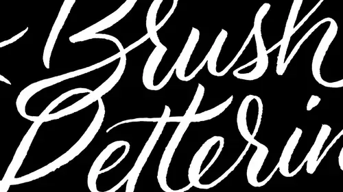
All right, so let's go ahead and start. Let's start working on lettering. Your name. You guys can feel free to use the line paper if you want kind of up to you on how you want to do that letter, your name, and that's we're doing this. I want to talk to you guys about really kind of assessing your lettering and really getting everything, you know, looking the way that you want. So I'm gonna just kind of talk through that while you're doing this. So here we got some tips for assessing and correcting your letters. So one of the main things that you want to look at and I think that this is the number one problem that I see is consistency so and what I mean consistency. There's a lot of different things that we're talking about. We have consistency in the weight of strokes. You know, our your six and thins consistent is the height of your letters consistent? Is the style consistent? You know, there's many different aspects to consider when it comes to this part right here. So that should be...
the very first thing that you take a look at is consistency. Now, with that fed, there's a lot of different lettering styles that are purposely inconsistent and for some crazy reason they managed to make that work. And I would say the reason why is because there's consistency still within the inconsistency. We may have two different sizes of letters going on, and we may have, you know, like one letter that's really super thick and then it's repeated again throughout. So if you repeat some of these elements, you can break that rule of consistency as long as it's repeated someplace throughout the remainder, that makes sense. Proportion is always a big one. I find that a lot of times the things like the uppercase letter tend to be too small. Upper case letters in scripts again. You want to make them large and grandiose. Eso you'd be paying attention to that with proportion. You know that you have your ace enders at a good height. You have your defenders at the right size. Yeah, and everything is just, you know, looking good that way. Spacing is a huge one. I find that the tendency when people are first getting started is to space things too close together and that gets to be a little bit, you know, claustrophobic feeling, especially later on the other classes will be talking about the pencil skeleton and, you know, and how Teoh letter Within that I find that people sometimes will put stuff to a little bit too close together and style is last one. So style is something that what I mean by that is we don't want to mix too many different styles unless it's very purposely intermezzo. You know, we want Teoh, you know, thick with if we're doing cursive letters, you don't want to throw in a Roman looking letter. You know, if you're doing on and the opposite is true, you're doing a tallix try to stick with the Tallix throughout. So you know it. Any kind of flourishes that you have anything else that goes with it with style. You know, you really want to be keeping all of that looking the same throughout. So any questions about assessing your lettering? I think I think so. So one of the questions that I saw at home and that I have as well is sort of if I don't quite get the little I don't even know what to call it a stroke that I want. But I want to add a little bit onto it. How How do I go? Best go about that to not make it so you can tell that I did that. Yeah. Connecting letters When I don't quite do it right, Do I can fill it in ideo? Absolutely. I mean, I'll take sometimes like a pig marker, which you have a little bit more tire control over and actually, like, sketch in some of those parts right there. You know, like, if you say like, oh, I want to fill in that area. If you have a really light, delicate, very accurate hand, you can do it with that brush. But generally I recommend using, like, a pig marker. Okay? And you know, another thing, too, is that a lot of some of this paper is actually translucent enough that you could take this and go over it. Another piece on on top of it, neither trace over it, like with a pigment marker. You know, Tracy outlines and then filling the outlines that way, trace it with pencil, or just simply go over it with another sheet of paper. Teoh, you know, kind of like a second correction because a lot of this is building up muscle memory. You know, as you're doing these letter forms and you're repeating them time and time again, you're telling your hand over and over how you want that form to be created. And it's just it's just kind of like a dance, you know, like if we learned, you know, tap dance. You know, we have to repeat that over and over again to get that perfect. Maybe you could show us maybe with your name. Oh, sure. A little bit about connecting again, connecting the letter, annexing the letters. Yes, that is a tricky one, because here's something that generally happens is that we have the like. A head of a tendency for people who are just getting started is the tightness that they create between. You know, they lack space in between the letters and so as you're doing an exit stroke. And one thing that I had mentioned is that the exit stroke usually goes halfway up the X height. You know, it's it's halfway in the middle, and so if you make it tall enough, that usually will give you enough space between those letters. It's common for people to kind of leave it a little on the short side, and then they end up with these really tight letters. Let me do my name here. So see, I'm gonna come halfway up without expert stroke, and that usually is gonna leave me plenty of space and see, the problem is, if I if I stopped like, say, like, right here without exit stroke in this one, in order for it to next to connect becomes really narrow. So that exit stroke kind of plays an important role in that. You do that again. Different style radio. Try doing my last name, which I was playing with yesterday. Pick up a little bit of speed when I do this one. See if I could maybe do something even kind of on the narrow side, you see, Like as I'm doing this lettering really big. You notice that like my hands air not moving very much, but my fingers aren't try that one more time. Right? Letter? Some of the people's names and class here. Here's Shane Dio Rosemary. All right, so it's great. I'm just kind of peeking over everyone's way are We're showing people at home. But maybe we can take a look at like Rosemary's. And yeah, have you kind of just take a look at it and see what you might suggest? Our critique or absolutely Oh yeah, with it with the left hand. Yeah, and you know it's OK because you know you will have. It's something that you'll get used to, and you do find a little bit more control. It's something that's harder for lead, right hand people, but easier for lefties. Do you ever actually doing it right? Okay. Do you have a chip? The pen and kind of pull it more than push it or that's a really good method. Okay, Absolutely. Okay, kind of do a little bit of a polling, and sometimes, you know, you might find to that with certain letters and when I would recommend it's really going through the alphabet and play with certain types of strokes and see, like, for me, for example, a counter clockwise stroke is easier for me to make, but sometimes with lefties, it's the counterclockwise stroke that's easier to make, and so you kind of have a choice as to which direction you're going to go on. So playing with this because your duct this is gonna be a little bit different. And it's one of these things that's really interesting with lefties is very individual. Yeah, so, you know, you'll have to play with it like, kind of formula that works for you. And I would even recommend doing some strokes, like counter clockwise clockwise, which is better. And that should help out. Take a look over here. Oh, lovely. An author. Hard to dio. I should know they're tough, but that looks beautiful. Good. All these relies very nice. And see, this is great. Like you have even spacing, you know, your fix and thins or really consistent. I mean, this this one, that's money and Jonathan. Wow, that looks incredible. And you're one of those people that likes the letter. Really large. Trying. Just trying new things. Yeah. Is that is that new for Ugo? Used a handwriting. Very small. Yeah, it's really breaking a habit. Imminent. How many of you guys find this to be a little bit on the awkward side? Then you're doing it right on. And it should It should feel awkward and it, you know, spend some time really just paying attention to your body. Mechanics like how you're holding the brush and how you're interacting with the page. That should be weird for you for quite some time. But really push past the discomfort because it's those people who really push past it that turned into the most amazing lettering artists. That looks great. Thank you. Have a really nice free flowing style here, and I really like that. I mean, it seems like you're really comfortable with this. That's what you're gonna really should it flourishes. I think it's interesting. I can tell who's gonna excel at what Just by looking at some basic stuff. Yeah, we've gone through, you know, discuss, you know, all the tools and materials and talked about the alphabet, you know, and I really, really recommend again what I was saying about using tracing paper and going over the exemplars. That's a really great way to learn how the letter properly, how toe, you know, and and it also keeps you from having too much discomfort. It helps train your hands and your body to do the right kinds of things. Start out with that and then maybe move into doing copying and then kind of trying it on your own without any sort of reference material that you're looking at. So I recommend, you know, kind of that three steps tracing, copying, starting out on your own. This is actually how the great Masters work when it would come to painting and painting studios. So give that a shot always, you know, play with experimental lettering. And remember, you can never spend too much time practicing practices, really where it's at. That's really going to be the thing that is going to push you to the next level faster. And if anything, it's the amount of time that you put into it. Can't stress time enough. All right, so here's my little follow page here.
Class Materials
Free Download
Bonus Materials with Purchase
Ratings and Reviews
lynny
Wow!!! Great class, terrific presenter! Easy to follow, professional, enthusiastic, fun!!! Most CL presenters have at least one of those attributes, but not all. CL Management: have potential new presenters learn from Laura's class. Only one suggestion: Laura's constant hair interference gets really tiresome and irritating. She frequently tosses her hair over a shoulder, and moves her hair behind her shoulder with her hands, and "fights" her hair being in the way during the whole presentation. Very distracting. Laura obviously loves how her very long hair defines her personality, and I'm not suggesting that is a bad thing. But for these short presentations, perhaps Laura would consider corralling all that hair with a loose ponytail, behind her back? That said, I bought the course anyway, as she is an outstanding teacher.
Debbie Smith
I loved loved loved this class. So wish I had been there in person. Although I'm not so great with the brush lettering, Laura was so perfect in her teaching and I definitely have some ideas to put into practice.
Shawn
This class was amazing it had high energy lots of details . It shared new ideas on where I could use such beautiful lettering I'm super excited to use it in my business and on my note cards! Buy it!