Lessons
Lesson Info
Create A Style Guide
Now we're into part three. Our final segment of the class today. And basically what we're gonna do is we're gonna put it all together. So we started with figuring out how to define some key concepts, and to yield your position and your strategy, and then basically how to visually communicate, and reinforce your position in part two with your visual identity, and figuring out your colors and your type faces, and your imagery. And so now we're really just gonna take all of that stuff that we talked about and tie it back to the one page style guide template that we're providing in the resources of today's class. So this way, again it's like, okay you've done so much leg work in the beginning, figuring out all the verbal stuff, now in the second part we have all these new visual design elements. So now it's really just being able to cohesively put this together for yourself or your company, organization on a one page style guide. And again, this is really meant to tie it all together for y...
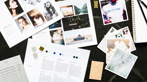
ou, but also to keep you on track, to know what you're working with, whether it's for yourself or your internal organization, or maybe for other partnerships, whether you're working with other designers or agencies, this is something that you would share with them as well to make sure that they're using all of the elements to keep whatever creative material they're creating for you is on brand. So, basically what I wanna do is just open up Illustrator and show you this template. We have it both in Illustrator and in Photoshop, and I believe a PDF version as well. So if you're more proficient in Illustrator or Photoshop, we have both versions available for you. So really how you're gonna be using this is we've just provided you the style guide that we created based on our case study today for Slow Candle Company. But after you basically go through part one and part two for yourself, for your own business, or for your company, you can just go in and update the type faces, and colors, and logos, and logo that you're using. So I'm just gonna open this up here and just show you how we put it together. So here we are, and I'm just gonna zoom in a little bit, just to show you. So again, it's just taking all the visual elements, and this is something acting as the starting point for you guys, but as you continue to grow, and if there's other pieces that maybe you're getting into your website design, and you're gonna have icons, or other graphics that you want to include in your style guide, add it here. Add either another art board or extend your art board here to add those additional pieces. Essentially you can go in here and double click, and then just swap out whatever it is, whatever the name of your organization or company is, go ahead and swap it out there. Then underneath that, we're gonna go ahead and put your logo and another thing is here, we just did a very simple logo but you can actually even expand this out even further if you wanted to. You can do your logo in different colors, or maybe reverse down on a dark background. Basically think about this as giving as much information as possible about how you plan to use these elements here. Again, it's gonna be very personal and different based on all your companies, but again, this is really just meant to give you a starting point. So put your logo here. And then again, this is where your type faces are gonna go. I put what our logo type face is, just again, if I were to ever work with another company, and they weren't totally clear what it was, I can put this here and make a note to say this is what the type face is but make sure that this isn't being used anywhere else outside the logo. It's really just for reference for you if you do make changes down the road. You really liked what your original logo type face was, but maybe you wanna make some adjustments, you know that you can research and go back to your original type face and look into the things you liked about it or what are key things you wanna keep, but maybe you wanna change just a little bit with a new updated type face. So then you're gonna go into your primary type faces. So I have our gotham here, so I'm putting what's the name of the type faces, and then I'm also putting the weight. So this is gonna give indication to yourself, or to whoever is gonna be using this guide to say, "Oh, we actually used, not only gotham, "but we used gotham in regular, we use it in medium, "and we also use it in bold." And then the same applies to your secondary type faces. So I'm gonna hop over here and say, "okay, here we have our secondary type face, "and it's in regular, and we have italic, and we have bold." So we're showing all the different weights. Some other things that you might wanna put in here, just food for thought, because you can make this as detailed as you want, is maybe under my primary type faces, I'm gonna add a note, and it's gonna say, "Use my primary type faces on all content, "body copy, headlines, etc." So you can actually get really detailed, and then say, this is the only places that I'm gonna actually be using these type faces. Then if I go to my secondary, and I'm gonna say, "Note: "use only on taglines, packaging, "and social media creative content." This is giving even more clear sense of direction of where you're using this, for yourself, for an outside agency, or a creative person that's helping you out. These are the little details. They're little details, but again, it matters. Those are opportunities for you to make sure that things are gonna be consistent. The best type of design is pretty much the design you don't really notice. It's really effortless. To me that really comes through these types of details. Take it a step further when you're designing your identity, and really call out where and why you wanna use these type faces, on what mediums, and how. Then create some guidelines and notes for people to follow, because this actually becomes important in terms of your onboarding process as you grow your team. You're saying, "Oh, you're new, this is the "visual identity for our brand. "This is information you need to know. "These are our type faces and how we use them." Then over here, we have our pantone colors. We have our three pantone colors, we put the pantone color listing underneath each color, and just something to note here, it says "TMS color," that's the same thing as a pantone color, it's just pantone management system. It's the same thing. So if you hear TMS and pantone color, they mean the same thing. The other thing is we could also take this further and say, add a note over here and we put, cyan, magenta, yellow, black. Values, right? And then if you're starting with pantone colors, and you're like, "Oh I don't know how to find this "TMYK or RGB break downs," just google it. Pantone offers a system where you can look it up online, and basically say, "I have pantone 350C. "What is the TMYK value and what are the RGB break downs?" So I can go ahead and add these here, and then, oops, that's a B, not a K. So if I'm using my pantone colors, but I actually need to print something using TMYK, I can just convert it. Then same thing for web, we'll have RGB colors, or Hex colors available to my web developer, or anyone who's doing anything online for me. Then lastly we have our imagery. This is really just, I just made this layout for you guys. Feel free to change it however works best for you, or maybe you don't have as many images as I have here, so you can delete any of these. These are just coming from the mood board that I pulled from online, from screen grab and what not. Maybe you do actually have your own company imagery, or imagery can really expand out to maybe there's other campaigns that you have, or you have imagery that's used on your site, but then maybe you have imagery that's used on your social channels. It's just thinking about all the assets that you have, and basically how can you organize them in a really clear fashion. When you get this template, the easiest thing you're gonna do is really just go into the link and just relink your images. So if I go down to links, I can just go and relink to whatever images you have on your desktop or whatever for your specific brand. This way you can adjust this as much as you want or keep it as is. It's really just trying to get all the information that we talked about from a visual perspective organized. So another thing too is, I always look at these things as working documents, and this is primarily focused on the visual aspects that we talked about today, but if you wanna expand this, and you wanna add some additional art boards, and include some of the information that you're actually writing down from your brand questionnaire, you could have another page here that's also like, "Hey, here's your mission statement, "and here's your vision, and here are your values." It just really keeps everything cohesive and in one document for you, so you can reference everything at one stage. That's only if you're really wanting to continue to expand and grow this document. Then you have all of this information nicely put together, and you can post it near your desk, or hand it out to people, or send it out as a PDF, jpeg, whatever you want, and it will keep everything together for you. I think it's really easy. It's nice to just have it all together, 'cause you can pull imagery, like we have these mood boards, you can pull pantone colors and stuff like that, but it's like, "Okay, I see how this type is looking next to this color, next to this image, and with our logo." I definitely would recommend, when you get to this stage, put it all together for yourself, 'cause it's just gonna make it easier for you. Here's a question that just came in. So how do you keep track of, I guess as many times as you use your brand essences, like in this final version, this question originally came from Smurfie, but she wanted to know, do you go through and check off like, "Okay, now I have this many components "that go with warm, and this many components that "go with clean?" Is there a good way to keep track and make sure you have all those components in there. Sure, I mean that's a great question and a great opportunity. I would say you could also go in here and you could make notes where, maybe it's under your type faces, and you're saying, "type equals your clean brand essence." And then same thing over here for your colors, maybe say, "It's your organic brand essence." I think that's a great idea. You can definitely add those under each element. Or maybe at the top you could do something like this, just more overarching so you can constantly look back on it. (mumbles to herself) So that way you could make this bigger. Maybe not that big. (laughter) And then you have these as you guidelines off to the corner. It's something more as a reminder, or you could get really specific as it relates to how we talked about originally, I know my type is gonna hit that essence, then all the type that you list under there, you have the essence above it, and you can see how it's working or not. I think that's a great suggestion, and it can just help you keep things on track. Especially too, it's kinda nice to also play around with this as your developing your identity, because you're kinda seeing how it's all coming together, so maybe you mess around in this document when you're playing with some type faces, or colors, or imagery. That way you can fine tune those elements as a whole, as opposed to each individual item. Yeah? Do you recommend making note of what not to do also? So you have all these things that show what the brand is, then maybe avoiding (mumbles). Sure. Normally that goes into a more extensive brand style guide, so it's important to know what to do, as much as it is to not to do. So I could also say, "So here's my logo," and maybe it's like this. And I make a note underneath, and I'm like, "Don't ever rotate it," and put it in this position. From a creative standpoint, when you're giving these types of assets to a creative, they're gonna take creative liberties, and they're gonna try to mess around with it as much as possible unless you do say, this is the way that we do it, or this is the way that we don't do it. I think that's also important. You can either do this within the style guide, or you can also make a one page word doc that says, brand, guidelines, dos and don'ts. So do use it this way, but don't use it that way. And that's something that we do for our clients all the time, and it continues to grow with them. As they continue to build more assets, it is helpful to give them the dos and don'ts.
Class Materials
Bonus Materials with Purchase
Ratings and Reviews
- Emma -
Just finished watching the course. Absolutely loved it! I have no experience in branding at all and this course has given me so much information that will help me a lot. I am so excited to get started and creating my brand style sheet. Thank you so much Danielle you were brilliant! Constructive criticism: If would be better if you knew the information rather than reading off the screen in front of you. Paraphrasing would help, too. But very good job nonetheless!
user-61d186
Amazing class! I've been looking for something like this on Creative Live for a long time. It taught me all I needed to know about creating my brand's visual identity and I finally got that needed push to formulate a brand strategy and assemble the visual elements for my brand. Very simple and straight to the point. Thank you, Danielle!
Vivian Bustamante
Great information with handy resources to use after and apply into our own project. The concepts explained made it more clear and I loved the quotes Danielle used to explain this words we heard a lot when talking about branding, the mission, vision, etc. These weren't clear to me up until this point. Thanks so much!
Student Work
Related Classes
Branding