Lessons
Chapter 1: Introduction
1Class Project
00:55 2Equipment
05:44 3Chapter 1: Quiz
Chapter 2: The Basics
4Camera and Phone Settings
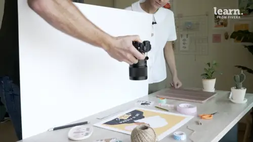
06:07 5Anatomy Of a Good Photo Of Art
10:41 6Example Images - A Breakdown
08:18Inspiration
03:28 8Chapter 2: Quiz
Chapter 3: Shooting
9Shooting in Studio
15:24 10Shooting Outside
05:13 11Chapter 3: Quiz
Chapter 4: Editing
12Basic Edits and Making Mockups in Photoshop
20:04 13Smartphone Editing
04:45 14Chapter 4: Quiz
Chapter 5: Conclusion
15Conclusion
01:57Final Quiz
16Final Quiz
Lesson Info
Example Images - A Breakdown
the first one I want to show you guys is this beautiful video actually from Lauren Home Home Sweet Home and it's a video but it would actually work just as good as a photo and I just thought it was so good. I wanted to share with you guys. So as we can see here we have her painting a little poster here. Um and then the overall setting is perfect, starting off at the top with lighting, the lighting is nice and even its bright. Her art is displayed very well. It just looks really, really good. So she's done a really good job here with the lighting but where this scene really shines is the styling in the composition as you can see she has all these interesting little objects, she has bread, she has cookies, coffee, a plant, um some paint a pencil and little stars and then even like a little badge and it just looks really cool. It's so interesting and it does actually add so much to her little painting here. If she was only just painting on a green piece of paper might be a little bit bori...
ng but because we have all these other things in the frame it just makes it so so interesting and in terms of composition, I love how she kind of twisted the paper a little bit, turned it so it's kind of tilted that just looks really good. Um and everything is just fitting in the frame really well. So fantastic job in this image. I really love it. Next up is this really cute little flat lay shot by art Arena victor, which I found on instagram and I just love it so much. This might be because I love christmas, I love the holidays and I love her her art here. It's just it's so moody, it's so emotional, I love it. But in terms of the overall image, the lighting is very good. As you can see her art is well lit. Um and then for the styling, she's, she's photographing it on a dark wooden table that's really allowing her work to pop. It's really allowing those reds to pop. It's not distracting and then she just has a few objects on the table that kind of add to the scene. She's got some mistletoe, she's got some some green kind of christmas tree plant there and then some art supplies. Um and then she also has her hand in the frame and hands are a very emotional thing where human beings, we see hands, we like hands, if you notice a lot of the best portrait photographers, they will have their models touching their face or something like that. And that's because hands look really good. I love how this artist has done this here. They've done a really good job and overall, I think it's fantastic composition, you know, possibly it could be changed a little bit, it's kind of close up, maybe it could be improved, but it's doing what it needs to do and it looks really good. So I like this image, definitely some inspiration for me. Next up is this shot by Forest Culture design and I love this artists, they're not only an amazing artist, but they're amazing photographer as well. And as you can see here, this is a straight up shot. So these shots are hanging on the wall um and they're organized in a way that's really interesting and allowing for a really awesome composition. If they were next to each other, there'd be a lot of empty space on the wall. It wouldn't look very good, but the way they're organized here, our eyes just naturally navigated from the left of the frame to the top right of the frame where we see the other artwork and then it kind of navigates around to the other aspects of it. It's very well lit. Um I like how the artist, you know, positioned these pieces of paper on the wall on a dark gray wall, which looks really good. So the color is good, they're really allowing it to pop and then those pops of green in the corner really emphasize the greens that we see in the illustration here. So it just looks really good. I love the color palette and I love the art as well. So, major inspiration for me for my straight up shots and somebody to think about while I'm shooting later today. The next one is a flat laid by a photographer that I've always really looked up too and that's steffi reads steffi is amazing at styling and lighting. She is the best photographer I know at styling a scene and really incorporating objects that really, really add to her scene. As you can see here, we see a small little piece of art in the middle of the frame and then it's just surrounded by all of these things that just add to it. First of all, the subject matter of her painting there is really nice and moody and then it's kind of enhanced by all the moodiness that we see in the frame. She has some yarn, a little pumpkin, a candle, a leather notebook, some plants, a book. Um and the styling is really spot on and all her images are really well styled. I also really like the lighting in this scene. We have one light source and it's very, very soft and there's also a lot of very creatively used shadows here. So she used one soft light source and perhaps in a dark room. Um, but it was enough to make sure that she had her main piece of art here in the middle of the little house, nice and well lit where all of the other things in the frame are kind of casting interesting shadows that really enhance the style of the image. So I really like how organic she is with her styling and how natural it just looks. Now this is an image from my good friend cat and I love how simple, but how well this shot works. As you can see this was taken outside in front of a bush and it's very, very simple cat. Just held it up in front of a bush with her hand and took it with her iphone straight on. Super simple, nothing fancy. But it really works. The lighting is fantastic, it's nice and soft. It makes the colors really pop. And then the styling is is really where this image shines, the greens, really make that white piece of paper pop. And that allows her artwork to really shine. I also love all the little bracelets that she has on her hand. That's definitely part of the styling and that definitely looks a lot more interesting than say, a naked hand. And then lastly the composition, which is a simple, straight up style composition looks really good and it just works so big props, has a few of these types of images on her page and I think they're all really good. And there's definitely some inspiration for me when I'm gonna be shooting later outside last but not least. This is a shot that I really like from letters, hop, letters hope. Um and it's a shot of her ipad here as well as some other papers in the background that kind of really add to the scene. So this is digital art. This is of an ipad and we're gonna be shooting some of that today with charlie because she does digital work through procreate. So I wanted to show that. So as you can see here we have the ipad in the middle. The scene is well lit, pretty simple lighting, everything is nice and lit well with digital art, we're not too stressed about ensuring that our light is really good. We want to just make sure we don't have reflections on the ipad, which is pretty simple to do and as you can see there's no reflections here. So lighting wise looks really good styling wise, fantastic job in this image. Fantastic use of color. So as you can see in in her illustration here, um the color palette is kind of soft, it's kind of pastel E and that's really enhanced by the colors that we see in the scene around the illustration. So the pink notebook, the kind of mint green or T. O green notebook off to the right even further. The full background is blue and then there's some white um in the papers as well as some pink pastel pencils and there's an orange one there as well and they really complement the colors in the image. So simple composition, simple, flat lay, but works really well. And I love how the artist did this here. I also really like how this artist used some b shots, some detail shots. So if I swipe to the right, you can see there's some detailed shots of some lettering you can see here which are beautiful. I love this. It's a really good example. Um and I think it's a fantastic image for charlie shoot today because we're gonna be shooting um some very similar color palettes to this one, so I'm excited to see this. It's really gonna help when we're shooting later on. Now after this, we're gonna do one more short lesson on where to find some inspiration for your shoot, which I think is super, super important before you actually start shooting. So let's talk about where you can find some inspiration and then we'll go shoot.