Combine & Merge Images Simply
Lesson 4 from: Where Art Meets Architecture: Post-Processing using Lightroom and PhotoshopMike Kelley
Combine & Merge Images Simply
Lesson 4 from: Where Art Meets Architecture: Post-Processing using Lightroom and PhotoshopMike Kelley
Lesson Info
4. Combine & Merge Images Simply
Lessons
Class Introduction
02:32 2Image Preparation in Lightroom
07:52 3Overview of Tools for Architecture in Photoshop
12:52 4Combine & Merge Images Simply
10:50 5Handling Common Problems in Architecture Photography
12:44 6Common Global Adjustments
07:57 7Advanced Architectural Processing in Photoshop
21:52Lesson Info
Combine & Merge Images Simply
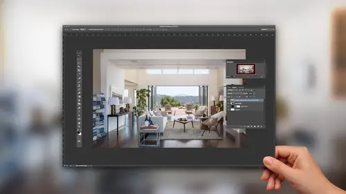
My next step, I wanna say is, I don't know, feels kinda sterile. I think we can go at our people right now, rather than trying to clone stuff out. What do you guys think? It's pretty empty . Let's add some life to it and some scale, shall we? So, I'm gonna jump back into Lightroom, and I'm gonna go through, and instead of using Lightroom in my multiple exposures to blend, highlight, and shadow, I'm gonna use multiple exposures to blend different subjects into the photo. So, I'm gonna add people the same way I added highlight and shadow. So, while I was on location, there's me kinda directing, we've got this doctor, and I say, "I want you to walk like you have a purpose. "Like you're on your way to surgery or something." We wanna make this feel like we just put the camera in there for a quick second, and we captured a scene, a moment in time, in this hospital. So, I had this guy walk back and forth a few times, and eventually I found one where I think he looks like-- Like I said, he's t...
alking with purpose. He's on the way to surgery. I'm gonna add him into our final composition, so I'm gonna set that rating to one. One star to mark it, set aside for later, and I wanna add a few more people, so I told this, I grabbed this nurse, and I said, told her the same thing, "I want you to walk with a purpose. "I want you to give it some effort," and we eventually found a pose that I think worked pretty well. Her walking up the stairs. Let's find out where we like her. I think when she's right here, she's too close to the camera, dominates the frame too much. So, I think something like this, where she's not so close would be better, but she's still in there to add life. So, I'm gonna use that frame. I'm gonna set the rating to one, and then I thought it would be great to have someone going out the door. So, I actually figured, "Hey, I'm dressed presentably. "I could work in this," so I myself went down there, and took my remote trigger, and walked in and out the door a few times, and you can't tell it's me, but you can see me down there, and there we go. I think one of these should add some nice motion, kinda likin' that one. So, we'll set the rating to one. I will go find those in my filter here by clicking on the star. Again, I can see all my one starred rated photos. And I'm gonna grab, let's see, we'll start with my doctor over here. So, I'm gonna right click, edit in, edit in Photoshop, and that'll open up, and I'm going to-- I'll close this. I can better see what I'm doing here. Here's our working file. Same thing as always, I'm gonna get my move tool. Press v, select it, shift, click, drag, bring that right over on top of our working document, and there is our doctor, right? So, how do I seamlessly blend him into this exposure? So, what I'm gonna do is, just like I've been doing before, I'm going to alt click on this layer mask button. It's going to fill that layer mask with black, which has hidden everything. I'm gonna select my brush,. I'm gonna switch the foreground color to white, and add 100% opacity. I'll wanna go all the way, 'cause I don't want him to be halfway there. I'm going to start painting him in, but the problem is, what I exposed for him is a little bit dark, so I need to adjust that, 'cause again it looks kinda burnt out around him. So, what I'll do is I'm gonna use an adjustment layer, and I'm going to select the curve adjustment layer. Oop. Neat. Make my pallet smaller here. Sorry, I'm working on like a 720p workspace here. It's pretty tough, and here's my properties tab that'll show me the curve, and what this curves adjustment layer will allow me to do is adjust the exposure of everything underneath it. But here's the problem, I don't wanna adjust everything underneath it, because that's gonna be the whole picture, and it's still gonna leave him relatively too dark for the rest of the frame. So, the first thing I wanna do is I wanna make sure this layer only adjusts our doctor, so I'm going to alt. I'm gonna hold alt, and move my cursor in between the curves and the doctor layer, and I'm gonna click, and that's gonna add a clipping mask. And what that clipping mask will do is it will ensure that this adjustment layer, to change the exposure of that doctor, only adjusts the layer that it is clipped to. So, it'll see those pixels underneath it and say, "Okay, I'm just gonna adjust those, "then I'm gonna stop. "I'm not gonna go any further." And then, using this tone curve, it gives me a representation of the histogram of our doctor here. I'm gonna drag that curve in the middle. I'm just gonna drag it up until it looks like the exposure of the doctor matches perfectly with that of the interior. So, again, I'm only adjusting the area around him thanks to that clipping mask, and I'm gonna go until it looks about perfect, and I'm gonna call that done. So, I still think there's a little bit of darkness. It might be a reflection from the elevator, but I'm not lovin' it. Let me rename this doctor, and I'm gonna select my mask, and I'm gonna take my brush. This time I'm gonna use a black brush just to reveal. I mean, sorry, black brush to hide, and I'm going to paint out that black reflection underneath the doctor. There we go. Just to kinda seamlessly blend it together, and I realize that I'm now painting in the elevator. We don't want that. So, I'll get in there nice and close. Get rid of that. There we go. And so, we have successfully composited one person, and you see how simple that was. It was just a matter, it was like three mouse clicks when you break it down. It was you added a new layer, we added a layer mask, and we brushed him in. That was it, and then we added our curves. We adjusted it, seamless compositing. No problem at all. So, the next thing I wanna do is fill out the scene with the rest of our people. So, I'm gonna go back and I'm gonna grab our nurse. Where was she? There she is. Is that her? No, she's too close there. I think that's the one. I was on a 17 millimeter lens here, so the closer she gets to the camera she's gonna bit a little bit stretched, and I don't wanna do that. You can never, you should never stretch out a woman with a 17 millimeter lens. It's just not a good look. So, we're gonna right click edit in Photoshop. Again, I'm gonna select v, my select tool, shift, click, drag onto our working document. Close that, and you accidentally put that in the wrong area, but we'll drag it up. Alright, so there is our nurse, and I'm gonna do the same thing as before. I'm gonna rename this to nurse. I'm going to alt click, add a layer mask, select my brush, and I'm gonna start with my soft brush painting in the nurse, and be sure to catch her reflection in the wall, so it's a bit realistic, and this time, I think, we've got a bit luckier. I think her exposure matches pretty perfectly. So, I don't know if we need to adjust with curves. We'll do a little adjustment. Looks a little bit dark to me. You can kinda see as I turn her on and off, that wall down there gets darker, so I'll go to my adjustment layers, select curves, alt click to clip it to that nurse layer, and I'll drag it up just a smidge to seamlessly blend that in there. Alright, and then lastly, we need to put the clown in the photo, which is me, and we'll go find a good look here. I think we'll have me going out. I think we've got everyone coming towards the camera, we can mix it up, so I'm gonna right click, edit in, edit in Adobe Photoshop CC. It'll open up for us. I'm gonna drag, shift, click onto our working layer. Again, that will automatically, holding shift automatically aligns all of the layers in Photoshop, so you're able to seamlessly blend, which is super helpful for speeding this whole process up. So, again, I'm gonna rename this to guy leaving. I'm gonna alt click, add a black layer mask, and start painting in, and we're gonna have to do some exposure matching 'cause if I turn this on and off, what you see again is that burnt out messy compositing. So, I'm going to select curves, alt click, clip it to that layer, make this bigger so you guys can see it, and I'm going to drag that up 'til the exposures match. Right about there looks pretty good. And, I'm gonna paint out, it's bleeding a little bit over here, so I'm just gonna select my black brush, nice and soft, go back to my layer mask, and paint out that extra messy bit of compositing, and then if I turn 'em on and off, it looks pretty seamless at this point, and he is added in. No problems at all. Alright, so in about five minutes here, we've just gone from our complete mess of a scene, which looked like this, which had no chance of ever being recovered, to something that looks pretty respectable for an architectural photograph I would say. Of course, we still have to go a little bit further. I'm gonna show you some ways to clean this photo up, but it's pretty impressive what you can do using the same basic tools over and over and over. Again, layer mask, brush, curves, blend it seamlessly together. Very simple. Very good results.
Class Materials
Bonus Materials with Purchase
Ratings and Reviews
user-748e5c
First, note to CreativeLive: Please include experience levels (beginner, intermediate, advanced). I think the bad reviews were because people expected a more advanced class than this. That, and that some people expect mind-blowing revelations in merely 70+/- minutes. This class was jammed pack with great information. I was looking for this exact information so it was perfect for me. Plus, Mike Kelley's teaching style is easy to understand. Any class taught by MK is worth watching, he always has useful insight and nifty shortcuts.
Chris Murray
not only is Mike Kelley a genius, he is the Bob Ross of architectural photography. It's got a real "Lets just add some happy cars here and some happy people there" kind of a vibe. What a killer tutorial. Thanks Creative Live and Mike Kelley.
user-fd7ce6
I really enjoyed the video as I do with all Mike Kelley videos. The different way to use the clone stamp as well a lot of little trick he did were great to hear. However, I completely agree with Nicholas, it would have been nice to see the image that they showed on the cover, as that is a scene that I'm far more likely to encounter.