Lessons
Day 1
1Hard Drive Management and Backup Strategy
44:57 2Smart File Management
17:53 3File Management Q&A
21:15 4Library Workflow and Syncing Time Stamps
17:40 5Rules for Selecting Images
31:04 6Keywording Techniques with Q&A
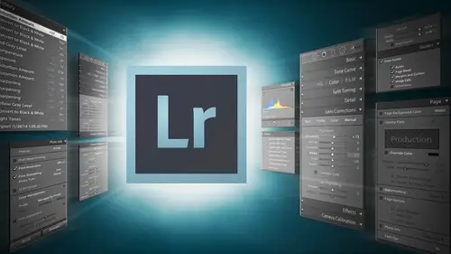
21:19 7Adobe Lightroom 5 Advancements
24:56Adobe Lightroom Presets
15:24 9Advanced Sync Techniques
17:37 10Camera Defaults and Calibrations
19:42 11Archive and Delivery
40:19 12Archiving the Job with Q&A
32:36Day 2
13Small Catalog Workflow and Templates
46:03 14Traveler Workflow and Smart Previews
36:33 15Outsourced Workflow Part 1
19:22 16Outsourced Workflow Part 2
46:37 17Interview with Jared Bauman
24:35 18Retouch Workflow Part 1
28:43 19Retouch Workflow Part 2
34:42 20Roundtrip Workflow Part 1
23:35 21Roundtrip Workflow Part 2
24:33 22Big Studio Workflow
24:08Day 3
23Web Proofing Workflow
25:31 24In Studio Proofing with Adobe Lightroom
19:44 25In Studio Proofing with Pro Select
43:58 26Introduction to Video
18:50 27Editing Video in Adobe Lightroom
30:46 28Adobe Lightroom Movies and Slideshows
26:07 29Album Workflow and Publishing Services
17:16 30Designing Albums Fast Part 1
23:39 31Designing Albums Fast Part 2
29:09 32Adobe Lightroom Q&A with Demonstration Part 1
34:27 33Adobe Lightroom Q&A with Demonstration Part 2
37:06Lesson Info
Adobe Lightroom 5 Advancements
Now let's move on to the develop module so we're inside the develop module because that is our second place and if you if you look at the way it's laid out light room is laid out to do the library and then the developed and then all the other things that's because your first set is to organize the images and make sure you're only working on the images you've selected and then you go into the develop module and I have to state this very emphatically you only have permission to go to the develop module when you're finished your job in the library module, so do your selection and then go into the developed module if you keep going back and forth, you're just going to waste a lot of time so you're distracting yourself by going in the developed module when you're not done with your primary job, which is to select the images on dh as well. Talk tomorrow it's also possible that this point once you're in the developed module to stop working because you could have someone else do it so you coul...
d be doing an outsource and send the images to do the scientific work which is just adjust it, make sure it's color balanced and exposed and has the right black points and white points that's all stuff that someone who is trained to see white points, black points and color balance can do it I mean, we shot film and we used to send our film to the lab, right that's what outsourcing is you were outsourcing your film color production and so it's very possible to do that as well. On we'll talk about that as a workflow methodology tomorrow. S o for now we want to talk about if I'm doing this all by myself what are the best ways to operate and get stuff done inside of the developed module? And we will do a little trickery and fun here in our developing today, but the next two days when we get to our develop segment which will be towards the end of the day on today, we will just be playing in the developed module and showing you what can be done today we want to get through work flow as much as possible so that you can see how quickly and then we'll play tomorrow and the next day so in the developed module, the first thing that you will notice that we'll get something done quickly is a preset so pre set is a very easy way to accomplish a lot of dialled pushing over here with the touch of a button and so if I want to do an aged color film on this photograph and I click on it it's done but that was three or four dials that I would have had to click in order to get that done so presets air absolutely important when it comes to getting stuff done quickly because the may the major work on an image is the adjustment. The adjustment is something where you know how bright does this need to be and you know where should the highlights? Bu no see, I'm getting that highlight back in there and then you know how much contrast should I have on it? And what should be the color balance of the photograph? All of that is very scientific vory something that an employee level does. Once you've got that correct, then the question is, what do you do stylistically to the photograph what makes it yours as opposed to anybody's and that's? The stuff that requires your attention is the photographer as the artistic director of this piece of work, and so that's something that you can actually codify into presets. Because once you have your images normalized so that their correctly exposed and balanced, and all that then style can be added to any image, and it will make every image look the same, like I can take this aged color film and click on this image and it makes it it looks like this, and then if I go to another image that is way over here, say this one, and I get the exposure correct on this one and I bring the highlights down and I bring up the shadows just a little bit and add a little bit of black and clarity and so if that's what I wanted to look like if I push the same preset the age color film, it does the same thing because it's just adding style on top of that image and so it's very easy then to take styles that you have created and you have honed and that you are that you've purchased, you can purchase other people style, but you can take that style that you've created and homed and you can apply it to things and because you've got the underlying image correct in the first place than that style is almost universal across the board and that's what's so powerful about a preset but it's on ly powerful if you create it in the correct way. So the first thing we have to talk about is the creation of a preset and so we're just going to go through and talk about creating a preset for you right now so that we can really discuss, you know, what is it about creating a preset that that makes it a powerful one versus a waste? So let's talk about that quickly now in light room wanna won and also in I have one called uh uh plug ins won a one way detail making presets so we go into really, really, really great debt on making presets so we won't go into that amount of death, but we do want to cover it enough that we can discuss it. So once I have done something to an image and I think that in this point it's it's a good point for us to go fine an image, so I'm gonna do this image here and let's work on this image and then create precept from whatever style we add to this image. So in normal operation of developing image is what you want to be doing is working through your images a ce fast. The speed is you can go because that's when you make money when you get more widgets out the door, but occasionally you'll come to a point where you want to do something different to an image that you haven't done before that's when you slow down, you make the best image you can make out of it and then you steal from that all the styles that you used to make it happen and you make those into pre set so that the next time you come across a situation like that it's just a matter of a couple clicks on a preset rather than, you know, working and finessing the file, so in this case, if we run across this image and we love it we want to work on it, so I'm going to go into the shadows and I'm going to, you know, bring out the shadows because I wantto work on the shadows on their face they're so that they're a little bit softer shadows instead of harsh, and then I'm going to take the highlights down a little bit because you can see that, you know, this side of their face is a little bit bright, and so I'm gonna pull the hot the highlights down a little bit and the whites down just a little bit shadows up a little bit. Um, so if that's, my, the work that I want to do on the basic image and I think that I'm pretty good on my temperature. Um, but a lot of the times when I'm working on temperature, I'll simply grab the little white balance tool, which is the w key, and I'll just click on a white that looks about correct, and you kind of learn what white balance is, because if I click in the shadows there going to be awfully warm, and if I click in the highlight, they're going to be more cool and it's, so it depends on what side of white you choose because shado white should be blue. Because shadows are blue and highlights should be warm so depends on how warm you wanted to be a so what part of that shadow you select so I'm going to just choose something right here on his collar that's not really super white and not not really blue so that I could get a nice you know, color on it and you can see now that I've got a nice warm tone to him coming across here once I've done that then maybe I need to have been yet little kind of cover see how the light here so I've got a big soft box over here and that's what's lighting them because the sun is actually way back here and so the soft boxes lighting them and so I'm gonna create a vignette but instead of creating a vignette which is the normal types of vignettes that we do and by the way this a good time to discuss the fact that if you purchase the chorus this photo will actually be in the course and so you khun once we've worked on this everything that we work on is going to and I'm actually gonna flag it right now is blue and that tells me that I have to provide this later on because we're gonna work on this one so I want you to be able to see and reverse engineer everything that we've done so I'm going tio go in instead of creating so you could create a post crop vigna post crop vignette will follow the vigna are followed the crop itself but rather than create a post crop in yet or if I don't do a lensman yet that will follow the lens itself so if if I were to crop this image it wouldn't wouldn't necessarily it would actually crop out the vigna so rather than do either of those I'm gonna create a vignette with something no that's noodle light from five which is our radio tool so our radio filter allows us to create a vignette anywhere we wanted city and so I'm going to create a vignette and I just simply click in the middle and by the way when you look at this there's a invert mask so the radio filter wants to apply things outside of the circle if you invert it applies it inside the circle so I'm going to create a vignette which means I want to think outside the circle and so I'm going to come into this area here into the exposure and I'm going to bring down the exposure until let's just call it a one stop burn for now so a one stop burned and I'm just going to click in the middle and drag and it's goingto see what makes the circle equal distance from wherever I am and they're so now I could you know move this around I can also tilt it I congrats on one side of it if I hold the option key down, I only extend one side for the side that I'm working on sea that so if I want this to be a little higher a gram and on lee tio makes all belong on dh, then if I grab both sides and hit shift, then it does everything at the same time pulling out in like this, and if I do one side, it does that on the opposite side at the same time. So those air your controls on this piece and I'm going to go in and create this just like that that's a good vignette and I'll show you why I'm doing this this way because later on it'll become a parent. So right now we're doing this is a radio filter vignette and I'm going to go in here and change the feather so I could do feather like hard feather or no feather see this so there's no father, so it just looks like a big window and then if I go feather, I go too much of better than it bleeds all the way into them, so I kind of want to do something kind of in the middle on the feather and so that's my vignette, and then what else should we do to this, uh, let's take oh, I know what we should do this, so I'm going to go into the hs cells and I'm going to intensify the blues so that the sky pops, but I want their skin tones to be soft and a one, so I could just go in to the basics and grab the saturation, but then their skin looks gross and I could grab the vibrance and it'll pop the blues, but see how their skin tones still get a little bit warm on dh so I can I can always take the vibrance up maybe ten or twenty or something like that, but once you get too far, it'll start to affect the skin tones as well, even though it is fairly smart, but I'm going to go into the hs cells where I can actually target very specific blues, so I'm going to go into the the luminous because I want I want the blues to get darker so the sky gets darker and so and it's also going to make this area back out here darker, and so I'm going to take the loom in its and I'm going to use this little button here. It's called target adjustments, I might click on it, and now I've got this weird little target symbol see that? And if I just use my finger on my mouse, the scrolling on the mouth or if you don't have a scroll mouse if you click and drag up and down, it will do a much bigger version of what I'm going to do, but I simply point at the blue and scroll down and you'll notice over here if you watch this little blue thing right here that blue channel is I scrolled down is going down along with aqua sail aqua has awk was made it's way down there too, because it knows that that color that I'm working on is a combination of blue and aqua so it's a good way of targeting specific color like, for instance, someone has magenta inside there skin or whatever and you don't know whether it's, magenta or red just point at it and scroll up and down and you'll find out what it is and it will start scrolling that for you so I can take the blue down. I don't want to go that far with it something to raise it up a little bit let's do that and then I'm gonna take the luminous of the of the oranges skin tones I'ma take those up so I'm just going to brighten up their skin tones little not too much, but I just want to make sure that I know make them brighter and blues darker so that thinking preset in our head, we're thinking globally, but also for this image and so I that way, it kind of pops them out again. This whole area here, the other thing you can do is go to the saturation and say, well, I want blue saturation remember, I still have my target adjustment tool, so I'm I'm blue saturation is to go up a little bit, but I want the saturation of their skins to go down a little bit so that it's a softer, more film look to their skin, but we still get the pot from the back, so I'm just going to look at their skin and I'm just gonna yeah, zoom in. So now we're looking at their skin, and if you look over here, you've got red, orange and yellow watched those sliders because as I go down with those and see that orange is what her skin, if I go away nuts up there's, lots of orange and I could go all the way down and she looks like a vampire. So, um, so we want to just bring it down a little bit, so I like that it's just subtle. If you go crazy with these things, they'll start creating lines everywhere you don't necessarily want to do that, so just just be aware of that so I've just played with the skin and the blues the blues have gone up a little bit, the skin tones have gone down a little bit and you can also take the hue and shift hughes back and forth so if you have a blue that's two greenish you can shift it back towards magenta so it becomes a better blue, more sky like blue so that's really up to you and the other thing that you'll notice as your zoomed in here so I'm going to zoom in like on him and I see it a little bit hard to see but there's a little bit of a a green line on his shoulder and that you can see it better right here and see that green line on the edge there I'm being really persnickety about this because you would never see it in print, but you khun go in and d fringe those edges if you go to the lens correction area and you go to the profile, I'm sorry the basic and right there is removed chromatic aberration if you click on that it will take care of that little green that green lines gone now so that the removed chromatic aberration is something that you could almost leave on all the time and it very rarely negatively affects the image and does a pretty good job especially if you're using a lens that kind of spends quite a bit at the ends and so when you get to the end's all sudden there's like magenta all over the place like in these weird lines you click on that does pretty good job solving that issue so wouldn't I don't necessarily leave it on all the time but it's something that you probably could and you would rarely see any negative effects from it okay, so now that we've done that, I want to add kind of ah feeling to the image now so like I wanted to be maybe a film look or maybe I wanted to have, you know, kind of an older look or a poppier look or something like that, so at that point, once I've kind of solved all of the internal issues, I could come and say, what do you guys think you want to make it maur saturated and poppy or do you want to be more? Yeah, okay, because got good colors and so you might as well write, so what we're going to do is I'm gonna take the vibrance up just a little bit and the saturation of just a little bit so that I've kind of added some pop to it and then I'm going to go into the tone curve because I think the tone curve is where you can do the tone curve is the least used and best tool in light room because it's something that can be applied universally to any image once you've created a good tone and it will do amazing things to the image and almost never do people use the tone curve, they very rarely use it, and so you can apply it across images all the all the time and nobody's touched it, and so it just adds whatever to it so you could have all this contrast and in the basic settings, and then if you add a tone curve to it just applies it on top of it. And in fact, most of the film looks that you see in pre sets in like room are done inside of the tone curve. Nowhere else, just the tone carve itself can create amazing effects just on its own and so let's just let's go there, so in the tone curve, you can play with the highlights and darks and shadows just this kind of a light room esque type of field. But if you go beyond that over here to this little this little box here that has this little curve on it, if I click on it it's called a point curve, I click on that now it changes the way this tone curve looks now it's like photoshopped and inside a photo shop, we have the ability to play with different channels so now, instead of working on our tone curve just is like a contrast it's, it's much more powerful, so I'm going to go outside here, I'm going to start creating so I could first ad the contrast that I want based on, you know, just total contrast, so I wanted to be a little little bit more contrast, a little tougher. So now it's a little bit little bit more contrast ing just overall, not much, but a little bit and then I go into my red it's now as reds, we can choose to kind of bring them down a little bit or we could bring him up a little bit. I'm going to choose to bring him down because went the blues to come out more, and so I'm going to kind of create a colder look to this image, eh? So I'm going to take my red down just a little bit and I could go way down and you can see how blue and cold that looks and there's little green coming into it as well, so I don't want to go too far, but I'm going to do that here in the shadows I'm gonna keep it fairly normal so that it doesn't get too long qi in the shadows just we start to lose it may be in the highlights just a little bit I'm just going to bring it down a little bit and then I'm going to go to the greens and in the greens be noticed when I brought the reds down the green started to show up don't want the greens to show up green's air green is the ugliest color we have available to us and so I'm going to take green and pull it down total to see how much that improve the image so let me undo that and I'm gonna zoom in on this okay so look att look at him and watch how much it improves the image when I pull the green out see that huge improvement green is just an unfortunate part of our existence so that's funny you know, I spent two years in kentucky and I love kentucky I think it's an amazing place so much fun and people are fantastic but there's nothing but green in that place I came home and I was so happy to see a rock you know, it was like just a piece of rock I could see rocks and stones and dirt because you can't see dirt in kentucky it's just green everywhere I got sick of green like seattle and you know phoenix is just brown everywhere that's right? You know, I guess you know where he visit you but but I was so happy to see brown somewhere so anyway very green is an the color was that that's true so I'm may not get out of here alive by talking down on green, but I just think greene needs to be moderated and that's that's coming from someone who was in the desert so so take it with a grain of salt. Okay? So now in the blue I want to bring the blew up so I'm gonna take the blew up a little bit and I don't want the blue to be too drastic in the highlights I just wanted the shadows, so I'm gonna take the shot, the highlight part of it back down and so now I've got a pretty like that. I like the way it's looking it's kind of an interesting look it's a little bit bluer but it's nice and you know, I like that I like that a lot, okay, so that's my total effect, I'm gonna go back to the total curve here and maybe I'll play with it a little bit now that I've kind of because I've messed with the contrast based on the reds, greens and blues, so I'm gonna go in one more time and take a look at the total image and see, do I want to bring up the highlights? The total highlights just a little bit and do I want to bring the shadows down just a little bit? Yeah tend to pop that's kind of nice I'll bring the mid tones up a little bit more and then I'm going to do something in the blacks that will make it feel a little bit more like an older film which is I'm going to take the total bottom right here which is the black right now what this is telling you is that black equals black zero equals zero and what I'm going to do by raising it up is I'm going to tell it that zero no longer equal zero you no longer have the ability to have true black it won't allow it so now if I go over to his hair watch the difference in his hair between here very rich and here here see how I'm like now I'm saying when you get to black you've got to go higher than and then that's when you get that solar ization kind of look which was very interesting in the eighties so we're not gonna go there but by pulling this up just a little bit we kind of create a much more analog feel to the images because in film it was very difficult actually get true black and so now we get kind of a nicer softer feel to the shadows and stuff like that and I'll feel a lot more like a portrait film but it will still have that kind of you know tough contrast so I like it
Class Materials
bonus material with purchase
Ratings and Reviews
a Creativelive Student
Jared is the best. Really, his class was absolutely awesome. He can teach you everything with an ease and you will not want to leave your computer untill you see the whole class. I am so happy I purchased this class, it was the best investment! Than you Jared for such a brilliant classes you bring to us.
jane
I believe that this man has saved my life, or at the very least returned my life me. So many wonderful tips and time savers. I had never realized how much time I wasted at the computer for no good reason. He is funny, easy to listen too, and he explains in a way that can be understood. If you could only purchase one course, this is it! I attended WPPI and Jared's Platform Class and at the end I wanted more so thank you Creative Live for have him.
a Creativelive Student
It takes a lot of devotion to spend so many hours in front of the computer but I found myself not able to leave the monitor. Thank you Jared Platt and Creative Live for providing this quality education and information. We also get the bonus of seeing beautiful images during the sessions. Jared is a wonderfully clear teacher. His extensive experience both behind the camera and in processing digital photography is so very evident in all that he covers in his seminars. I'm looking forward to the next time.