Lessons
Lesson Info
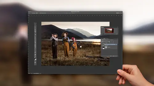
Stylizing Your Image
So you can see how we can adjust that. Now let's add a little bit of a style to it. Now in this case I kind of feel like it should be a warmer image, it feels like maybe it's kind of in the South, then on a porch. I want it to be that kind of dreamy summer days. So I wanna take the Temperature up just a little bit more, so that feels nice there. I'm gonna add a little bit of Clarity to it. And then I'm gonna go into the Tone Curve. Now in the Tone Curve, Tone Curve is one of my favorite places. Tone Curve is a really wonderful place to be. Inside of Tone Curve you have the ability to change not only the exposure of individual areas inside of the entire histogram, but you also have the ability to change the red, the green, and the blue channels as well. And so if you're used to Photoshop. Is everybody pretty used to Photoshop in here? Yeah. So if you're used to Photoshop they have a Curves area. When you open up the Curves area there is a regular curve, which is this. So if you go to th...
e Curves you can grab onto say the middle of the curve and when you grab onto it it creates a point. This is would you would be used to in Photoshop. So in Photoshop you'd grab onto the point and you would increase it, like that. And you can see that the middle tones are getting increased, whereas the white tones are staying exactly the way they were and the black tones are staying exactly the way they were. I can right-click this and flatten the curve anytime I want. Now inside of Lightroom it has two different curves. It has a curve here, which is just kind of three sliders, Highlights, Lights, Darks, and Shadows. So it allows me to operate on each individual area in the curve independently. So when I go over here to the curves, we don't even need to see the picture necessarily, but you can see right here inside of the curve area the piles, that's the histogram right here. You can see all those, like a faint histogram in there. And if I hover over the Highlights slider you can see that it has an area here right up at the top that is specifically telling you that's the area that this curve will be affected. So if I grab the Highlights area and I start shifting it you can see it only operates within that area. Just like that. If I double-click it it returns back to zero. Same thing with those Shadows. You see it only operates within that little area right there. And then, of course, the Lights and the Darks are the whole middle section, but the Lights kind of favor towards the top and the Darks favor towards the bottom. Now there are three little things right here, these little handles help define what the quadrants are. So right now they're equal, it's 25, 25, 25, and 25% of that photo is Highlights, Lights, Darks, and Lights. But what we can do is change that. I can grab this and bring it down, so that only the bottom 10% of the photo is considered a Shadow. And then the Darks is kind of a bigger portion and then I can do the same to the Light, so that the top 10% is the Highlights. So now I've got a bigger area in the center, littler areas in the top. And I'll show you what that does. So if I'm just looking at the photograph and I grab the Shadows and really bring them down. I'm just gonna drop those Shadows way down. You can see that it only really affected over here in her hair, maybe right up there, but watch what happens if I grab that little handle and start bringing it. Do you see how the more I go out the more of the photograph, right now 50% of the photograph is considered a shadow and that's why you've got those blocked up shadows, that's why you're getting really blocked up shadow in the window, things like that. So that just gives you an idea of what you can do inside of this curves area. It's fairly complex. It's easy to use, but it's got a lot of options to it, so you really have a lot of abilities within the Tone Curve itself. And we haven't even gotten to the Point Curve, which is right here. So right here on the bottom left hand corner is what's called the Point Curve. If I click on the Point Curve it changes the entire curve area, so that we don't have those sliders anymore, now we actually have a Photoshop version of a Tone Curve. So now I can just kind of create whatever curve I'm interested in. Now I'm gonna show you what I wanna do with this, because I want it to be this kind of old school warm summer days feel, maybe it's even like it came out of the 1970s. It's an old print that I found on the counter that's been kind of yellowed by the sun, that's kind of what I want it to be. So what I'm gonna do is first I have to create that film look inside of, this is called the RGB Curve, which means it's actually working on all three parts of the curve at the same time, red, green, and blue. So there's no color shift to it. So what I'm gonna do is I'm gonna go down to the bottom of the curve and I'm gonna grab, see that little point right there, if I grab it and drag it up, like this, and I don't want it to be a straight line like that, but let me. Grab it and drag it up just a bit. Oh, it's a little touchy. Too touchy, hold on. Let's flatten the curve and let's just take it up on its own first. There we go. Okay, so by doing that what I've done, if I hover over it you can see right in the top left hand corner of the curve it has an area here that tells you zero now equals 11%. So what was black is now 11% black, it's almost black, but it's not. So nothing can ever be truly black, everything's gonna be 10% off of that number. All right, so what I'm gonna do now is I can also take the whites down just a little bit, so nothing can truly ever equal white either. So if I hover over it it says 100% white is now equal to 93.3% white. So by doing that you can see when I go in here that her hair has no true black in it. It has nice shadows and things, but no true blacks. And if I wanna keep the contrast moving I can grab the contrast curve here and bring it down, and then bring the other side up a little bit. So I've got some nice contrast in there, but I still have no true black. Which is a really pretty way to look at a photograph. It really makes some beautiful images. Now this is where it gets really fun, because now I can go into the Red and the Green and the Blue. See now how that, this is curve is red, you can only see that pile of red. So now I can go in and tell it do I want it to be more red? Do I want it to be more magenta, more green, more blue? So I'm gonna grab the Red and I'm gonna bring it up just a hair, I don't want it to go up too much. Then I'm gonna go into the Green and I'm gonna bring the Green down a little bit, which is actually gonna create a little bit of a magentaish feel. And then I'm gonna go into the Blue and bring the Blue up. Oh, no, down I mean. Because the Blue, if I go down with the Blue I get yellow. So I'm gonna bring the Blue down and get quite a bit of yellow into that image. And I'm gonna really do that a lot in the shadows. But I don't want the highlights to get, 'cause the highlights are already kind of yellow, so I'm gonna take the shadows down, but I'm gonna make another point on the curve and come up with it, so that the highlights kind of go back up to neutral. Then I can go through and fuss with the Greens and the Blue, or the Reds again and make sure that it's exactly where I want it to, the right place. Then I'm gonna go to the Reds and I think that maybe the Reds, I kind of what those to be higher in the shadows as well, but I wanna bring the highlights down a little bit, 'cause they were getting too red. So I'm gonna bring those highlights down just a little bit. And you can see, let me just turn this on and off and let you see the difference as to what we're seeing here. So if I click this on and off, I'm gonna turn it off. See, that's normal. It's kind of a neutral, scientific, it's the right exposure, it's the right color balance. And then I turn on the Tone Curve and watch the colors change. See that? The colors change on you. And then you've got that style locked in. So that's now your new style. Now there's two places that you can save that style. And this is important, because this amount of work that I just did on this photograph is way too much work to do on any one photograph. But it's good to do as an investment on the next 150 photographs that you do or 3,000 photographs that you do. So what you're gonna do now is you can either saves those in a Point Curve. See that drop-down. So these are all a bunch of Point Curves that I've created. So these are, it's actually a collection of curves that I have on my store, but I've created those, so that I never have to do them again. If you want to save this all you have to do is go to the Save button right at the bottom. So whatever you've done and you like it you hit Save, it's gonna ask you where, well, you don't get to choose where to save it. If you save it somewhere other than where it shows you it won't exist inside of Lightroom. But when you open it up you can see that it's going to be inside of Application Support, Adobe, CameraRaw, Curves. On a PC that pathway is a little different, but it's the same thing, you end up in this Curves folder. And you can see all these little XMP files here, those are the curves that you have inside of Lightroom. And so if I save this, I'm just gonna call this a Test and hit Save. And now when I click on here I have all of mine plus the Test. So it's very easy then if I were on this photograph and I wanted to add a style to it I could simply go to my curves here and I could say, well, I want to add kind of a classic warm film look, so I'm gonna click on that. And see how quickly that happens? Just like that I've got the color I want, it's the style. It goes on top of all of these adjustments that you made at a basic level. All right, so the second place that you can add one of these styles from the Tone Curve is simply go over to the Preset area and inside of the Preset area hit the plus button. And when you go to the plus button you could name that preset and then just tell it Check None, only use the Tone Curve, and then name that Tone Curve. Once you've done that and hit Create then from then on out you're gonna have a bunch of Tone Curves inside of your Preset. Either way works. You can make a preset under the Tone Curve or you can make a preset over in the Preset area. Both of them will control the Tone Curve exactly the same way. It's just that this one is kind of a more minute, it can fit under things, whereas this preset is coming from over here, it's more of a global basis. So whenever I make a Tone Curve, in fact in my Tone Curves collection I have the original Tone Curves over here. They're just the color balances and things. And then over on the left hand side when I had the preset I actually make a preset that when I click on it, so if I do the same thing, if I do a classic warm film, when I click on it, instead of just adding that curve, it also adds some grain to it and a different color saturation and things like that. So it's kind of actually additive. It does three things at once, instead of one. Okay, so now you can see that it's got some grain on it, because I clicked on my Color Film preset instead of if I had, so if I undo that, see that's what it would've looked like if I had just used this preset over here, which is just the Tone Curve. But instead, because I clicked on this preset it also added the grain structure to it. All right, okay. So that is the proper way to use a Tone Curve. Do we have any questions out there. So the question is relating to the curves themselves. The line that you end up with under the tone is not the same as the line if you switch back to the other one, is it? I mean, the other side of it, is that linear? Is that what it is? It's a point curve and a linear curve on the bottom of the box? Okay, so I think what you're asking is when I switch back, so I've got all of these curves. So if you look at the RGB look how funky that RGB curve is, right. So I've done a lot of work on that curve specifically to make it a certain way. But if I click over to the other side of the curve when I click on it there's nothing there. They are independent of each other, but they are additive to each other. And so then if I want to further hone the curve I can, it's almost like you create the style of the curve below it in the Point Curve, and then when you go over to the actual normal Tone Curve then you can say, okay, I like that, but I want to have a little less brightness. So I can take the Lights down just a little bit. And so it's gonna just kind of affect it, I can take the Shadows down a little bit or up a little bit. So I can actually finesse the curve over the top of the curve that I created styling. Yeah, so. I just didn't realize it was actually two different tools. It's two different tools, they're not mimicking each other and just different tools, they are two different Tone Curve tools. So you can work on just this one or the other one, the Point Curve, or you can work them in tandem. Now my preference is to always work, when I'm making a style, is to try and work inside of the Point Curve, and then I can then finesse it from here. That's kind of like individually, I'm like, okay, all these images need to be a little bit darker and whatever, a little more contrast. But if you make the actual style here then you can still finesse it here. Any questions? Yeah, we do. Why would a Tone Curve adjustment style be saved in Camera Raw and not in the Lightroom Library folder. That is a great question and I have no answer for it, other than that it does allow you to, because Camera Raw is the one that's running the thing, so Camera Raw is where, like that's the engine behind Lightroom and behind Photoshop, and so what's happening is they're sending the Tone Curve to Camera Raw, so that if you were to go to Camera Raw today and open these images then your Tone Curves would be available there as well. So it makes them available in both places. But I kind of wish they were easier to find. But the easiest way to find them is to click on this Point Curve drop-down and go to the Save area. And by the way, you actually have to adjust it somehow before you can go and hit Save, so I have to go in and do like some kind of a, something to it, which don't do that. So you don't want your curve to go like this, because then it goes blah, freaks out and does really weird things. But once you've adjusted it and made a custom curve then you can hit Save. When you hit Save it shows you that's where it is, right there. You can find it right there. So that's the easiest way to find it. The other way to find it is to go up to your Preferences menu, you go to Lightroom, Preferences, and then inside of the Preferences in your Preset area, so right here in the Preset panel down toward the middle there's a little button that says Show Lightroom Presets Folder. You click on that and it opens up the Lightroom Preset Folder, which is right here. And then here's all the presets that you were just talking about, you know, they're all here, except for your Tone Curves. And your Tone Curves are in CameraRaw, which is right above it. See that? See, there's Lightroom, there's CameraRaw. So CameraRaw, that's where your Tone Curves are, so if you click on CameraRaw, there it is in the Curves, right there. And incidentally, also you know what else is here? Is Camera Profiles. Those are also in the Camera Raw area, as apposed to in the Lightroom area, because they are a Camera Raw issue instead. But it's all right there inside of that same folder, the Adobe folder inside of your Application Support right next to that Lightroom folder. So that's the easiest way to find it is to just click on this button right here. All right, so let's go to another image and let's talk about the HSL Tool. The HSL Tool is a very useful tool that you don't wanna get overly hyped about, because you can make some weird effects with it and cause some problems. But if you understand how to use it can be very helpful. So I'm going to take this image here and I want it to become more dramatic. So the first thing when I go into the Develop module, first thing I'm gonna do just as always is I'm going to work on the image itself. You can see, again, I always grab that Exposure up and then I start taking those Highlights back down to get those under control. And then once I have what I want, I like the way it looks, but I want that sky to be richer and more vibrant. So now I'm gonna go into the HSL area, which is Hue, Saturation, and Luminance, grab onto the Luminance tool. Once I'm in the Luminance tool I can just go grab the Blue and bring it down or I can click on this little tool here, which is, this is the target adjustment tool. If I click on the target adjustment tool and then I go and hover over the blue and I use my finger to wheel down the mouse, I just use the mouse wheel and just wheel it down you can see how I'm messing with the Luminance of that one specific. But notice, see how that, once I got really deep in it the Aqua when down as well by minus two. So it went down with minus two, because there is a tiny bit of aqua in that sky. Now I don't want it go that far, so I'm gonna wheel it back up there. But I like about right there. By the way, if you go all the way down and then you zoom into the photograph you can see that it does, you see what it's doing right there on the edge of the umbrella? See how it's like there's, I'm gonna go even, oh, let me go this way. Okay, see what it's doing on the edge of the umbrella? It's creating a little halo. So that's what you get if you go too far with that tool. So don't go too far with it. I'm gonna wheel it up, get it to about there. That looks pretty good. And then, of course, come back in and do some of those simple adjustments. So I've still got the Exposure coming down at one stop and just grab the bottom down here and drag up a little exposure change on that. I can do the same over to here, so that kind our eye leads into the photograph. I can also, by the way, a Radial Filter does all the same things as a Gradient Filter. It's just a gradient in a radial sense. So I can grab the Radial Filter and I can just go around him. So when I do that I just go like this and so that area in the center is unchanged and then the Radial Filter is, I can kind of just move it around and spread it out. Can be circular or an oval. And then once I've got it open like that I can move the center around by grabbing the pin and then I can also tilt it, like this, and I can grab this edge and just pull it out, and see how it changes both sides at the same time. And then I can also hit the Option key and now it's only gonna move one side at a time, like this. And then I can also hit the Shift key and if I grab any of these it'll expand all the way out like this. See that? So I can just kind of change this to however I feel is necessary. And then I'm gonna go like this and tilt it just a little bit, like that. Okay, so now. But you notice that I have done something, so I've kind of based this on the photograph itself. And probably you're looking at me and thinking, well, that's fine, but you're burning him in the process. And I can actually show you, if I go down to the Show Selected Mask Overlay, if I click on that it'll actually show you what the mask looks like. And you can see all that red area right there is what's being burned. And that's a lot of him being burned. Especially this nice bright umbrella that we wanna keep. So I've burned everything, but I'm also burning him. So what we're gonna do is now we're actually show you something really awesome. And this is pretty new, so I love this part. So this is Lightroom CC. If you're in Lightroom 5 or 4 or whatever it's time to get to Lightroom 6 or CC, because now you can actually change this brush by clicking, so look, when I open up a brush, so I'm gonna click on this Radial tool right here, you can see I can create a New brush or a New Radial Filter, or I can Edit a filter, but there's also a Brush tool. So I'm gonna click on that little circle, that pin tells me I'm active here. And now you can see that I can either create a New one, right now I'm editing, but if I click on this Brush button it turns into a Brush tool, now I can edit this to my heart's content with all the same things. So now I'm gonna come down here and I'm gonna, see the, see how it says Brush. I can use an A brush or B brush. If I use the A brush or B brush, which is A and B are just different settings on the same brush. So if I click on B those settings change right here. But if I click on Erase. So if I did A or B it would continue to paint more of this effect into that, so I'd be painting red into that mask. But if I click on Erase it's gonna remove the mask. So now I can, I'm gonna grab my pen tool here on my Wacom tablet and I'm gonna go into this area here. And let me just kind of go out to about three, there we go. So now I can see that pretty well and notice that my circle here, my brush has a minus on it. So I'm gonna change the size of my brush and it's on minus. And then I can say the Flow is going to be, let's just put the Flow at about 60 some odd percent. That'll work. And then I'm gonna click on here. Now there's an Auto Mask feature as well. Auto Mask allows it to, for instance, it'll work really well in the red. So if I click on Auto Mask and I click on this red area here it's gonna erase from the red, but it's not going to erase from the blue. So it only erase, it was hard to see, because we're actually working on a red mask and then you're looking at red, but if I click here on the white it'll do the same thing. It's erasing everything from that area, but notice that it's spilling into this area, because it's a white cloud. So Auto Mask looks for similar colors and similar tones and when it finds the line it stops there, so that it won't go beyond it. So for instance, I can erase anything from his hair, so I'm gonna go down and click on his hair. And so I am erasing that mask anywhere from his hair and then I, and the key to working with Auto Mask is to keep clicking. So if I go over to his hair and I click on his hair then I work on that and it's removing it from that specific area. Then I'm gonna click again on his face tones and get rid of that. Then I'm gonna click again on his suit and I'm gonna get rid of any kind of masking or any kind of darkness that's happening there. And I can do the same thing down here. See, this'll be really clear. If I click right here and I start erasing, see how I'm erasing out of there, but it's not going beyond his, even though I'm brushing beyond his leg it's not actually erasing beyond his leg. And then I click again and now his shoe is going to be removed. But notice that even those highlights in his shoe are not being erased out of the mask. And so it's a very helpful tool. The Auto Masking feature is actually come a long way since they first introduced it. Originally it was actually quite bad, but now it's really quite good. So I can do a lot of Auto Masking. And then the rest of it I'll just turn off the Auto Mask and I'll just come in and work as much as I can on the umbrella itself. So I'm just. But notice I'm not going too close to the edge of the umbrella. It's okay if there's just a little bit of a fade into that umbrella, 'cause when I turn off the Auto Mask Overlay, see how you can't see that in the actual umbrella. So that works out just fine. Then if I come back in and I want to add a little bit more of that effect I can go back to the A tool and now I can come in and let's just bring that Flow down to about 25%. And then I, oops, that's too much, 'cause it went all the way up to 100%. So I can come in and just kind of, see how I'm burning in this center part of it just a little bit? And then if I come down here, again, now I can turn on the Auto Flow again, but now I'm going to be clicking on the brown dirt. So when I click on it it's gonna Auto Mask and not burn his coat. And it's just gonna go up to the edge of his coat. And I'll do the same right under his legs here. See that. And a little bit right over there. There we go. So the key to a good edit inside of Lightroom is to do as big a general thing as you can, like say the vignette, the general vignette for the effect, and then erase out the little pieces that kind of go beyond it. 'Cause the other way I could've done this is I could've just said, well, I want everything to be a little darker, and so then I could go in and burn everything. But I would be burning all over the place and then skipping him. Instead, I only had to do a couple little additions and retractions from that overall vignette and then I was good to go.
Class Materials
Bonus Materials with Purchase
Ratings and Reviews
nancy_cuppy
Jared is a very good teacher, he explains things clearly and gets to the point. He is also a very good speaker so he is easy to listen to.
Helder Cardoso
Liked and recommend.
Robin Spencer
I've used LR for years and still can't believe how much I learned in this class. Very well done and would recommend it.