Shadowing Paper & Flat Objects
Lesson 5 from: Shadowing in Adobe Photoshop for Digital ScrapbookersTraci Reed
Shadowing Paper & Flat Objects
Lesson 5 from: Shadowing in Adobe Photoshop for Digital ScrapbookersTraci Reed
Lessons
Why You Should Scrapbook Digitally
10:34 2The Scrapbooking Journey
19:32 3Shadows & Behind Your Scrapbook in Adobe® Photoshop®
15:43 4The Anatomy of Shadows in Adobe® Photoshop®
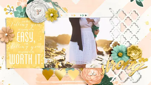
11:38 5Shadowing Paper & Flat Objects
19:18 6Applying Layer Styles to Your Page
22:57 7Realistic Flat Object Shadowing
09:15 8Recoloring Shadows in Adobe® Photoshop®
07:26Extraction with the Pen Tool
16:55 10Building the Layout with Extracted Images
15:52 11Warping with the Smudge Tool in Adobe® Photoshop®
07:10 12Distort Shadows with Wavelength
04:00 13Making an Action in Adobe® Photoshop®
05:01 14Warp Shadows with Transform Tool
03:15 15Warp Shadows with Gradient Tool
03:43 16Intro to the Adobe® Photoshop® Puppet Warp Tool
10:34 17Creating Effective Inner Shadows in Adobe® Photoshop®
09:16Lesson Info
Shadowing Paper & Flat Objects
So let's hop in the photo shop then what are some things that you probably shouldn't shadow text is no tax what else? Stand and stamped and has just a tiny bit sometimes you can you actually can show those fancy right but it has to be really, really, really settle sometimes it can bring some definition in that you kind of lose around the edge of the stamp especially if they're similar colors that kind of a thing but yes, you want to be very careful with the stamps uh, anything else? How about paint glitter sitting with holes can be hard tio shadow because you're also going to shadow the holes um doodle stickers anything like that just sits directly on the page and doesn't come away at all you know we're not going to shadow that stuff it's not going to work it's going toe like we saw with the dirt on the original image it's going to be crazy so I want to show you, um how I set up my canvas or my when I took the pictures so you can see I put it on my table and the light source is one hun...
dred twenty degrees and I just um said everything up so that when I shot straight down I have the right light source and we could see together how everything is different when we take pictures, they all have the same light source, they are all just sitting on the same surface, but you can see that the leaf is coming way away from the table, which is going to involve the warp tool. The bow casts a really harsh shadow, but these little things in here, like the doily where it touches it's all really small shadows and you would think that you have to be really intense with your shadows when you are tryingto make it so that you can, like, delineate between the layers and photoshopped but really subtle is better. However, when I opened up these images, I was kind of flabbergasted by how dark the shadows are because I actually shot a really light compared tio how dark this looks in here, so this's a dyke, a real dichotomy and the digital die cat and I actually I'm going to use this shadow style for all of my paper objects because they're all going to be the same. So you can see that it's kind of dark right in here, and if I get my phone back to you, if I double click on it and open up the shadow palette, I can now these air the standard shadows that they're going to give you and you can see me make the fool out of the way it's kind of light and the distance is ok, but we're really going toe change it up and we're going toe kick it up a notch so um paper die cuts flat ribbons, banners I use the same shadow for all of them because they also right on the page so they're small hard shadows because they're so close to the page so I like to take my shadow too linear burn and we're going to try fifty percent and then a distance of five and the size of five and I don't mess with the rest of this but we have one hundred twenty degrees already and you can see it's way darker than I thought it would be but it matches perfectly so what we're going to do is we're going to make the match perfectly and then when we actually get into shadowing riel layouts we're going to see how sometimes when we use the perfect shadows it doesn't look right so we're gonna have to adjust them so this is my paper shadow and what about things like oil lease and lace what's the difference between that and paper you think besides the fact that they're floating away from the page in this image let's look at just the parts where it's touching what do you think you have to do differently? It is someone pit yeah we're going to work the shadow but if we're just talking about not working the doyle ease and the lace are so delicate and we have so many holes that if you open up the drop shadow and if we applied the same exact drop shadow that we did the paper even though it's a paper object they're pretty it's going to be pretty harsh and not as beautiful, especially in the more delicate things like like really holy laced they tend tio muddy up the campus because you have so many holes that cast so many shadows that it just becomes one big glob of shadows, so this one we're going to make it even smaller and we're going to go to about thirty five percent and we're just going to one pixel for both and in this example it's not it's very subtle, but later when we get into lace, it'll be way more obvious. So if we just go through and open up all of these things but it's a chip or this whole massive chipboard pieces with suman and digital chip or chipboard casts a really harsh shadow because it has a lot of volume up top and it's really dark too. So I actually have always used my paper shadows for chip board, so when I opened up these images, I was like, oh, I'm wrong and he's a much harsher, harsher shadow because it has so much height, so we're going to forty percent and then we're gonna go all way up to fifteen about nine or ten you can see I could even go deeper and darker with the color of the shadow so let's jump jump it up to sixty percent and that's probably getting closer to where we are but that's pretty harsh of a shadow eso in aa lot of a lot of times we'll have to drop down how harsh the shadow is because what looks good in real life doesn't necessarily look good on a digital scrapbooking page it's always a balance that we're trying to find so here's a puffy flower and I always I always give these really soft shadows and I realized that that was probably pretty wrong so this one's coming away from the paper I mean the table but not very much not as much as I normally give it I normally get a pretty high shadow but you can see in some places is casting a really large shadow and in some places it's not casting shadow at all where it's touching so we're going to learn how to in segment for we're gonna learn howto warp it so that there's shadow in places and shadow no shadow in other places but for now we're going to just give it an overall shadow so let's try forty five fifteen and thirty so it's giving me kind of a floaty shadow you can see that ah when we raise the distance it starts to get a really soft edge around the edge of our flower so the distance the size, the bigger the sizes this after the edge if I lower the size down, you can see the kids really sharp so if you want things that are floating away from the screen are away from the paper and look like they're like feathery like flowers are around the edges, then you're going to want a lot higher of of a size but not too high ninety might be kind of ridiculous yeah that's a little crazy even that s o you never want to go way up into the shadow there up into these size and distance chester's yeah, we want to be conservative so we got fifteen and thirty, so he has this nice low soft shadow. Now my biggest surprise when I was doing this you was this, um bow this bow cast a huge shadow and I never really thought of it in that time I actually always shadowed my bows like I shot on my ribbons and that's obviously totally wrong. So we're going to go super dark with this one and we're changing toe linear burn seventy percent and then this one we can go super far away, but yeah, even though this is pretty realistic let's drop the shadow down a little bit if you put this on your digital scrapbooking layout, it would look pretty terrible unless you have just the right balance of things, so we're going to start here and we're gonna make it realistic, but I think we're gonna have to adjust it later on down the line so you can see that even though some things are realistic and we're doing them so they match perfectly when you actually translated into photo shop and in digital digital scrapbooking, it doesn't look good, so we have to know when to break those rules. We have to know when to say, ok, well, it may look like this in real life, but if I do this on my layout, then I'm not going to like it so leaves or another thing you can see where it's warping away from the table here, but when you actually look where it's touching it's, pretty harsh shadow and I always shadow my leaves pretty high, so I was surprised when I opened that up, so drop shadow, linear burn and we're going to go thirty five and then I'm gonna go somewhere in between a really low and really high since I'm going to warp it later, but you can see this was kind of the shadow in here so later, when we learned about working, I can take the tip down soto, where it looks like it's touching and then I can pull this bottom part out just like this one tore it looks like it's coming away from the table ribbons. Now, this is a it's, not a curly ribbon, but I'm gonna shadow like a curly ribbon. Um, but I kind of I photographed the room and saw that it was kind of curling away from the table, even though it's pretty hard in real life to replicate the curly ribbons that we all love in digital. I don't think I see a lot of favors grab bookers doing that because how the heck are you supposed to make that work? You'd have to like glue it everywhere and then it gets flattened way because you're looking. So how are you supposed to make something realistic that is unrealistic to begin with? We don't do that in paper scrap booking, so we're just going to talk about about how this one that I kind of got to curl away from the the paperwork's from nana v g tracing she's asking when you're shadowing the flower use multiply, but then you change too linear burn for other shadows was that I know I just didn't change it because we it's repetitive but lenny arena multiply they really are interchangeable it's a total preference, it's just what you like? I prefer living your burn, but if something lands on multiply, I'm not going to cry if I forget to do in your burn, I just want to clarify this may be something to get to but s for has been asking and six people voted on this question there, saying what the challenges is of chattering on black background are we going to be doing anything or black background? Yes, I have one of the layouts. Um, I have black background and we'll get back background seem harder, but it's really just has a really dark shadow. And if it's like a super solid black background, then you might have issues. You might have to lighten up the paper a little bit to see the shadow, but we'll go over that. Okay, so this ribbon is definitely going to take some warping later on down the line. But let's, just start, make sure you change the linear rune they want to forget that again. Thirty percent. Um thirty, twenty five and fifteen and we can start to see that we get this kind of glowy shadow where it's kind of pulling away a little bit now, when we were up, it will make it so that it looks like it touching in places and look like it's coming away in places because actually this looks pretty good and it would probably work on the layout but if we want to go super fun and realistic with it then it's going to require some warping sharing string is the bane of a lot of people's existence because that looks pretty flat um it's another one where it pulls away from the paper and it touches the paper to um so this is going to have a really hard shadow because it's such a small thin object that it kind of acts like paper in the way that the shadow works so this one's going to fifty percent fifteen and actually this would be decent if you left it on your way out like this it would work perfectly fine but we don't like that we want to play we're almost there there's so many things that we use but you never think about enamel dodds so enamel dots actually have a lot higher and harder of a shadow than you would think because they do have a lot of texture they go up and away from the page and even though it's still a small shadow compared to other shadows it's a lot deeper than you would think it would be so we're gonna go teo clean here burn and fifty percent five he's changing that one ten here you never mess with the spread really I think that the natural spread the way it works in photo shop works fine for digital scrapbooking zoom in you can see we kind of have this glowy shadow around the edges and we have a glowy shadow around the edges here now I was I was shadowing my arm I enamel dots on one and one really tiny shadow because I figured they're stickers they stick to the page and have tiny shadows but when you look at it they have bigger shadows and you would think because they are boldest okay buttons I was surprised by buttons too they have big shadows that's amazing I've always shadowed the buttons inside I was telling her clear the shadow so we can start over okay so I I always thought the buttons had really small shadows too I was giving a little bit bigger than enamel dots but um not quite as big a zit shows here twenty percent sorry fifty percent twenty five and fifteen it's a really big heart shadow huh? Switching between the new bern and multiply on the on because it seems that that's a good big shadow yeah it is a big shadow so it's to multiply you see it the blacker the what linear burners of doing is taking color from underneath and making your shadow a little bit more colored so if I go back to a linear burn if the darker shadow yeah but it's also it's the right color so typically on linear burn shadows, you have to drop the opacity a lot lower than you would on multiply so well, because his button has such a dark shadow it's all the way up here in the fifty percent range and we could probably drop it down to forty and it was silly. Fine. It's totally going to be a preference. Yeah, that was a good, good example of the difference because they are interchangeable. A lot of most people use multiply, but I just started using linear burn and I was so we're excited by it. Now, let's, talk about the low. Okay, so I have a a paper here. I tried to replicate it as close as I could. So white paper with vellum and valentini tricky to shadow. So what happens when you shadow vellum like you would shadow a normal paper? But I'm dark meaning slights transplant anymore. Exactly. And so how do you? I mean, the question is, how do you get around that? Okay, so if we go multiply or let's even check out linear burn it's going to be super dark and it muddies up your vellum and nobody likes that that's not that's, not pretty and that's, not even what it looks like in real life, so what we have to d'oh is we have to change it to a really small opacity so that it doesn't money it up and you're going to get a little bit of darkening but that's that's normal and then you want since its paper you want a small paper shadow so five and five and it's really subtle and it can be hard to shadow vellum but we have the shadow that we need without darkening the semi transparent object so ok so let's look at would you see super harsh shadow it's amazing to me I when I really started going in depth with my own shadows I was like things are a lot different than I thought that they would be okay so linear burn way need is just going to be a lot like our veneer I mean our flare shadow because it has so much height we're gonna dio fifty percent twenty five and ten small ray it's probably a little dark but when you'll see that when we actually start going in and shadowing things in real life it gets pretty um pretty dicey being able to use stock shadows that's why I never people have asked me to sell my shadow cells before, but I think that shadowing is such a personal thing that it's really when you use other people's shadows styles it's easy and it works but it takes the personality out of your layouts so we'll play with them a little bit more. And then also with vellum is also the same kind of thing with washi tape, except with washington. Since it's stuck to the paper, it's got a really tiny shadow. So with washi tape, I would drop it even down farther toe like too one. Maybe so. You have a really hard shadow, it's going to be so subtle. But it really makes a difference in your layout, just to have make sure that everything is shadowed.
Class Materials
bonus material with purchase
Ratings and Reviews
Diane
I bought all three of Traci's classes and am very impressed. Even though I consider myself a professional Photoshop user, I learned some great new tips and tricks. Not only that, I found the classes inspiring and it kicked my digital scrapbooking creativity up a few levels. More than worth the money. Easy to watch, inspiring and a great teacher.
L. Phillips
This class was fascinating and moved at a good pace. Scrapbookers these days use so many varied Photoshop skills and are some of the most creative thinkers around. I learned so many practical - use it right now! - tricks for shadowing any kind of object and make styles out of them for one-click usability. There's a bit much of the biography section at the front of the class but I felt the usable information was enough to warrant the purchase so I can skip the personal section. Traci is a friendly and clear speaker, and a wealth of knowledge. She should definitely be featured in more advanced scrapbooking classes AND even for creating vector embellishments!
a Creativelive Student
Awesome class! WOW, I had no idea about the world of shadowing. I just started digital scrapbooking and knew my layouts were lacking something and now I know what...depth! I definitely feel more confident now in adding shadows to my pages and I have also graduated from Elements to the full version of PS thanks to Traci's suggestion. I am headed now to search for more classes by Traci. Thanks for a great class!